

- Share
Did the COVID-19 Pandemic Cause an Urban Exodus?
In 2020, several media stories reported that residents were leaving urban neighborhood because they feared contracting COVID-19. However, people’s taking flight from urban areas is only part of the reason dense neighborhoods were left with fewer residents.

The views authors express in District Data Briefs are theirs and not necessarily those of the Federal Reserve Bank of Cleveland or the Board of Governors of the Federal Reserve System. The series editor is Harrison Markel.
One constant through the upheavals of 2020 was the steady stream of media reports about residents' fleeing dense urban areas.1 In this data brief, I use the Federal Reserve Bank of New York/Equifax Consumer Credit Panel (CCP) and find that migration flows were in fact very unfavorable for urban neighborhoods in 2020. However, people's taking flight from urban areas is only part of the story.
Initially, the urban exodus stories reported that people were afraid of contracting the novel coronavirus in elevators and subways. Then the narratives suggested remote work had freed office workers from long commutes, allowing them to relocate. With both remote workers and students at home full time, a desire for home offices purportedly rose, and low interest rates made buying a larger suburban home attractive. Urban amenities such as restaurants and theaters were shuttered. Later, the protests sparked by the killing of George Floyd and others were cited for motivating some urban residents to leave. Most major cities experienced increases in violent crime during 2020, and crime rates have historically predicted migration changes.2 The proposed and enacted cuts to police funding were also cited as a reason to leave by some people who feared that crime would increase further.
The media reports have used a variety of data sources to measure the urban exodus, ranging from real estate listings to the hiring of movers and renting of moving vans. For this District Data Brief, I use the CCP, which is arguably a more accurate source for measuring migration. The CCP is a nationally representative anonymous random sample of 5 percent of US consumers with a credit file, resulting in a sample of more than 10 million adults. Approximately 9 of 10 adults have credit records, so CCP-based estimates are more representative than measures that reflect only homebuyers or only clients of a specific company. The populations the CCP underrepresents include low-income people who do not use traditional lenders (for example, banks and credit cards) and college-aged adults whose parents are still handling their finances.3 The techniques and definitions I use in this brief are the same as those I detailed in two 2019 Economic Commentaries (Whitaker, 2019a and 2019b).
Lenders report their borrowers' current addresses to Equifax each month, and the CCP reports each borrower's census tract. Using census tracts allows us to observe moves into and out of urban neighborhoods with much more precision than the many data analyses that rely on county-level migration aggregates. Almost all counties include both high-density and low-density neighborhoods. In the CCP, we can observe urban-suburban transitions that do not cross a county line, and we can distinguish those transitions from suburb to suburb moves that do cross a county line. I define urban neighborhoods as census tracts in metro areas with populations of more than 500,000 that have either a population density of more than 7,000 people per square mile or the majority of their housing stock built before World War II (WWII).4 Having either of these characteristics makes it more likely the neighborhood will be recognizable as urban. Neighborhoods built before WWII were designed for pedestrians, so residential, commercial, and retail buildings are within walking distance. Very-high-density neighborhoods built after WWII can also offer an urban lifestyle if they can support walkable retail and high-frequency public transit. In nonurban neighborhoods, zoning usually separates residences from businesses, so almost all trips require a car.
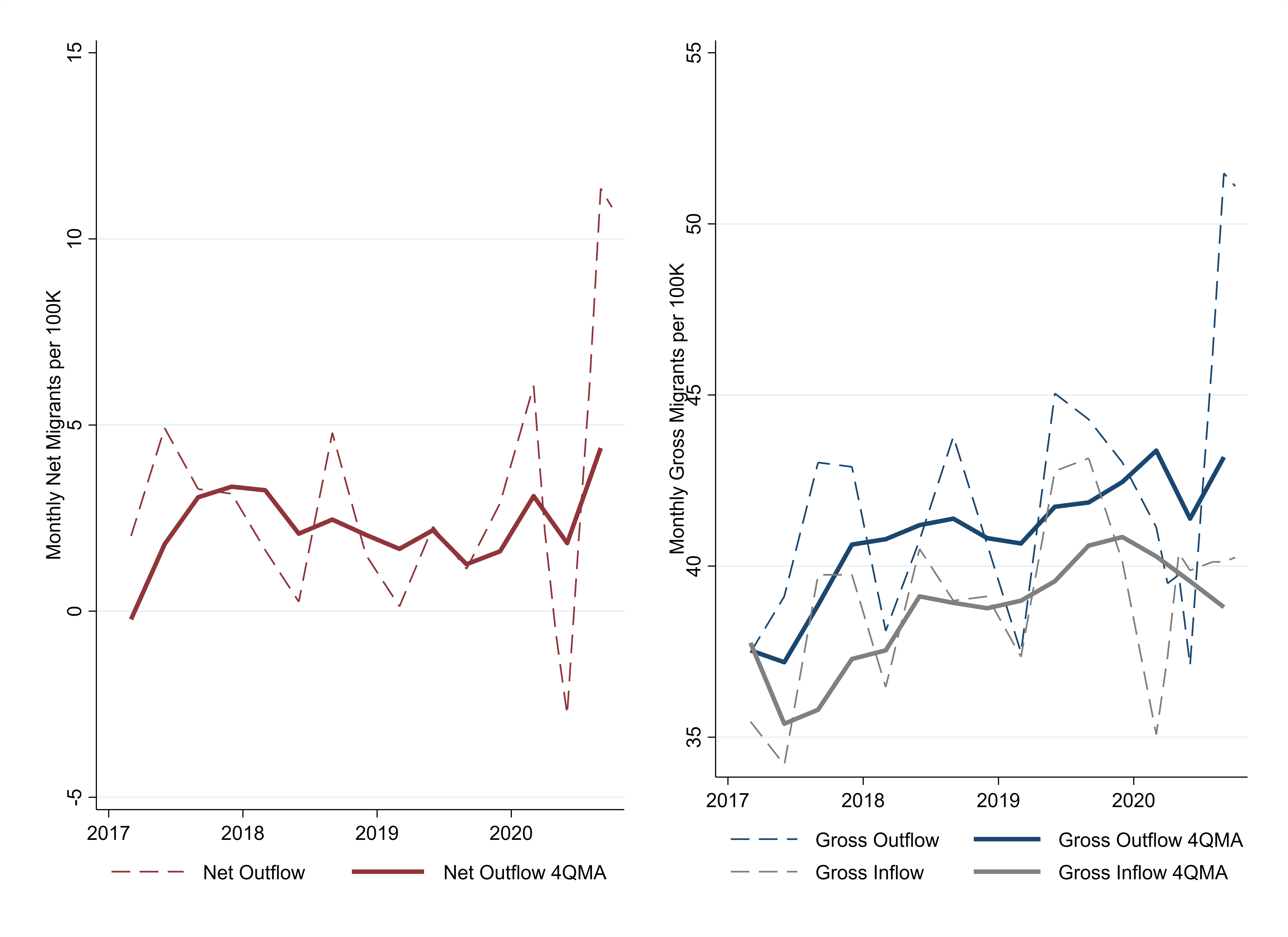
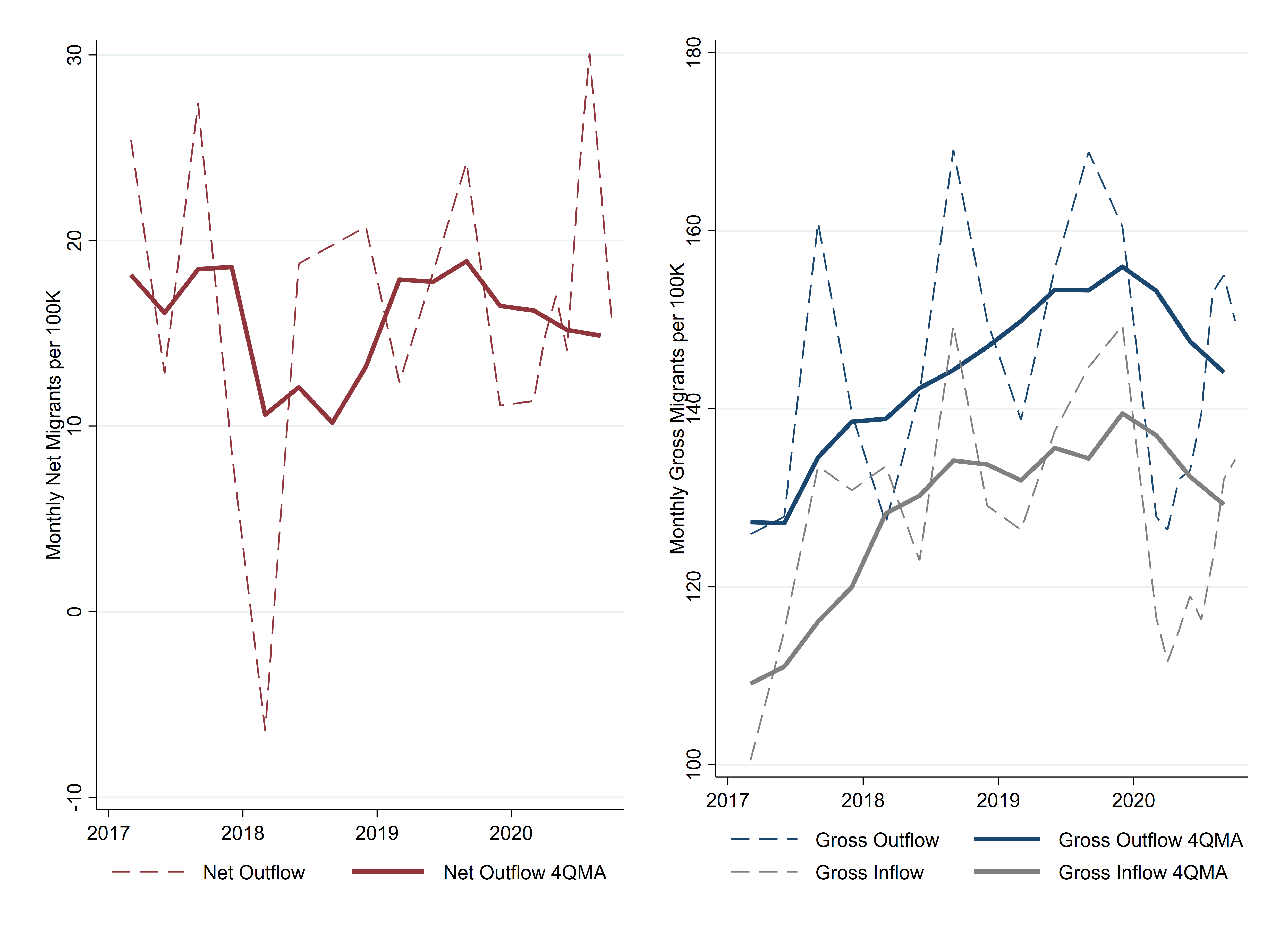
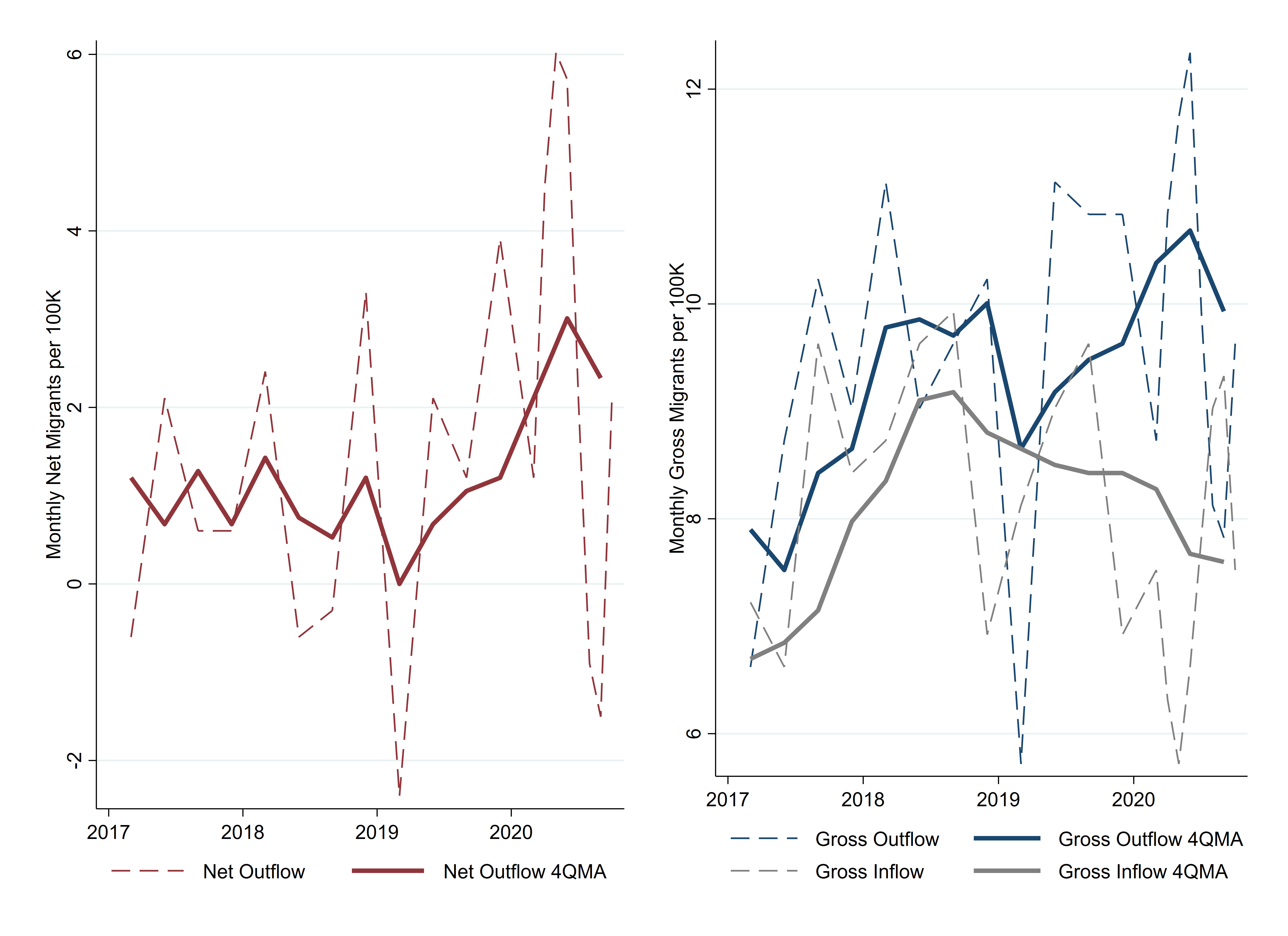
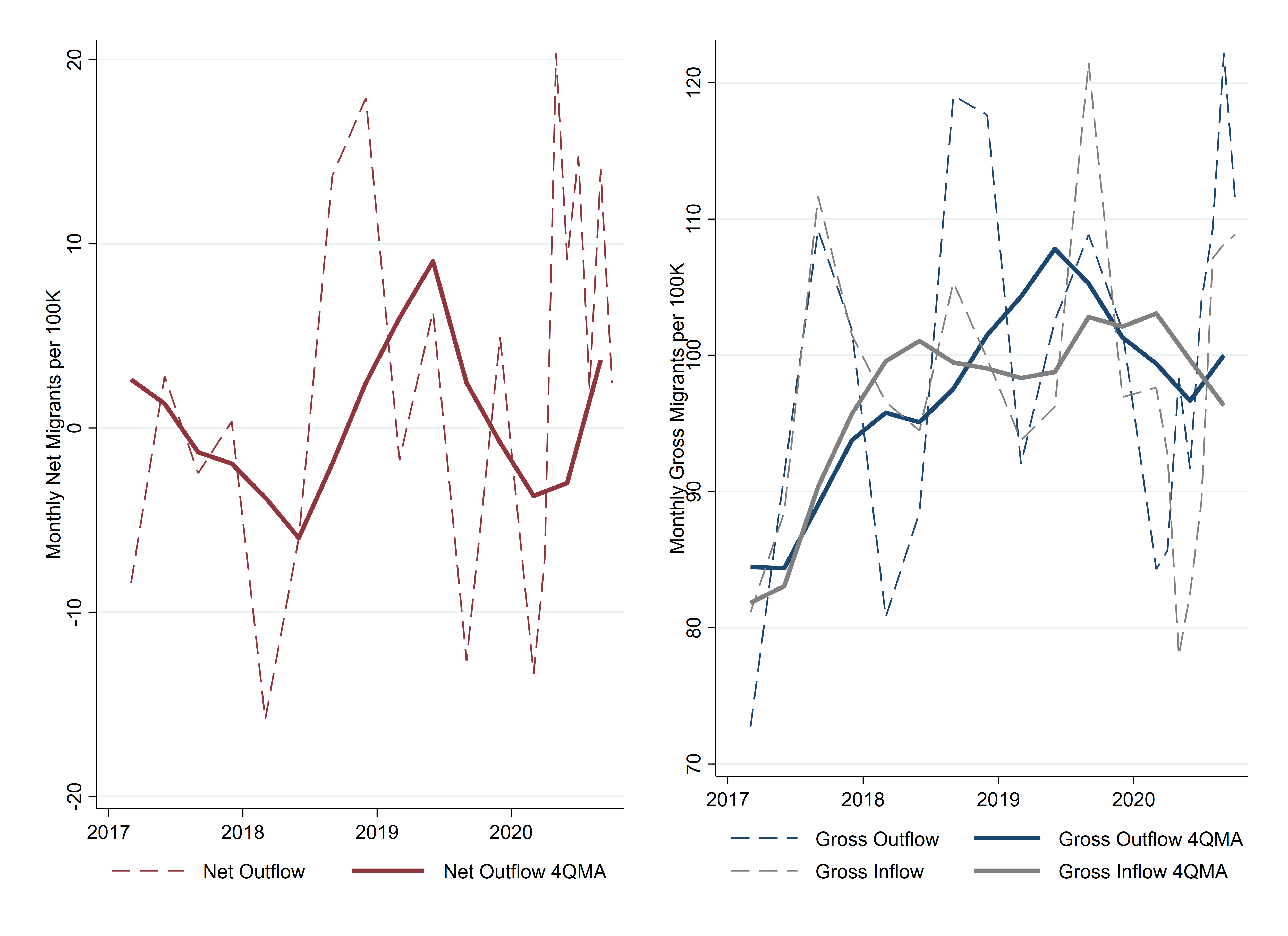
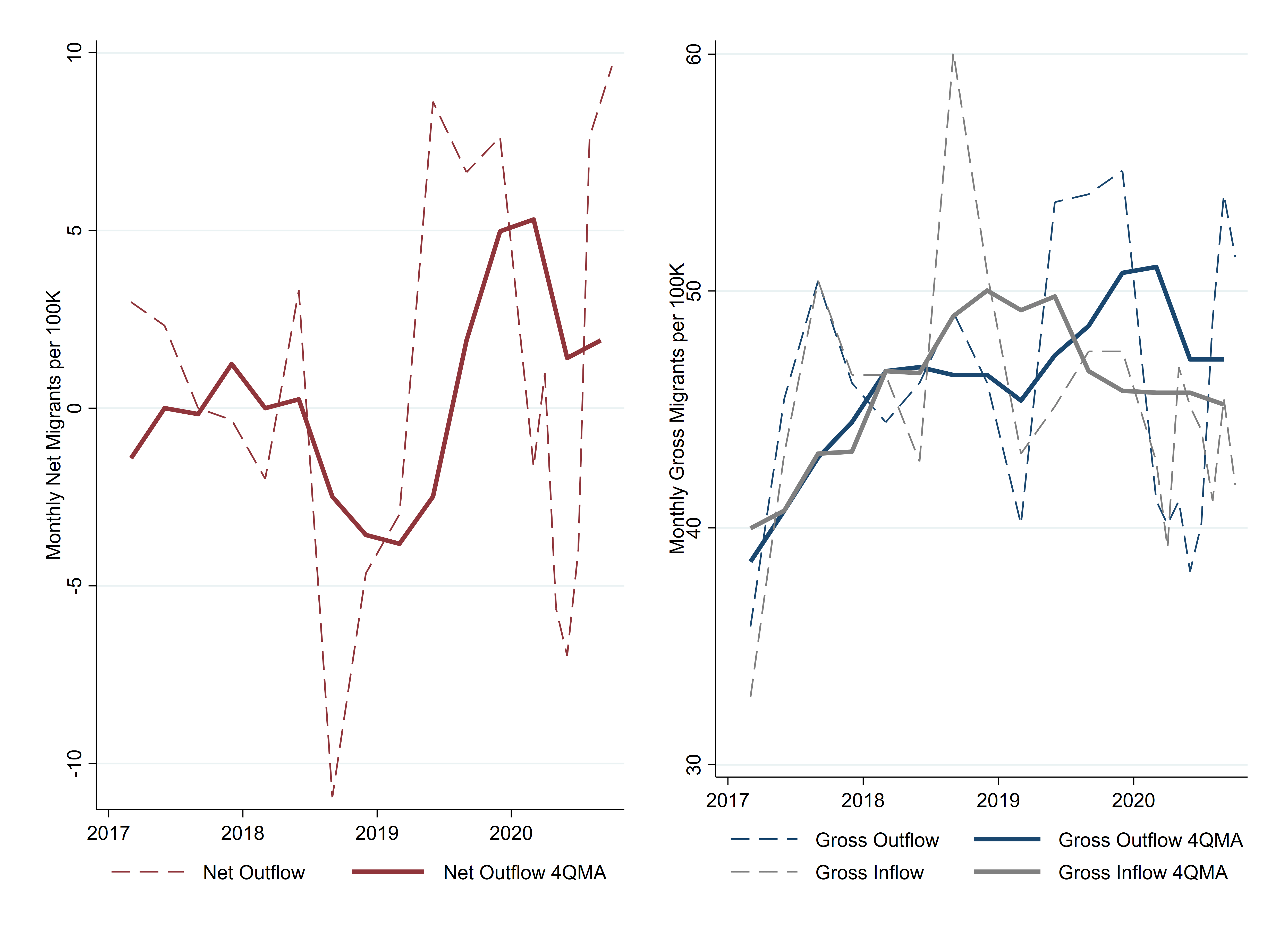
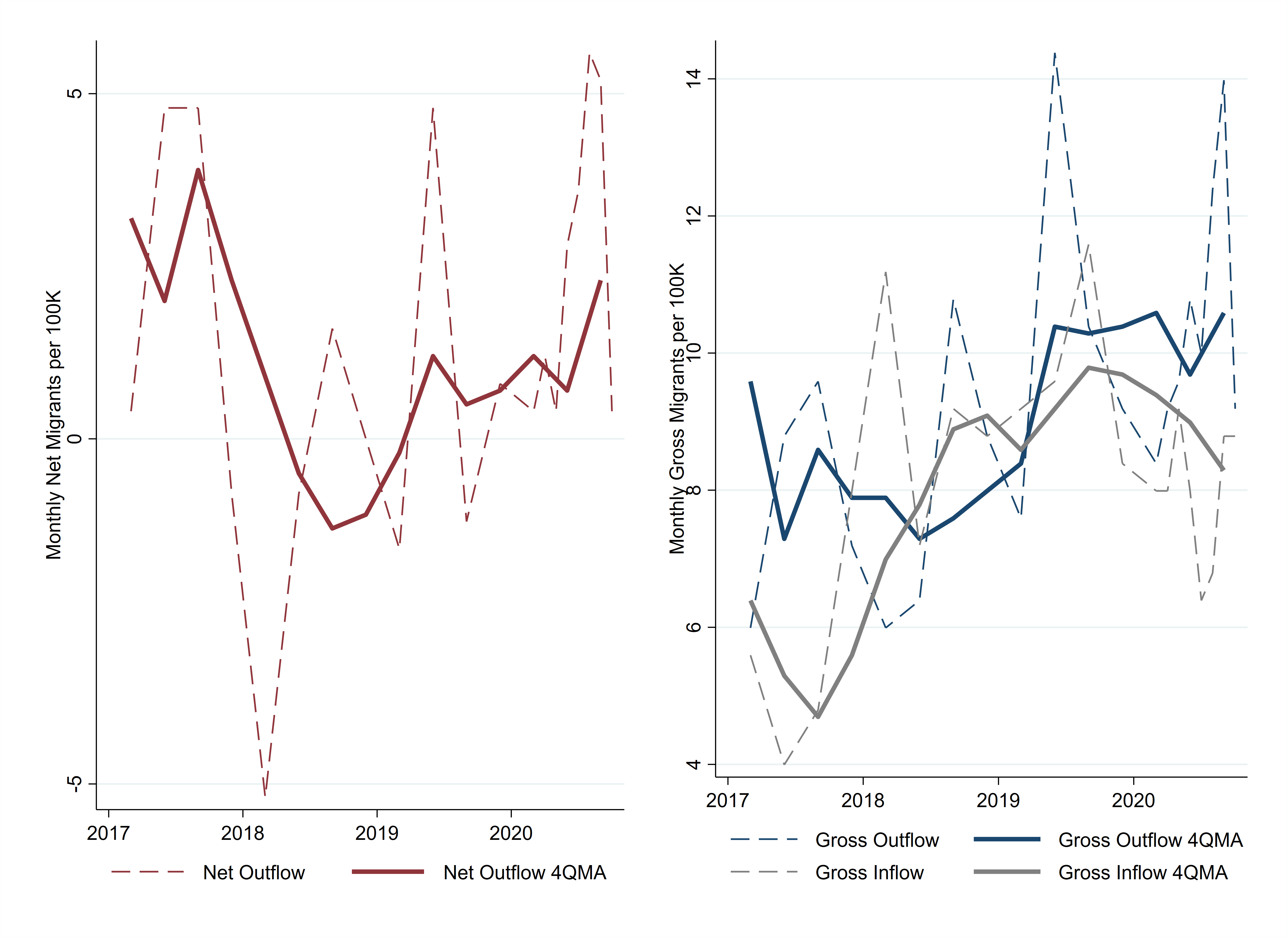
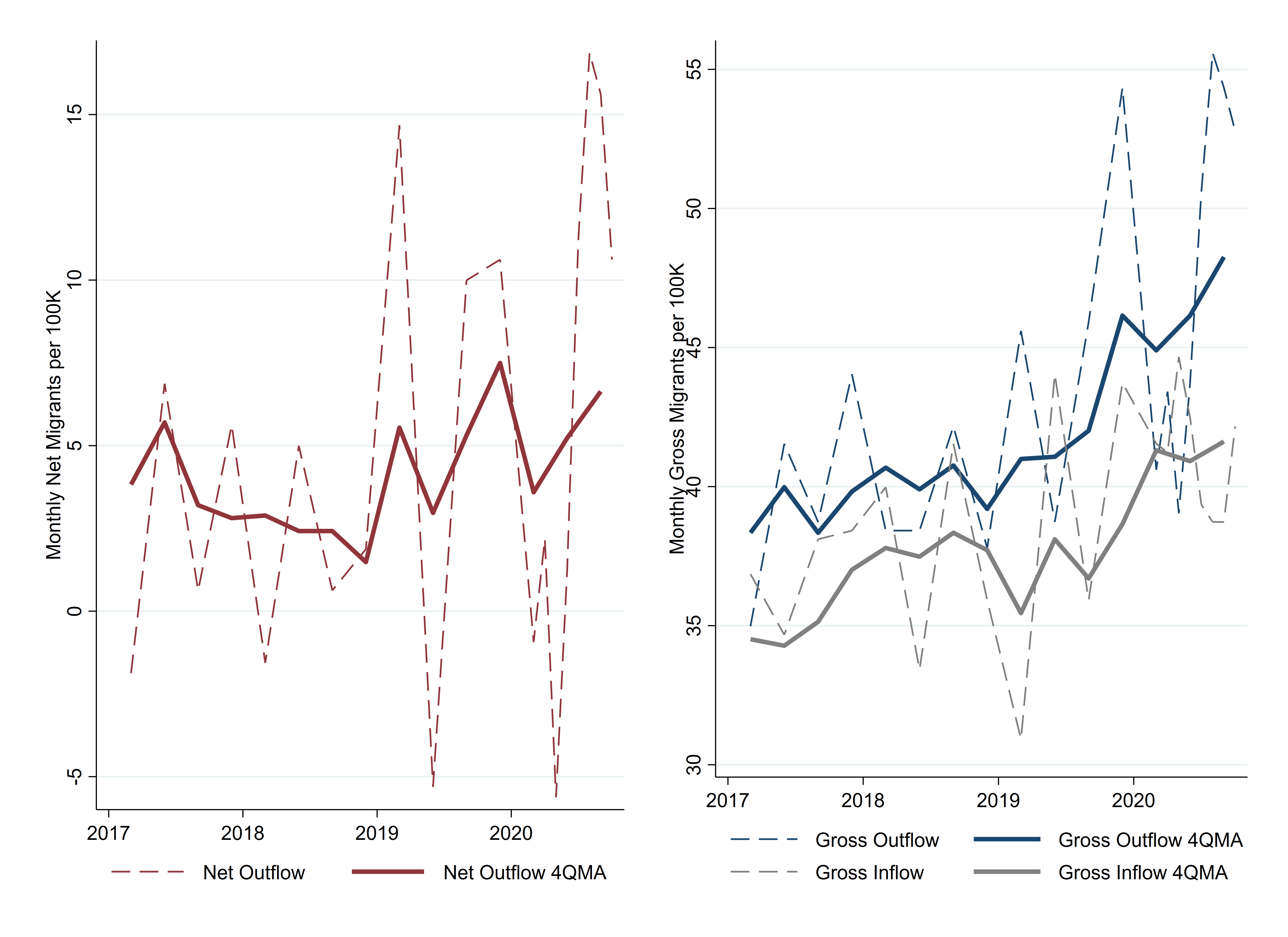
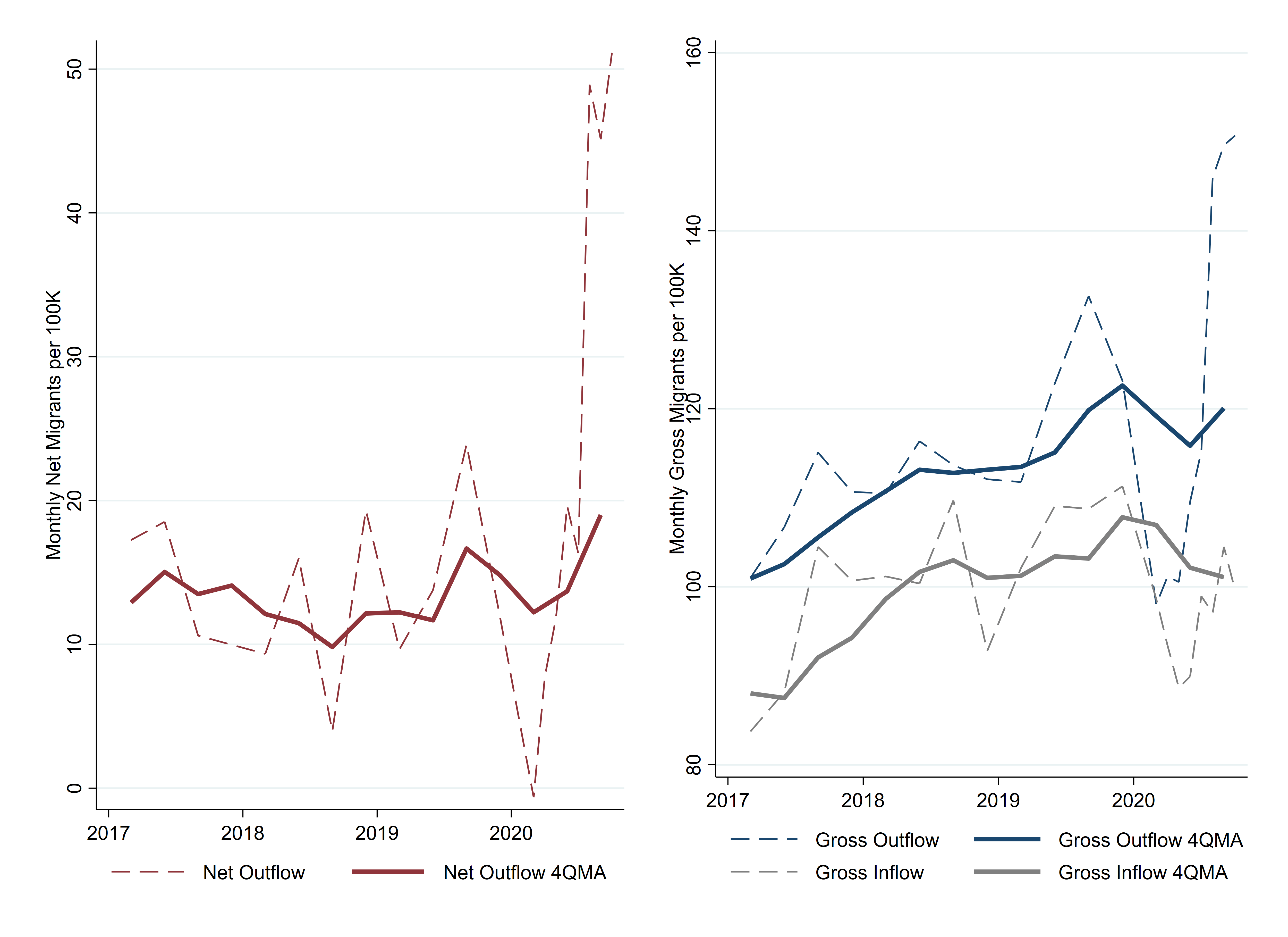
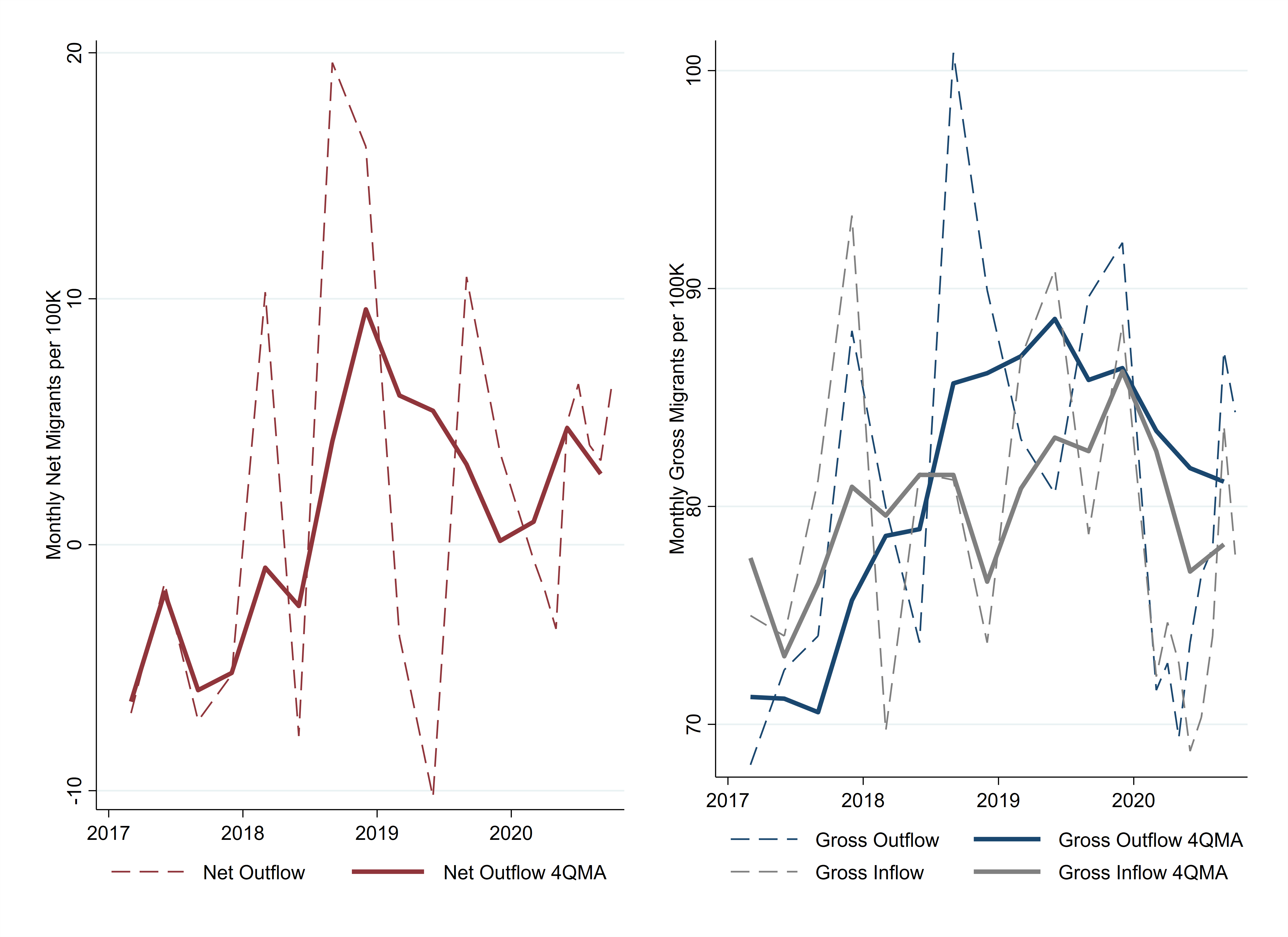
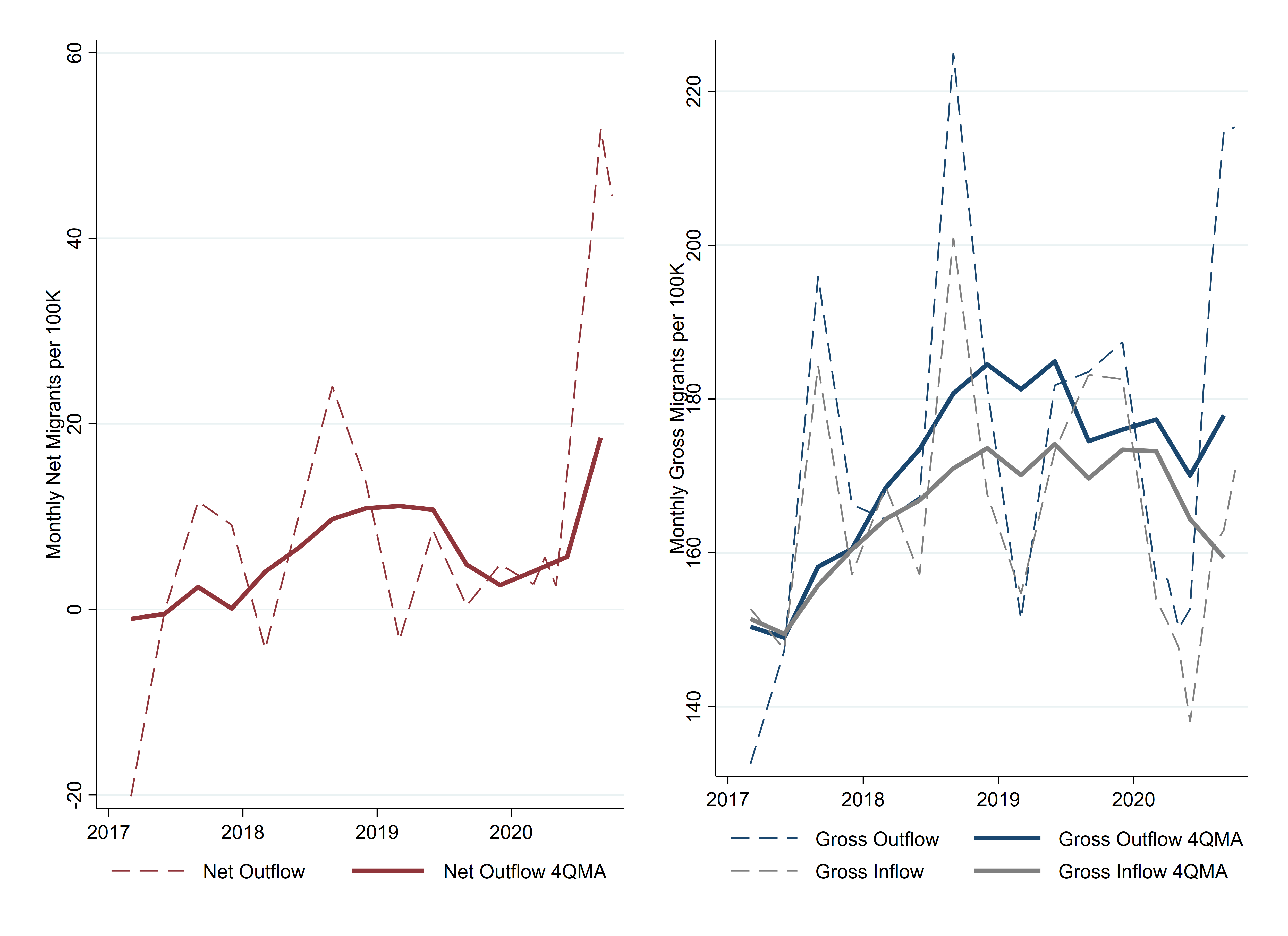
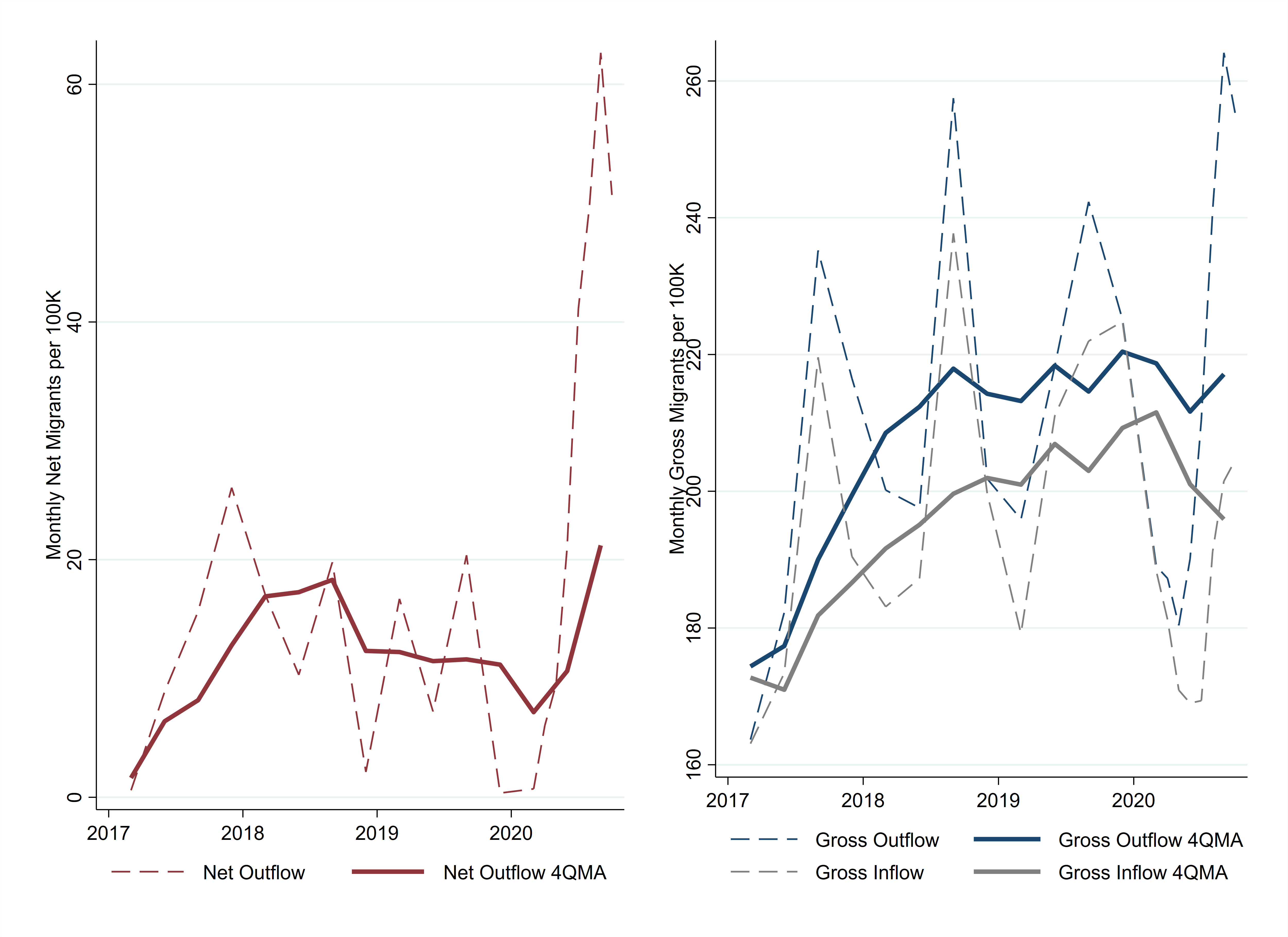
As measured by net migration to and from urban neighborhoods, 2020 does appear to have seen an urban exodus relative to the migration flows during the preceding 10 years (Figure 1). The net flow of people out of US urban neighborhoods averaged nearly 28,000 people per month in March through September of the recent years 2017 to 2019. That number about doubled—to 56,000 people per month—in 2020 after the pandemic's onset in March.

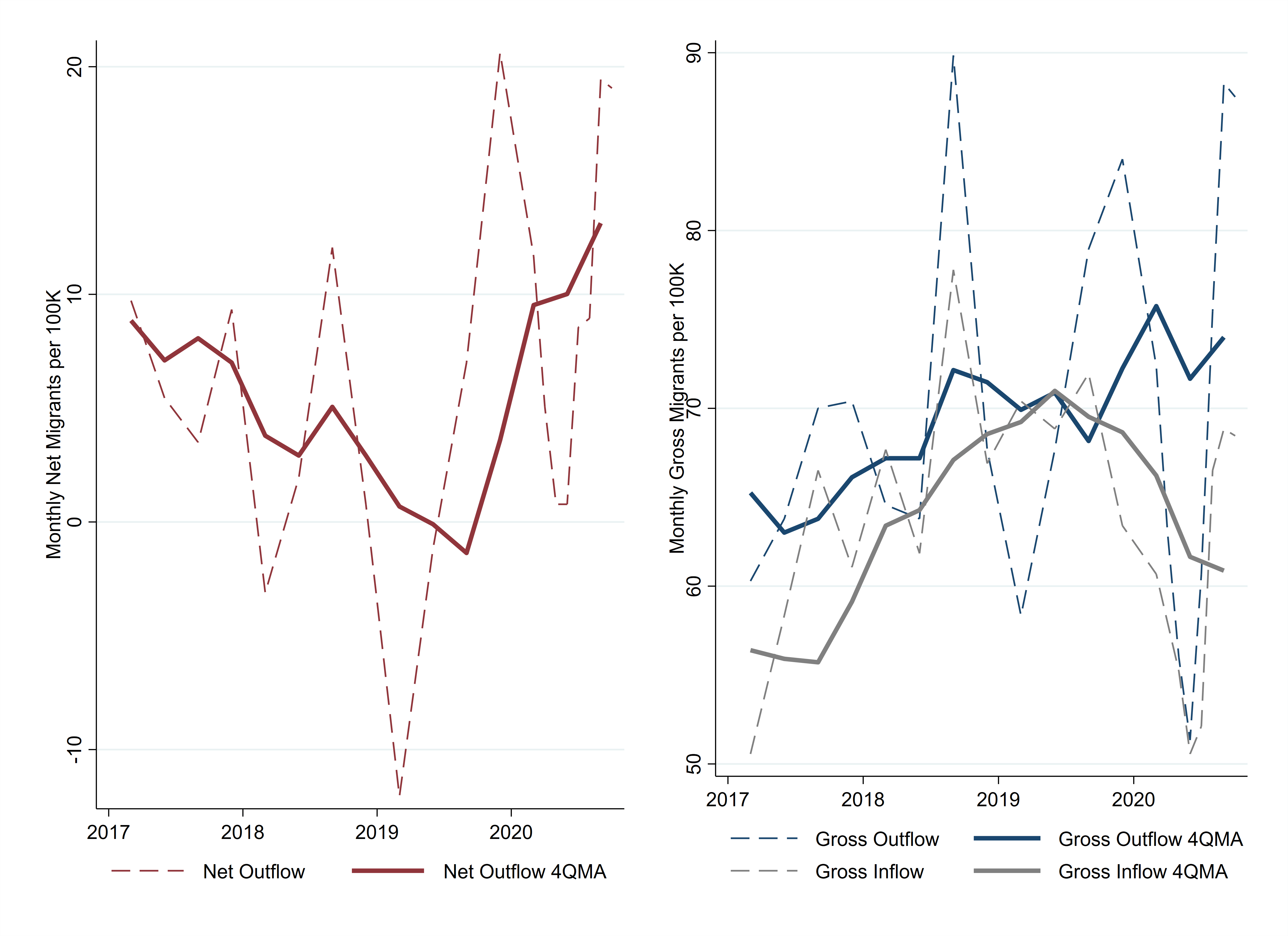
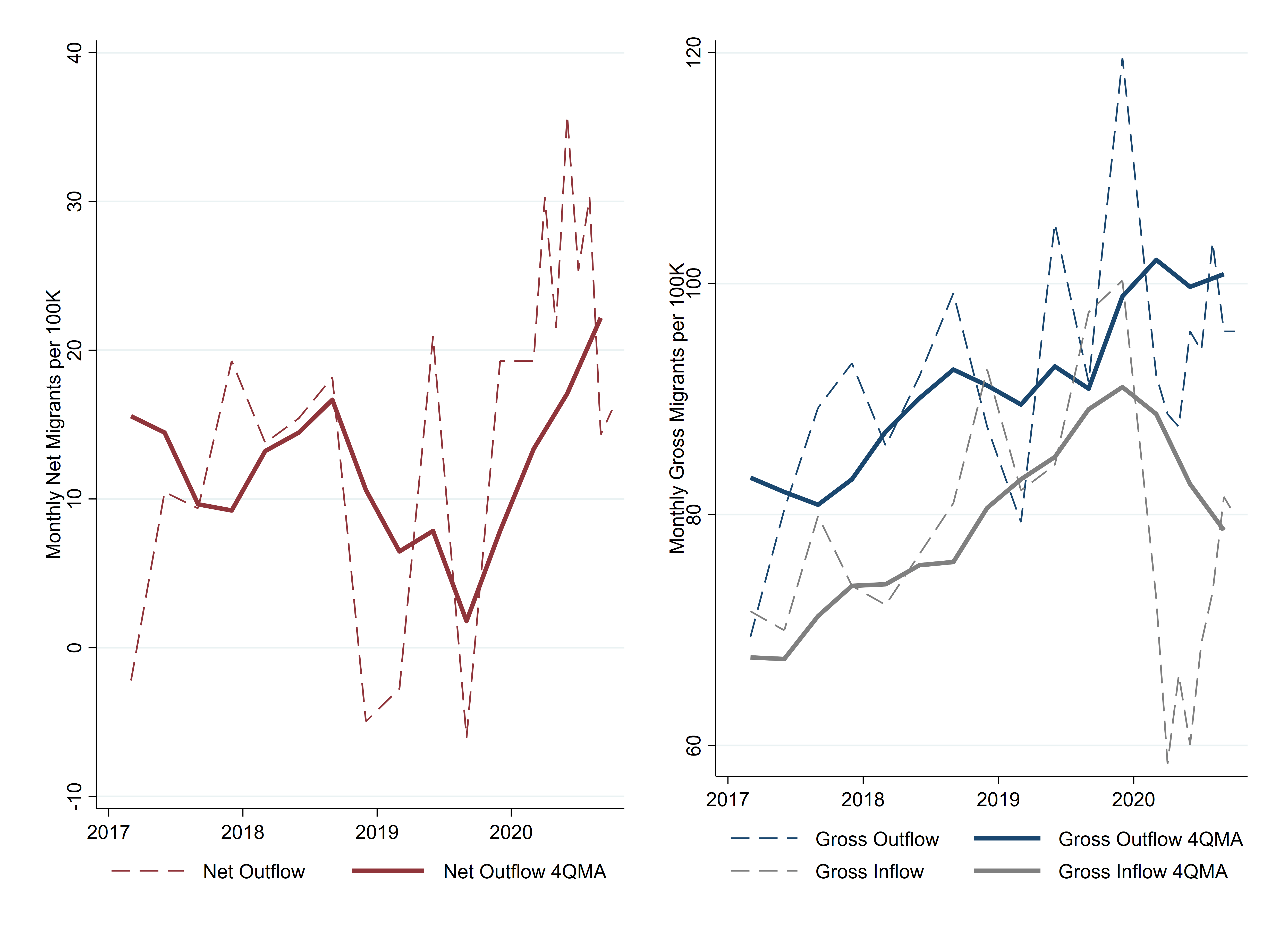
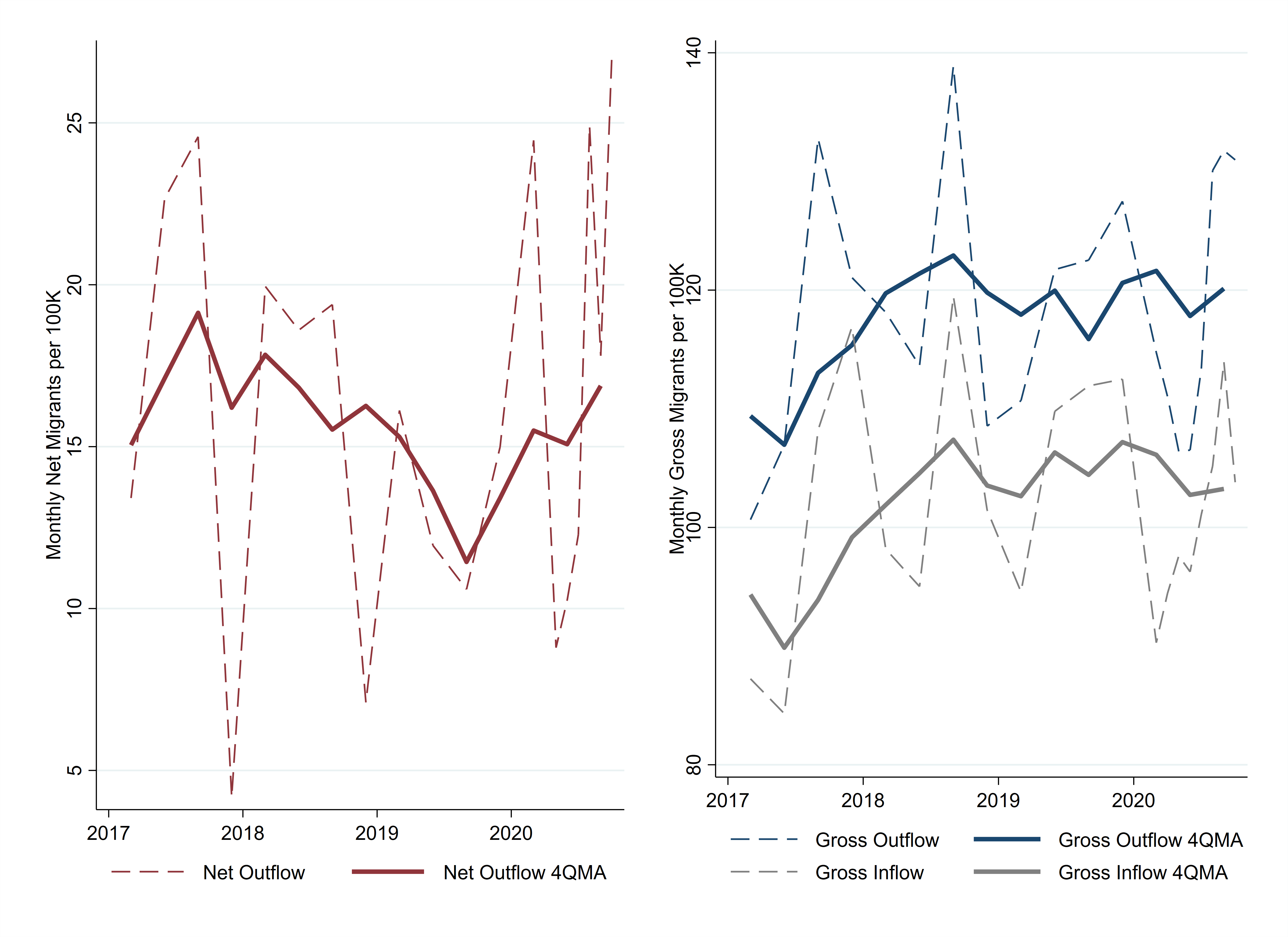
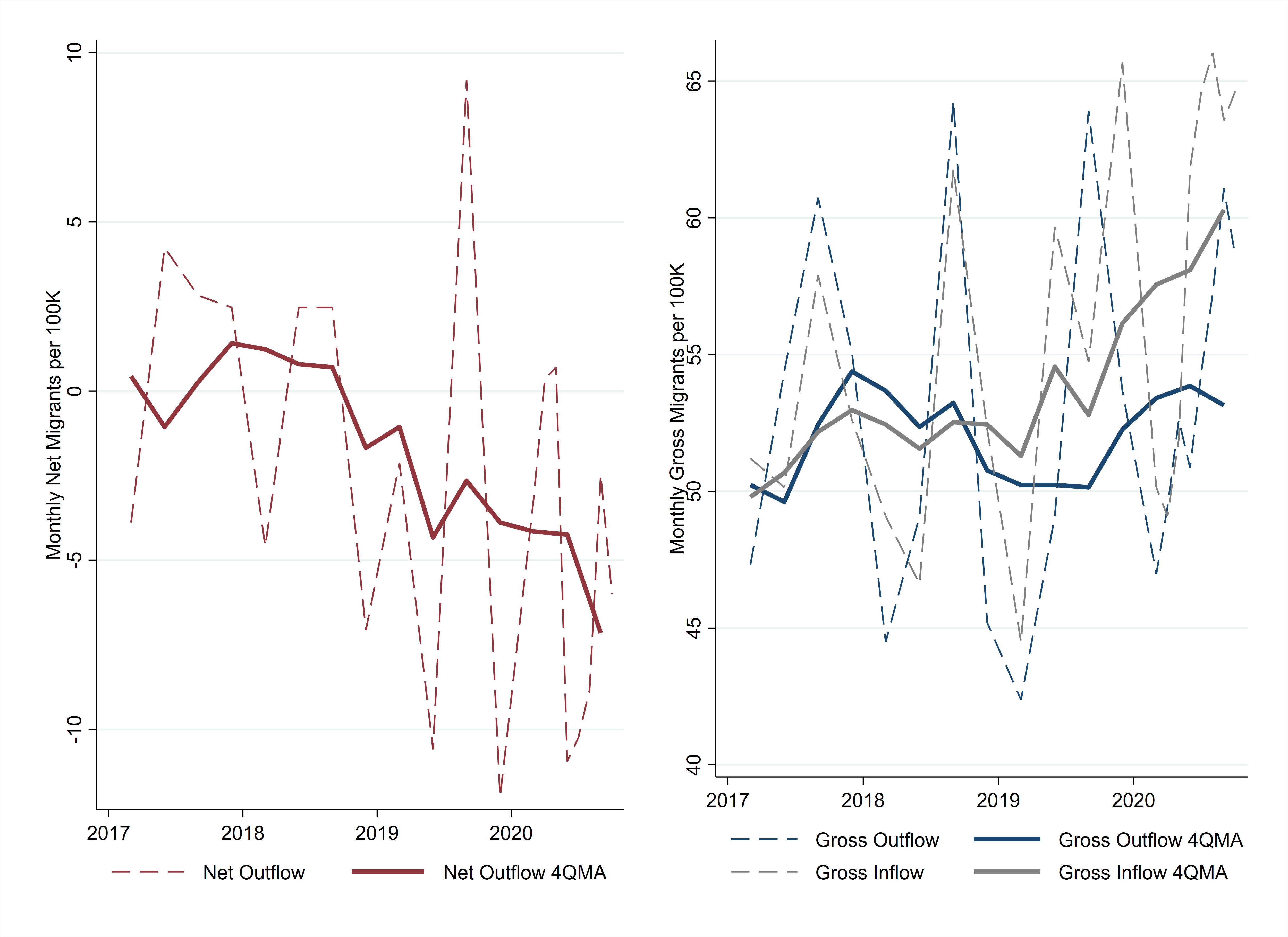
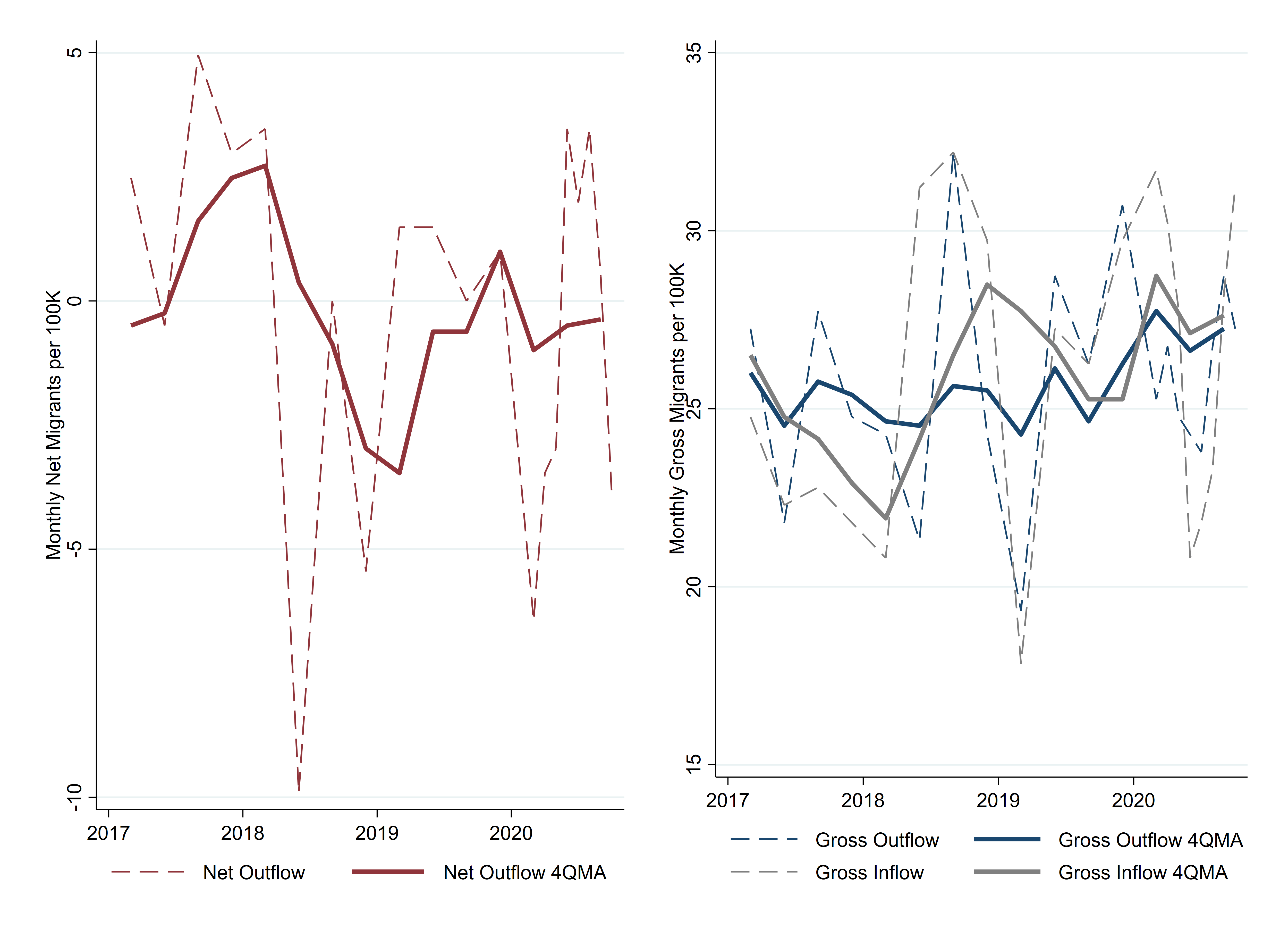
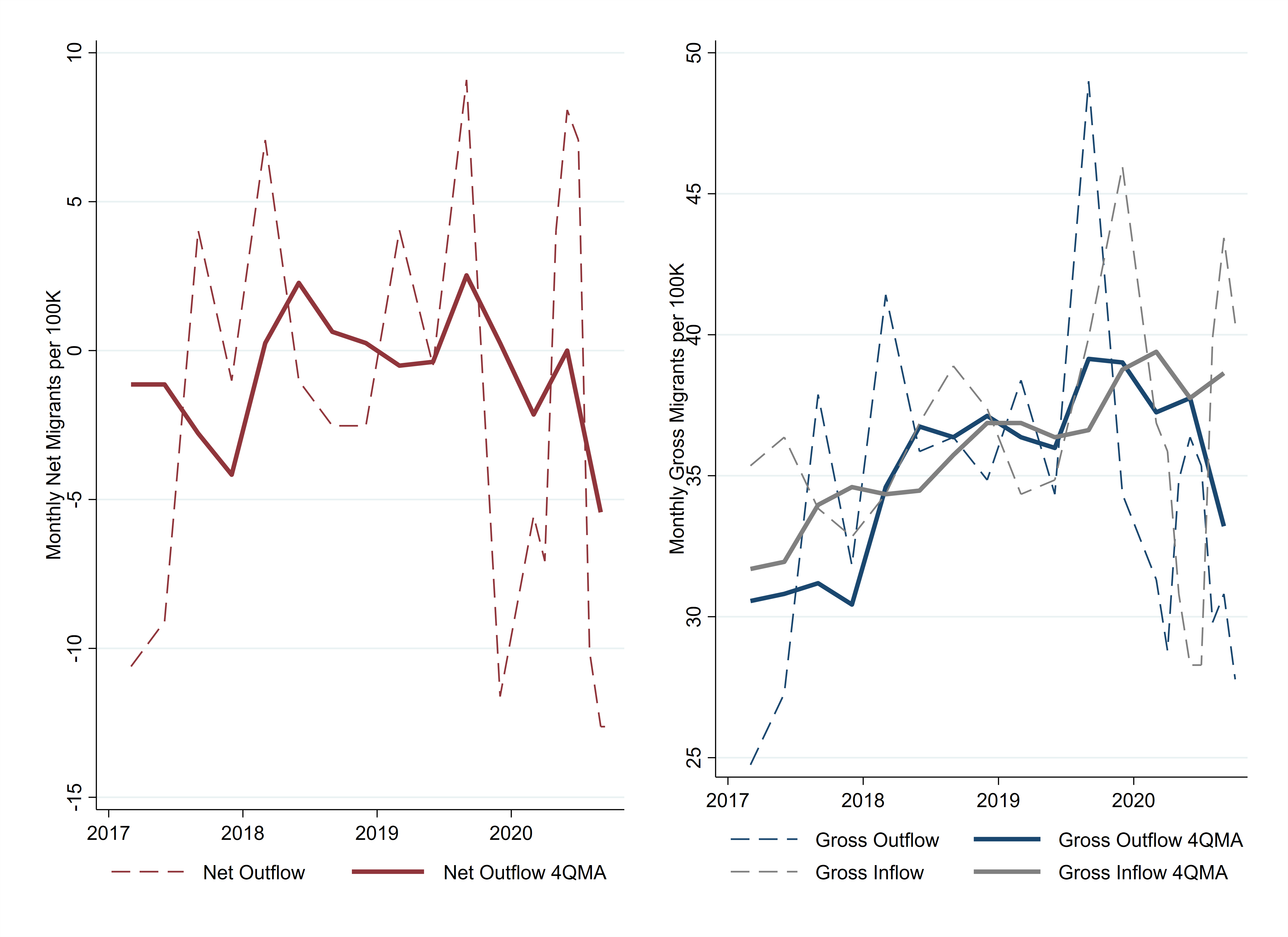
An increase in the net out-migration from urban neighborhoods can be driven either by an increase in people moving out or by a decrease in people moving in. Figure 2 shows that the decline of in-migration is actually the larger driver. The average of monthly out-migration was 276,000 in March through September 2020. This is 10,000 more than its average of 266,000 for the same months in 2017 through 2019. The larger change was for in-migration, which fell 18,000—from an average of 238,000 in 2017 to 2019—to 220,000 in 2020. Figure 2 shows the four-quarter moving average of the estimated flows to smooth out seasonality. Doing so also balances the dip and spike that occurred because the pandemic delayed many moves from the spring into the summer.

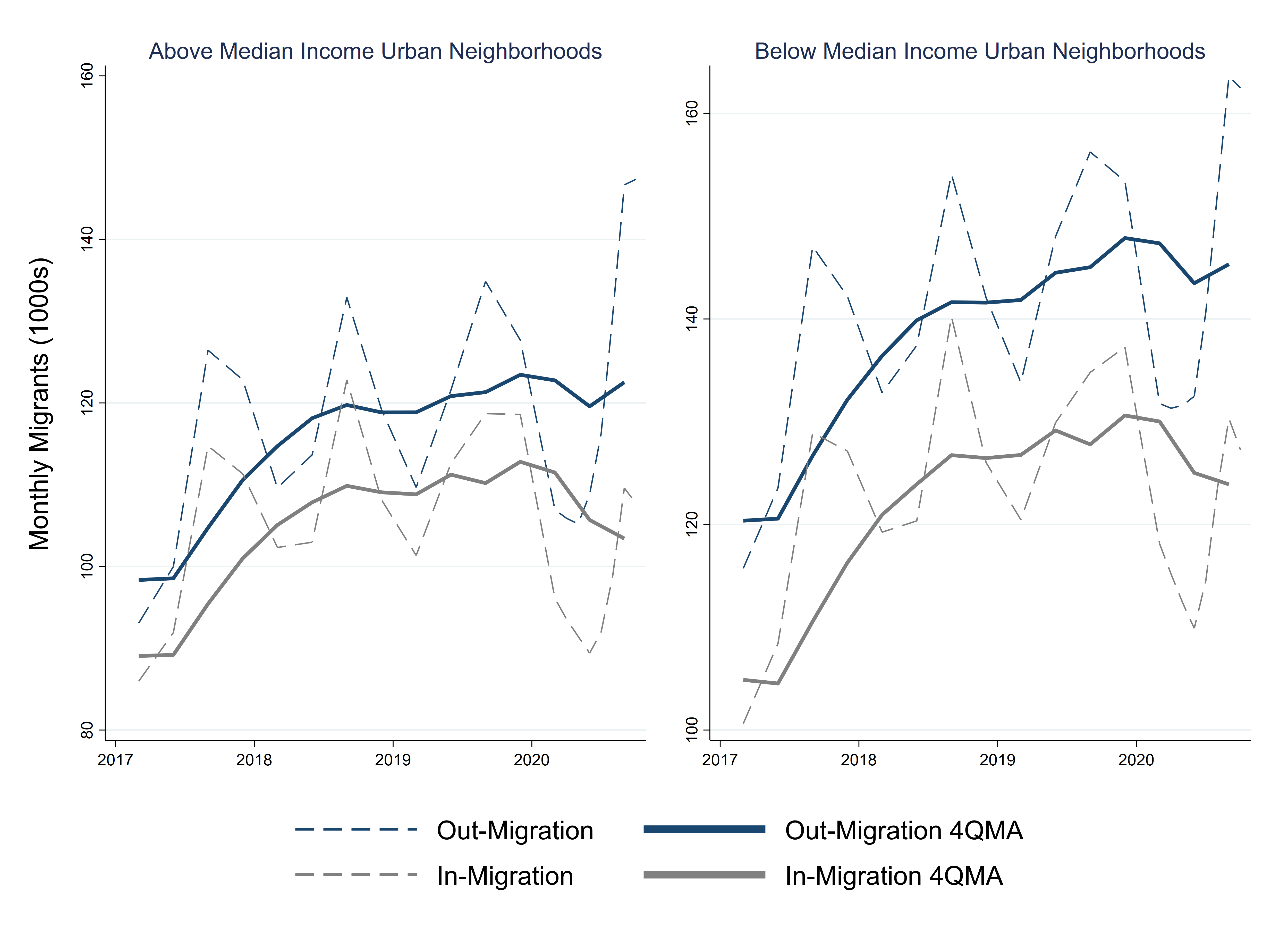
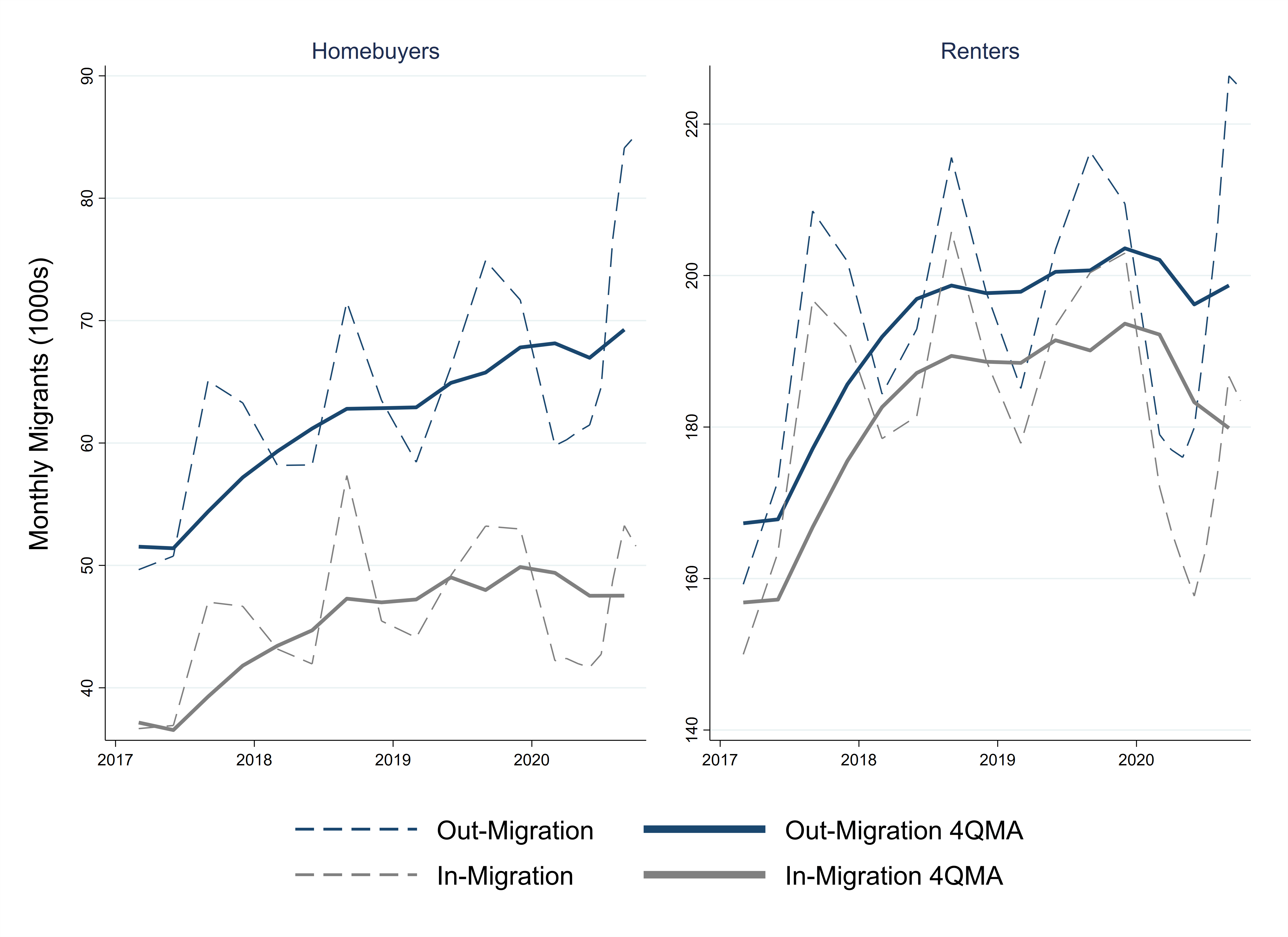
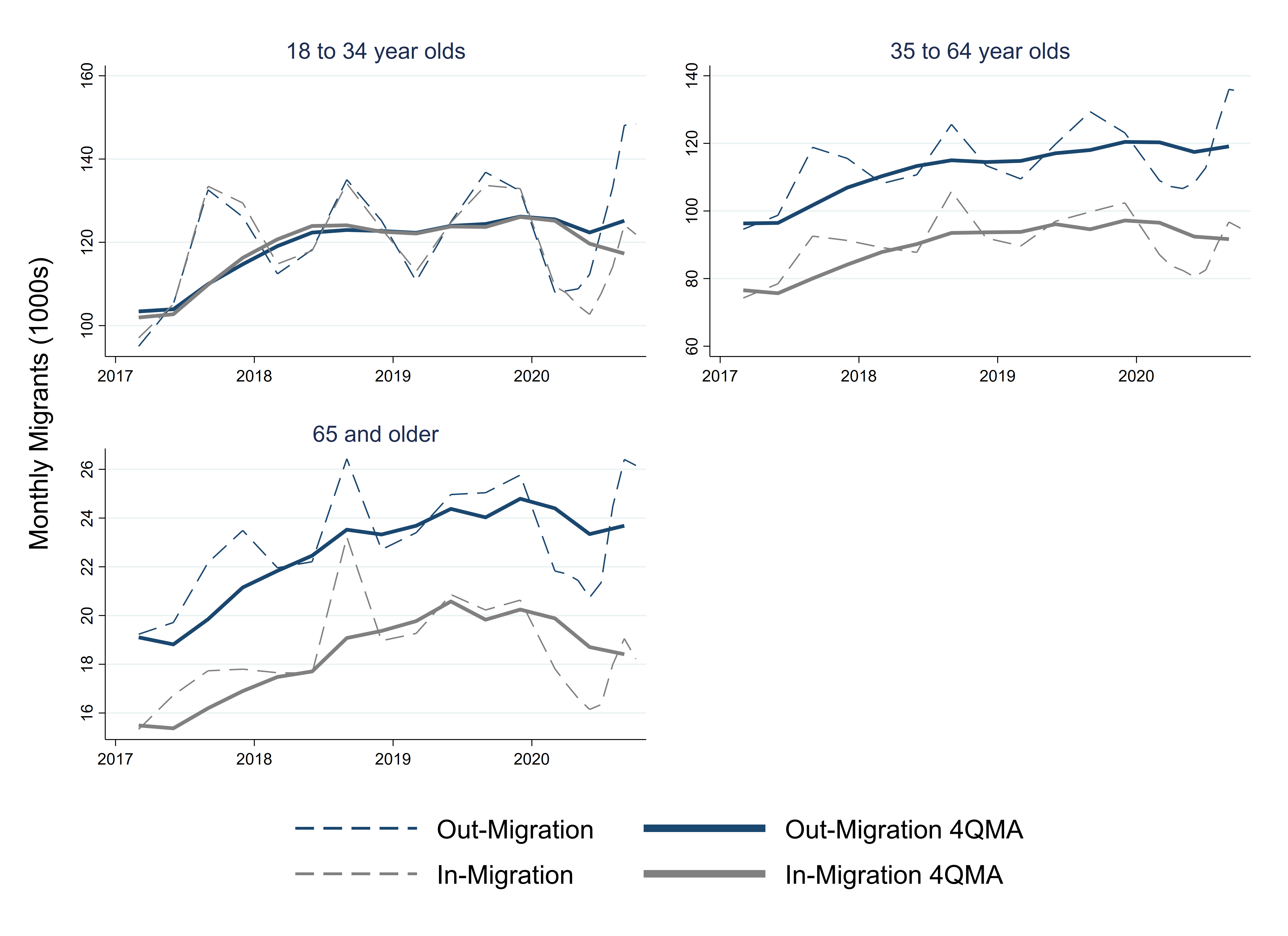
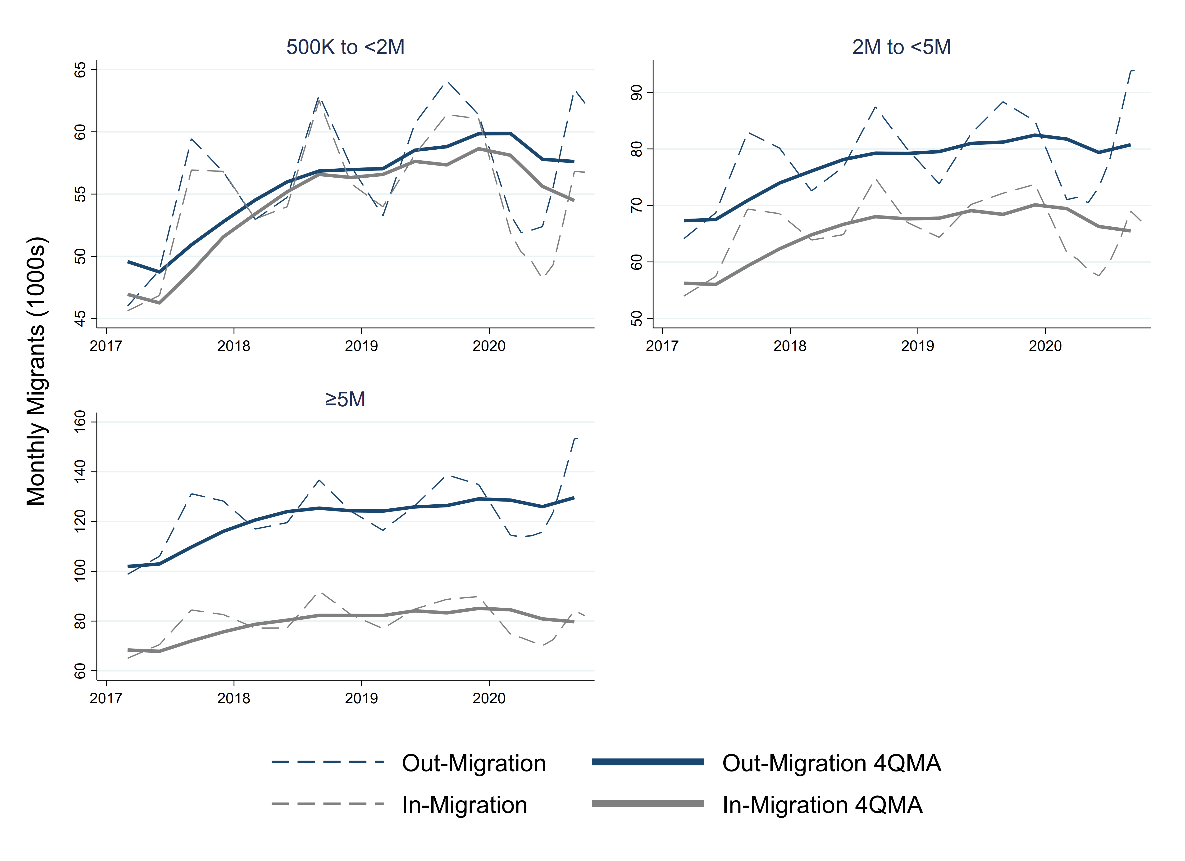
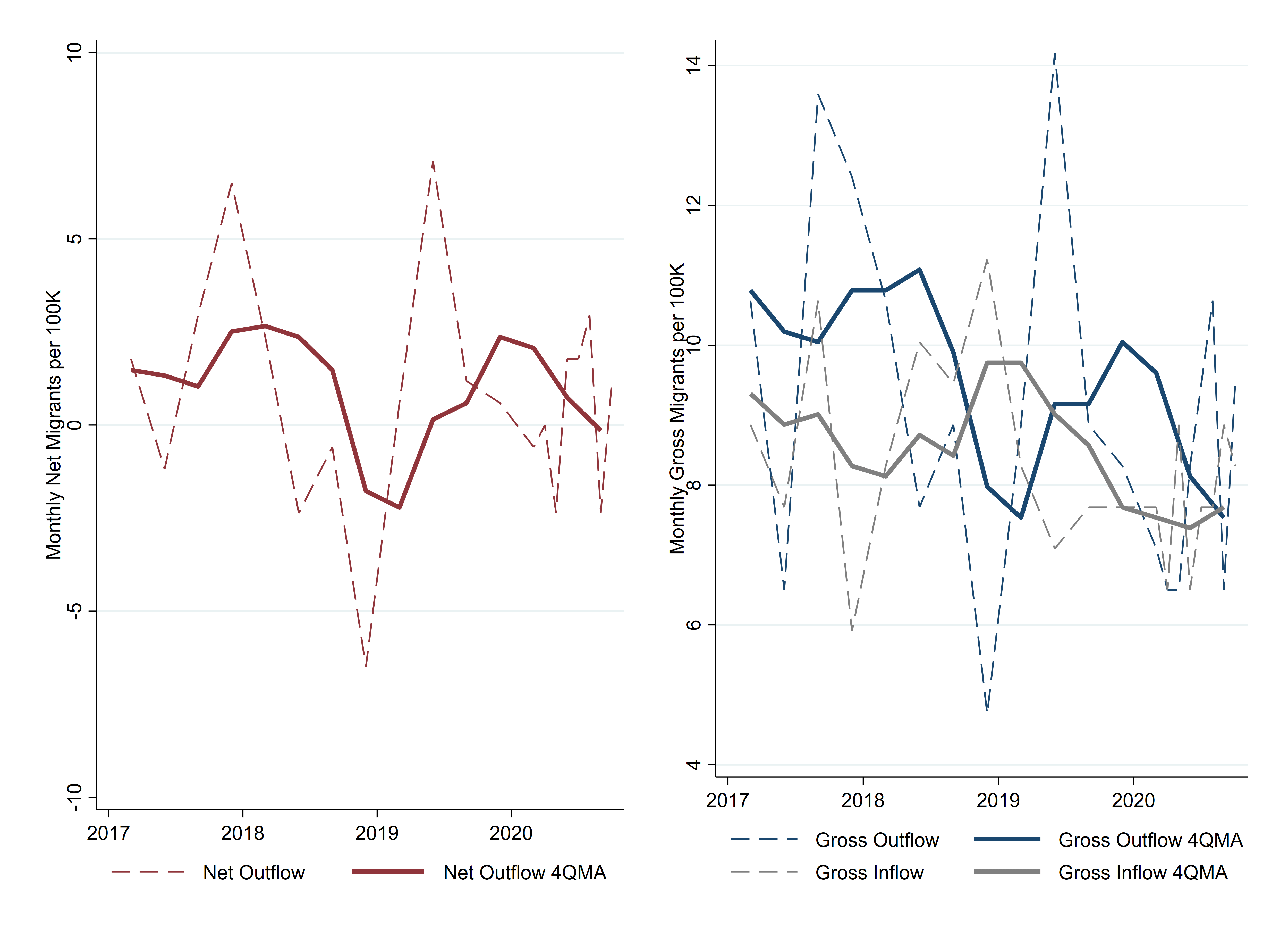
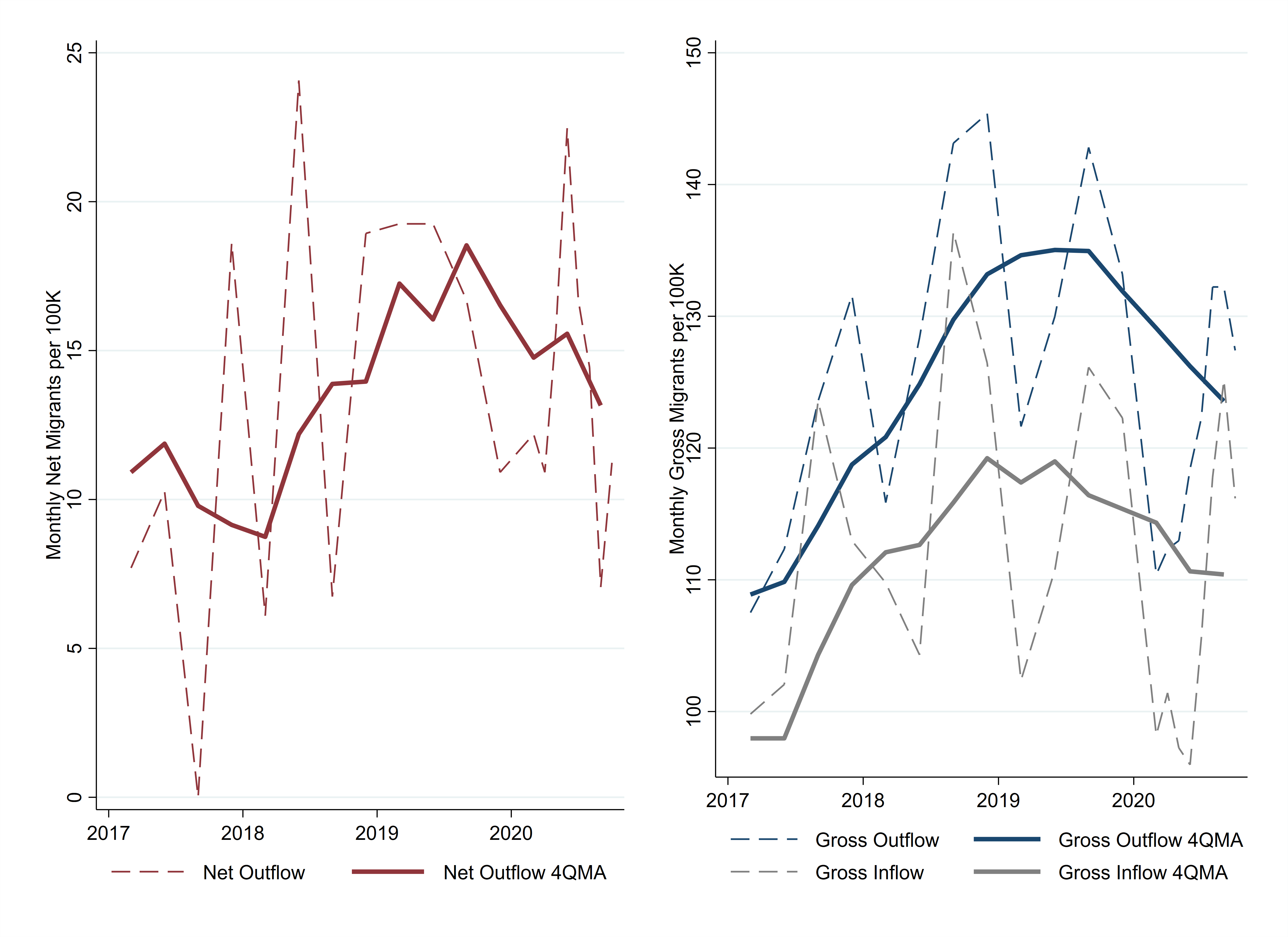
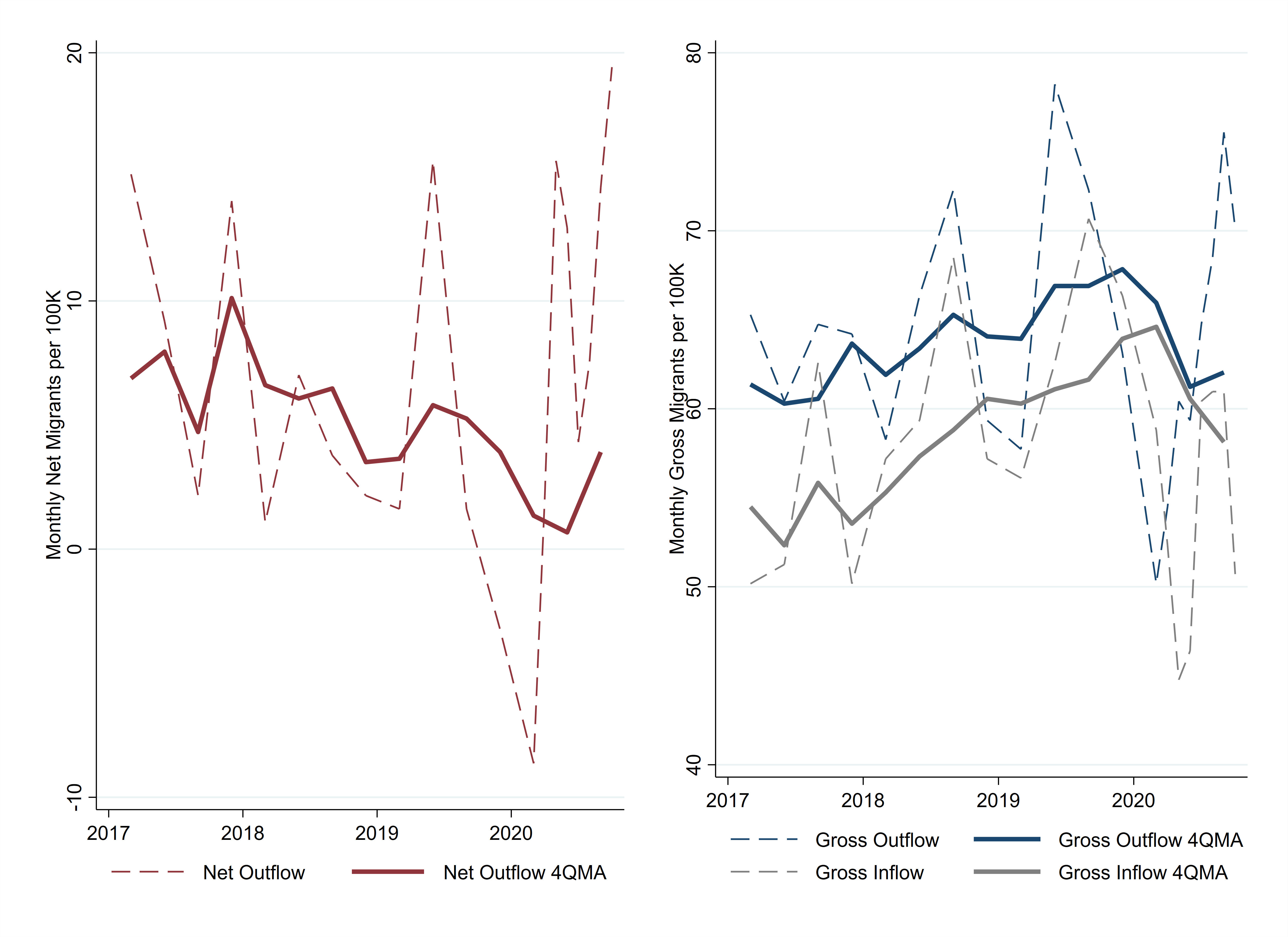
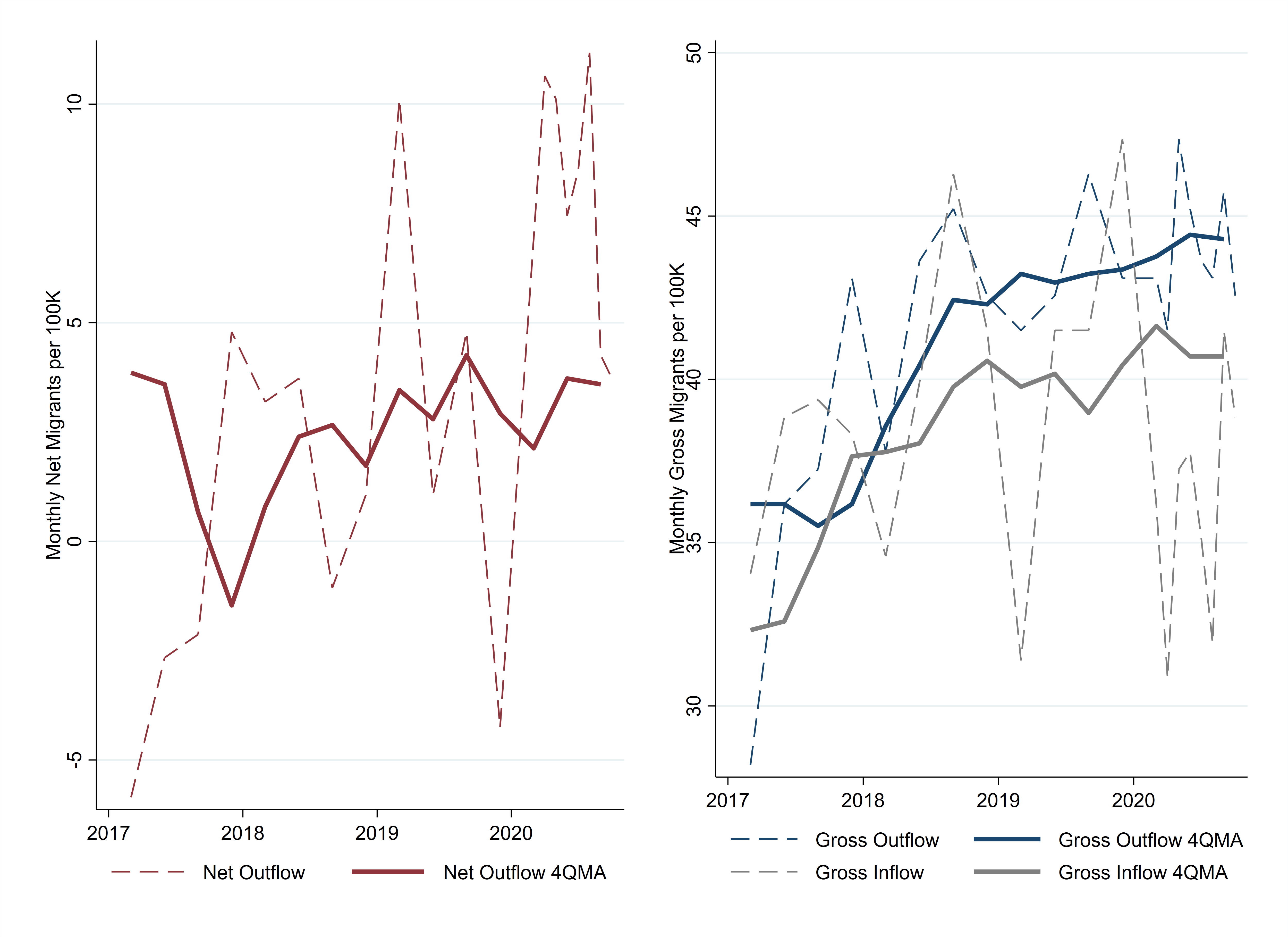
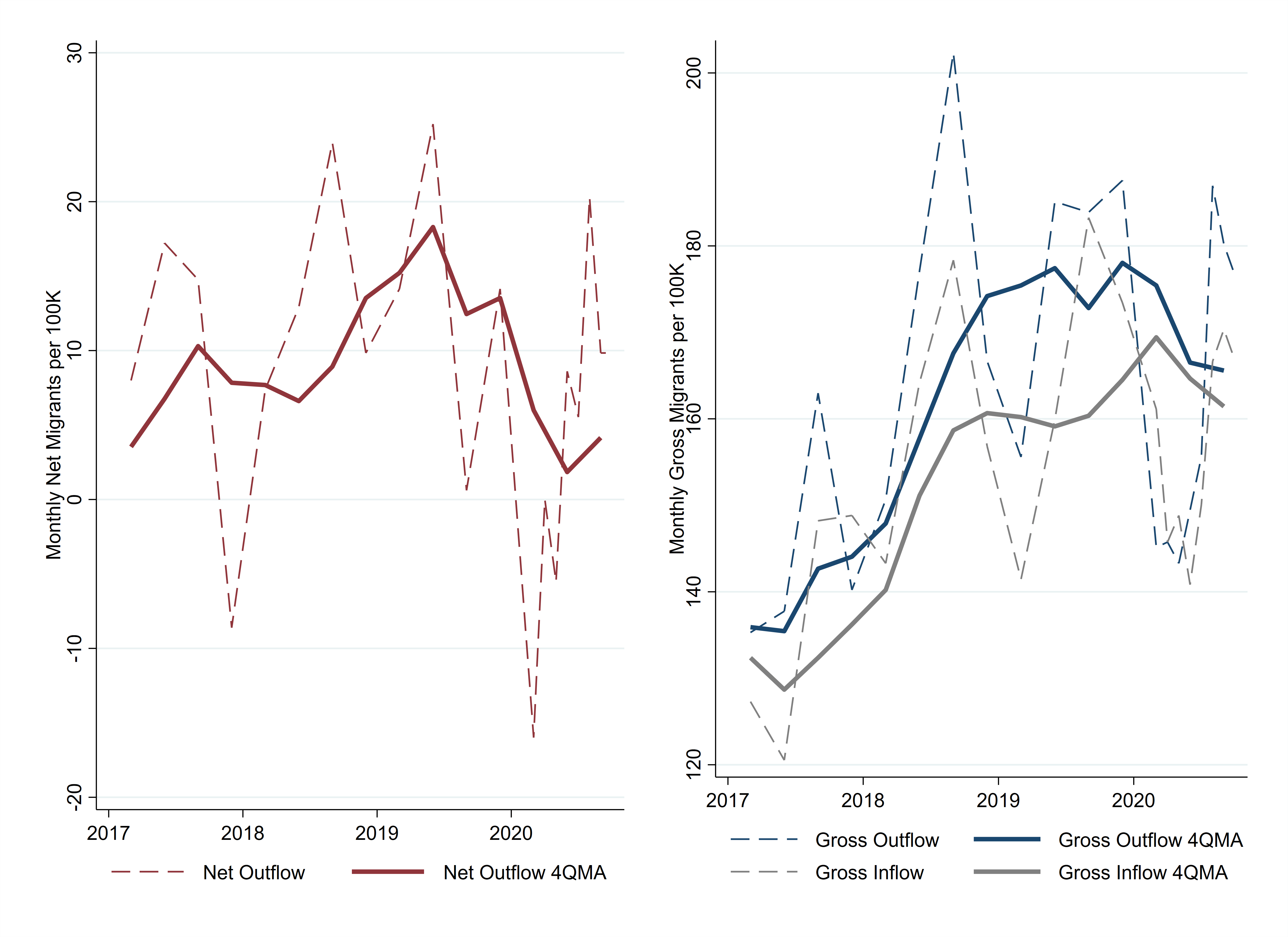
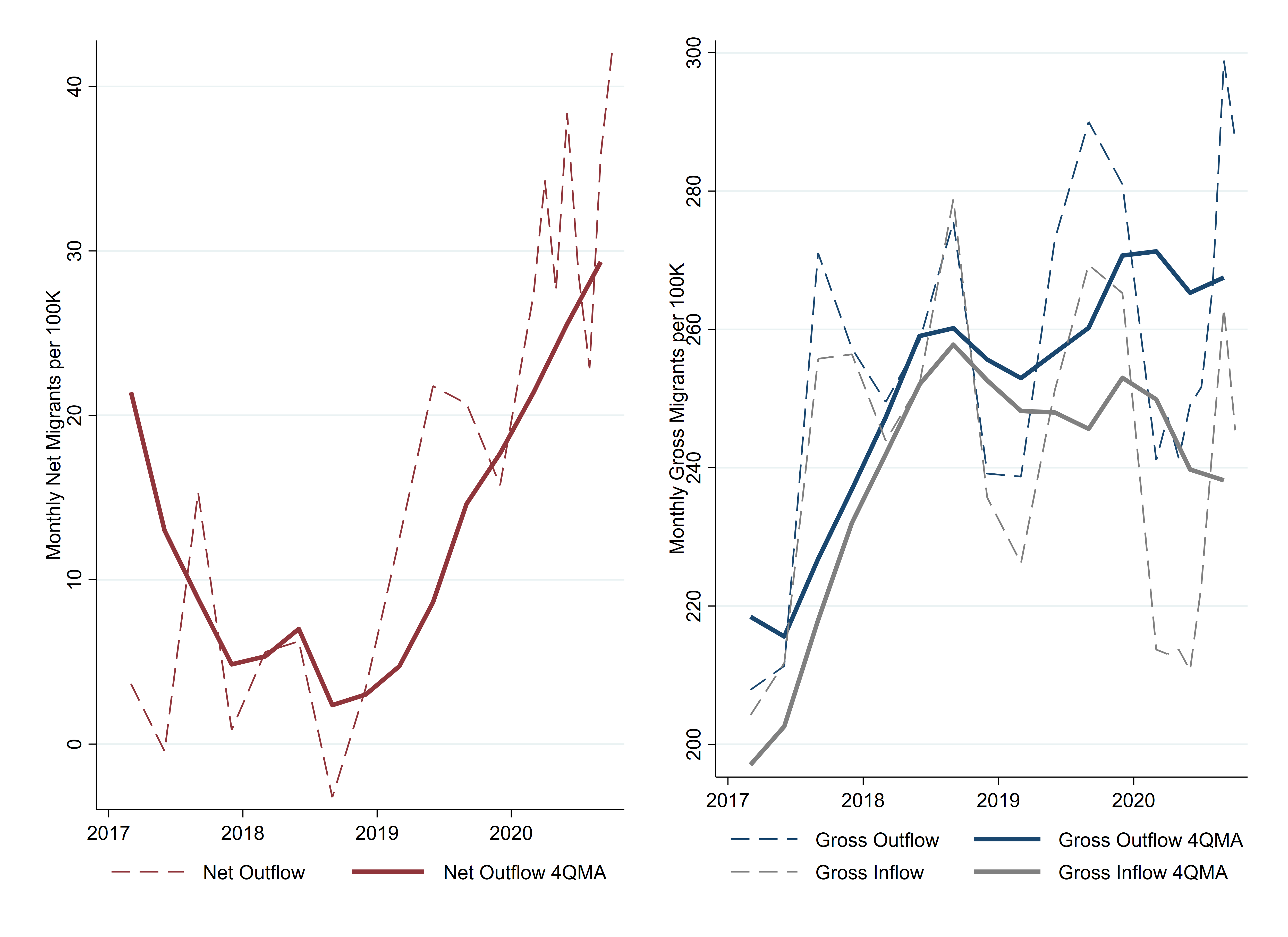
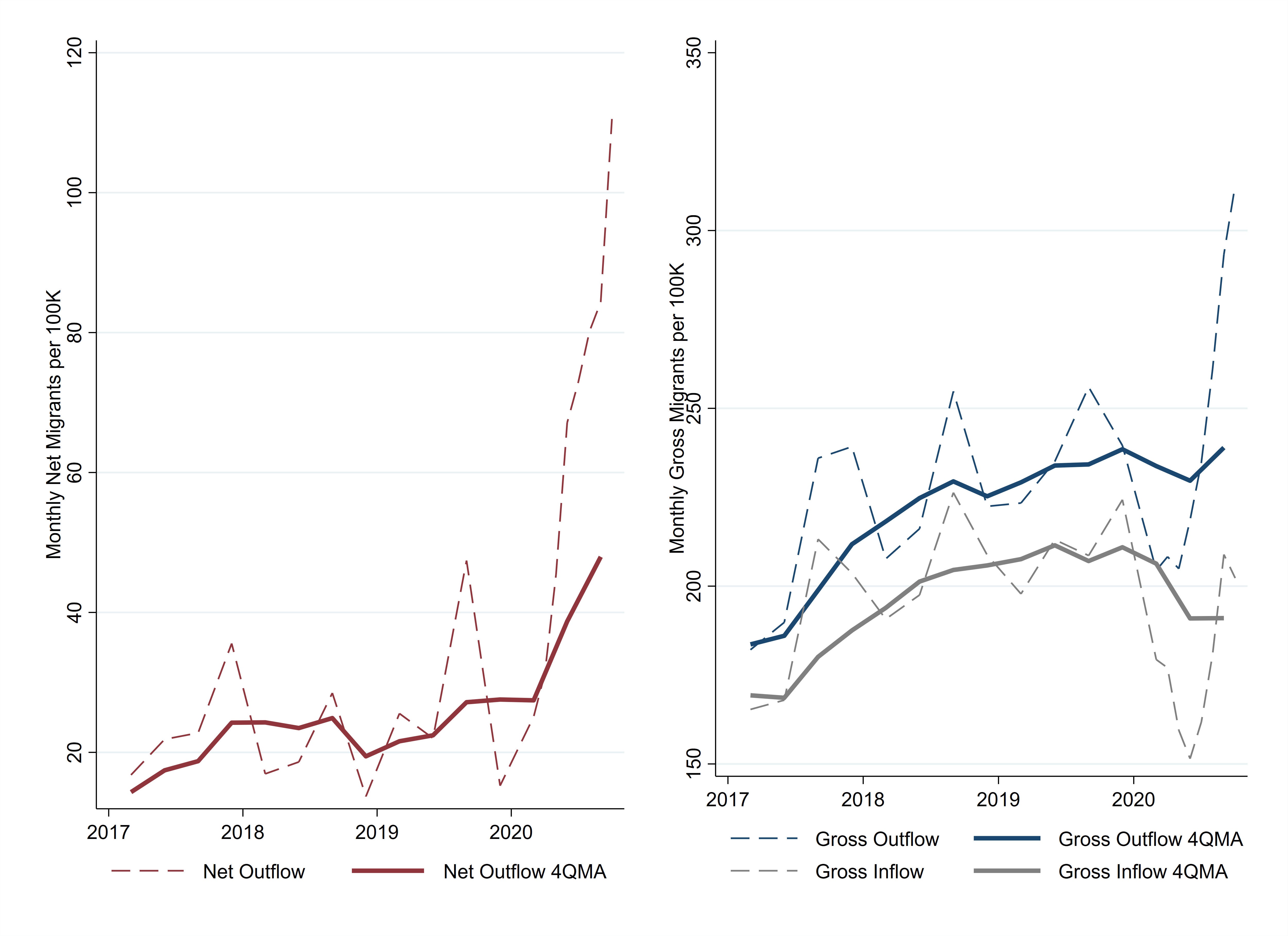
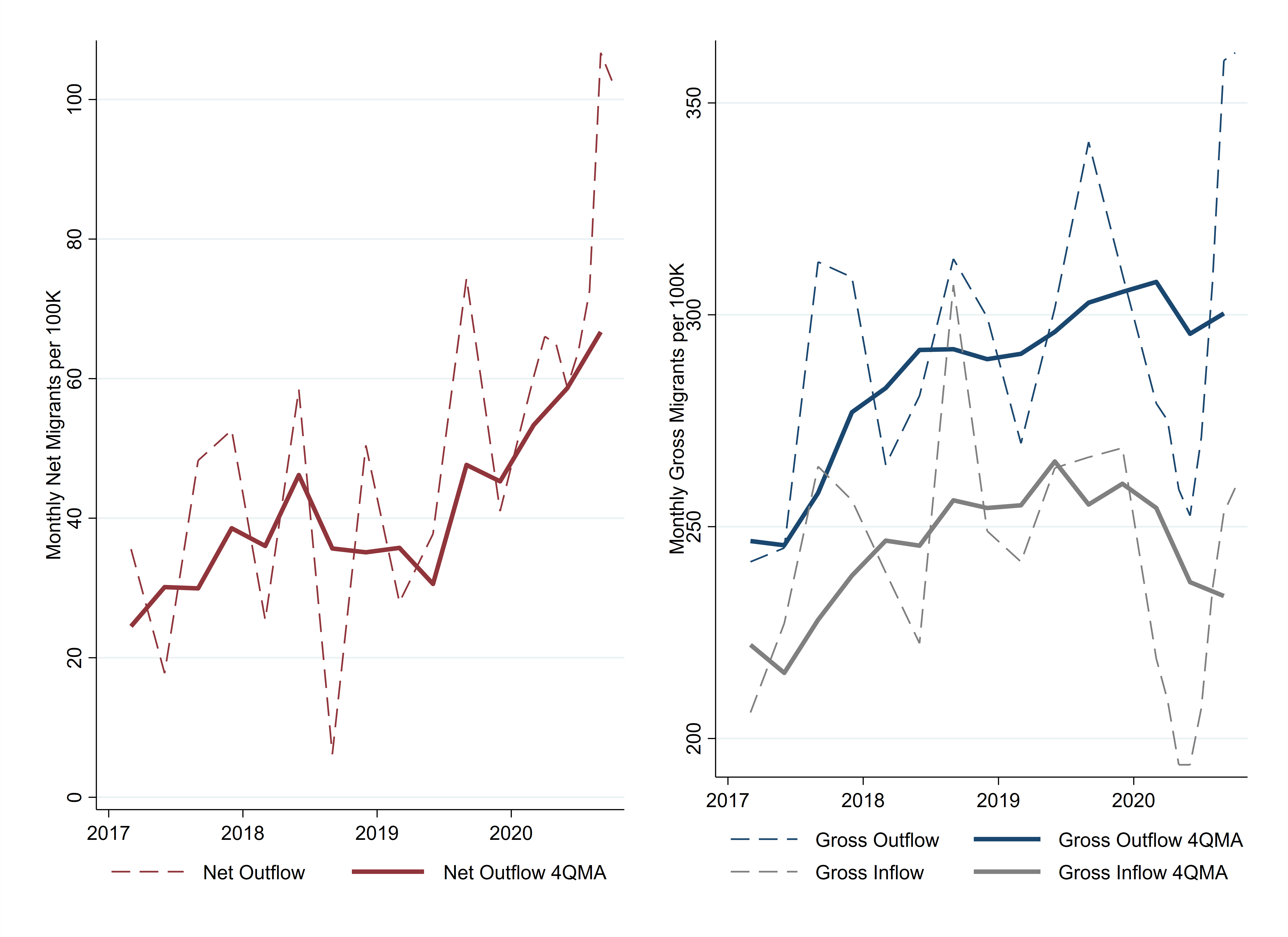
We can examine the net out-migration from urban neighborhoods several ways. Figure 3 shows the net out-migration by neighborhood income, renter or homebuyer status, resident age, and population. For neighborhood income, I divide the flows by whether the urban neighborhood had above- or below-median household income. In most years, the net flows out of below-median-income neighborhoods are larger than the net flows out of above-median-income urban neighborhoods, but this pattern reversed in 2020. The net outflow of people who are purchasing a home at their destination neighborhood increased 62 percent, but the net outflow of those renting at their destination increased by 210 percent. By age category, young adults exhibited the largest increase in net outflows. The most populous metro areas, those with more than 5 million residents, saw larger increases in net outflows than did smaller metro areas.

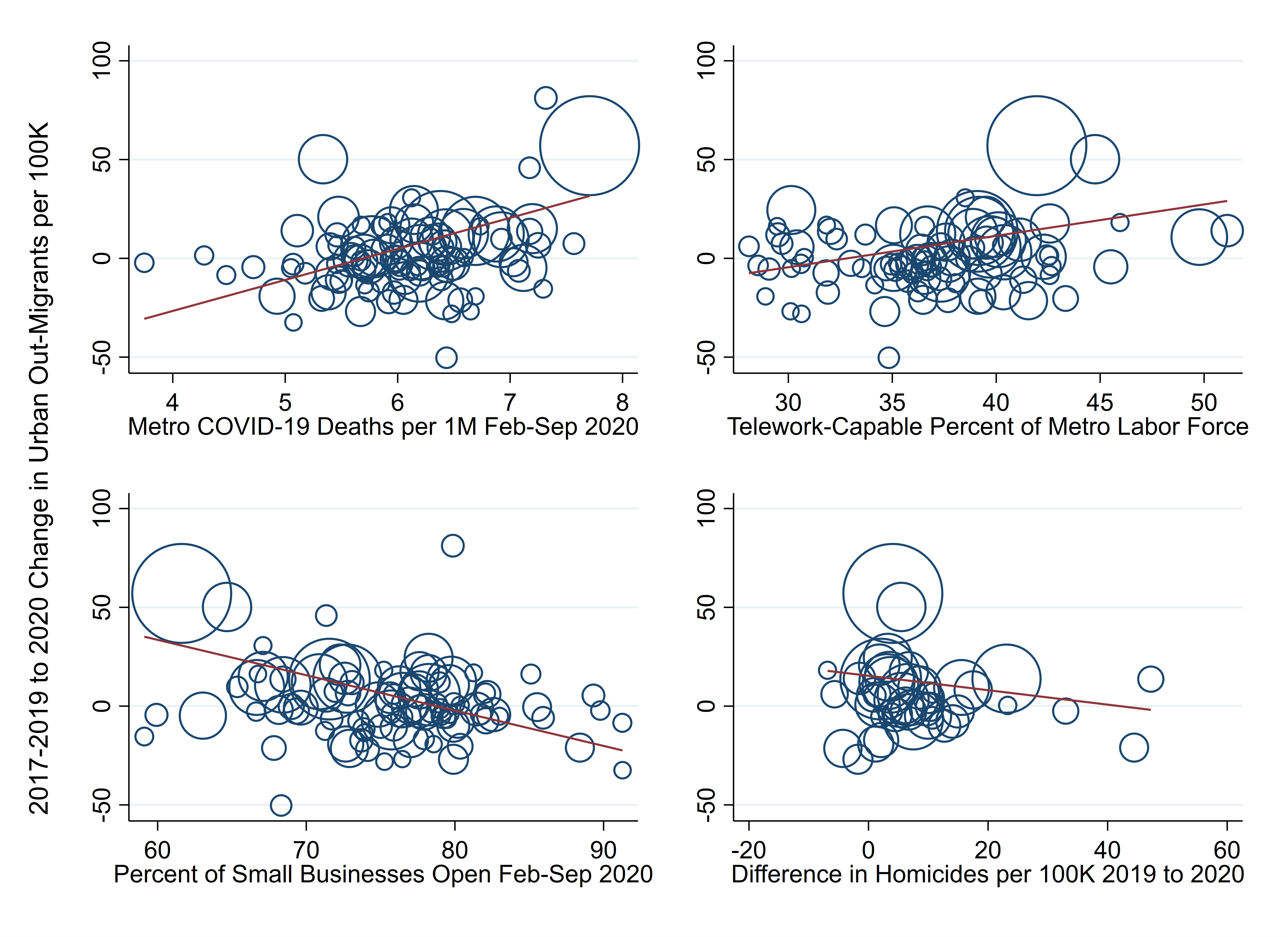
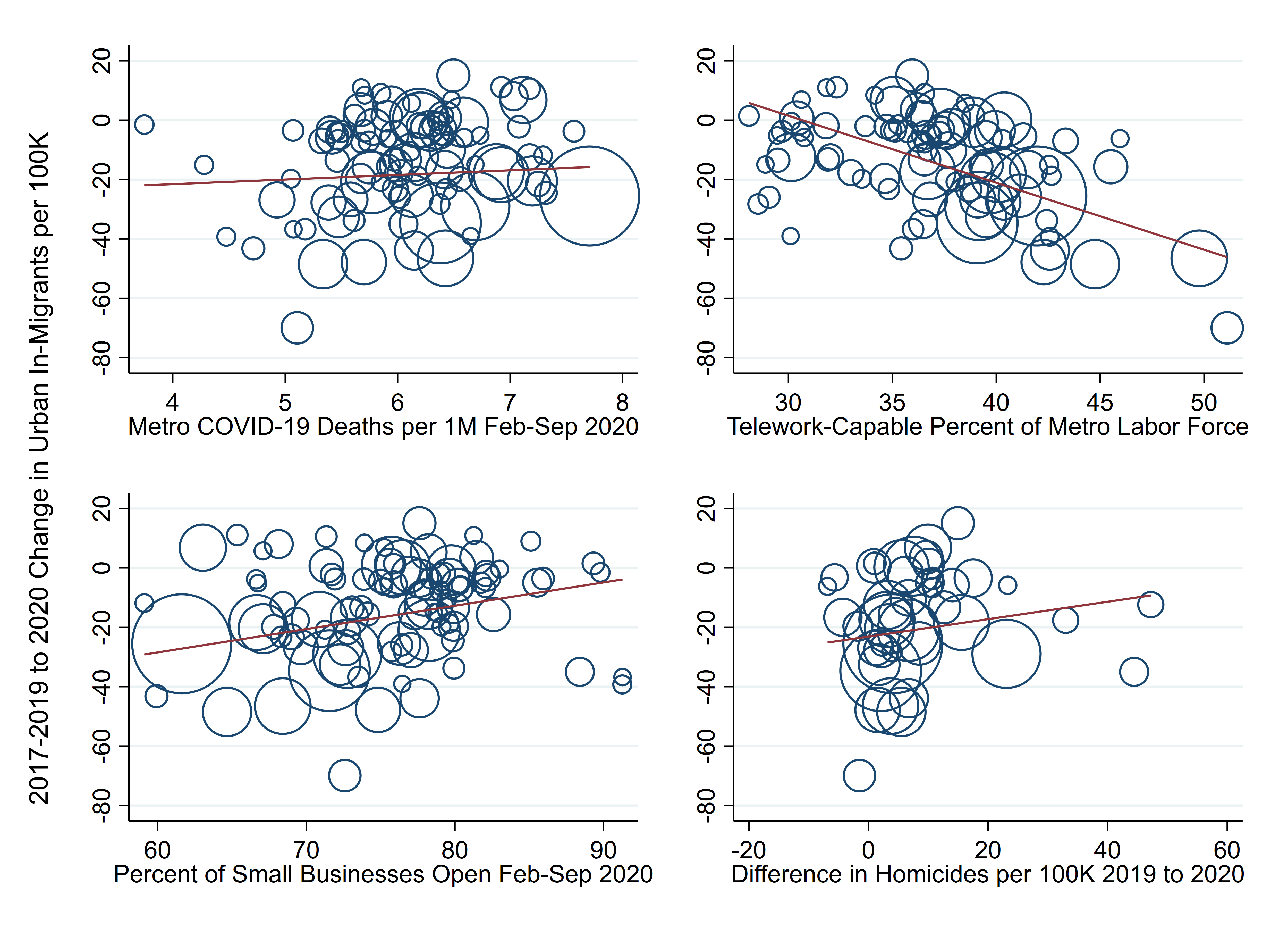
Figure 4 shows the difference in the urban outflow from 2020 over the average outflow from 2017, 2018, and 2019 for the months of April through September. The differences are plotted over four measures suggested to influence out-migration: deaths from COVID-19 in the metro area, the share of the labor force that can work remotely, small-business closures, and an increase in homicides in the central city. The details of how each of these is measured can be found in the appendix.

The correlations run in the direction we would expect for three of the relationships. Net out-migration was greater for metro areas that had more deaths from COVID-19 and those with more telework-capable occupations. Metro areas that had more small businesses remain open experienced less net out-migration. The increases in homicides in the metro area's central city was not associated with increased net out-migration.
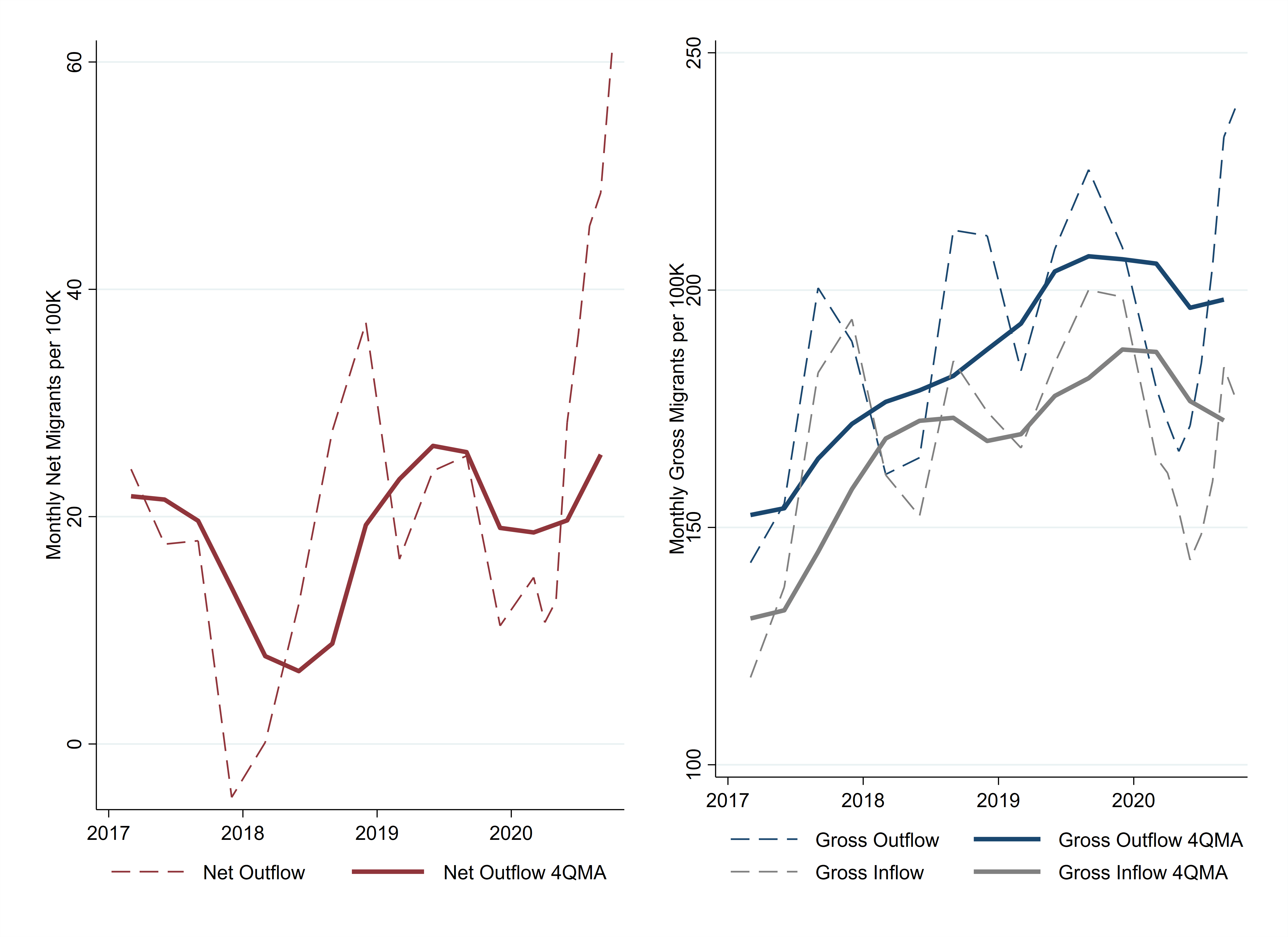
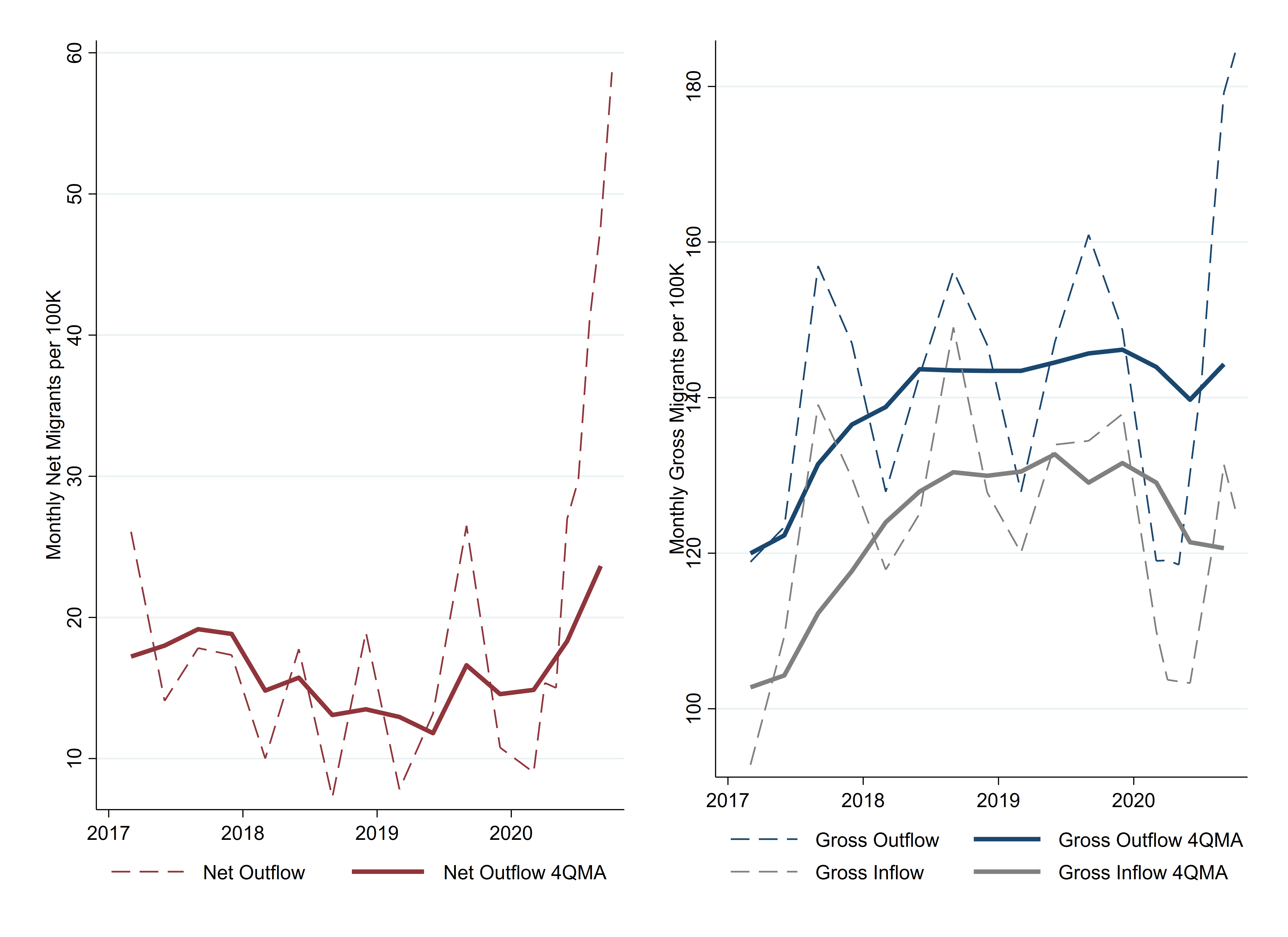
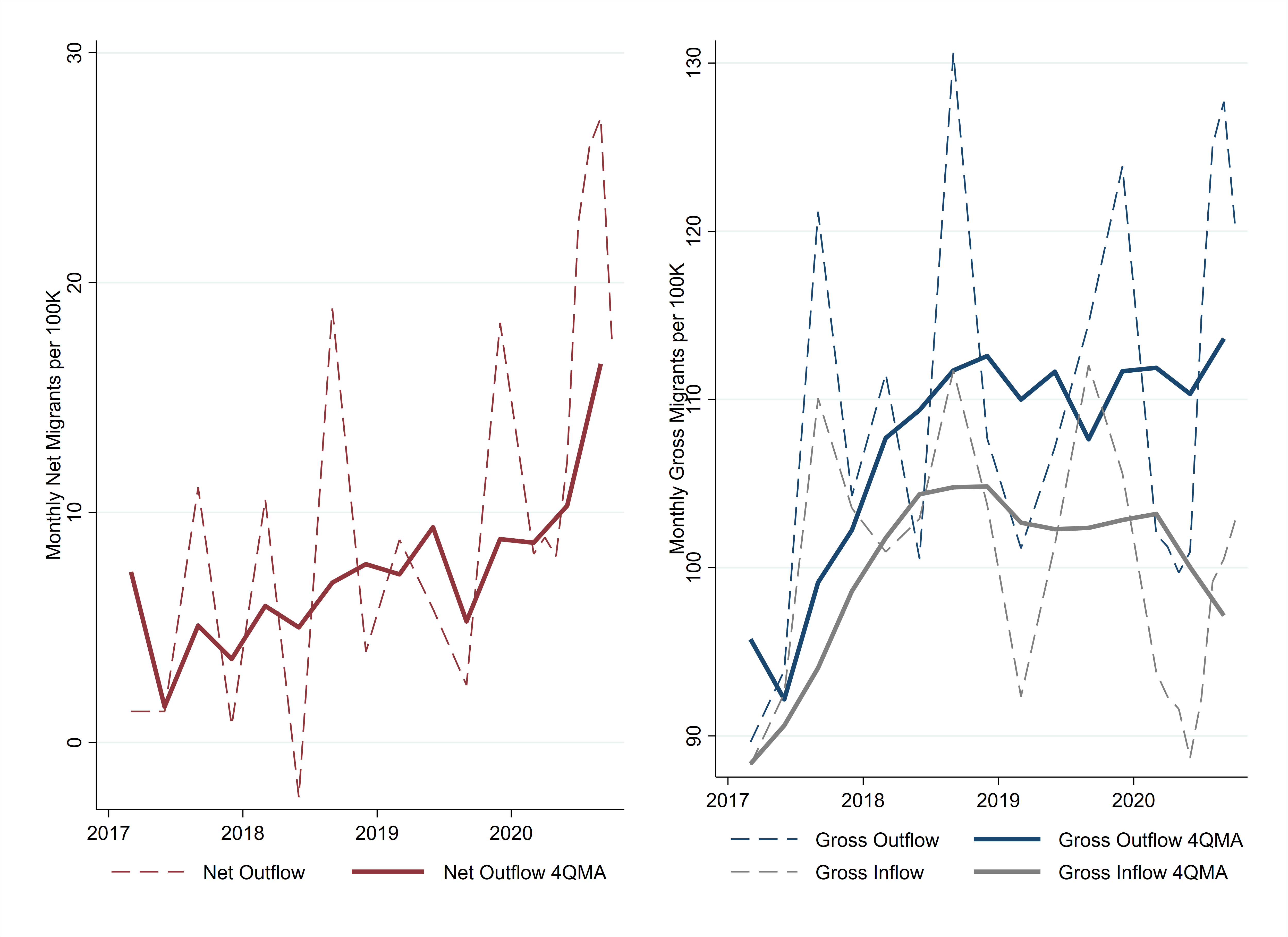
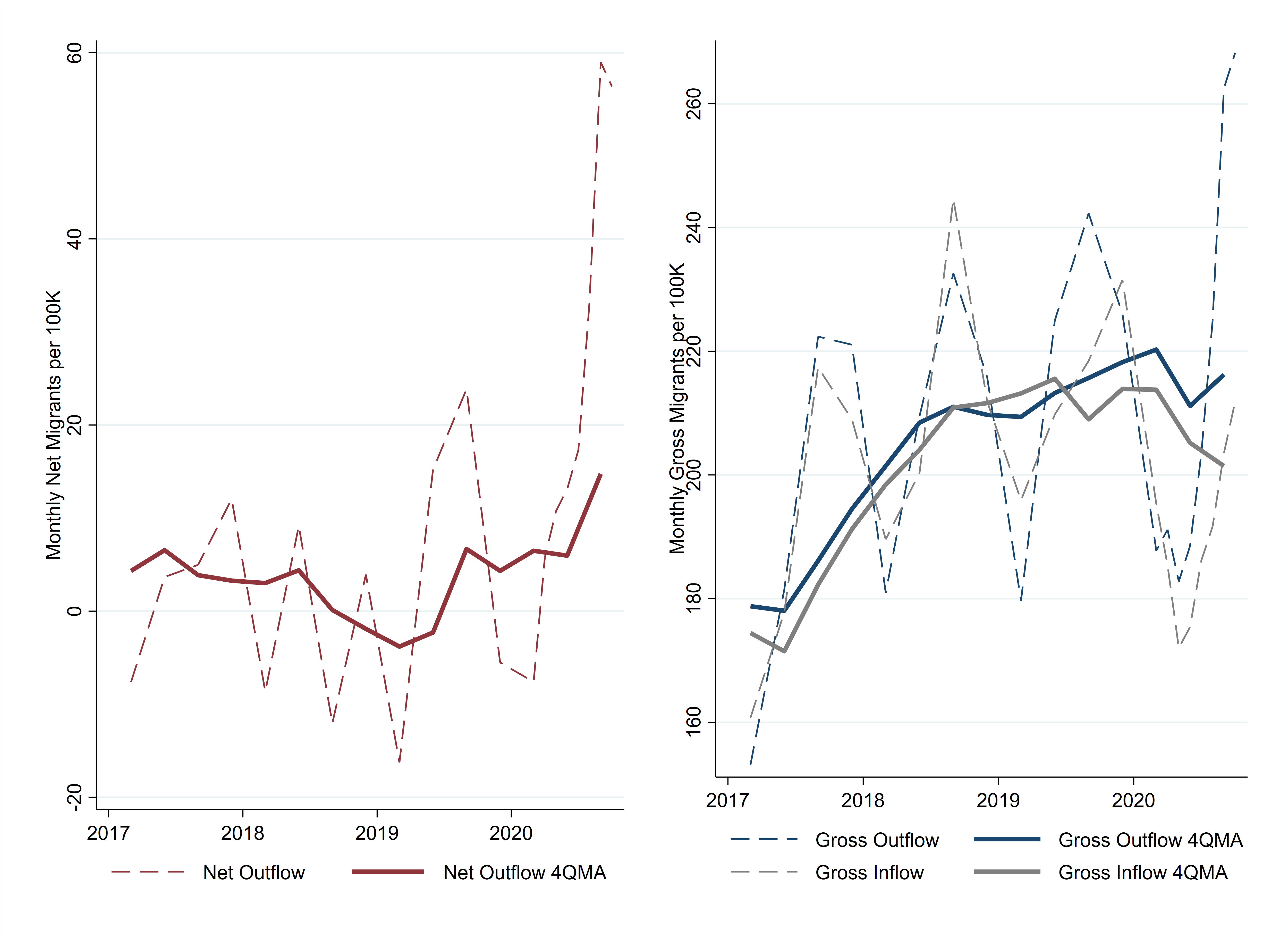
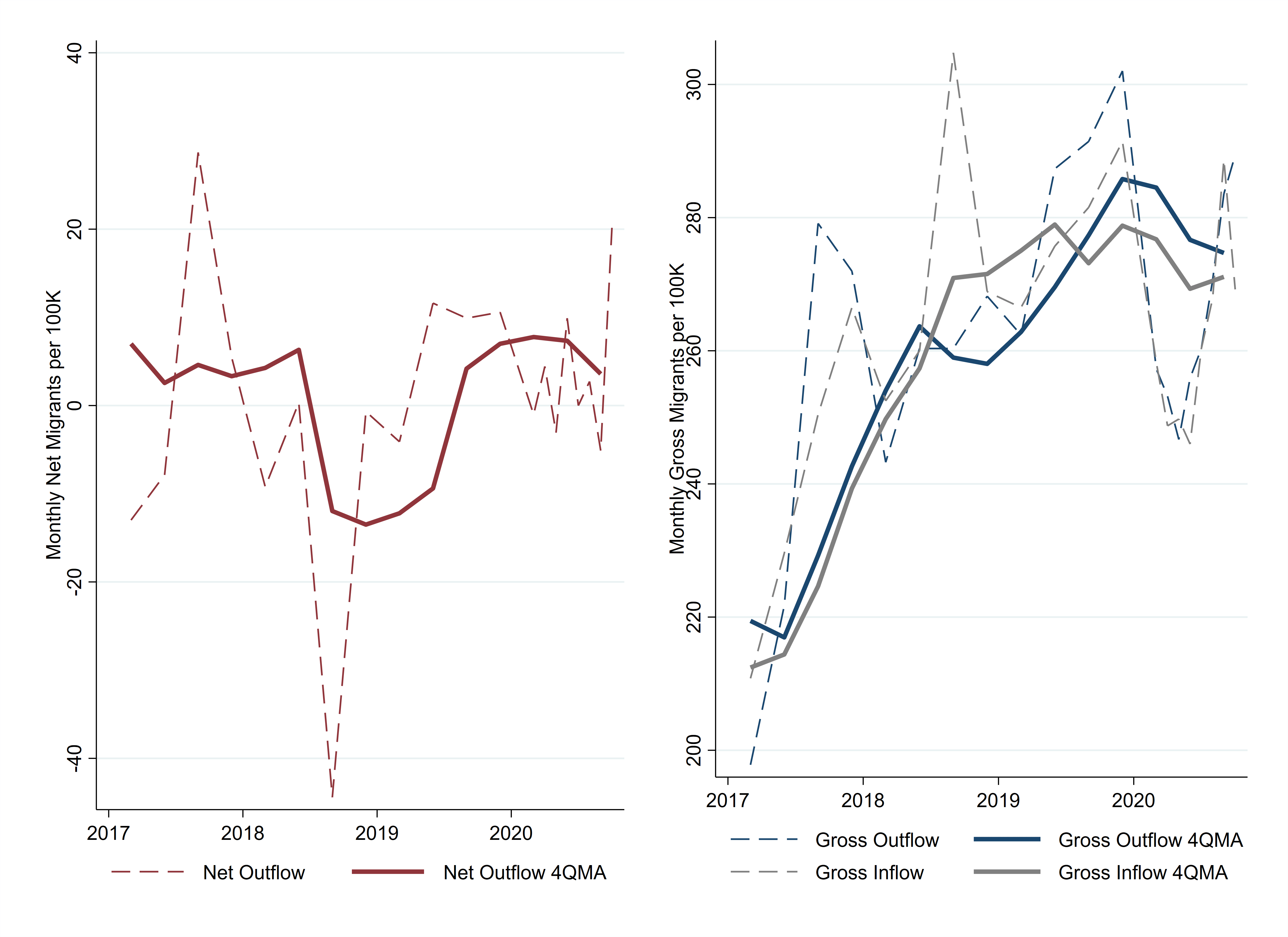
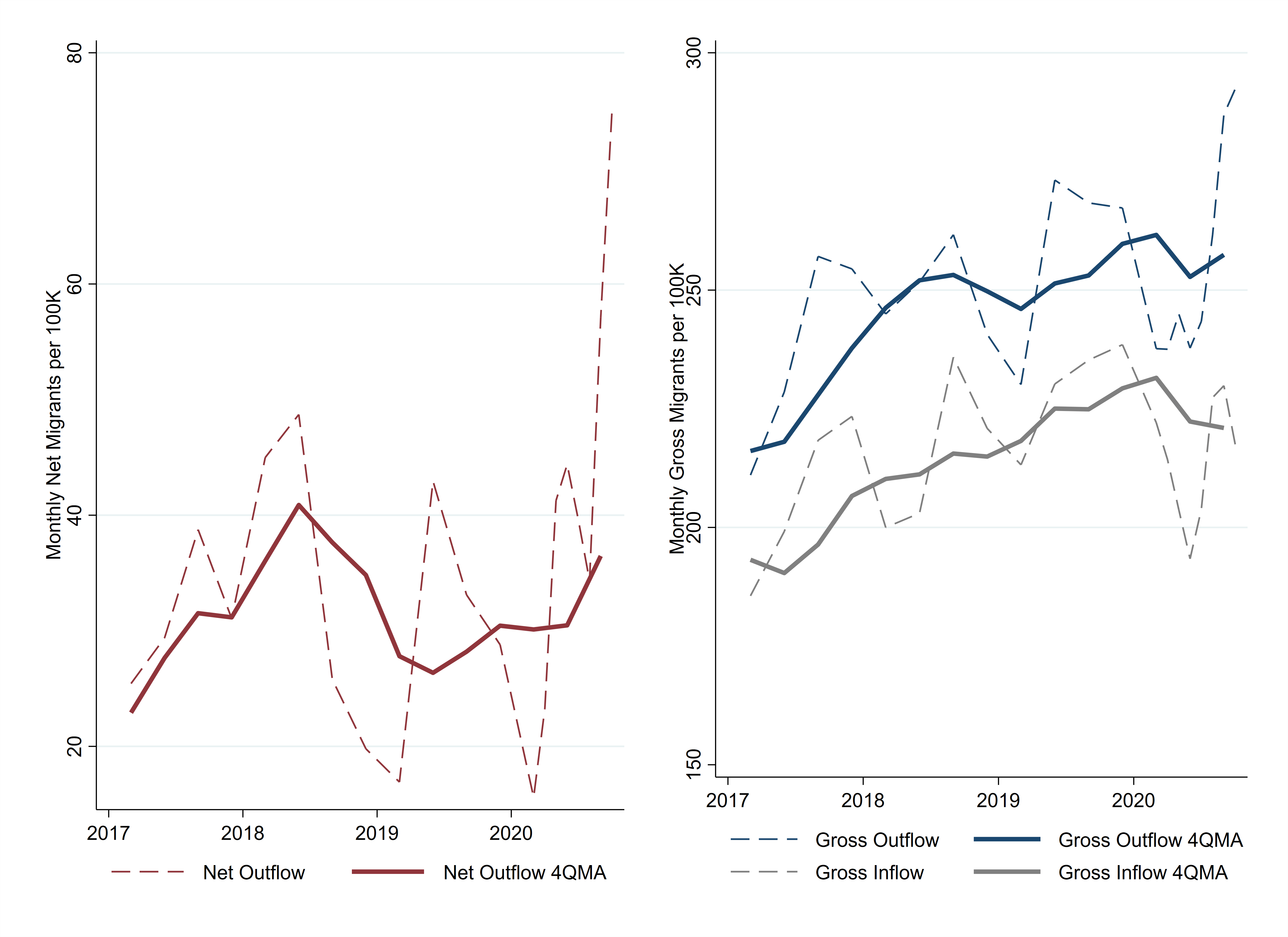
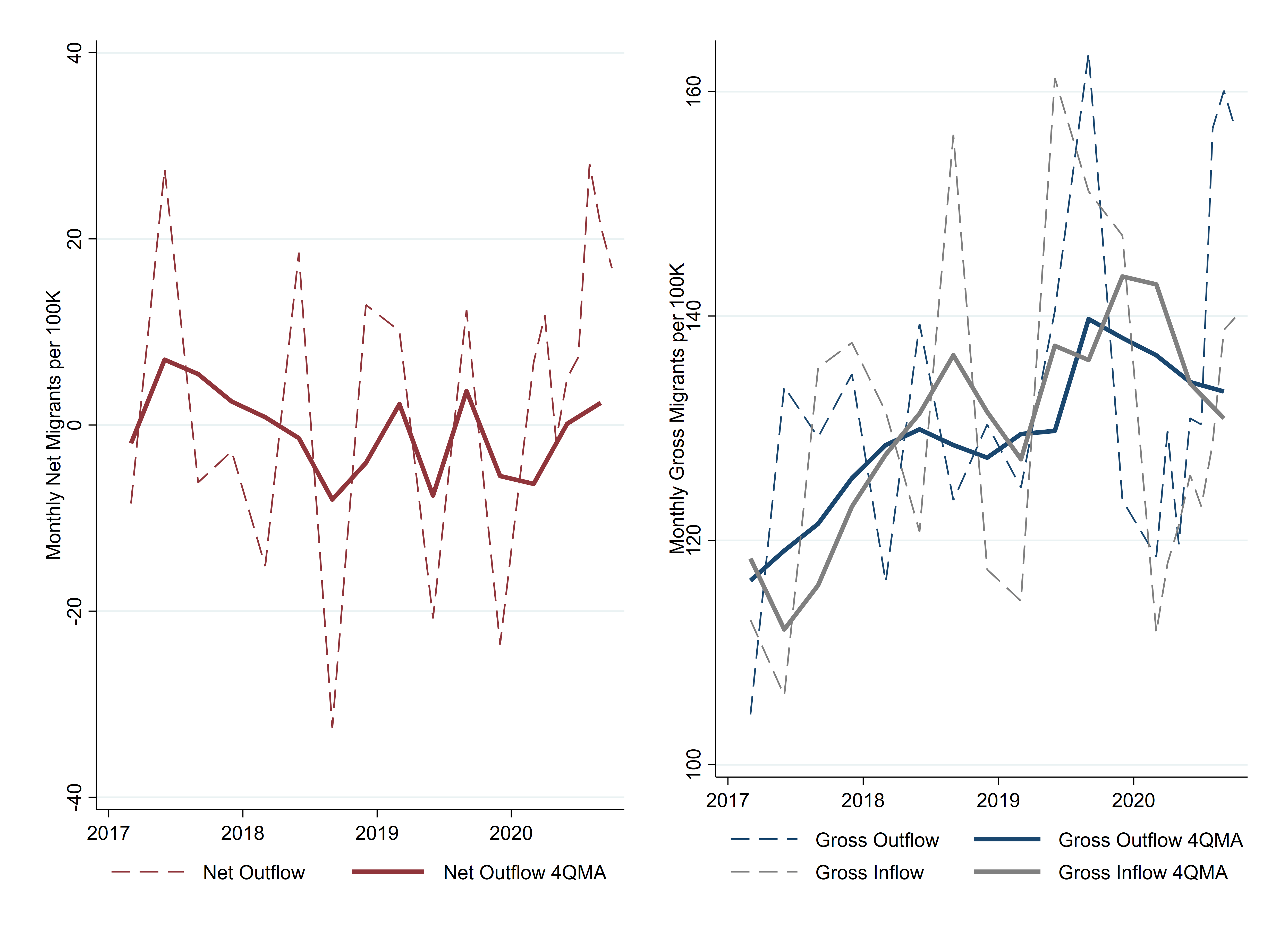
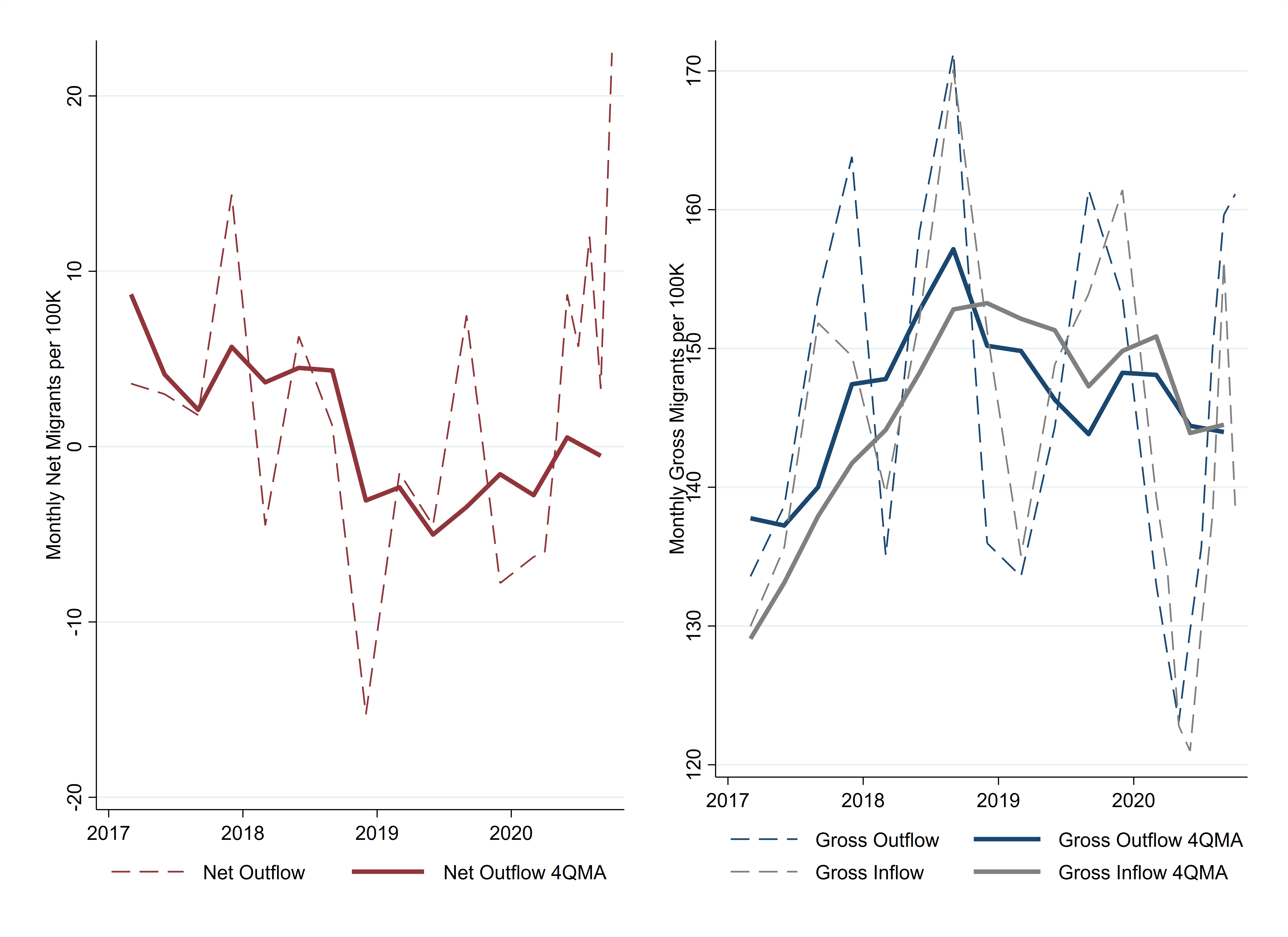
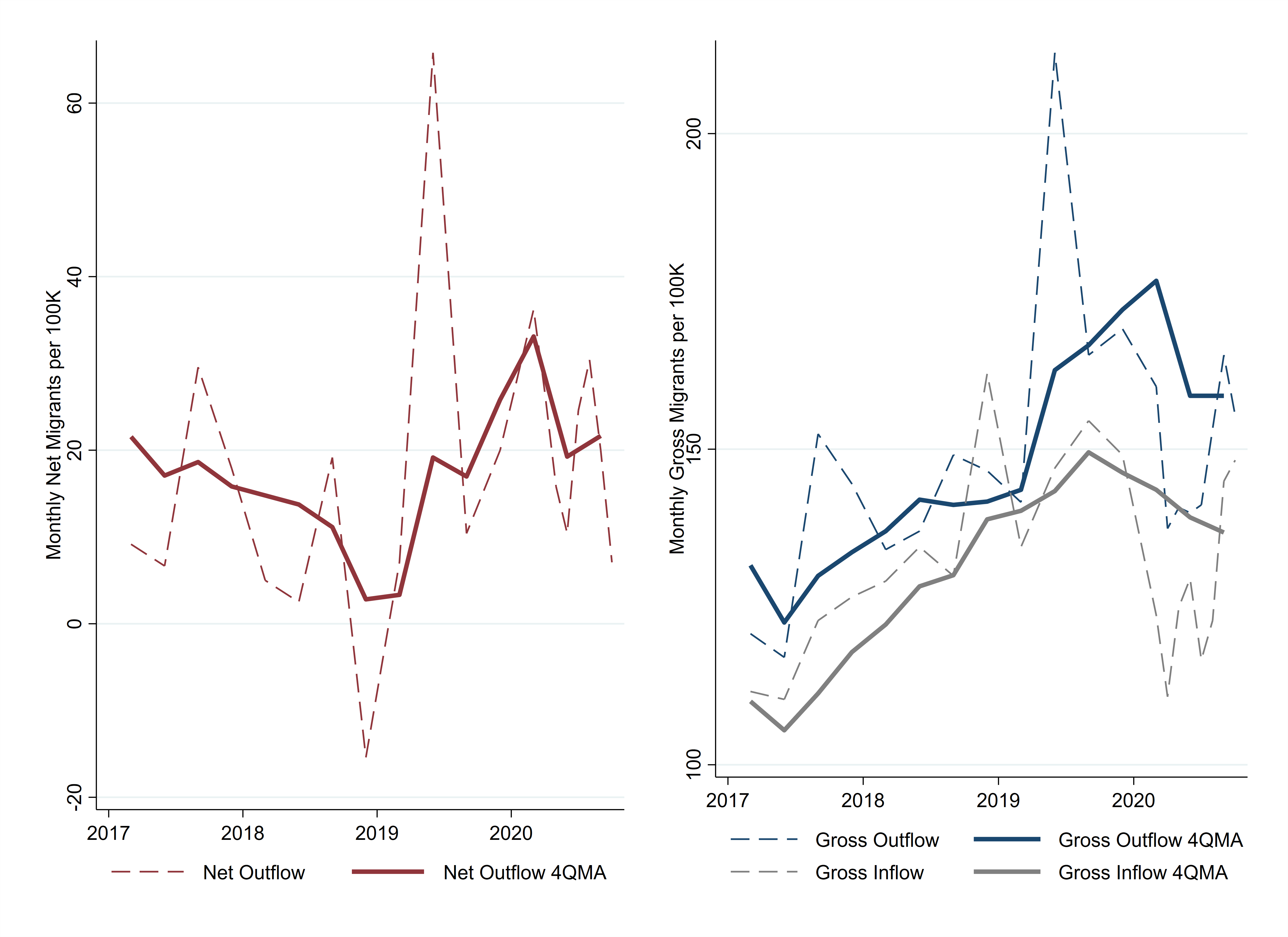
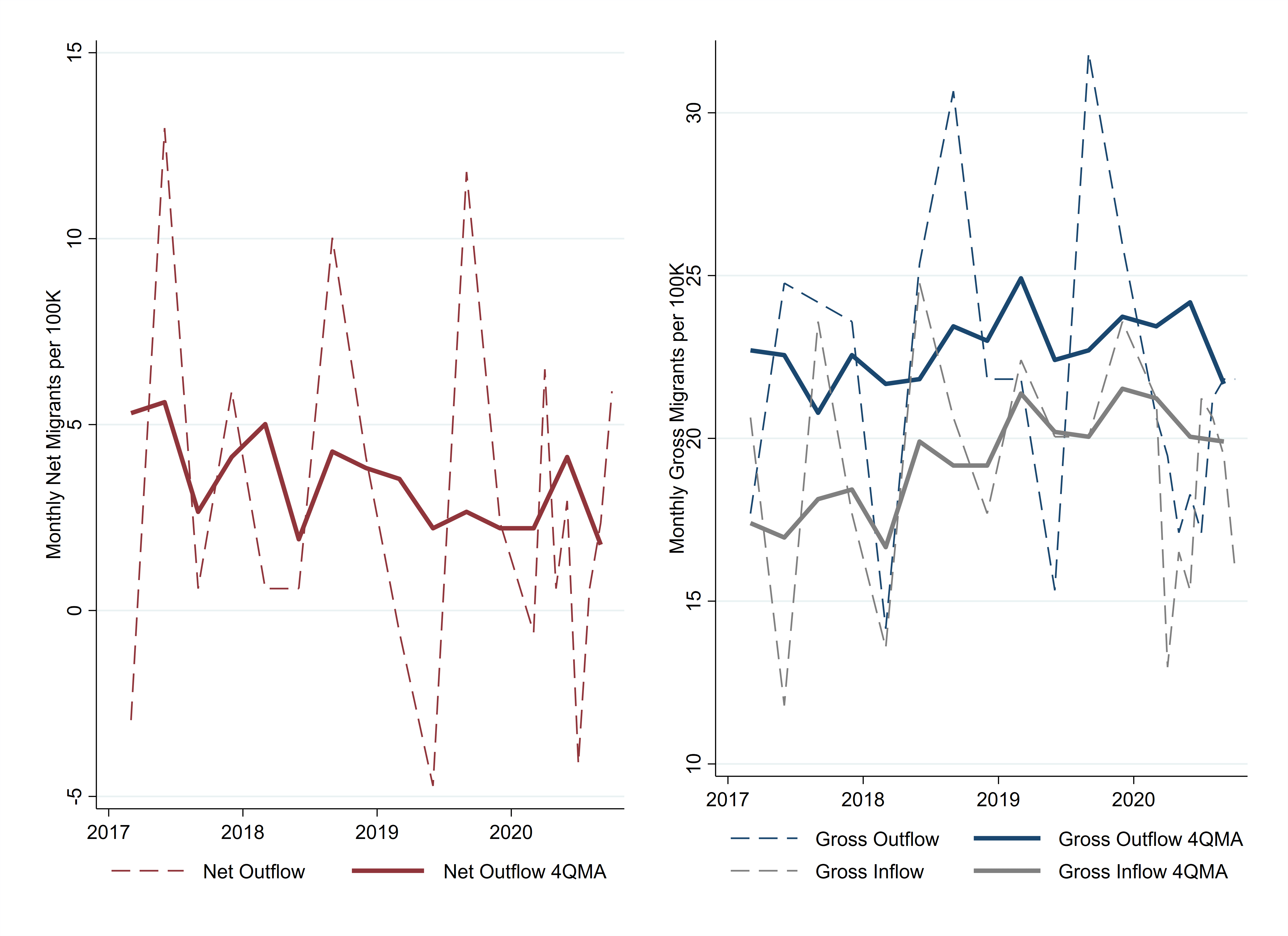
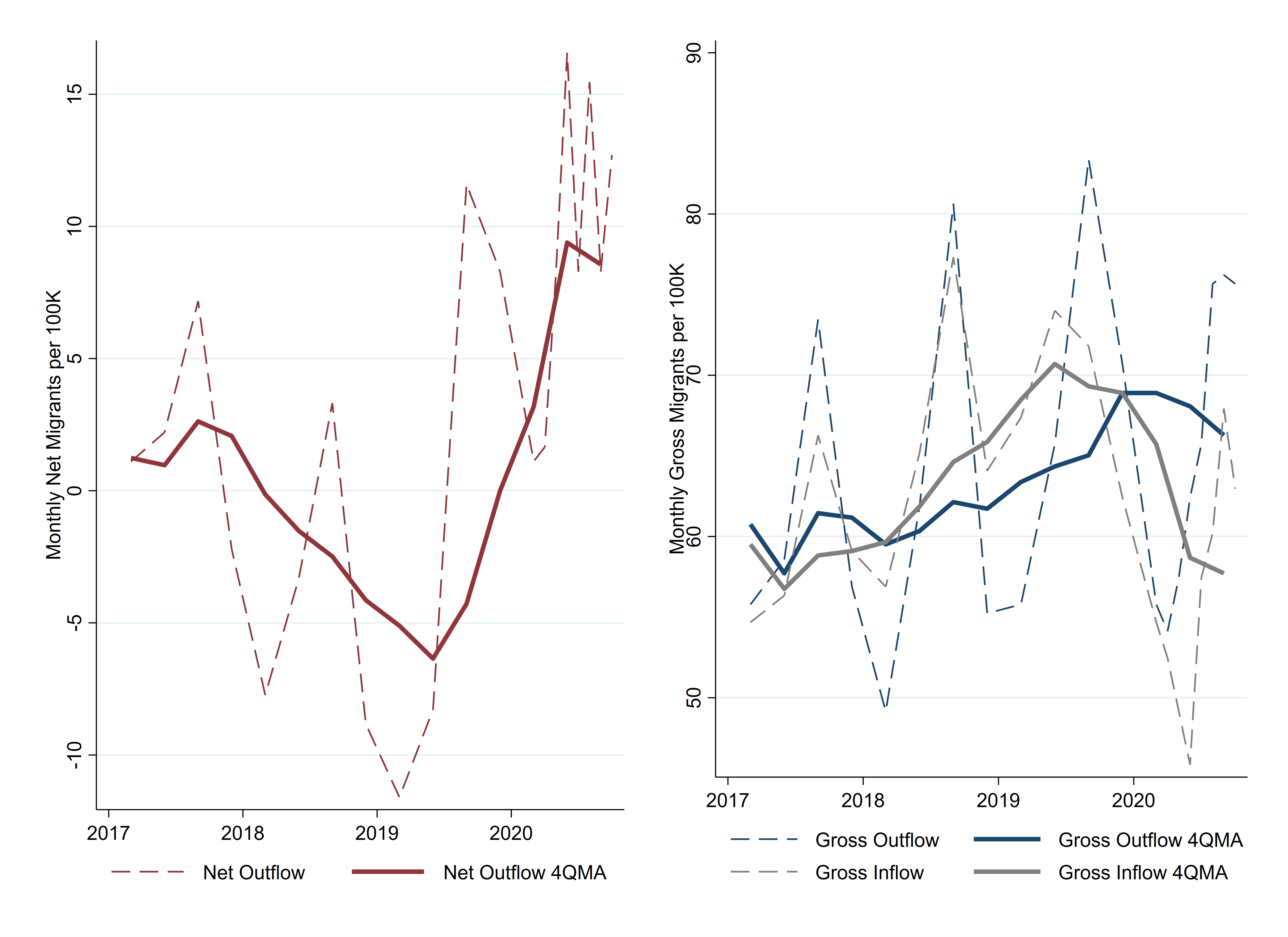
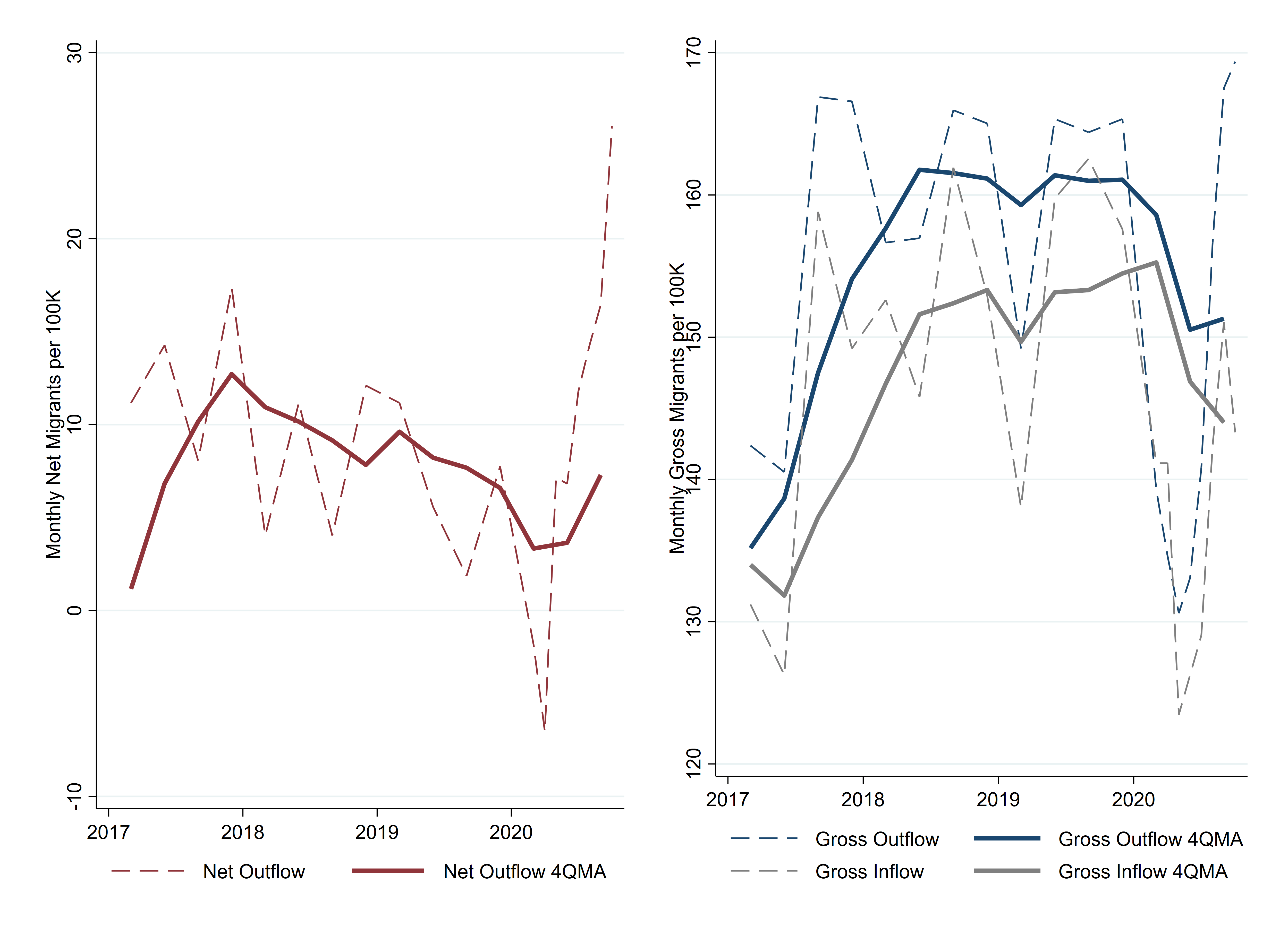
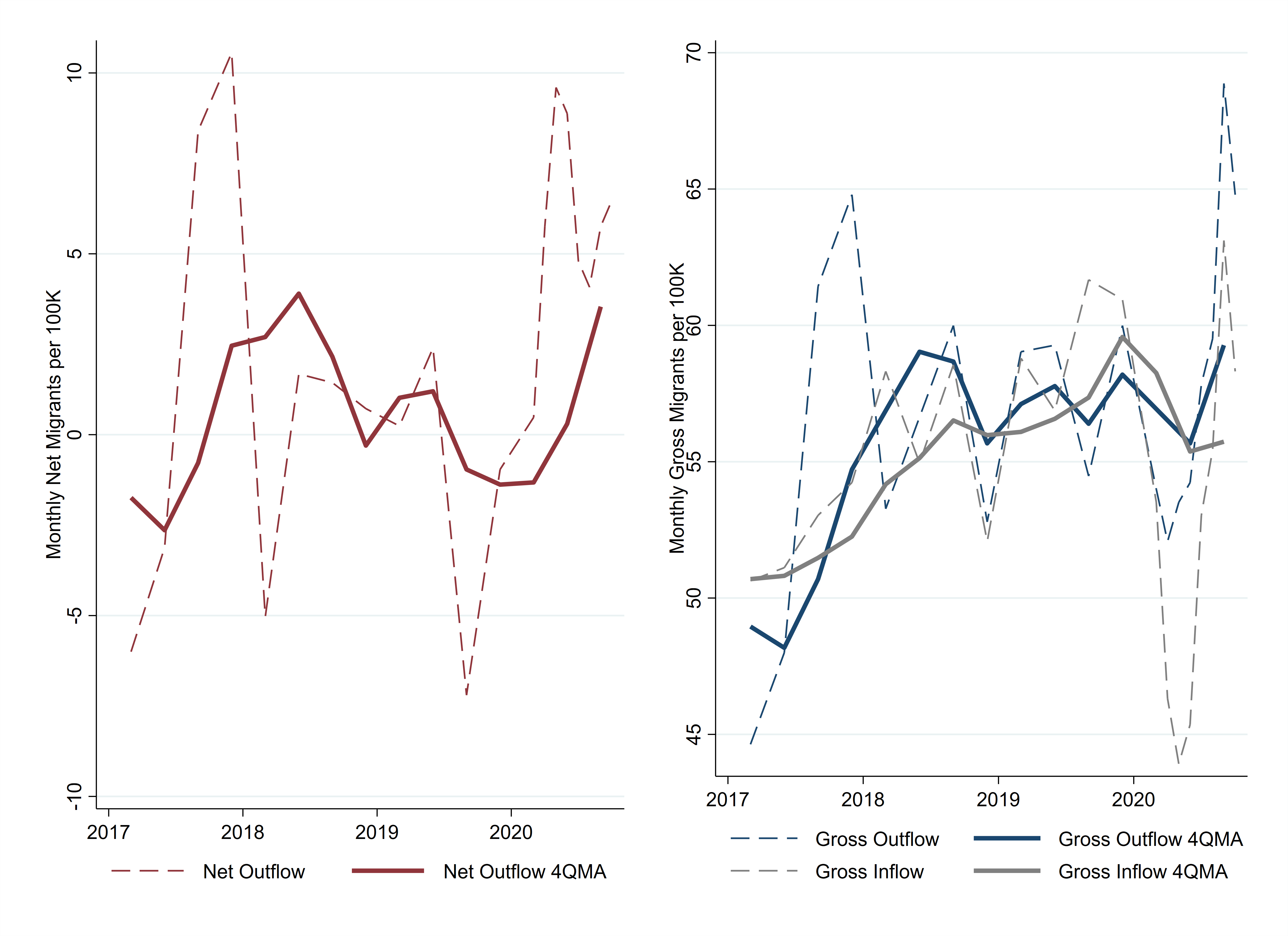
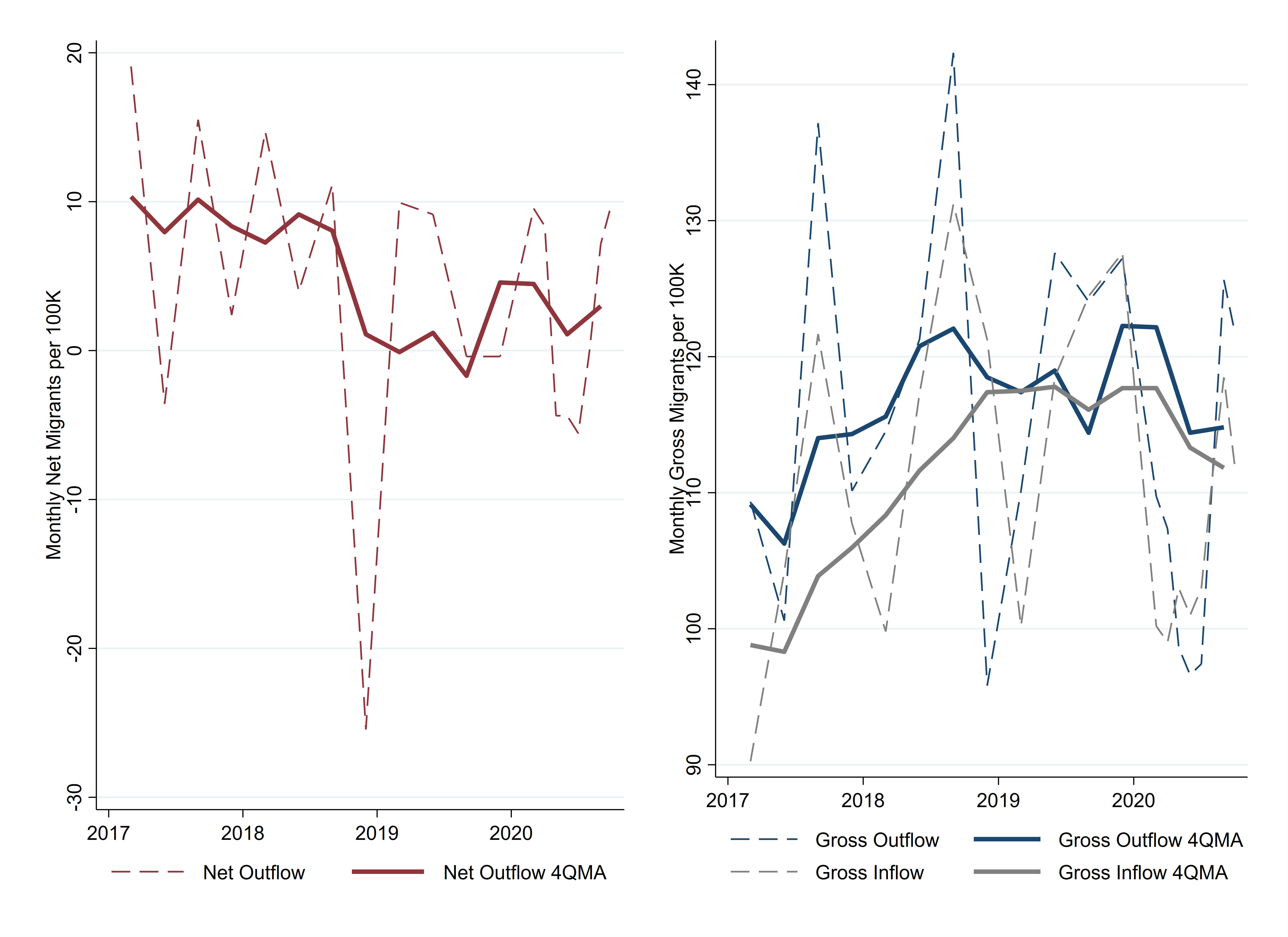
The final proposed cause of the urban exodus, the protests and civil unrest, is more difficult to measure. While protests occurred in every major city in the country, some were considerably more destructive or long lasting. Figure 5 shows the net out-migration series for six metro areas that had very high-profile civil unrest, and the figures for other metros with populations of more than 1 million are included in the appendix. The red vertical lines in the graphs mark the beginning of the protests in May. In Chicago, New York, Philadelphia, and Seattle, the most recent net out-migration estimates are more than twice as high as the average during the preceding three years.

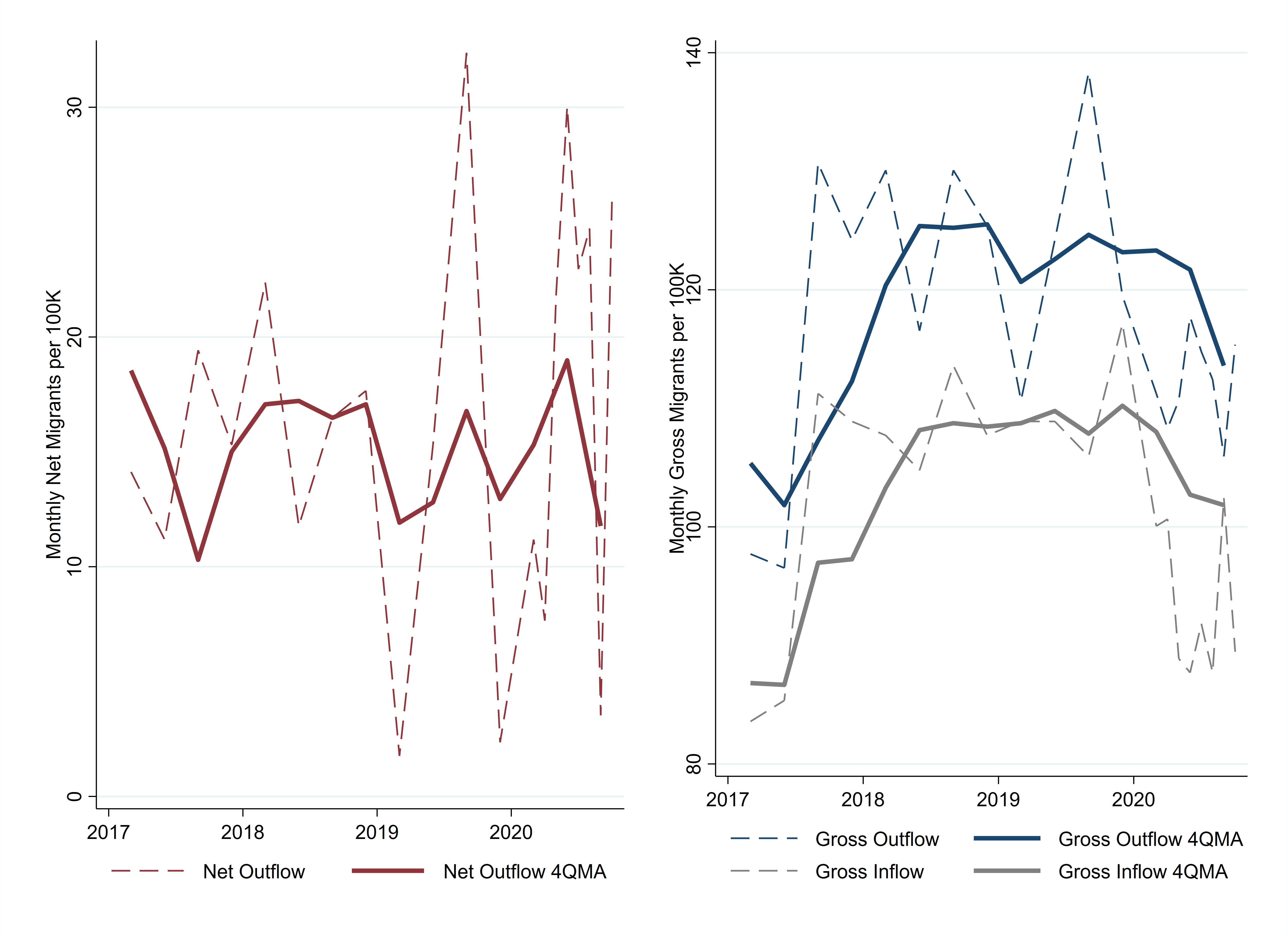
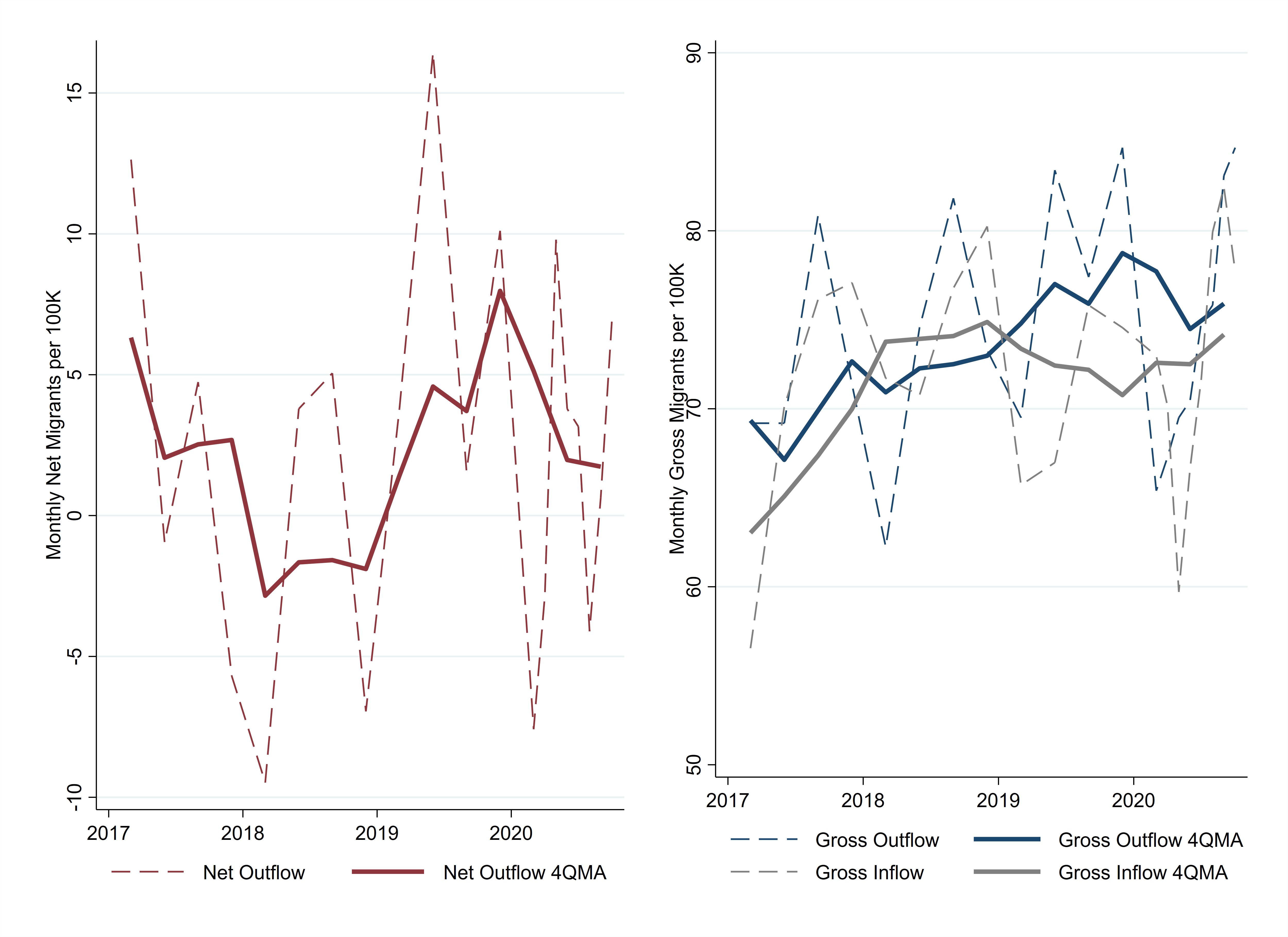
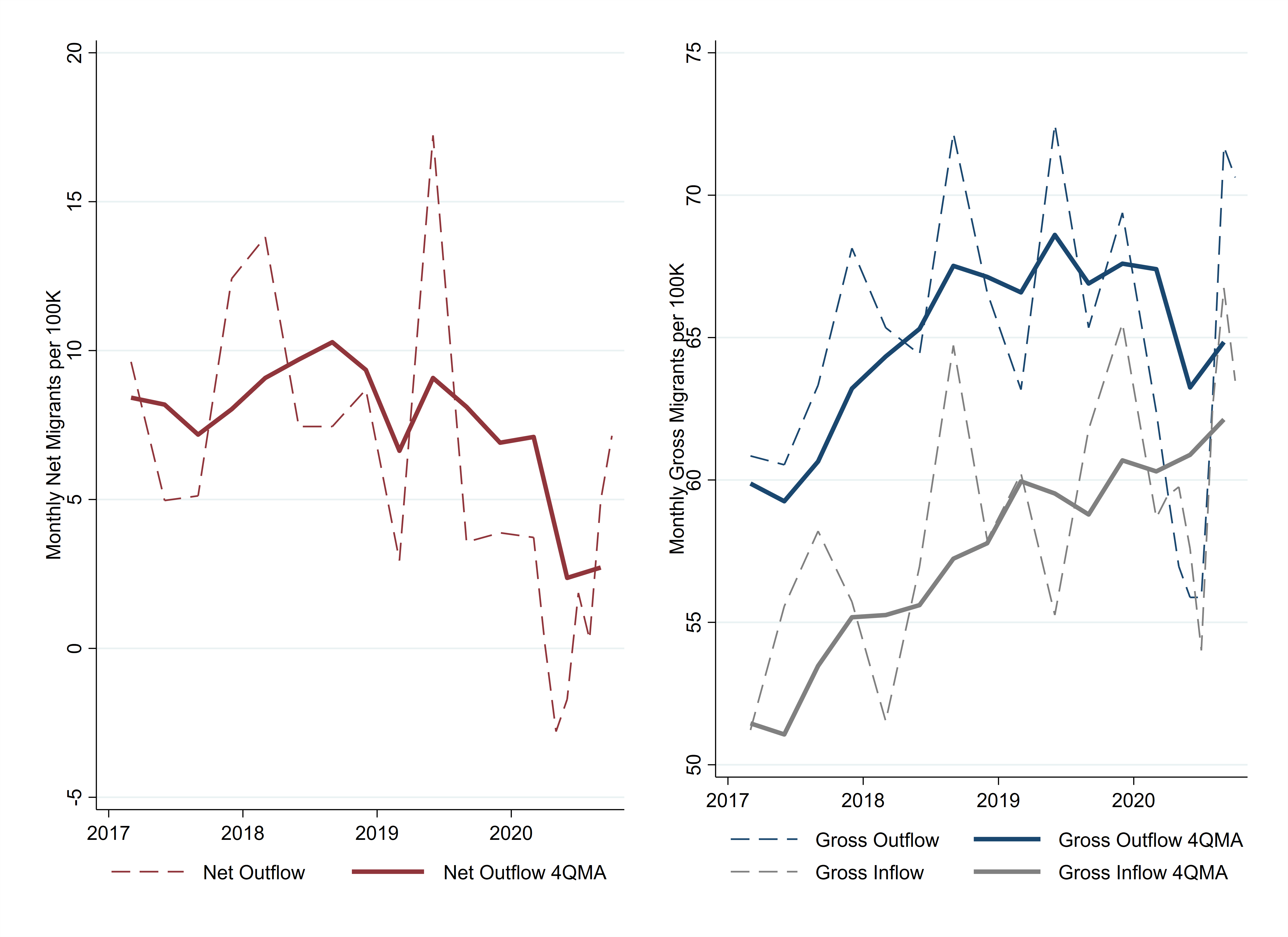
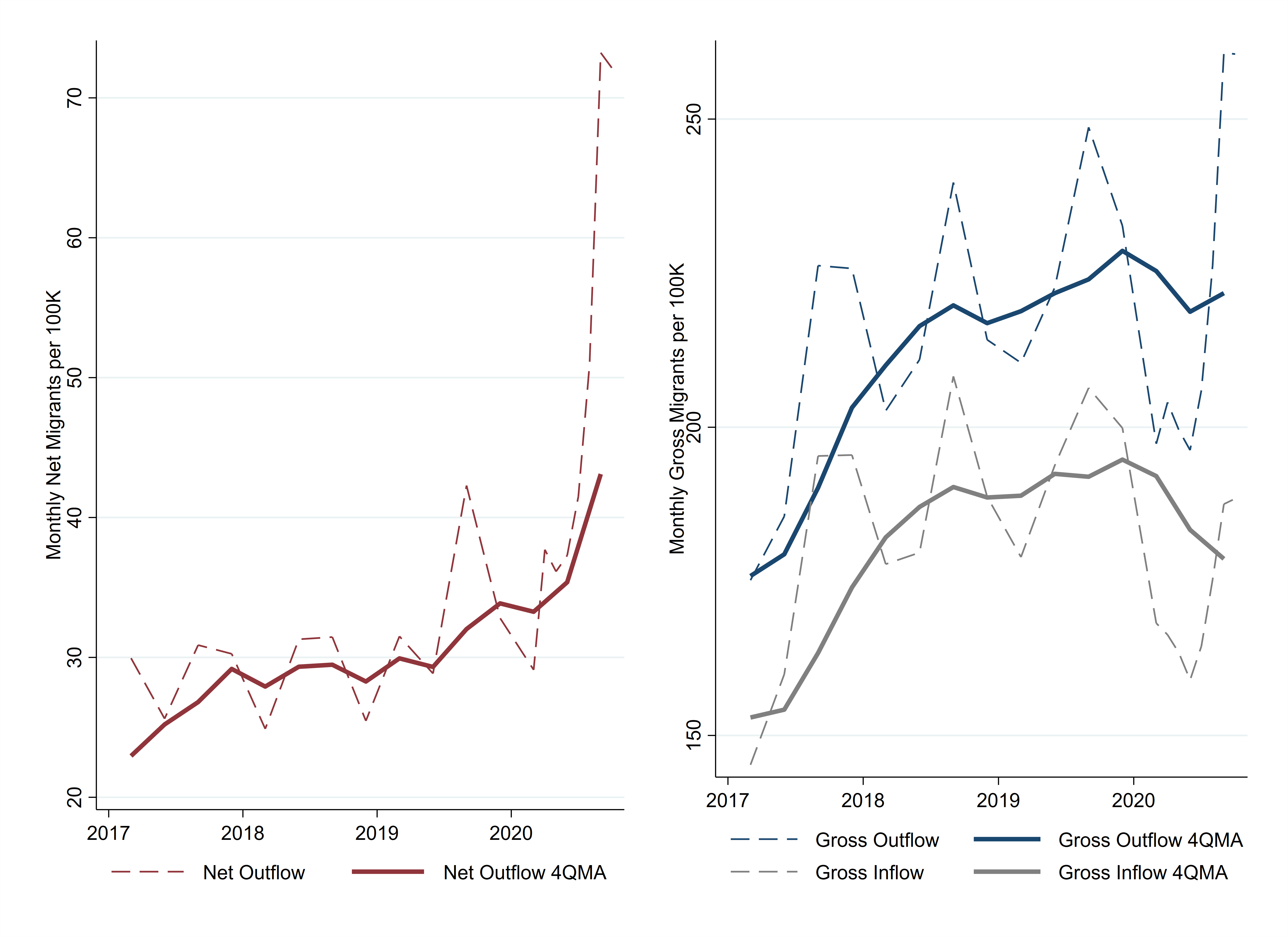
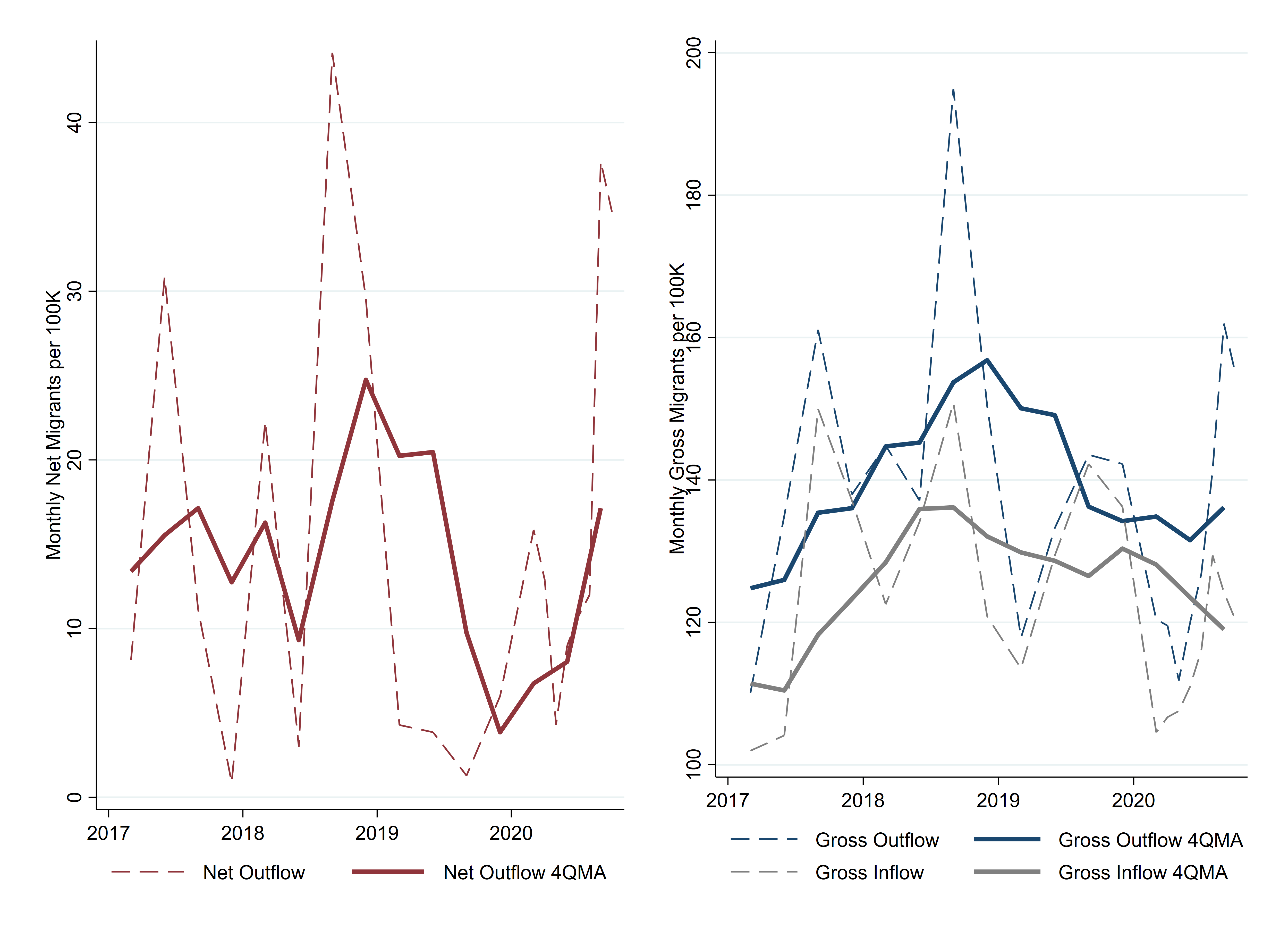
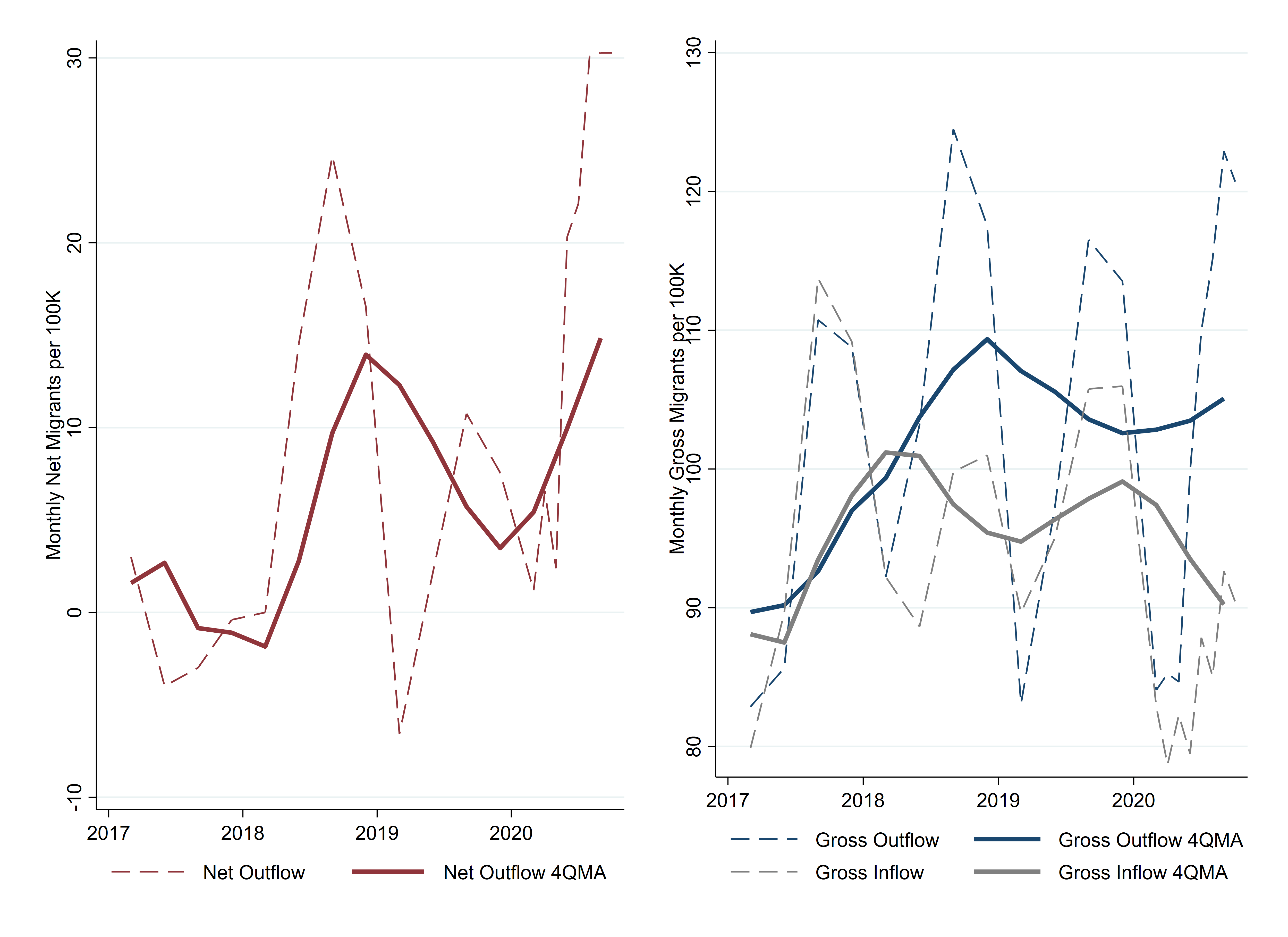
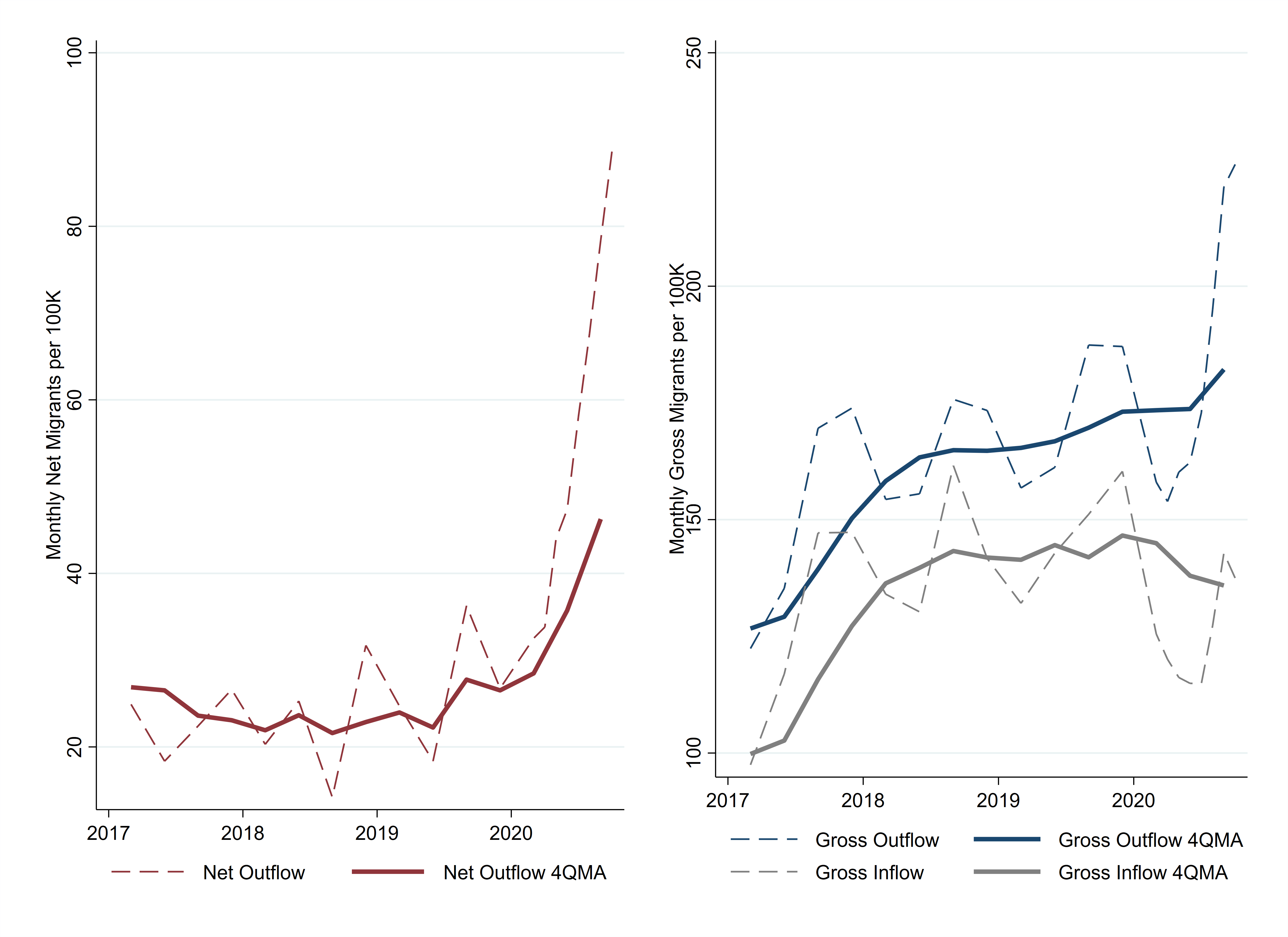
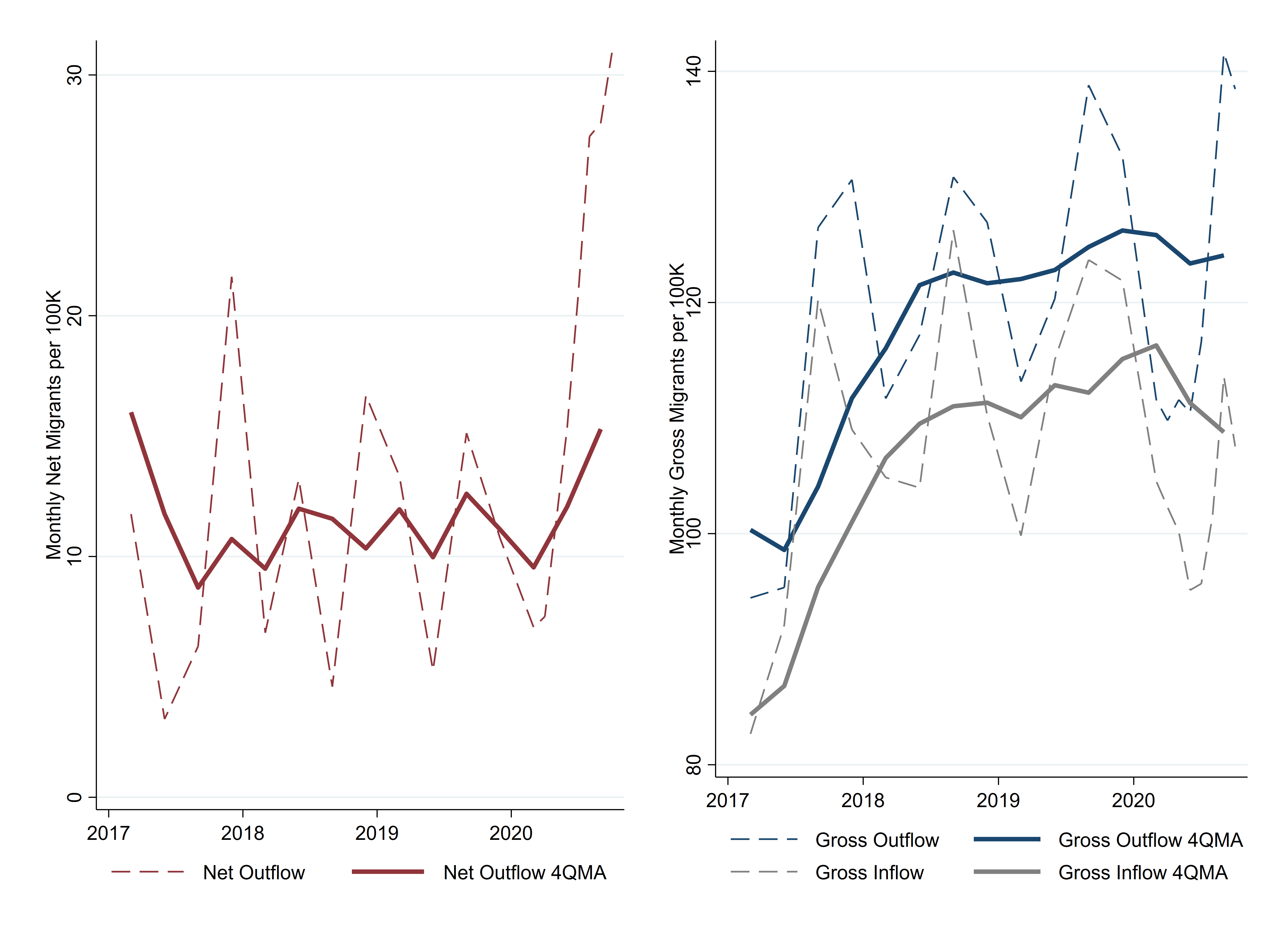
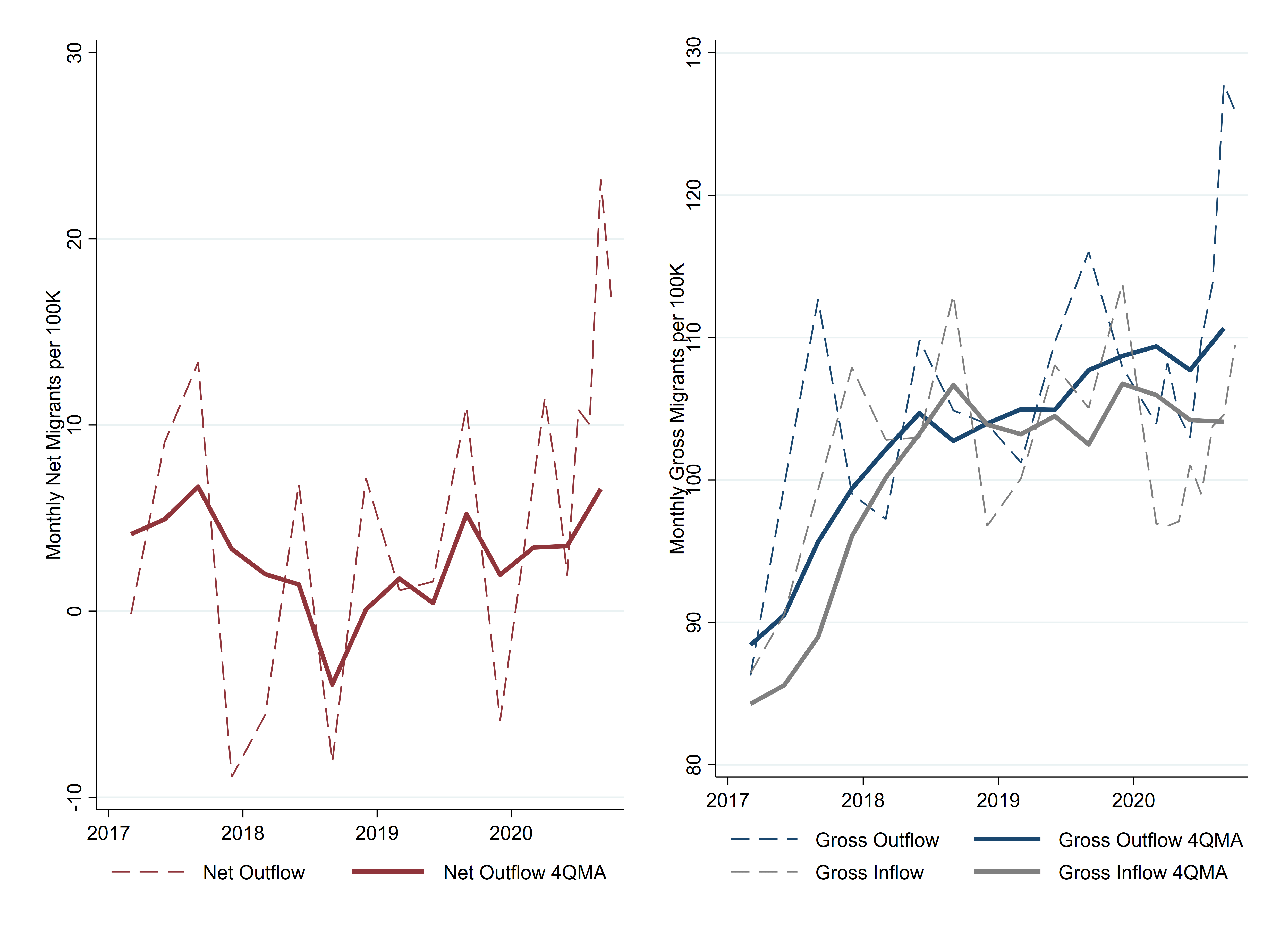
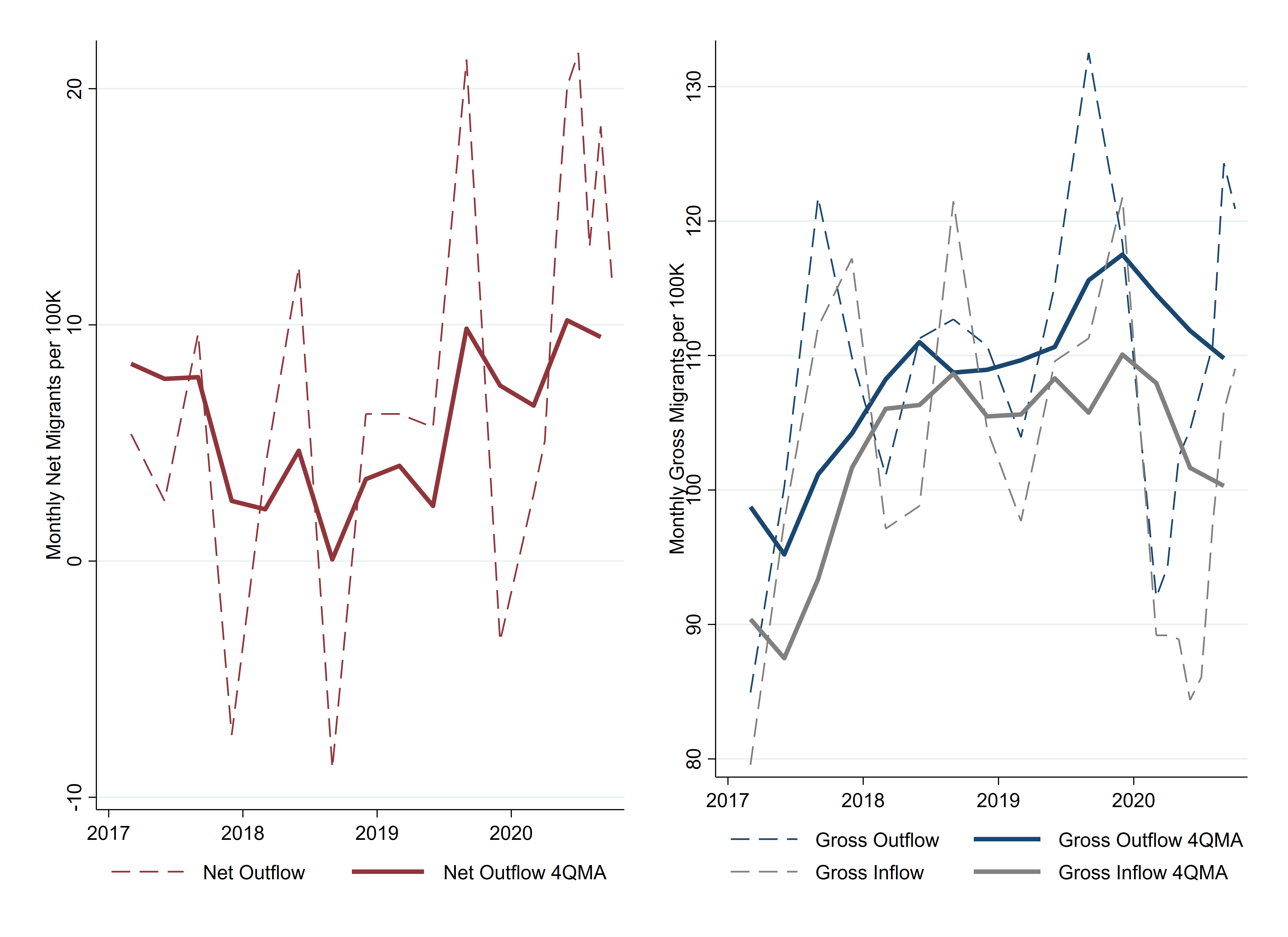
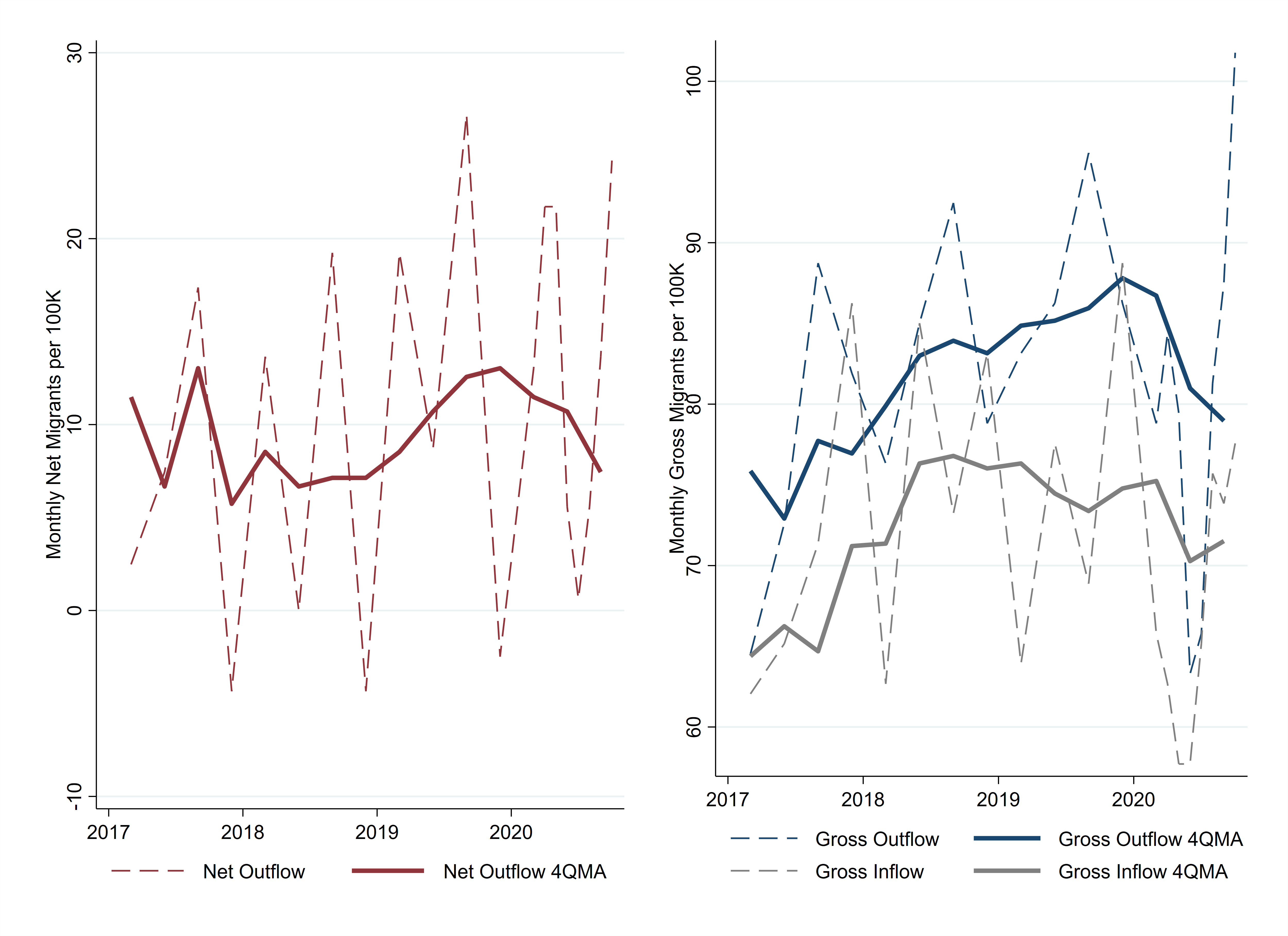
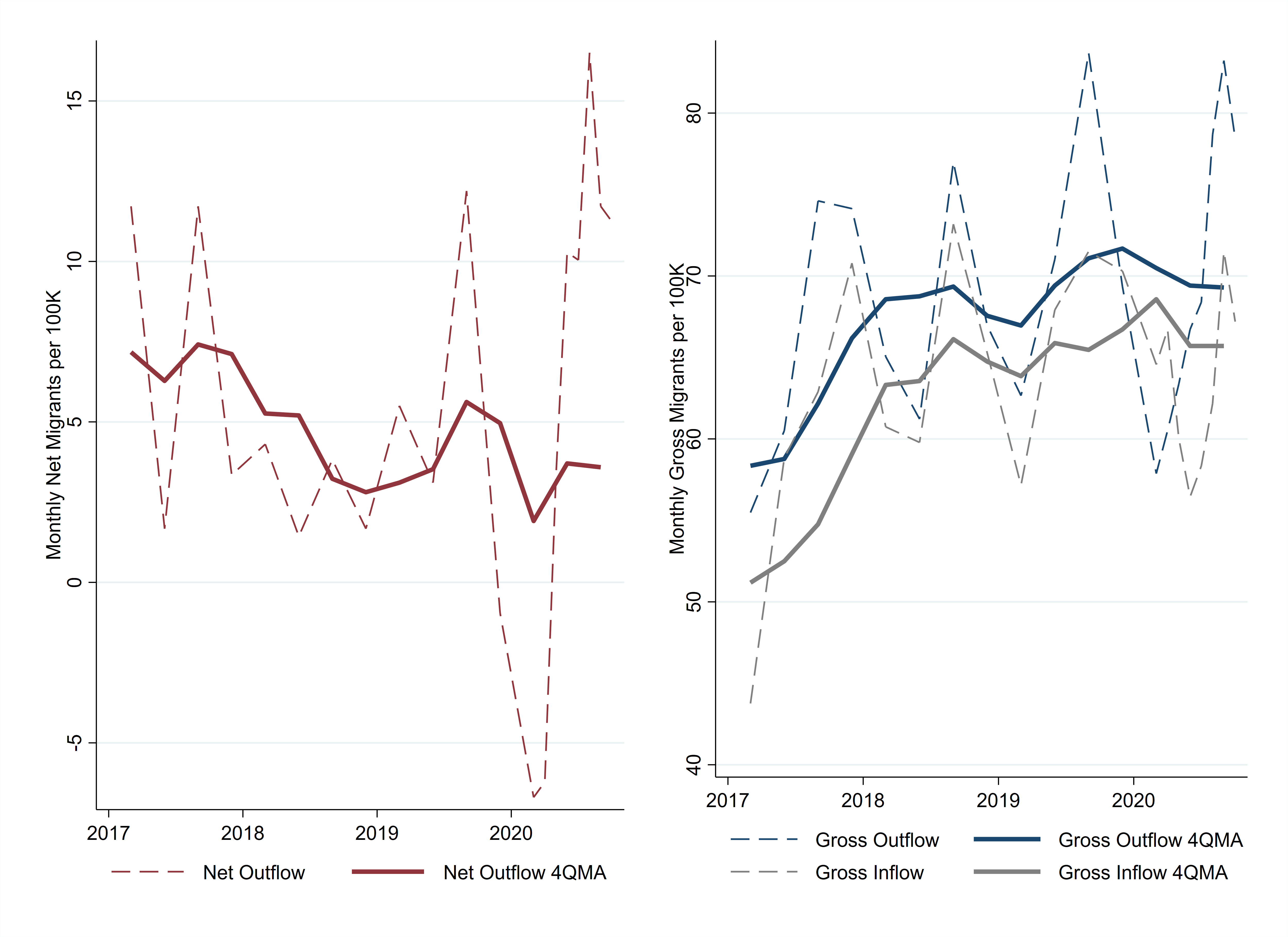
Among major cities in the Cleveland Fed's District, Pittsburgh and Columbus saw increases in net out-migration in 2020 (Figure 6). For Columbus, the decline in inflows accounted for about two-thirds of the net change. Pittsburgh's gross outflows were almost unchanged, while its 2020 inflows fell by 27 people per 100,000. In the other four of the six largest metro areas in the Fourth District, 2020 was not remarkably different from the recent past.

Conclusion
Did the COVID-19 pandemic start an urban exodus? The estimates presented here strongly suggest that migration flows were unfavorable for urban neighborhoods during 2020. However, the word "exodus" emphasizes that migrants are leaving a particular area in large numbers. If we look at the gross flows underlying the trends in Figures 3 through 6 (available in the appendix), we can see that the declines of in-migration are almost always greater than the increases in out-migration. Out-migration did increase in many urban neighborhoods, but the magnitudes probably would not fit most definitions of an exodus. What is certain is that hundreds of thousands of people who would have moved into an urban neighborhood in a typical year were unwilling or unable to do so in 2020. These people may be harder to identify, label, and interview, but they may be best positioned to tell the real story.
Footnotes
- In the appendix, I provide 16 examples of these articles. Return to 1
- Cullen, Julie Berry, and Steven D. Levitt. 1999. “Crime, Urban Flight, and the Consequences for Cities.” The Review of Economics and Statistics. 81(2): 159-169. https://doi.org/10.1162/003465399558030. Return to 2
- Brevoort, Kenneth P., Philipp Grimm, and Michelle Kambara. 2016. “Credit Invisibles and the Unscored.” Cityscape: A Journal of Policy Development and Research. 18 (2). https://www.huduser.gov/portal/periodicals/cityscpe/vol18num2/ch1.pdf. Return to 3
- For tracts that have a majority pre-WWII housing, I also require that they have a population density of at least 2,000 people per square mile. This avoids including exurban edges where old rural homes have not yet been outnumbered by homes in new subdivisions. I selected the 7,000 people per square mile threshold because it was the average density of major cities in the pre-WWII period. Return to 4
References
- Dingel, Jonathan I., and Brent Neiman. 2020. “How Many Jobs Can Be Done at Home?” National Bureau of Economic Research, Working Paper No. 26948. https://doi.org/10.3386/w26948
- Whitaker, Stephan. 2019a. “12 Facts about Temporary Urbanists.” Federal Reserve Bank of Cleveland, Economic Commentary. 2019-07. https://doi.org/10.26509/frbc-ec-201907.
- Whitaker, Stephan. 2019b. “Population, Migration, and Generations in Urban Neighborhoods.” Federal Reserve Bank of Cleveland, Economic Commentary. 2019-08. https://doi.org/10.26509/frbc-ec-201908.
Appendix
I. Measuring Migration with the CCP
From 1999 through 2019, the CCP data include quarterly observations. To better track the economic impact of the pandemic, the CCP shifted to monthly observations in 2020, including for January and February. For all time periods before 2020, I match individuals in the panel and observe whether they live in the same census tract at the end of a quarter as they did at the end of the preceding quarter. If the tract is different, I identify those who have shifted from an urban tract to a nonurban tract or vice versa. The counts of the people transitioning form the basis of all migration flow estimates. I divide the quarterly counts by three to approximate a monthly flow.
To keep the 2020 data comparable to other years, I look back from each month to the census tract reported three months prior. This means that an individual contributes to the estimates for three separate months, so the monthly estimates are similar to a three-month moving average. When I report moving averages, sums, or changes from prior years in this brief, I use only the June 2020 and September 2020 90-day lookbacks, so there is no duplicate counting, and the 2020 figures are defined in exactly the same way as the 2019 and earlier estimates.
II. Gross Flows by Neighborhood and Individual Characteristics
| Metro Area | Change in Net Flow | Change in Outflow | Change in Inflow |
|---|---|---|---|
| National | 28.0 | 9.9 | -18.1 |
| Below Median Income | 10.7 | 3.7 | -7.0 |
| Above Median Income | 17.3 | 6.2 | -11.1 |
| Homebuyers | 8.5 | 8.3 | -0.1 |
| Renters | 19.5 | 1.5 | -18.0 |
| 18–34 years old | 16.2 | 4.7 | -11.4 |
| 35–64 years old | 9.9 | 5.0 | -4.9 |
| 65+ years old | 2.0 | 0.2 | -1.8 |
| 500K to <2M metro population | 3.6 | -0.6 | -4.1 |
| 2M to <5M metro population | 7.2 | 2.3 | -4.8 |
| ≥5M metro population | 13.9 | 8.1 | -5.8 |
Note: The units are thousands of migrants per month. The change is calculated as the difference between the average monthly flow in April to September 2020 and the average monthly flow from the same months in 2017, 2018, and 2019.
Source: Federal Reserve Bank of New York/Equifax Consumer Credit Panel, American Community Survey, and author’s calculations.
Source: Federal Reserve Bank of New York/Equifax Consumer Credit Panel, American Community Survey, and author’s calculations.
Source: Federal Reserve Bank of New York/Equifax Consumer Credit Panel, American Community Survey, and author’s calculations.
Source: Federal Reserve Bank of New York/Equifax Consumer Credit Panel, American Community Survey, and author’s calculations.
Source: Federal Reserve Bank of New York/Equifax Consumer Credit Panel, American Community Survey, and author’s calculations.
III. Data Sources and Calculations for Potential Migration Drivers
A. COVID-19 Deaths
The data on COVID-19 deaths are maintained by the Center for Systems Science and Engineering at Johns Hopkins University. The data are reported daily by county. I aggregate all deaths through the end of September 2020 for each county. I aggregate the county totals to metro area totals and divide them by the most recent estimate of the metro population (in millions).
B. Telework-Capable Employment
The estimate of the share of the metro labor force that is telework capable is from Dingel and Neiman (2020). The authors categorize a job as telework capable using workers’ responses to surveys conducted by the US Department of Labor’s O*NET program. They estimate the share of employees in each metro area who can work remotely.
Dingel, Jonathan I., and Brent Neiman. 2020. “How Many Jobs Can Be Done at Home?” National Bureau of Economic Research, Working Paper No. 26948. https://doi.org/10.3386/w26948
C. Small Businesses Open
Homebase is a provider of scheduling services for employers. (joinhomebase.com/data) While the company serves all industries, its clientele is heavily weighted toward small businesses in food service and retail. To facilitate monitoring the impact of the pandemic on small businesses, the company has shared anonymized microdata with researchers. Data include work shifts, with establishment IDs, county codes, and dates. First, I identified all establishments that reported shifts in January 2020. I combined the counties into their metro areas, and I counted the number of establishments that reported shifts on each day from April 1 through September 28, 2020. I then divided each day’s count by the average count of establishments that reported shifts during January. For every metro area, this measure—the percentage of businesses open—dips to 40 percent to 60 percent in April and May. Most recover to between 70 percent and 100 percent by July. I averaged all days from April to September to get a single value that summarizes how severe the shutdowns were for each metro area.
D. Homicides
Uniform Crime Reports are not yet available for 2020, so I used data collected by Asher and Horwitz (2020). Their article contains a link to a spreadsheet that updates each month with homicide statistics from 59 major cities. The data I used were as of September 28, 2020. I divided the year-to-date count of homicides by the metro area population (in hundreds of thousands) and subtracted the 2019 value from the 2020 value.
Asher, J., and Ben Horwitz. 2020. “It’s Been ‘Such a Weird Year.’ That’s Also Reflected in Crime Statistics.” The New York Times. https://www.nytimes.com/2020/07/06/upshot/murders-rising-crime-coronavirus.html
IV. Changes in Gross Flows by Potential Migration Drivers
Note: Trend lines are calculated using metro populations as weights. The change is calculated as the difference between the flow in April to September 2020 and the average from the same months in 2017, 2018, and 2019. Marker sizes represent metro populations.
Source: Federal Reserve Bank of New York/Equifax Consumer Credit Panel, American Community Survey, Center for Systems Science and Engineering, Dingel and Neiman (2020), Homebase, New York Times, and author’s calculations.
Note: The trend lines are calculated using metro populations as weights. The change is calculated as the difference between the flow in April to September 2020 and the average from the same months in 2017, 2018, and 2019. Marker sizes represent metro populations.
Source: Federal Reserve Bank of New York/Equifax Consumer Credit Panel, American Community Survey, Center for Systems Science and Engineering, Dingel and Neiman (2020), Homebase, New York Times, and author’s calculations.
V. Change in Gross and Net Flows for Metro Areas with Populations Greater Than 500,000
| Metro Area | Change in Net Flow | Change in Outflow | Change in Inflow |
|---|---|---|---|
| Bridgeport–Stamford–Norwalk, CT | 106 | 81 | -24 |
| San Francisco–Oakland–Hayward, CA | 99 | 50 | -48 |
| San Jose–Sunnyvale–Santa Clara, CA | 84 | 14 | -70 |
| New York–Newark–Jersey City, NY–NJ–PA | 83 | 57 | -26 |
| Denver–Aurora–Lakewood, CO | 62 | 18 | -44 |
| Washington–Arlington–Alexandria, DC–VA–MD–WV | 57 | 11 | -47 |
| San Diego–Carlsbad, CA | 53 | 21 | -33 |
| Seattle–Tacoma–Bellevue, WA | 49 | 1 | -48 |
| Los Angeles–Long Beach–Anaheim, CA | 48 | 14 | -35 |
| Chicago–Naperville–Elgin, IL–IN–WI | 43 | 14 | -29 |
| Urban Honolulu, HI | 39 | -4 | -43 |
| Riverside–San Bernardino–Ontario, CA | 37 | 24 | -12 |
| Boston–Cambridge–Newton, MA–NH | 36 | 15 | -20 |
| New Haven–Milford, CT | 35 | 46 | 11 |
| Albany–Schenectady–Troy, NY | 35 | 1 | -34 |
| Minneapolis–St. Paul–Bloomington, MN–WI | 35 | 9 | -25 |
| Provo–Orem, UT | 31 | -8 | -39 |
| Miami–Fort Lauderdale–West Palm Beach, FL | 30 | 12 | -17 |
| Oxnard–Thousand Oaks–Ventura, CA | 29 | -8 | -37 |
| Hartford–West Hartford–East Hartford, CT | 28 | 7 | -21 |
| Philadelphia–Camden–Wilmington, PA–NJ–DE–MD | 28 | 9 | -18 |
| Dallas–Fort Worth–Arlington, TX | 27 | 6 | -21 |
| New Orleans–Metairie, LA | 26 | 14 | -12 |
| Pittsburgh, PA | 26 | -1 | -27 |
| Grand Rapids–Wyoming, MI | 25 | 12 | -13 |
| Harrisburg–Carlisle, PA | 25 | 31 | 6 |
| Stockton–Lodi, CA | 25 | -4 | -28 |
| Durham–Chapel Hill, NC | 24 | 18 | -6 |
| Columbus, OH | 23 | 8 | -15 |
| Richmond, VA | 23 | 0 | -23 |
| Lancaster, PA | 21 | 16 | -5 |
| Bakersfield, CA | 21 | -5 | -26 |
| Madison, WI | 17 | 1 | -15 |
| Louisville/Jefferson County, KY–IN | 15 | -3 | -18 |
| Des Moines–West Des Moines, IA | 15 | -4 | -19 |
| Wichita, KS | 15 | -5 | -20 |
| Tampa–St. Petersburg–Clearwater, FL | 14 | 11 | -4 |
| Charleston–North Charleston, SC | 14 | 12 | -2 |
| Milwaukee–Waukesha–West Allis, WI | 14 | -21 | -35 |
| Phoenix–Mesa–Scottsdale, AZ | 13 | 13 | -1 |
| Colorado Springs, CO | 13 | 7 | -7 |
| Scranton–Wilkes–Barre–Hazleton, PA | 12 | -27 | -39 |
| St. Louis, MO–IL | 12 | 8 | -3 |
| Orlando–Kissimmee–Sanford, FL | 11 | 17 | 5 |
| Austin–Round Rock, TX | 11 | -4 | -16 |
| McAllen–Edinburg–Mission, TX | 11 | 7 | -4 |
| Sacramento–Roseville–Arden–Arcade, CA | 11 | -17 | -28 |
| Oklahoma City, OK | 9 | 6 | -3 |
| Syracuse, NY | 8 | -13 | -21 |
| Portland–Vancouver–Hillsboro, OR–WA | 8 | -19 | -27 |
| Boise City, ID | 7 | 16 | 9 |
| San Antonio–New Braunfels, TX | 7 | -3 | -10 |
| Little Rock–North Little Rock–Conway, AR | 6 | -1 | -8 |
| Toledo, OH | 6 | 0 | -6 |
| Chattanooga, TN–GA | 6 | 17 | 11 |
| Las Vegas–Henderson–Paradise, NV | 5 | 6 | 1 |
| Cape Coral–Fort Myers, FL | 5 | 6 | 1 |
| Jacksonville, FL | 4 | 0 | -5 |
| Portland–South Portland, ME | 4 | -32 | -37 |
| Akron, OH | 4 | -6 | -10 |
| Omaha–Council Bluffs, NE–IA | 4 | 5 | 2 |
| Cleveland–Elyria, OH | 3 | -10 | -13 |
| Nashville–Davidson–Murfreesboro–Franklin, TN | 3 | 4 | 1 |
| Atlanta–Sandy Springs–Roswell, GA | 3 | 3 | 0 |
| Charlotte–Concord–Gastonia, NC–SC | 3 | 0 | -2 |
| Winston–Salem, NC | 1 | -3 | -4 |
| Columbia, SC | 1 | -4 | -5 |
| Knoxville, TN | 1 | -3 | -3 |
| Ogden–Clearfield, UT | -1 | -2 | -1 |
| Allentown–Bethlehem–Easton, PA–NJ | -1 | 10 | 11 |
| Buffalo–Cheektowaga–Niagara Falls, NY | -1 | -21 | -20 |
| Kansas City, MO–KS | -2 | -8 | -6 |
| Tulsa, OK | -2 | -6 | -4 |
| Birmingham–Hoover, AL | -3 | -5 | -2 |
| Springfield, MA | -4 | -15 | -12 |
| Fresno, CA | -4 | -17 | -13 |
| Worcester, MA–CT | -4 | -6 | -2 |
| Youngstown–Warren–Boardman, OH–PA | -4 | -19 | -15 |
| Augusta–Richmond County, GA–SC | -5 | -5 | 0 |
| Baltimore–Columbia–Towson, MD | -5 | -21 | -17 |
| Cincinnati, OH–KY–IN | -5 | -1 | 4 |
| Raleigh, NC | -5 | -11 | -6 |
| Memphis, TN–MS–AR | -6 | -7 | -2 |
| Tucson, AZ | -6 | -10 | -4 |
| Rochester, NY | -6 | -22 | -16 |
| Virginia Beach–Norfolk–Newport News, VA–NC | -7 | -27 | -20 |
| Houston–The Woodlands–Sugar Land, TX | -8 | -7 | 1 |
| Albuquerque, NM | -8 | -12 | -4 |
| Dayton, OH | -9 | -17 | -7 |
| Providence–Warwick, RI–MA | -10 | -2 | 8 |
| Detroit–Warren–Dearborn, MI | -12 | -5 | 7 |
| Salt Lake City, UT | -13 | -20 | -7 |
| Indianapolis–Carmel–Anderson, IN | -18 | -3 | 15 |
| Spokane–Spokane Valley, WA | -22 | -13 | 8 |
| El Paso, TX | -27 | -50 | -23 |
| Modesto, CA | -35 | -28 | 7 |
Note: Units are migrants per 100,000 metro area residents. Change is calculated as the difference between the flow in April to September 2020 from the average from the same months in 2017, 2018, and 2019. Changes in the outflow and inflow may not sum to the change in the net flow due to rounding.
Source: Federal Reserve Bank of New York/Equifax Consumer Credit Panel, American Community Survey, and author’s calculations.
Source: Federal Reserve Bank of New York/Equifax Consumer Credit Panel, American Community Survey, and author’s calculations.
Source: Federal Reserve Bank of New York/Equifax Consumer Credit Panel, American Community Survey, and author’s calculations.
Source: Federal Reserve Bank of New York/Equifax Consumer Credit Panel, American Community Survey, and author’s calculations.
Source: Federal Reserve Bank of New York/Equifax Consumer Credit Panel, American Community Survey, and author’s calculations.
Source: Federal Reserve Bank of New York/Equifax Consumer Credit Panel, American Community Survey, and author’s calculations.
Source: Federal Reserve Bank of New York/Equifax Consumer Credit Panel, American Community Survey, and author’s calculations.
Source: Federal Reserve Bank of New York/Equifax Consumer Credit Panel, American Community Survey, and author’s calculations.
Source: Federal Reserve Bank of New York/Equifax Consumer Credit Panel, American Community Survey, and author’s calculations.
Source: Federal Reserve Bank of New York/Equifax Consumer Credit Panel, American Community Survey, and author’s calculations.
Source: Federal Reserve Bank of New York/Equifax Consumer Credit Panel, American Community Survey, and author’s calculations.
Source: Federal Reserve Bank of New York/Equifax Consumer Credit Panel, American Community Survey, and author’s calculations.
Source: Federal Reserve Bank of New York/Equifax Consumer Credit Panel, American Community Survey, and author’s calculations.
Source: Federal Reserve Bank of New York/Equifax Consumer Credit Panel, American Community Survey, and author’s calculations.
Source: Federal Reserve Bank of New York/Equifax Consumer Credit Panel, American Community Survey, and author’s calculations.
Source: Federal Reserve Bank of New York/Equifax Consumer Credit Panel, American Community Survey, and author’s calculations.
Source: Federal Reserve Bank of New York/Equifax Consumer Credit Panel, American Community Survey, and author’s calculations.
Source: Federal Reserve Bank of New York/Equifax Consumer Credit Panel, American Community Survey, and author’s calculations.
Source: Federal Reserve Bank of New York/Equifax Consumer Credit Panel, American Community Survey, and author’s calculations.
Source: Federal Reserve Bank of New York/Equifax Consumer Credit Panel, American Community Survey, and author’s calculations.
Source: Federal Reserve Bank of New York/Equifax Consumer Credit Panel, American Community Survey, and author’s calculations.
Source: Federal Reserve Bank of New York/Equifax Consumer Credit Panel, American Community Survey, and author’s calculations.
Source: Federal Reserve Bank of New York/Equifax Consumer Credit Panel, American Community Survey, and author’s calculations.
Source: Federal Reserve Bank of New York/Equifax Consumer Credit Panel, American Community Survey, and author’s calculations.
Source: Federal Reserve Bank of New York/Equifax Consumer Credit Panel, American Community Survey, and author’s calculations.
Source: Federal Reserve Bank of New York/Equifax Consumer Credit Panel, American Community Survey, and author’s calculations.
Source: Federal Reserve Bank of New York/Equifax Consumer Credit Panel, American Community Survey, and author’s calculations.
Source: Federal Reserve Bank of New York/Equifax Consumer Credit Panel, American Community Survey, and author’s calculations.
Source: Federal Reserve Bank of New York/Equifax Consumer Credit Panel, American Community Survey, and author’s calculations.
Source: Federal Reserve Bank of New York/Equifax Consumer Credit Panel, American Community Survey, and author’s calculations.
Source: Federal Reserve Bank of New York/Equifax Consumer Credit Panel, American Community Survey, and author’s calculations.
Source: Federal Reserve Bank of New York/Equifax Consumer Credit Panel, American Community Survey, and author’s calculations.
Source: Federal Reserve Bank of New York/Equifax Consumer Credit Panel, American Community Survey, and author’s calculations.
Source: Federal Reserve Bank of New York/Equifax Consumer Credit Panel, American Community Survey, and author’s calculations.
Source: Federal Reserve Bank of New York/Equifax Consumer Credit Panel, American Community Survey, and author’s calculations.
Source: Federal Reserve Bank of New York/Equifax Consumer Credit Panel, American Community Survey, and author’s calculations.
Source: Federal Reserve Bank of New York/Equifax Consumer Credit Panel, American Community Survey, and author’s calculations.
Source: Federal Reserve Bank of New York/Equifax Consumer Credit Panel, American Community Survey, and author’s calculations.
Source: Federal Reserve Bank of New York/Equifax Consumer Credit Panel, American Community Survey, and author’s calculations.
Source: Federal Reserve Bank of New York/Equifax Consumer Credit Panel, American Community Survey, and author’s calculations.
Source: Federal Reserve Bank of New York/Equifax Consumer Credit Panel, American Community Survey, and author’s calculations.
Source: Federal Reserve Bank of New York/Equifax Consumer Credit Panel, American Community Survey, and author’s calculations.
Source: Federal Reserve Bank of New York/Equifax Consumer Credit Panel, American Community Survey, and author’s calculations.
Source: Federal Reserve Bank of New York/Equifax Consumer Credit Panel, American Community Survey, and author’s calculations.
Source: Federal Reserve Bank of New York/Equifax Consumer Credit Panel, American Community Survey, and author’s calculations.
Source: Federal Reserve Bank of New York/Equifax Consumer Credit Panel, American Community Survey, and author’s calculations.
Source: Federal Reserve Bank of New York/Equifax Consumer Credit Panel, American Community Survey, and author’s calculations.
Source: Federal Reserve Bank of New York/Equifax Consumer Credit Panel, American Community Survey, and author’s calculations.
Source: Federal Reserve Bank of New York/Equifax Consumer Credit Panel, American Community Survey, and author’s calculations.
Source: Federal Reserve Bank of New York/Equifax Consumer Credit Panel, American Community Survey, and author’s calculations.
Source: Federal Reserve Bank of New York/Equifax Consumer Credit Panel, American Community Survey, and author’s calculations.
Source: Federal Reserve Bank of New York/Equifax Consumer Credit Panel, American Community Survey, and author’s calculations.
VI. Articles on Urban Migration in 2020
- Bahney, Anna. 2020. “These People Have Left Big Cities for Good. Here’s Where They Landed.” CNN. https://www.cnn.com/2020/08/31/success/leaving-the-city-for-suburbs/index.html.
- Chinni, Dante. 2020. “Rural Real Estate Prices Rise as People Consider Leaving Cities.” NBC. https://www.nbcnews.com/politics/meet-the-press/rural-real-estate-prices-rise-people-consider-leaving-cities-n1234309.
- Florida, Richard. 2020. “This Is Not the End of Cities.” Bloomberg CityLab. https://www.bloomberg.com/news/features/2020-06-19/cities-will-survive-pandemics-and-protests.
- Haynes, Suyin. 2020. “COVID-19 Is Prompting Wealthy People to Move Out of Cities. The Plague Had the Same Effect Hundreds of Years Ago.” Time. https://time.com/5851978/pandemic-plague-henry-viii/.
- Ioannou, Lori. 2020. “Vast Migration of over 14 Million Americans Coming Due to Rise in Remote Work, Study Says.” CNBC. https://www.cnbc.com/2020/10/28/vast-migration-of-over-14-million-americans-coming-due-to-remote-work.html.
- Johnson, Christen. 2020. “‘I’ve Never Had to Think About My Own Safety in This Way Before’: Shaken by Summer Looting in Affluent Neighborhoods, Some Chicagoans Are Moving Away.” Chicago Tribune. https://www.chicagotribune.com/real-estate/ct-re-moving-looting-riots-protests-0826-20200826-ps432obfcbg3jhcinoyn4izbwq-story.html.
- Liu, Jennifer. 2020. “These Rising US Cities Could Become the Top Places to Live and Work from Home.” CNBC. https://www.cnbc.com/2020/08/31/rising-us-cities-could-become-the-top-places-to-live-and-work-from-home.html.
- Marcus, Jon. 2020. “Small Cities Are a Big Draw for Remote Workers during the Pandemic.” NPR. https://www.npr.org/2020/11/16/931400786/small-cities-are-a-big-draw-for-remote-workers-during-the-pandemic.
- Olick Diana. 2020a. “Earnings for Apartment Owners Show the Pain of Urban Flight.” CNBC. https://www.cnbc.com/2020/10/29/earnings-for-apartment-owners-show-the-pain-of-urban-flight-.html.
- Olick, Diana. 2020b. “Smaller American Cities See Big Interest from Urban Flight.” CNBC. https://www.cnbc.com/2020/10/30/smaller-american-cities-see-big-interest-from-urban-flight-.html.
- Patino, Marie. 2020. “What We Actually Know About How Americans Are Moving During Covid.” Bloomberg CityLab. https://www.bloomberg.com/news/articles/2020-09-16/the-truth-about-american-migration-during-covid.
- Paynter, Sarah. 2020. “Coronavirus-Fueled Suburban Migration May Be Slowing Down.” Yahoo! Finance. https://finance.yahoo.com/news/coronavirusfueled-suburban-migration-may-be-slowing-down-201230785.html.
- Salam, Reihan. 2020. “Is Another Exodus Ahead for U.S. Cities?” The Wall Street Journal. https://www.wsj.com/articles/is-another-exodus-ahead-for-u-s-cities-11592488220.
- Tavernise, Sabrina, and Sarah Mervosh. 2020. “America’s Biggest Cities Were Already Losing Their Allure. What Happens Next?” The New York Times. https://www.nytimes.com/2020/04/19/us/coronavirus-moving-city-future.html.
- Tonar, Remington, and Ellis Talton. 2020. “People Fleeing Big Cities May Spur Economic Growth in Smaller Metros.” Forbes. https://www.forbes.com/sites/ellistalton/2020/09/03/people-fleeing-big-cities-may-spur-economic-growth-in-smaller-metros/?sh=70e2590352d6.
- Yang, Stephanie. 2020. “Young Families Are Driving the Exodus from New York City to the Suburbs.” The Wall Street Journal. https://www.wsj.com/articles/young-families-are-driving-the-exodus-from-new-york-city-to-the-suburbs-11602763200.
Suggested Citation
Whitaker, Stephan D. 2021. “Did the COVID-19 Pandemic Cause an Urban Exodus?” Federal Reserve Bank of Cleveland, Cleveland Fed District Data Brief. https://doi.org/10.26509/frbc-ddb-20210205
This work by Federal Reserve Bank of Cleveland is licensed under Creative Commons Attribution-NonCommercial 4.0 International

