

- Share
Population, Migration, and Generations in Urban Neighborhoods
The number of people living in urban neighborhoods has been rising in recent decades. This Commentary investigates changes in the number, ages, and financial status of those who have been moving into and out of urban neighborhoods, using data from the Federal Reserve Bank of New York/Equifax Consumer Credit Panel. I find that since 2000, the increase in urban populations is the result of young adults migrating into urban neighborhoods and senior citizens aging in place. Urban populations have also become more educated and well to do. While declining urban neighborhoods may still outnumber growing urban neighborhoods within some regions, urban leaders there can work toward population or tax base growth knowing that consumer tastes and national trends are favorable to those goals.

The views authors express in Economic Commentary are theirs and not necessarily those of the Federal Reserve Bank of Cleveland or the Board of Governors of the Federal Reserve System. The series editor is Tasia Hane. This paper and its data are subject to revision; please visit clevelandfed.org for updates.
In most large US cities, one can find many young professionals who have moved into downtown and nearby neighborhoods over the last decade. These enclaves of higher-income college graduates receive a lot of attention because they have enlivened commercial districts and seem to counter the decades-old narrative of urban decline. However, it is important for policymakers and investors to know if the demographic trends in all urban neighborhoods tell the same story as these high-profile examples. Are urban populations rising overall? Are the flows of younger generations into and out of urban neighborhoods different from those of previous generations? Finally, are educated and higher-income individuals choosing to live in urban neighborhoods even though they could afford to live elsewhere?
To investigate these questions, I analyze census data and compare population, education, and income levels in urban neighborhoods. I also explore demographic changes in migration flows over time, that is, changes in the number, ages, and financial status of people who move into and out of urban neighborhoods, using data from the Federal Reserve Bank of New York/Equifax Consumer Credit Panel.
I find that since 2000, the populations of urban neighborhoods have been growing. The increase is the result of young adults migrating into urban neighborhoods and senior citizens aging in place. The flows of millennials into urban neighborhoods have offset the outflows of Gen Xers, and urban populations have become more educated and well to do.
Motivation
The changes in population and migration patterns analyzed here have profound implications for the quality of life of urban residents. Most urban neighborhoods in the United States were losing population to suburban development between 1950 and 2000, and that population loss has resulted in declining tax bases, shrinking revenues, and a struggle to maintain cities’ infrastructures. Retailers and local service providers have also withdrawn from neighborhoods when households with strong purchasing power have migrated away. If depopulation had continued, some cities would have had greater difficulty meeting their debt and pension obligations. To sustain their tax bases, cities must either maintain larger populations with at least midrange incomes or a smaller population of higher-incomes households.
There is a popular perception that people with higher levels of education and income will choose to live in urban neighborhoods from the time they finish their degrees to the time they have school-aged children. And because the age of marriage and child bearing has risen, the period of time young residents might prefer an urban lifestyle could be lengthening. In many regions, these young adults could be the pivotal component of the tax base if urban jurisdictions can continually replenish their ranks. Outside of the most urbanized areas, a majority of every age cohort lives in suburban or exurban neighborhoods. By capturing a small fraction of this suburban market, urban areas could realize large increases in their populations. Some younger households might be kept indefinitely in the urban area if the jurisdiction has adequate crime prevention, school options, and housing units.
Data and Definition of “Urban”
For this analysis, I use census tracts to identify urban areas, rather than cities or counties. Tracts are intended to approximately represent neighborhoods, and using tracts for the analysis is more precise than the standard practices of using the central counties of core-based statistical areas (CBSAs) or the most populous municipalities. Counties rarely contain only urban neighborhoods, and central cities do not always contain all of the urban neighborhoods in a CBSA. An urban neighborhood, for this analysis, is one where either the vintage of the houses or the population density makes it likely that the neighborhood will have a mixture of residential, commercial, and retail buildings within walking distance. Neighborhoods built before World War II (WWII) were usually designed for pedestrians. Very high-density neighborhoods built after WWII can also offer an urban lifestyle if they support walkable retail and high-frequency public transit. In nonurban neighborhoods, zoning usually separates residences from businesses, so almost all trips require driving.
I first divide census tracts into those in which the majority of the housing stock was built before WWII and those in which the majority was built after the war. I then categorize post-WWII census tracts as urban if they have a population density of over 7,000 people per square mile and pre-WWII census tracts as urban if they have a population density of over 2,000 people per square mile. I also require that the tract be in a metro area with a population of at least 500,000 to be categorized as urban.
Once census tracts have been categorized, we can observe the migration of people into and out of neighborhoods using the Federal Reserve Bank of New York/Equifax Consumer Credit Panel (CCP). The CCP is a 5 percent sample drawn from a database of 220 million Americans’ credit records. It has the advantage of including the census tract of residence for individuals from 1999 through 2018. These data allow us to observe individuals who move between neighborhoods in the same county or city. The CCP has some limitations. First, not every adult has a credit record. The CCP does not allow us to observe people who do not do business with banks, credit card companies, or other lenders who report to the credit bureaus. Also, most people’s credit histories begin sometime between the ages of 18 and 23. We cannot observe whether or not someone was living in an urban neighborhood before their credit history began.
Note that the census data I use are from the 2000 Decennial Census and the 2013 through 2017 American Community Surveys, while the CCP data cover 1999 to 2018.
Have Urban Populations Been Increasing?
Between 2000 and 2017, the total population in urban neighborhoods did rise from 51.6 million to 60.5 million people, an increase of 17.2 percent. Table 1 displays population changes in urban neighborhoods by age group between 2000 and 2017.1 Over this period, the number of young adults between the ages of 20 and 34 rose by 18.3 percent. This very substantial increase in young adults was accompanied by an increase in all other age categories as well. The baby boomers who remained in their urban neighborhoods as they aged into their 50s and early 60s increased that urban population segment by 3.7 million. There was a modest increase in the population of children below the age of five in urban neighborhoods, despite a steep national decline in births following the Great Recession. The population of school-aged children, 5 to 19, rose slightly. International migration also contributed to the rise in the population of urban neighborhoods. In 2000, there were 14.0 million immigrants living in urban neighborhoods. By 2017, the immigrant population had grown to 17.3 million.
| 2000 | 2017 | Growth (percent) | |
|---|---|---|---|
| 5 and under | 3.8 | 4.0 | 5.1 |
| 5 to 19 | 11.0 | 11.2 | 1.6 |
| 20 to 34 | 13.2 | 15.7 | 18.3 |
| 35 to 49 | 11.4 | 12.1 | 6.6 |
| 50 to 64 | 6.7 | 10.4 | 54.7 |
| 65 and over | 5.4 | 7.1 | 30.8 |
| Total | 51.6 | 60.5 | 17.2 |
Sources: 2000 Decennial Census, American Community Surveys 2013–2017, and author’s calculations.
The net domestic migration between urban and nonurban areas has been more favorable to a rising urban population in the last 7 years of data than it was during the period from 2001 to 2010. While the outflow of domestic migrants from urban to nonurban areas was greater in any given year between 2000 and 2018 than the inflow, the net outflow has decreased in the past 9 years (figure 1).
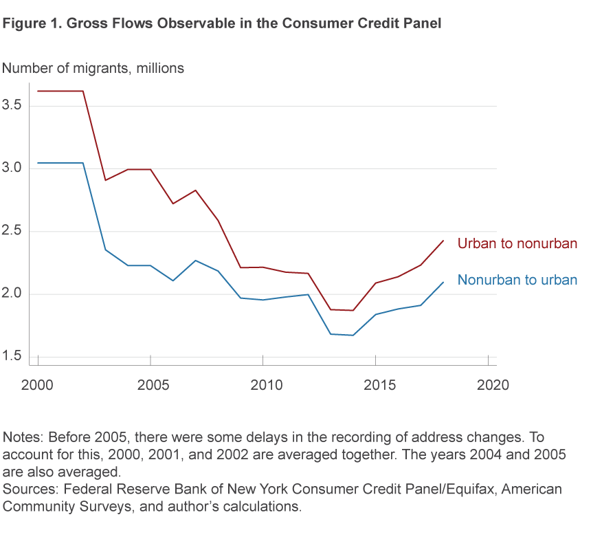
While inflows decreased from over 3 million in the early 2000s to close to 2 million today, outflows decreased more, especially between 2007 and 2011. As a result, the net population outflow from urban neighborhoods declined from almost 600,000 people per year before 2009 to an average of less than 250,000 since 2009. Moreover, this narrowed gap has endured even as both inflows and outflows increased in the most recent years of the economic expansion. The net loss of domestic migrants offsets the sources of urban population growth—births, international in-migration, and rising life expectancies—and the slower domestic net outflows are, the less they offset these other growth factors.
Are Younger Cohorts’ Migration Flows Different?
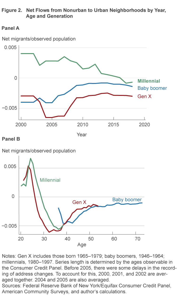
In figure 2, the net flow of domestic migrants is broken out by generation and plotted first by year (Panel A) and then by age (Panel B). Generation names are those commonly used and include “baby boomers” for people born between 1946 and 1964, “Generation X” (Gen X) for those born between 1965 and 1979, and “millennials” for those born from 1980 onward. Since 2000, baby boomers and Gen Xers have been flowing out of urban areas on net. Millennials were, on net, migrating into urban neighborhoods until 2015. The difference in flows reflects which life stage each generation was in from 2000 to 2018. In figure 2B, we can see that Gen Xers also moved toward urban areas when they were in their early 20s. While the age migration profiles of Gen Xers and millennials have very similar shapes and magnitudes, both the millennials’ inflows and outflows were delayed to later ages relative to the flows of Gen Xers. As mentioned above, many milestones including leaving one’s parents’ home, getting married, and having children have been delayed for millennials relative to prior generations. For the people who are spending a few years living in an urban neighborhood, this stage seems to have been shifted from their early and mid-20s to their late 20s.
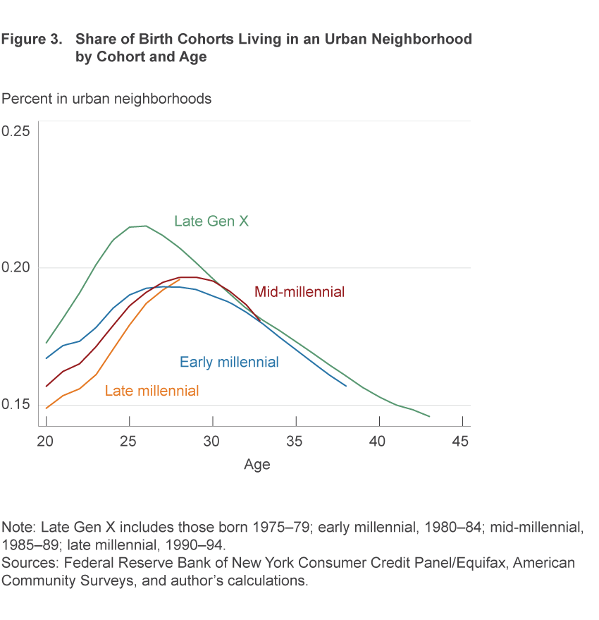
Another way the flows of younger generations differ from those of older generations is that each younger cohort has had to offset the greater suburbanization of its parents. In figure 3, this is visible in the percent of individuals in the CCP sample who lived in urban neighborhoods at age 20. People born in the early 1990s were 2.4 percentage points less urbanized at age 20 than the people born in the late 1970s. The urbanization of people born between 1985 and 1994 increases rapidly through their late 20s, but it does not completely offset their lower initial level of urbanization. The urbanization of people born from 1975 to 1979 peaked at age 26, reaching 21.5 percent. The early millennials (born between 1980 and 1984) peaked at age 27 with only 19.3 percent urbanization. Those born between 1985 and 1989 peaked at age 29 with 19.7 percent urbanization. While millennials had somewhat lower urbanization rates than Gen Xers, the larger size of their cohorts offsets this and results in the increased urban population for 20-to-34 year olds seen in table 1.
Are Urban Areas Attracting the Educationally and Economically Advantaged or Disadvantaged?
Urban neighborhoods have experienced an increase in the education levels and earning power of their residents. The households in urban neighborhoods today can provide a deeper tax base for local governments and a more lucrative customer base for merchants. Table 2 illustrates the significant increase in the population of degree holders in urban neighborhoods that happened between 2000 and 2017. In 2000, 22.3 percent of urban adults had a college degree; by 2017, the share in urban areas had risen to 30.0 percent.
| Education | 2000 | 2017 | Growth (percent) |
|---|---|---|---|
| Less than high school | 10.7 | 8.3 | −23 |
| High school | 19.9 | 24.6 | 24 |
| College degree | 5.6 | 8.8 | 57 |
| Graduate degree | 3.2 | 5.3 | 64 |
|
|
|
|
|
| Income quintile | 2000 | 2017 | Growth (percent) |
| First | 19.4 | 20.6 | 6 |
| Second | 9.6 | 11.4 | 19 |
| Third | 7.2 | 8.6 | 19 |
| Fourth | 6.9 | 7.9 | 14 |
| Fifth | 8.4 | 12.0 | 43 |
Sources: 2000 and 2010 Decennial Census, American Community Surveys 2011–2015, and author’s calculations
Urban neighborhoods have also become higher-income over the past two decades. In table 2, I categorize each neighborhood by where its per capita income fell in the national distribution in 2000 and in 2017 and report the number of people living in those income quintiles in urban neighborhoods. The urban population in bottom-quintile neighborhoods is still higher than in any of the other quintiles, but it experienced slow growth from 2000 to 2007. The largest urban population increase was seen in top-quintile neighborhoods. By 2017, the share of the urban population in top income-quintile neighborhoods equaled that in nonurban neighborhoods—approximately 20 percent.
The CCP does not have education or income data, but categorizing people based on their credit history can suggest whether it is the more advantaged or less advantaged who are participating in the flows into and out of urban neighborhoods. The Equifax Risk Score reported in the CCP is based on the individual’s credit history. A higher score suggests the borrower is more likely to repay his or her debts. The score is positively correlated with income and other measures of socioeconomic status. Figure 4A shows the net flows of Gen X and millennial populations into urban areas by risk score. Individuals are categorized by whether their risk score is above or below the median for people who are the same age that year.
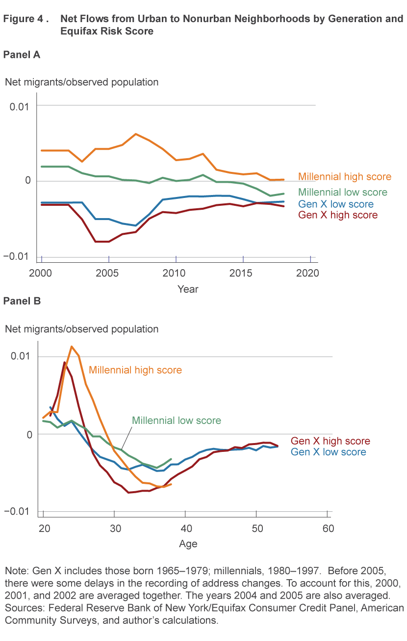
For Gen X borrowers, net flows out of urban areas since 2000 were modestly larger for those with an above-median score than for those with below-median scores. Until the last couple years, millennials with above-median risk scores were more likely to be moving into an urban neighborhood than out. There was almost no net flow of millennials with below-median scores between 2004 and 2014. Given their relative magnitudes, the Gen X flows would have pushed urban neighborhoods toward a lower distribution of socioeconomic status. The millennial flows did the opposite.
As with the overall flows, the risk score migration patterns vary with the ages over which we can observe the generations. Figure 4B shows the net flows by age. People with high scores and people with low scores are both more likely to move into an urban neighborhood in their early and mid-20s and more likely to move out of an urban neighborhood in their 30s. The net flow of people with better credit histories is larger than the net flow of people with weaker credit histories both for the flow into urban neighborhoods and the flow out. While many of the individuals with strong credit who migrate in later migrate out, their migration into urban areas is likely voluntary because their consistent repayment of their debts suggests they could afford many suburban housing options.
Conclusion
Since 2000, the population of Americans living in urban neighborhoods has been rising. The increase is the result of both young adults migrating into urban neighborhoods and senior citizens aging in place. The flows of millennials into urban neighborhoods have offset the outflows of Gen Xers. In addition, the urban populations have become more educated and well to do. There have been substantial increases in the share of urban residents who hold undergraduate and graduate degrees, as well as increases in high-income individuals. The migration patterns of people with strong credit histories suggests that urban living is a lifestyle of choice for many, rather than a refuge only for people who cannot afford suburban housing. This analysis reports national aggregate figures, so it tells us at least that population growth in the metro areas with the strongest urban neighborhoods is greater than the population losses that are still happening in metro areas with weaker urban neighborhoods. The national increases in population and the socioeconomic status of urban residents confirms the on-the-street impression that urban neighborhoods can successfully compete for educated and higher-income residents. While declining urban neighborhoods may still outnumber growing urban neighborhoods within some regions, urban leaders there can work toward population or tax base growth knowing that consumer tastes and national trends are favorable to those goals.
Footnotes
- Population changes in any area are driven by births, deaths, and migration flows. The urban population reported here can also change through neighborhoods’ gaining or losing the “urban” designation. For example, the construction of a major high-rise might lift a neighborhood above the density threshold, and everyone living in the neighborhood would then be added to the urban population count. Return to 1
Suggested Citation
Whitaker, Stephan D. 2019. “Population, Migration, and Generations in Urban Neighborhoods.” Federal Reserve Bank of Cleveland, Economic Commentary 2019-08. https://doi.org/10.26509/frbc-ec-201908
This work by Federal Reserve Bank of Cleveland is licensed under Creative Commons Attribution-NonCommercial 4.0 International

