

- Share
Getting to Accuracy: Measuring COVID-19 by Mortality Rates and Percentage Changes
Relying on confirmed cases to compare the trajectory of the COVID-19 epidemic in different countries has significant limitations. Measuring mortality rates and their percentage changes proves to be a superior way to track the progression of the disease. The method shows that, as of April 5, the epidemic in the United States has a similar mortality rate to those in Europe and is more deadly than in China and South Korea.
The views authors express in District Data Briefs are theirs and not necessarily those of the Federal Reserve Bank of Cleveland or the Board of Governors of the Federal Reserve System. The series editor is Harrison Markel.
Comparing the trajectory of the COVID-19 epidemic in the United States to that of other countries can provide important insights into how the virus is progressing in the United States and the effectiveness of our response. The quality of those insights depends on the data we choose to compare and how we conduct that comparison. This report argues that cumulative mortality rates and their percentage changes are the best available measures for comparing the trajectory of the epidemic in different countries. Based on these measures, the epidemic in the United States has a similar mortality rate to those in Europe and is more deadly than in China and South Korea.
A number of broadly used sources report counts of confirmed COVID-19 cases and deaths.1 These sources typically focus primarily on case counts, which have the advantage of being the earliest indicator of an epidemic. However, case counts have two significant limitations when comparing across countries. First, case counts depend on the size of a country’s population—all else equal, the higher the population, the greater the number of cases. Second, case counts depend on the breadth, accuracy, reporting, and speed of testing—all of which have varied across nations. The first concern can be addressed by dividing case counts by population to get case rates, but the second concern remains.
Mortality rates are better suited for comparison because they are scaled by population size and fairly consistently measured across geography and time. This advantage is evident in the cumulative COVID-19 case and mortality rates in Spain and Switzerland on April 5, 2020. Spain and Switzerland have similar case rates (2,818 per million and 2,478 per million, respectively), but Spain’s mortality rate is more than triple Switzerland’s (271 per million and 84 per million, respectively).
The definition of the mortality rate for this report is the cumulative reported number of COVID-19 deaths per 1 million residents.2 While mortality rates are the best available measure for comparing COVID-19 epidemics, they may not be perfect—some countries may have unreported deaths.3
COVID-19 spreads at different rates in different countries. As a result, it can be misleading to compare data by calendar days. Aatish Bhatia makes this point clear in his graph, which shows the relationship between the cumulative number of cases and number of cases in the prior week for many countries. The following graphs build on Bhatia’s work by using mortality rates and examining the 7-day moving average of the daily percentage changes in these rates. Looking at the percentage change makes it easier to see changes in the rate of growth and to understand how fast an epidemic is growing.
Graph 1 shows the mortality rate on the horizontal axis and the average daily percentage change in this rate on the vertical axis. The mortality rate is cumulative and, within a country, time is moving left to right. There is a week of data between each pair of small vertical bars on the lines in this graph. The last data point for each country is April 5, 2020. To reduce noise early in many countries’ trajectories, the data for a country is excluded until it has had at least 5 cumulative deaths for 7 days.
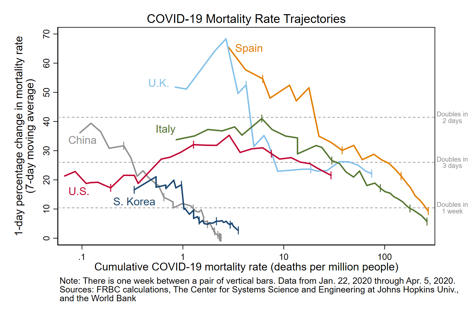
Note:
- Thanks to Andrew Gelman and his readers at Statistical Modeling, Causal Inference, and Social Science for their comments related to the charts in this piece. We’ve modified them accordingly to make the information conveyed here clearer. The vertical axis of each graph now displays the 7-day moving average of the daily percent change in the COVID-19 cumulative mortality rate. To put these percentage changes into context, there are now reference lines showing the percentage change associated with this mortality rate doubling in 2, 3, and 7 days. To reduce noise early in many countries’ trajectories, the data for a country is excluded until it had at least 5 cumulative deaths for 7 days. The correct dates that the mortality rate in Italy and Spain stopped doubling or more in a 7-day period are March 29, 2020, and April 4, 2020, respectively.
The mortality rates show how deadly the epidemic has been for each nation. Note that this axis has a log scale, so values rise rapidly from left to right. To lend context to this scale, on April 5, 2020, the cumulative mortality rate was 4 per million in South Korea and 271 per million in Spain. Based on these mortality rates, the epidemics in China and South Korea have been much less deadly than those in Italy, Spain, the United Kingdom, and the United States. The latest mortality rate for the United States is 29 per million.
The dashed reference lines show the percentage change associated with the mortality rate doubling in 2, 3, and 7 days. Above the reference line at 10.4 percent, the mortality rate is more than doubling in a single week. The United Kingdom and the United States are currently at this phase of their epidemics. The next phase of an epidemic is when the mortality rate is still rapidly rising, but no longer doubling in a week. Italy and Spain reached this milestone on March 29, 2020, and April 4, 2020, respectively. China and South Korea have reached the third phase of an epidemic, during which the mortality rate changes little from day to day.
Another way to get a sense of how the United States’ epidemic compares to that of other countries is to look at changes over time. The beginning of each country’s epidemic is unique (and missing for China because the earliest data point is from January 22, 2020). Therefore, graph 2 shows the average daily percentage changes from the first day the mortality rates exceeded 1 per million, for up to 35 days.
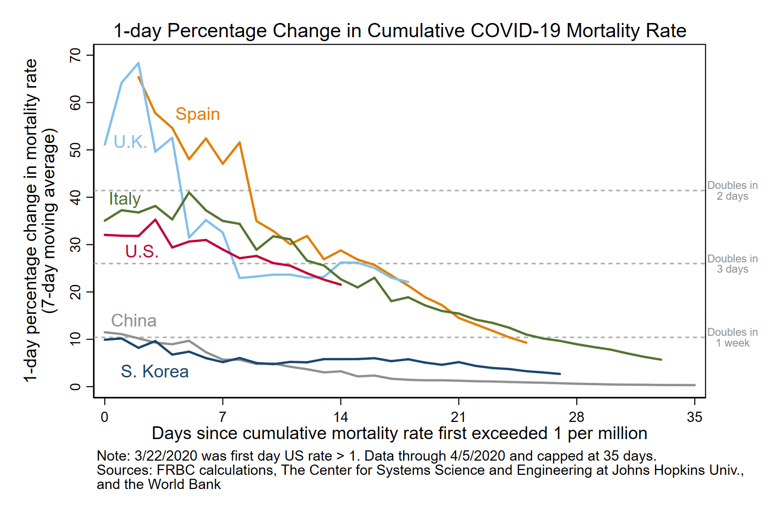
The most important lesson to take from this graph is that COVID-19 epidemics do not always slow down smoothly over time. For example, both South Korea and the United Kingdom had periods during which the rate of change was little changed for a week or more. I hope the United States will follow the more common trend and our epidemic will continue to decelerate in the weeks ahead.
An upcoming report will present similar trends for US states, particularly those of the Federal Reserve Bank of Cleveland’s Fourth District. That report further illuminates the United States’ epidemic, including why its beginning had an atypical trajectory.
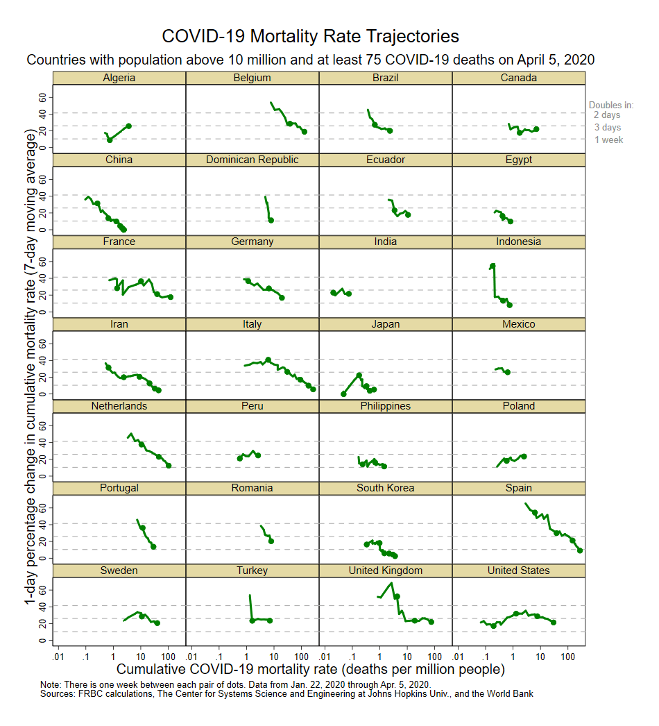
Note: Graph 3 is a supplemental graph that shows the cumulative COVID-19 mortality rate and 7-day moving average of the daily percentage change in that rate for each of 28 countries with population of more than 10 million and at least 75 COVID-19 deaths as of April 5, 2020.
Footnotes
- See www.nytimes.com/interactive/2020/us/coronavirus-us-cases.html and www.coronavirus.jhu.edu/map.html. Return to 1
- The COVID-19 data comes from The Center for Systems Science and Engineering at Johns Hopkins University, https://github.com/CSSEGISandData/COVID-19/tree/master/csse_covid_19_data/csse_covid_19_time_series. The 2018 population data comes from The World Bank, www.data.worldbank.org/indicator/sp.pop.totl?name_desc=false. Return to 2
- For example, www.economist.com/graphic-detail/2020/04/03/covid-19s-death-toll-appears-higher-than-official-figures-suggest and https://fortune.com/2020/04/01/china-coronavirus-cases-deaths-total-under-report-cover-up-covid-19/. Return to 3
Suggested Citation
Elvery, Joel A. 2020. “Getting to Accuracy: Measuring COVID-19 by Mortality Rates and Percentage Changes.” Federal Reserve Bank of Cleveland, Cleveland Fed District Data Brief. https://doi.org/10.26509/frbc-ddb-20200408
This work by Federal Reserve Bank of Cleveland is licensed under Creative Commons Attribution-NonCommercial 4.0 International

