

- Share
Housing Recovery: How Far Have We Come?
Four years into the economic recovery, housing markets have finally started to improve. While many indicators of activity indicate recent growth, comparing over time and across the United States suggests that many regional housing markets are looking better now only in comparison to where they were during the recession. The recovery in housing markets does appear to be gaining steam, but it remains a work in progress in many places.

The views authors express in Economic Commentary are theirs and not necessarily those of the Federal Reserve Bank of Cleveland or the Board of Governors of the Federal Reserve System. The series editor is Tasia Hane. This paper and its data are subject to revision; please visit clevelandfed.org for updates.
Economic recoveries typically start with a boost in building activity. But this recovery has been different. Housing markets lagged at the onset of the recovery and stayed weak long after, with home prices continuing to decline through 2011, and building activity remaining at muted levels. This is not surprising, given the role that housing played in the financial crisis and subsequent Great Recession.
Finally, over the course of the past year, housing has started to pick up. Residential investment increased by almost 21 percent—the biggest year-over-year increase since 2004. Moreover, home prices have firmed up across the country, with year-over-year gains averaging 12.5 percent in the 20 housing markets that are tracked by the Case-Shiller index.
This Commentary takes stock of the recent gains to assess how much progress we have made. We show that despite recent increases, home prices in many of the 20 Case-Shiller markets are no higher in real terms than they were in 2000. We also find that regional housing markets have not all shared equally in the recovery of housing prices—rather, gains are concentrated in specific locales.
Signs of National Recovery
A key variable in gauging the strength of the housing market is housing starts. Housing starts measure the number of housing units that begin construction in a given month. Housing permits are useful, too, because they give a sense of future construction activity. Figure 1 shows the path of housing starts and housing permits from 1990 to the middle of 2013. The boom-bust cycle from 2003 to 2007 is quite evident, as is the subsequent recovery.
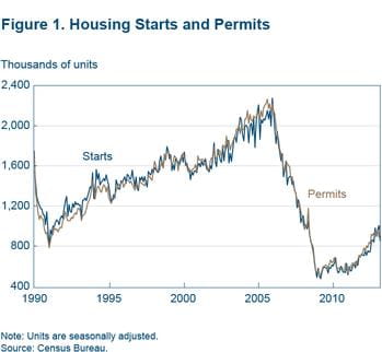
The figure also shows that housing starts and permitting activity have picked up substantially since 2010—increasing by 50 percent. Still, they remain at low levels compared to the 1990s and 2000s. In fact, they are hovering around the levels seen during the low point of the recession of the early 1990s—a time when the US population was about 20 percent below where it stands today.
What’s Been Driving the Pace of Residential Building?
The subdued level of residential construction activity is likely the result of several factors. First, there was an overhang of inventory to work off before new homes could be built. The overhang built up during the early 2000s, when the supply of new homes likely outpaced demand.
Second, that overhang has been harder to whittle down, because homes have been moving out of the “shadow inventory” and back onto the market. This movement is due both to homes having finally made it through the foreclosure process (with some properties having been vacant for several years) and to sellers simply waiting for the market to improve.
Finally, the demand for housing fell during and following the most recent recession on account of weak income growth and lower levels of household formation, as children moved back in with parents rather than getting their own place.
Healthy Growth in Multifamily Structures
Looking more closely at the types of residential structures being built reveals that while new construction of single-family homes remains quite low, construction of multifamily units is back near its average during the late 1990s and early 2000s (figure 2).
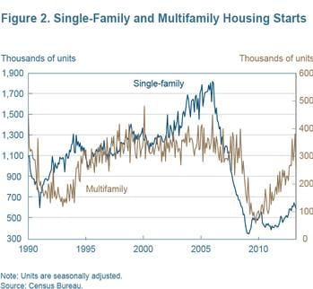
This difference may reflect the permanent impact of the crisis on people’s preference for owner-occupied or rental housing. In the aftermath of the housing bust, some potential homebuyers now realize that rental properties may be a more appropriate housing option for their circumstances. Moreover, underwriting standards have risen, which will likely delay home purchases for younger families and for individuals with blemished credit records.
Other Promising Signs of Stabilization
One sign that housing markets may be back to a somewhat more stable equilibrium is that the number of units of housing on the market and the pace of sales are back to more normal rates (figure 3).
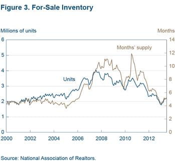
Prior to the recession, there was roughly five months of inventory available, given the sales rate at that time. In the recession, the months of inventory doubled as the rate of sales declined sharply. Basically, home sellers had to wait much longer, on average, to sell their homes as buyers withdrew from the market.
Today, the market is back to pre-recession inventory levels, according to the months-of-supply-inventory metric. This is a sign that some of the things dragging down the housing recovery—excess inventory and lower rates of household formation—may be abating.
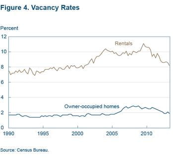
Another indication that housing markets are stabilizing is that vacancy rates are returning to trend. While a certain proportion of housing units are typically vacant due to households moving from one unit to another, a rise in vacancy rates above that level may indicate a glut of housing supply.
The run-up in building activity prior to the Great Recession resulted in a rise in vacancy rates in both rental and owner-occupied properties, though rental vacancy rates began increasing much earlier (figure 4). In the aftermath of the Great Recession, we have seen rental and owner-occupied vacancy rates fall back down to levels closer to those typically seen in the 1990s and early 2000s.
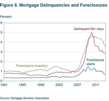
These measures of inventories and housing vacancy rates are linked closely to the foreclosure crisis. Foreclosure and delinquency rates shot up to unprecedented levels during the recession and have been slow to come back down, but progress is being made. In the past few years the foreclosure inventory has begun to fall substantially.
Another good sign for housing markets in the future is that the proportion of mortgages in default (measured as three or more missed payments) has dropped sharply in recent years (figure 5). The fraction of mortgages entering the foreclosure process has also been declining. That said, there are still many homes working their way through the foreclosure process and, as mentioned above, this is likely to act as a continuing constraint on building activity.
Home prices are also showing lasting signs of improvement. Home prices grew nationally, in nominal terms, by more than 10 percent over the past year after about four years of decline or stagnation (figure 6).
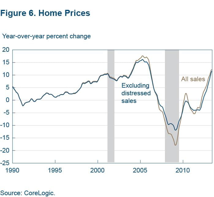
Another good sign is that prices are increasing at about the same rate whether one looks at repeat sale indexes that include or exclude distressed properties—properties that are physically or financially in bad shape. During the depths of the recession, price declines were steeper when distressed properties were included in the calculations. This suggests that the price growth of distressed properties is no longer below that of nondistressed properties.
Different Housing Recoveries, Depending Where You Look
While home prices have been rising robustly at the national level over the past year, growth has varied quite a bit depending on the region. California, Nevada, Arizona, parts of Florida, and areas near Atlanta, Georgia, saw the steepest growth from February 2012 to February 2013 (figure 7).
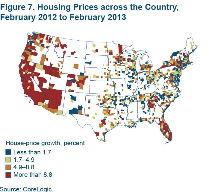
These are many of the same places that experienced the greatest drop-off in prices during the bust. In fact, we find that home-price growth over the past year is positively correlated with home-price declines over the previous five years. On average, a one-standard-deviation drop in prices from 2007 to 2012 (a 14 percent drop) is associated with higher price growth of 1.7 percentage points from 2012 to 2013. (Average price growth across all counties was 5.3 percent).
Counties that had the least price growth over the past year tended to be those in the middle of the country, which had smaller booms in the early 2000s and smaller busts in the past five years.
Prices also grew faster in areas with improved rates of mortgage default. Home prices are positively correlated with declines in mortgage default over the previous three years, though the relationship depends on whether a property is located in a judicial or nonjudicial foreclosure state. Nonjudicial foreclosure states are states where foreclosures are handled in an administrative rather than a judicial setting. Typically, the foreclosure timeline is shorter in nonjudicial states.
In nonjudicial states, a one-standard-deviation decrease (1.5 percentage points) in the proportion of mortgage holders in default from 2009:Q4 to 2012:Q4 is associated with about 0.8 percentage points of higher price growth in the past year. There is less of a relationship in judicial states. On average, counties in judicial states saw about 2 percentage points lower home-price growth, but the relationship between the change in the proportion of mortgage holders in default and home-price growth is not statistically distinguishable from zero in these states.
Finally, prices also grew faster in regions that are growing. A one-standard-deviation increase in a county’s population growth (0.9 percentage points) from 2011 to 2012 (the most recently available data) is associated with about 0.5 percentage points of higher home-price growth from February 2012 to February 2013.
There does not seem to be much of a relationship between recent changes in unemployment rates and home-price growth across counties, holding constant the previously mentioned variables.
Housing Prices over the Long Run
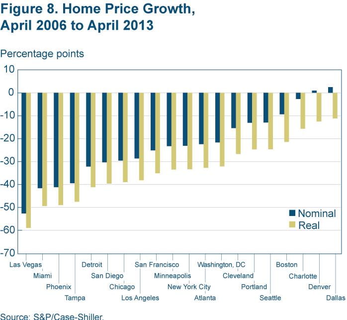
While home prices have started to rise in many areas over the last year, we need to remember where we came from. Prices fell into such a deep hole, that in spite of recent growth, they have not yet caught up to pre-recession levels. Figure 8 shows that 18 of the 20 housing markets tracked by the Case-Shiller indexes are still below their 2006 level. When prices are adjusted for inflation, all 20 markets are down at least 10 percent since 2006. While the paths of home prices have certainly improved, the recovery in
many markets remains a work in progress.
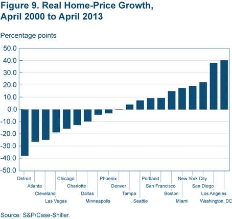
Looking at growth since 2000, we see that about half of the cities (mostly on the coasts) have experienced increases in home prices since then, once prices are adjusted for inflation (figure 9). These are locations where relative demand due to population and income growth has generally been strong, and the housing supply may be more tightly constrained due to geography. For the other half (all in the interior of the country), prices are lower than they were in 2000.
Conclusion
The recovery in housing markets does appear to be gaining steam. At the national level, construction and permitting activity has picked up, inventories of homes for sale and vacancy rates have returned to historically normal levels, foreclosure inventories and mortgage-default rates have begun to fall, and housing prices have increased by more than 10 percent (in nominal terms).
However, these national statistics obscure a good deal of regional variation in home-price growth. Home-price growth over the past year has been higher, on average, in counties where prices fell the most precipitously over the five prior years. Looking farther back, we see that prices have appreciated significantly only in coastal markets since 2000, once we adjust prices for inflation. In many markets, prices are near or below their 2000 level.
Taking the recent data together, the housing market seems to be operating in a more normal, pre-boom-and-bust state. Though not brisk enough to make up for past losses in some places, it does seem to be on firm footing.
Suggested Citation
Fee, Kyle D., and Daniel A. Hartley. 2013. “Housing Recovery: How Far Have We Come?” Federal Reserve Bank of Cleveland, Economic Commentary 2013-11. https://doi.org/10.26509/frbc-ec-201311
This work by Federal Reserve Bank of Cleveland is licensed under Creative Commons Attribution-NonCommercial 4.0 International

