

- Share
The Concentration of Poverty Within Metropolitan Areas
Not only has poverty recently increased in the United States, it has also become more concentrated. This Commentary documents changes in the concentration of poverty in metropolitan areas over the last decade. The analysis shows that the concentration of poverty tends to be highest in northern cities, and that wherever overall poverty or unemployment rates went up the most over the course of the decade, the concentration of poverty tended to increase there as well.

The views authors express in Economic Commentary are theirs and not necessarily those of the Federal Reserve Bank of Cleveland or the Board of Governors of the Federal Reserve System. The series editor is Tasia Hane. This paper and its data are subject to revision; please visit clevelandfed.org for updates.
Over the course of the last decade, the poverty rate in the United States rose from 11.3 percent to 15.0 percent. From a geographic perspective, the increase has been widespread, as 49 out of the 50 states have seen a rise in poverty rates from 1999 to 2011. Clearly, this rise in poverty is linked closely to economic conditions, with many families and individuals seeing declining incomes during the Great Recession. The manufacturing states of the Midwest saw particularly sharp increases in poverty rates over this time period.
At the same time that the overall level of poverty was rising in the United States, the concentration of poverty was also increasing. While poverty tended to increase in all neighborhoods, this increase was most rapid in neighborhoods that already had a large share of poor residents. This increase in the concentration of poverty is a distinct cause for concern because the disadvantages to an individual from being poor are thought to be either muted or amplified depending on the poverty in their neighborhood. Neighborhoods with many poor residents typically have less access to job opportunities, face higher crime rates, and incur a range of other social problems.
This Commentary documents changes in the concentration of poverty that have occurred over the last decade, focusing on changes within metropolitan areas in the United States. The analysis shows that metropolitan areas with the greatest concentration of poverty are northern cities, and that an increased poverty or unemployment rate at the metro-level implies a larger increase in the neighborhood poverty rates of the poor than of the nonpoor.
Measuring the Concentration of Poverty
The official poverty measure of the U.S. Census Bureau is defined at the family level in terms of absolute income thresholds. In 2010, for example, the U.S. Census Bureau defined the poverty threshold to be $22,113 for a family of four with two children. If such a family’s total income was less than this threshold, then that family and every individual in it was considered to be in poverty. The official poverty measure was created to reflect the level of income below which families lack the resources necessary to provide the food, shelter, and clothing needed for healthy living.1
Based on this poverty definition for a family, all individuals in the United States can be identified as being poor or nonpoor. Then for any geographic area—a neighborhood, city, or metropolitan area—the share of the population that lives in poverty can be constructed. In our analysis, two levels of geography are employed, the neighborhood and the metropolitan area. The poverty rate for a neighborhood is simply the share of individuals who live below the poverty line in a census tract. A census tract typically contains around 4,000 residents. The metropolitan area then is made up of a collection of neighborhoods (census tracts) that are within the same broad labor market. For example, the Cleveland metropolitan area contains 636 such census tracts.
Whether poverty is concentrated or dispersed depends on how poor individuals are distributed across a region. Suppose a small metropolitan area had 10 neighborhoods with 4,000 residents in each neighborhood and a total of 4,000 people living in poverty. This metro area would have a poverty rate of 10 percent ((4,000 ÷ 40,000) × 100%).
If all the poor lived in one neighborhood, this would reflect the most extreme form of concentration, as the poor neighborhood would have a poverty rate of 100 percent and all the other neighborhoods in the region would have a poverty rate of 0 percent.
On the other end of the spectrum, if poor individuals were distributed equally across all neighborhoods, then each neighborhood would have 400 people in poverty and a poverty rate of 10 percent. The poor and nonpoor would live in neighborhoods with identical poverty rates. This discussion helps to put the actual concentration of poverty into perspective: In the period 2006–2010, 50 percent of the poor in the United States lived in “poverty areas,” or census tracts with poverty rates exceeding 20 percent. Only 18 percent of nonpoor people lived in tracts with such high-poverty rates.
Differences in the Concentration of Poverty Across Metro Areas
Figure 1 shows the distribution of poor and nonpoor residents in metro areas in the United States in 2000 by the neighborhood poverty rate. We can immediately see that the poor lived in neighborhoods with much higher poverty rates than the nonpoor. While half of the poor lived in neighborhoods with poverty rates greater than 18.6 percent, only 16 percent of the nonpoor lived in neighborhoods with rates that high. Note that if the poor were evenly distributed across neighborhoods in the United States, then the poor and nonpoor distributions in figure 1 would be exactly the same, and the poverty rate of every neighborhood would match the overall poverty rate of the entire U.S. population.
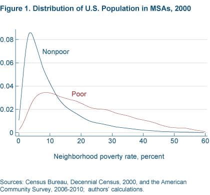
Sources: Census Bureau, Decennial Census, 2000, and the American Community Survey, 2006-2010, authors' calculations.
In order to analyze how the concentration of poverty has changed in metropolitan areas of the United States, a measure of metropolitan concentration is needed. We define the concentration of poverty within a metro area as the difference in the neighborhood poverty rates of the neighborhood where the median poor person lives and the neighborhood where the median nonpoor person lives. To construct the concentration measure, census-tract-level data from the 2000 Decennial Census and the 2006—2010 American Community Survey (ACS) are employed. The ACS is a smaller sample than the Decennial Census and relies on five-year samples to produce accurate tract-level statistics. Both the 2000 Census and the 2006–2010 ACS data are accessed using the National Historical Geographic Information System (NHGIS). Finally, this analysis focuses on the 100 largest MSAs by population in the United States in 2000.
This measure is illustrated in figure 2. The figure shows the distribution of neighborhood poverty rates for the poor and nonpoor for the two cities in our sample with the least and greatest concentration—Scranton, Pennsylvania, and Milwaukee, Wisconsin. The four vertical lines represent the median neighborhood poverty rate for poor and nonpoor residents for each of the cities. Our measure of concentrated poverty is the differences in these vertical lines for each metropolitan area—a larger difference means greater concentration of poverty.
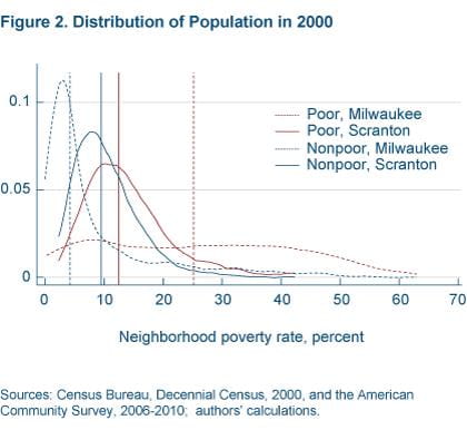
Sources: Census Bureau, Decennial Census, 2000, and the American Community Survey, 2006-2010, authors' calculations.
Focusing first on Scranton, we see that the median poor and nonpoor live in neighborhoods with relatively similar poverty rates. The difference in the poverty rates in these neighborhoods is 3 percentage points. In contrast, the median poor and nonpoor live in neighborhoods with very different poverty rates in Milwaukee. There the difference in poverty rates is 21 percentage points.
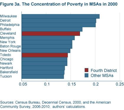
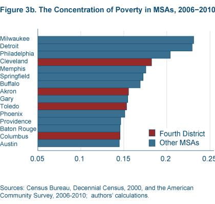
Figures 3a and 3b show the measure of the concentration of poverty for the 15 most concentrated metro areas in the 2000 and 2006–2010 samples. Several points are worth noting. First, in both figures, old industrial metro areas have the highest concentrated poverty and are located in the top area of the chart. Second, there was a substantial shift out in the distribution of concentrated poverty between 2000 (figure 3a) and 2006–2010 (figure 3b). Third, Federal Reserve Fourth District metro areas are well represented in figure 3b.
Sources: Census Bureau, Decennial Census, 2000, and the American Community Survey, 2006-2010, authors' calculations.
Sources: Census Bureau, Decennial Census, 2000, and the American Community Survey, 2006-2010, authors' calculations.
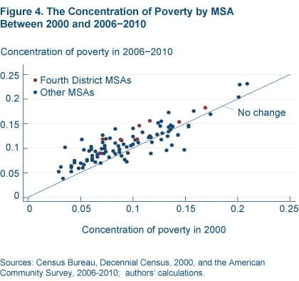
The increased concentration of poverty across the top 100 metro areas is shown clearly in figure 4. Metro areas above the 45 degree line in the figure experienced an increase in concentration over the years in question, while metro areas below the 45 degree line experienced a decrease in the concentration of poverty. We can clearly see that most metropolitan areas experienced an increase in concentration: Of the 100 metro areas in our sample, 83 experienced an increase in concentration.
All eight Fourth District metro areas in our sample experienced increases in concentration. Figure 4 also shows that concentrated poverty is persistent. Metro areas with high degrees of concentrated poverty in 2000 tended to have high degrees of concentrated poverty in 2006–2010, and vice versa.
Sources: Census Bureau, Decennial Census, 2000, and the American Community Survey, 2006-2010, authors' calculations.
Recent Changes in the Concentration of Poverty
We know that the overall poverty rate increased dramatically from 11.3 percent to 15.3 percent between 2000 and 2010. Unsurprisingly, the median neighborhood poverty rate also increased between 2000 and 2006–2010, from 8.4 percent to 10.9 percent. However, it should be noted that while these are the most recent tract-level data available, they do not reflect the full effect of the recession since the averages contain data from years that preceded the recession (2006 and 2007).
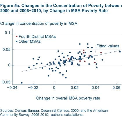
Despite these recent increases in poverty rates at the individual, neighborhood, and metropolitan levels, it does not necessary follow that the concentration of poverty also increased. It could be that all neighborhoods in a region are equally affected by the rise in overall poverty rates. However, that is not the case. What we find is the metropolitan areas that experienced a sharper rise in poverty rates also experienced an increase in the concentration of poverty (figure 5a). In these metro areas the difference in neighborhood poverty rates of the median poor person and the median nonpoor person was growing wider.
Sources: Census Bureau, Decennial Census, 2000, and the American Community Survey, 2006-2010, authors' calculations.
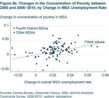
Not surprisingly, this rise in the concentration of poverty was also related to changes in economic conditions in metropolitan areas. Metropolitan areas that had larger increases in unemployment rates tended to have somewhat higher increases in concentrated poverty (figure 5b). This is suggestive of the fact that poorer neighborhoods’ poverty rose more sharply in metros that were facing weak economic conditions.
Sources: Census Bureau, Decennial Census, 2000, and the American Community Survey, 2006-2010, authors' calculations.
Recent Changes in the Concentration of Poverty in Fourth District MSAs
The concentration of poverty also rose markedly in many Fourth District metro areas over the period 2000 to 2006–2010 (table 1). Both Cleveland and Toledo were in the top-ten most concentrated metro areas in 2000, and both had maintained such a ranking by 2006–2010.
| Fourth District MSA | Rank in 2000 | Rank in 2006−2010 | Change in position |
|---|---|---|---|
| Akron, Ohio | 31 | 8 | −23 |
| Cincinnati-Middletown, OH-KY-IN | 51 | 40 | −11 |
| Cleveland-Elyria-Mentor, OH | 5 | 4 | −1 |
| Columbus, OH | 35 | 14 | −21 |
| Dayton, OH | 37 | 36 | −1 |
| Pittsburgh, PA | 73 | 71 | −2 |
| Toledo, OH | 10 | 10 | 0 |
| Youngstown-Warren-Boardman, OH-PA | 69 | 37 | −32 |
Note: Rankings are among the 100 largest U.S. MSAs in 2000.
Sources: Census Bureau, Decennial Census, 2000, and the American Community Survey, 2006–2010; authors’ calculations.
Compare that with the experiences of Akron, Ohio, and Columbus, Ohio. Akron and Columbus were ranked 31st and 35th, respectively, in 2000. Poverty in both of these metro areas was relatively concentrated, but not extremely so in 2000. But by 2006–2010, both of these metro areas had experienced large increases in the concentration of poverty.
Although Cincinnati, Ohio, and Youngstown, Ohio, did not have extremely concentrated poverty in 2000, their relative rankings had become significantly worse by 2006–2010. Dayton, Ohio, and Pittsburgh, Pennsylvania, were the only major Fourth District metro areas that neither were highly concentrated in 2000 nor experienced large relative increases in poverty concentration between 2000 and 2006–2010. The movement up in the rankings of concentration for so many Ohio metro areas reflects, in large part, the severity of the recession in Ohio.
Conclusion
In the 1990s, the overall poverty rate was falling and the share of people living in high-poverty neighborhoods was decreasing. But in the last decade, the concentration of poverty has increased, reversing progress made in the 1990s. It is important to note that the full effects of the Great Recession are likely not fully reflected in our data, as the end period of the data in our sample is averaged over the years 2006 through 2010. We expect that as the sample window shifts forward, estimates of neighborhood poverty rates will rise, and it is possible that the concentration of poverty will continue to rise.
The key issue going forward will be whether the increased concentration of poverty is persistent or reverts back to its pre-recession levels. If the rise is persistent, then policymakers will need to look carefully at programs that mitigate the negative outcomes associated with such concentration of poverty.
Footnote
- This official poverty measure has some well-documented weaknesses, and the Census Bureau and the Bureau of Labor Statistics have been developing an improved, supplemental poverty measure (Short and Garner 2012). Return to 1
Further Reading
- “Areas with Concentrated Poverty: 2006–2010.” Alemayehu Bishaw, 2011. American Community Survey Briefs: U.S. Census Bureau.
- “Poverty: 2010 and 2011.” Alemayehu Bishaw, 2012. American Community Survey Briefs: U.S. Census Bureau.
- “The Enduring Challenge of Concentrated Poverty in America: Case Studies from Communities across the U.S.” Federal Reserve System/Brookings Institution, 2008.
- “Poverty and Place: Ghettos, Barrios, and the American City.” Paul A. Jargowsky, 1997. New York: Russell Sage Foundation.
- “The Changing Face of Poverty in Northeast Ohio.” Richey Piiparinen and Claudia Coulton, 2012. Case Western Reserve University: Center on Urban Poverty and Community Development.
- “The Supplemental Poverty Measure: A Joint Project between the Census Bureau and the Bureau of Labor Statistics.” Kathleen S. Short and Thesia I. Garner, 2012. Federal Economic Statistics Advisory Committee.
Suggested Citation
Aliprantis, Dionissi, Kyle D. Fee, and Nelson Oliver. 2013. “The Concentration of Poverty Within Metropolitan Areas.” Federal Reserve Bank of Cleveland, Economic Commentary 2013-01. https://doi.org/10.26509/frbc-ec-201301
This work by Federal Reserve Bank of Cleveland is licensed under Creative Commons Attribution-NonCommercial 4.0 International

