

- Share
The Decline in Access to Jobs and the Location of Employment Growth in US Metro Areas: Implications for Economic Opportunity and Mobility

The views expressed in this report are those of the author(s) and are not necessarily those of the Federal Reserve Bank of Cleveland or the Board of Governors of the Federal Reserve System.
Introduction
Job access, defined as the number or share of jobs found within a fixed distance or travel time from a worker’s residence, is an important indicator of economic opportunity and mobility. Access to jobs has been associated with positive individual economic outcomes for low-income minority workers.1 By contrast, low rates of job access have been linked to longer unemployment spells and lower rates of generational economic mobility.2
Increasing job accessibility has been found to significantly decrease the duration of joblessness among lower-income displaced workers, especially for African Americans, females, and older workers,3 and policies that increase job accessibility could possibly influence the pace of the labor market recovery from the COVID-19-induced recession. By studying trends in job access from 2007 to 2017, we discern developments that might inform our policy choices.
Findings
- From 2007 to 2017, workers’ access to the share of metro employment within what is considered a “typical commuting distance” declined an average of 1.7 percent across 96 US metro areas, with 74 of those 96 metro areas experiencing declines.
- Within metro areas, on average, suburban employment levels grew 5.5 percent faster than urban employment levels (14.1 percent vs 9.4 percent) from 2007 to 2017.
- Declines in metro-area job access are associated with patterns of employment growth that favor suburban locations in those metro areas (correlation = –0.56).
- Job access declined in all Fourth District metro areas except Columbus, Ohio, and Pittsburgh, Pennsylvania, where it increased 1.7 percent and 0.4 percent, respectively. The Cincinnati, Dayton, Toledo, and Youngstown, Ohio, metro areas each saw job access decline by more than 2.0 percent during this time.
- Suburban locations are driving employment growth in all Fourth District metro areas; employment declined in urban locations in six of eight District metro areas, with the exceptions being the Columbus, Ohio, and Pittsburgh, Pennsylvania, metro areas.
Background
Previous analysis found that job access in major metro areas, on average, declined 7 percent from 2000 to 2012.4 Shrinking cities, in particular, have seen a reduction in job accessibility, especially for lower-wage workers.5 Declining job access effectively adds additional barriers for workers seeking employment, and these findings suggest that economic opportunity has declined and upward mobility has become more challenging. We extended the analysis to 2017 and found that job access has continued to decline from 2007 to 2017 in the majority of the 96 metro areas studied.
Transportation—specifically, public transportation—is often top of mind when seeking solutions for addressing job-access challenges. Studies of jobs accessible by public transportation found that job access is the lowest for workers with only a high school diploma and for those in low-wage positions.6 Additionally, the studies found that major job centers are accessible within a 60-minute public transit commute to only small portions of the local workforce.
While job access via public transit is an important piece of the economic opportunity and mobility puzzle, it is not easily compared across many metro areas because public transit infrastructure, service, and usage rates vary markedly from metro area to metro area. For example, in terms of usage, public transit commutes are more likely in a few metros, such as New York, New York (30.9 percent), and San Francisco, California (17.3 percent), and less likely in most other metro areas. In the Fourth District,7 Pittsburgh, Pennsylvania, is the only metro area to have greater than 5 percent of all commutes to work occur via public transportation.8 This analysis builds on previous work by looking at what job access is for the typical commuter in a metro area, including—but not limited to—public transit.
It is natural to explore solutions other than public transit to address declining job access. Public transit options differ widely across metro areas, and many areas face challenges to expanding or upgrading their public transportation infrastructures. Factors other than public transportation affect job access rates, and the location of the jobs themselves is one policy lever that is ripe for intervention. We find that stronger employment growth in suburban and rural areas compared to urban areas within a metro is associated with declines in job access. This finding suggests that policies influencing the location of jobs could be potentially viable solutions for improving job access.
This analysis explores changes in job access and the location of employment growth within 96 metro areas from 2007 to 2017. The 96-metro average and Fourth District metros are featured throughout this analysis, but data for each of the other 88 metro areas is located in the appendix.
Data and Methods
Estimating Job Access
For this analysis, we measure job access as the share of metro area employment that is found within the typical (median) commute distance for a given metro area using the Longitudinal Employer-Household Dynamics (LEHD) Origin-Destination Employment Statistics (LODES).9 The typical commute distance varies markedly across the metro areas in this analysis. For example, several metro areas have a typical commute of less than 8 miles, while others have a commute in excess of 15 miles. The typical commute distance for a metro area does not change much over time, so it is held constant in this analysis.
Figure 1A illustrates how job access is measured for an example census block in the Columbus metro area in 2007. The blue area shows the block, and the red ring marks off an area that extends 11.1 miles from the center of the block in all directions, as that is the median commute distance for the Columbus metro area. The number of jobs available within the ring is calculated by combining all the jobs located within that ring, specifically all of the jobs located in any of the census blocks whose geographic centers lie within the ring. This total for the ring is then divided by the total number of jobs located within the overall metro area, resulting in a job access rate for the census block; that is, the access rate shows what percentage of the metro area’s jobs can be reached within 11.1 miles by those living in that census block.
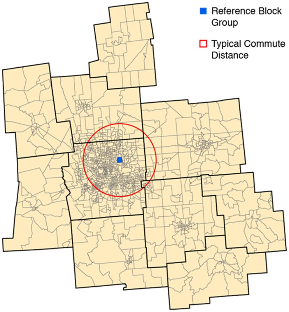
Source: Author’s analysis of Longitudinal Employer-Household Dynamics (LEHD) Origin-Destination Employment Statistics (LODES) is used to compute estimates of job access in 2007
Figure 1B shows the share of employment accessible for all census block groups in the Columbus, Ohio, metro area in 2007. Notice that job access rates vary within the Columbus metro area. Higher rates of job access are found in the center of the metro area than on its periphery. Metro-area job access rates are estimated by taking the population weighted average of the share of employment accessible within a typical commute distance for all census block groups in the metro.
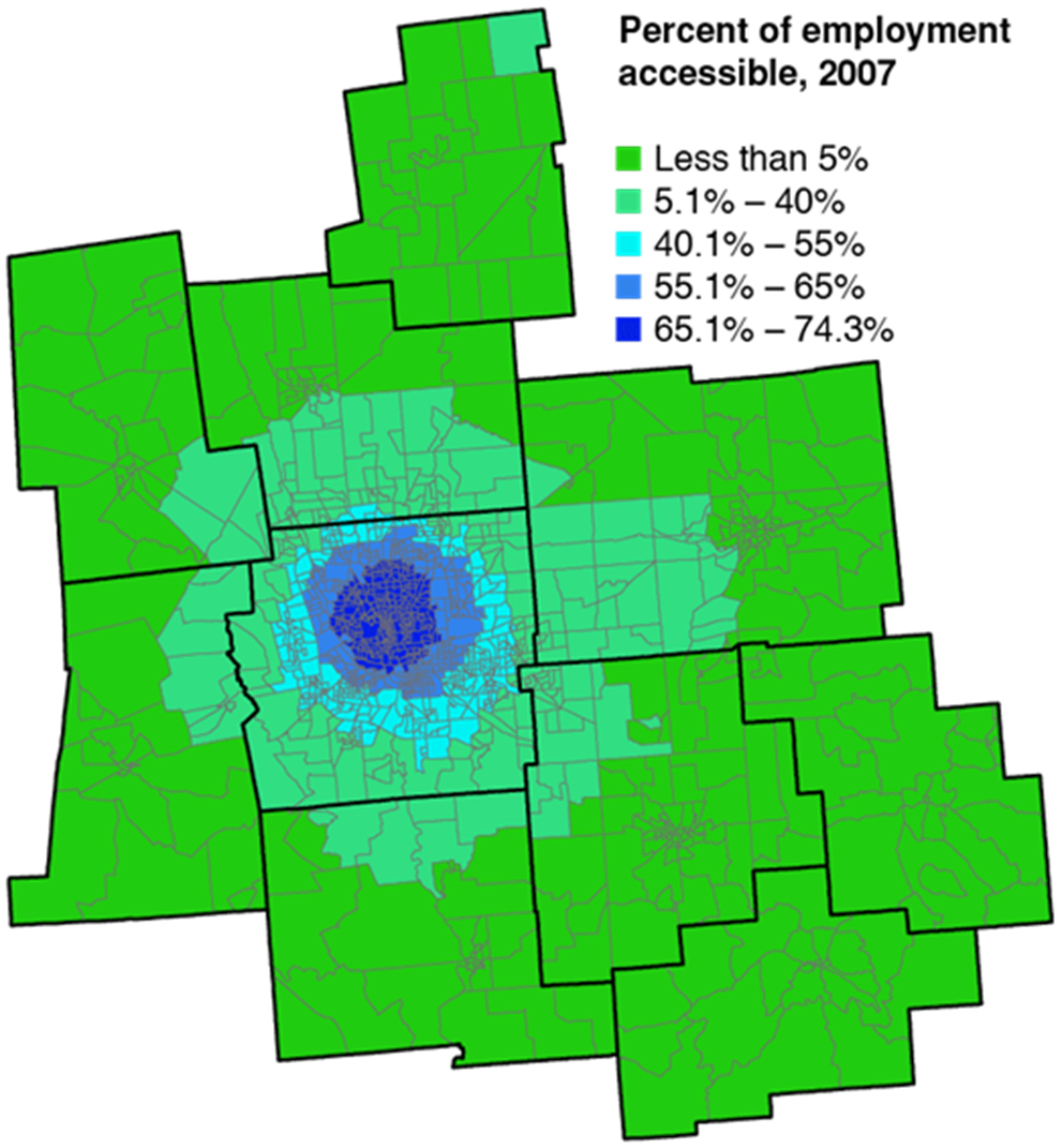
Source: Author’s analysis of Longitudinal Employer-Household Dynamics (LEHD) Origin-Destination Employment Statistics (LODES) is used to compute estimates of job access in 2007
Estimating Employment Growth by Location within a Metro Area
The LEHD-LODES dataset is also used to estimate the location of employment growth within a metro area. Estimating employment growth by location within a metro area can be challenging because the lack of an authoritative source on what constitutes a “suburb” has resulted in a wide variety of ways to define suburban locations.10 This analysis utilizes a data source from the US Department of Housing and Development (HUD); the Urbanization Perceptions Small Area Index classifies each census tract in the country as urban, suburban, or rural based on a question in the 2017 American Housing Survey (AHS) asking respondents to describe their neighborhood along with census tract characteristics.11 Table 1 presents the composition of observations, employment, and population for each location designation within a metro area for our 96 metro sample in 2007 and changes from 2007 to 2017. First, note that more than half of metro areas are suburban locations, according to the count, employment, and population metrics, followed by urban locations. Also note that urban areas account for more employment than population at 42.9 percent and 32.2 percent, respectively. Second, urban locations saw their share of employment and population decline while suburban locations experienced increasing shares of employment and population.
Net employment changes between 2007 and 2017 for each location within a metro are calculated to show where employment growth within a metro area is taking place. We then compare the difference in net employment between suburban and urban locations alongside changes in job access to illustrate how job access is related to where employment growth takes place within a metro area.
Table 1. Share of Selected Data by Location
| 2007 | Change 2007 to 2017 | |||||
|---|---|---|---|---|---|---|
| Observations | Employment | Population | Employment | Population | ||
| Urban | 37.1 | 42.9 | 32.2 | -0.8 | -0.5 | |
| Suburban | 53.6 | 52.4 | 58.1 | 0.6 | 0.6 | |
| Rural | 9.3 | 4.7 | 9.7 | 0.2 | -0.2 | |
Source: LODES, American Community Survey, Department of Housing and Urban Development
Changes in job access and employment growth from 2007 to 2017
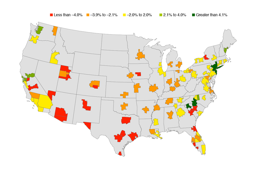
For the entire 10-year period, job access on average declined by 1.7 percent—from 29.7 percent to 29.2 percent of employment accessible within a typical commute. Of the 96 metro areas analyzed, 74 exhibited declines in job access and 21 posted increases in job access during this time; only the Chattanooga, Tennessee, metro area experienced no change in job access. In fact, more metro areas saw access decline by more than double the metro average (25) than metro areas that saw job access increase (21). Figure 2 provides additional context for job-access trends. The largest decreases in job access occurred in metro areas concentrated in the southwestern states of Arizona, Colorado, New Mexico, Texas, and Utah. Metro areas in the central part of the country exhibited modest declines, and some metros in coastal states saw job access increase. Interestingly, sometimes metro areas within the same state—such as in California and South Carolina—displayed opposing job-access trends.
Source: Author’s analysis of Longitudinal Employer-Household Dynamics (LEHD) Origin-Destination Employment Statistics (LODES) is used to compute estimates of job access in 2007 and 2017
As previously mentioned, if declining job access is a concern, the location of jobs is one policy lever to explore. Examining differences in employment growth by location within a metro area is one way to see if there is a connection between the location of employment growth and job access. Within a metro area, on average, suburban employment levels grew 5.5 percent faster than urban employment levels (14.1 percent vs 9.4 percent) from 2007 to 2017. In 38 of the 96 metro areas, both urban and suburban locations experienced employment gains, but suburbs saw higher rates of employment growth. In 29 metro areas, suburban employment grew and urban employment declined. In 20 metro areas, urban employment growth outpaced suburban employment growth; however, eight of these areas still saw job access decline from 2007 to 2017.
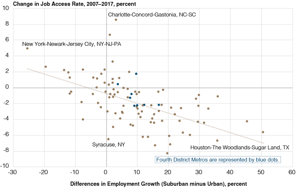
Figure 3 plots the difference in employment growth between suburban and urban areas on the horizontal axis and the change in job access on the vertical axis from 2007 to 2017. Overall, declines in job access are associated with patterns of employment growth that favor suburban locations within a metro area (correlation = –0.56). For example, in the Houston–The Woodlands–Sugar Land metro area, suburban employment outgrew urban employment growth by 36 percentage points and subsequently saw job access decline by 6.7 percent. Conversely, in the New York–Newark–Jersey City metro, urban employment growth outpaced suburban growth by 25 percentage points and job access increased 4.9 percent. There are also some outliers to this general pattern, a situation which suggests that other metro specific factors could be involved. The Charlotte–Concord–Gastonia and Syracuse metro areas both see slightly stronger suburban employment growth at 3 and 1 percentage points, respectively. However, in terms of job access, the Charlotte–Concord–Gastonia metro area saw job access increase by 8.5 percent, while the Syracuse metro area had job access decline by 6.6 percent.
Source: LODES, Department of Housing and Urban Development
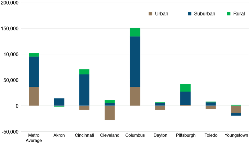
Focusing on Fourth District metro areas highlights the need for district stakeholders to emphasize the importance of job access and where employment growth is taking place within a metro area during the next recovery. Table 2 presents changes in job access in Fourth District metro areas. Job access declined in all Fourth District metro areas except Columbus, Ohio, and Pittsburgh, Pennsylvania, where it increased 1.7 percent and 0.4 percent, respectively. The Cincinnati, Dayton, Toledo, and Youngstown, Ohio metro areas each saw job access decline by more than 2.0 percent during this time.
Table 2. Percent of Metro Area Employment Accessible within a Typical Commute
| 2007 | 2017 | % Change 2007 to 2017 | |
|---|---|---|---|
| Average Metro Area | 29.7 | 29.2 | -1.7 |
| Akron, OH | 57.5 | 57.0 | -0.8 |
| Cincinnati, OH | 26.3 | 25.7 | -2.2 |
| Cleveland, OH | 28.0 | 27.6 | -1.3 |
| Columbus, OH | 36.1 | 36.7 | 1.7 |
| Dayton, OH | 45.6 | 44.5 | -2.3 |
| Pittsburgh, PA | 19.0 | 19.1 | 0.4 |
| Toledo, OH | 42.1 | 41.1 | -2.3 |
| Youngstown, OH | 28.0 | 27.4 | -2.2 |
Source: Author’s analysis of Longitudinal Employer-Household Dynamics (LEHD) Origin-Destination Employment Statistics (LODES) is used to compute estimates of job access in 2007, 2010, and 2017
Figure 4 shows the net employment change by location from 2007 to 2017 for each of the Fourth District metro areas along with the metro average. Within a metro area, employment growth tended to favor suburban locations over urban locations by more than 23,000 jobs from 2007 to 2017. Suburban locations are driving employment growth in all Fourth District metro areas. Moreover, employment declined in urban locations in six of eight Fourth District metros, with the exceptions being the Columbus, Ohio and Pittsburgh, Pennsylvania metro areas. The lack of urban employment growth appears be associated with declines in job access also seen in these six metro areas. It suggests that urban job loss rather than suburban employment growth might play a larger role in declining job access. Additionally, development patterns in all Fourth District metros except for Columbus show more job growth in rural locations, a situation which further hinders job access.
Source: LODES, Department of Housing and Urban Development
Conclusion
Job access is an important indicator to follow for those concerned with increasing economic mobility and opportunity for workers. On average, metro area job access has tended to decline since 2007. Most Fourth District metro areas saw job access decline during this time, too. Focusing on the interactions between employment growth and job access reveals that the location of employment growth within a metro area directly impacts job access. Overall, this analysis highlights that the location of jobs and where employment growth takes place within a metro could be an impactful policy option to pursue alongside options that have traditionally focused on transportation-based solutions to job access. Potential policy options used to affect the location of jobs can come from different fields, too. For example, incentivizing employers to remain or locate near population or employment centers is an economic development approach, while planning/zoning strategies could be used to better integrate commercial and residential land uses.
Appendix
Job Access and Location of Employment Growth by Metro Area from 2007 to 2017
| Metro Area | Typical Commute Distance | Job Access Share | Employment Growth, 2007–2017 | |||||
|---|---|---|---|---|---|---|---|---|
| 2007 | 2017 | % Change | Urban | Suburban | Rural | Suburban Minus Urban | ||
| Akron, OH | 10.3 | 57.5% | 57.0% | -0.8 | -0.7% | 7.7% | -1.1% | 8.3% |
| Albany–Schenectady–Troy, NY | 9.9 | 36.9% | 36.6% | -0.8 | 11.4% | -0.3% | 22.8% | -11.7% |
| Albuquerque, NM | 7.6 | 43.6% | 41.8% | -4.3 | -8.0% | 15.7% | 6.3% | 23.7% |
| Allentown–Bethlehem–Easton, PA–NJ | 9.0 | 41.6% | 41.5% | -0.3 | -4.5% | 13.8% | 32.5% | 18.4% |
| Atlanta–Sandy Springs–Alpharetta, GA | 14.4 | 22.6% | 22.4% | -0.9 | 16.3% | 12.1% | 11.6% | -4.2% |
| Augusta–Richmond County, GA–SC | 10.4 | 38.1% | 36.4% | -4.4 | 0.2% | 14.7% | 18.5% | 14.5% |
| Austin–Round Rock–Georgetown, TX | 12.8 | 45.6% | 42.8% | -6.1 | 21.9% | 42.2% | 64.1% | 20.4% |
| Bakersfield, CA | 8.7 | 36.4% | 35.6% | -2.4 | 3.6% | 33.4% | -12.7% | 29.9% |
| Baltimore–Columbia–Towson, MD | 11.0 | 33.1% | 32.1% | -3.1 | 5.7% | 10.9% | 3.3% | 5.2% |
| Baton Rouge, LA | 12.2 | 46.0% | 44.4% | -3.4 | -2.0% | 20.3% | 27.1% | 22.2% |
| Birmingham–Hoover, AL | 13.3 | 44.0% | 43.0% | -2.3 | -8.6% | 6.0% | 8.6% | 14.6% |
| Boise City, ID | 7.6 | 35.2% | 35.3% | 0.3 | 11.1% | 12.0% | 24.3% | 1.0% |
| Bridgeport–Stamford–Norwalk, CT | 10.1 | 40.6% | 40.6% | -0.1 | -2.4% | 3.2% | 3.4% | 5.6% |
| Buffalo–Cheektowaga, NY | 7.9 | 33.8% | 33.5% | -0.6 | -1.8% | 2.1% | 6.3% | 3.9% |
| Cape Coral–Fort Myers, FL | 10.9 | 55.5% | 52.0% | -6.3 | 5.1% | 17.1% | 129.5% | 12.0% |
| Charleston–North Charleston, SC | 10.6 | 40.9% | 40.6% | -0.9 | 16.7% | 26.6% | 14.8% | 9.9% |
| Charlotte–Concord–Gastonia, NC–SC | 13.1 | 25.0% | 27.1% | 8.5 | 21.5% | 24.8% | 10.2% | 3.3% |
| Chattanooga, TN–GA | 11.0 | 51.5% | 51.5% | 0.0 | 4.3% | 1.4% | 23.6% | -2.9% |
| Chicago–Naperville–Elgin, IL–IN–WI | 10.6 | 15.5% | 15.6% | 1.1 | 7.9% | 5.1% | 10.7% | -2.8% |
| Cincinnati, OH–KY–IN | 10.2 | 26.3% | 25.7% | -2.2 | -2.5% | 9.8% | 15.8% | 12.4% |
| Cleveland–Elyria, OH | 10.0 | 28.0% | 27.6% | -1.3 | -7.0% | 0.8% | 11.0% | 7.9% |
| Colorado Springs, CO | 7.7 | 49.9% | 46.9% | -6.0 | -4.7% | 22.3% | 50.9% | 27.0% |
| Columbia, SC | 13.6 | 52.3% | 50.0% | -4.5 | -10.1% | 21.6% | 17.9% | 31.6% |
| Columbus, OH | 11.1 | 36.1% | 36.7% | 1.7 | 10.8% | 20.6% | 24.1% | 9.8% |
| Dallas–Fort Worth–Arlington, TX | 14.0 | 24.4% | 23.3% | -4.5 | 17.2% | 32.7% | 40.3% | 15.5% |
| Dayton–Kettering, OH | 9.6 | 45.6% | 44.5% | -2.3 | -7.0% | 2.2% | 14.9% | 9.2% |
| Deltona–Daytona Beach–Ormond Beach, FL | 13.1 | 40.8% | 41.3% | 1.1 | -0.5% | 1.6% | 18.2% | 2.2% |
| Denver–Aurora–Lakewood, CO | 10.0 | 37.0% | 35.8% | -3.3 | 16.7% | 19.8% | 25.8% | 3.1% |
| Des Moines–West Des Moines, IA | 8.9 | 46.3% | 44.3% | -4.2 | 7.1% | 25.2% | 25.2% | 18.1% |
| Detroit–Warren–Dearborn, MI | 11.8 | 25.6% | 24.8% | -3.2 | -0.3% | 5.2% | 18.1% | 5.4% |
| El Paso, TX | 8.1 | 44.4% | 41.9% | -5.7 | 1.3% | 26.2% | 5.2% | 24.8% |
| Fresno, CA | 8.4 | 46.9% | 44.6% | -5.0 | 14.2% | 16.6% | 20.3% | 2.4% |
| Grand Rapids–Kentwood, MI | 11.5 | 38.9% | 37.8% | -2.7 | -1.2% | 31.7% | 33.8% | 33.0% |
| Greensboro–High Point, NC | 12.7 | 48.5% | 50.0% | 3.3 | -4.7% | -2.4% | 17.6% | 2.3% |
| Greenville–Anderson, SC | 11.5 | 35.4% | 37.7% | 6.6 | 7.3% | 8.6% | 21.9% | 1.3% |
| Harrisburg–Carlisle, PA | 12.3 | 57.9% | 57.0% | -1.5 | -16.3% | 12.7% | 17.7% | 29.1% |
| Hartford–East Hartford–Middletown, CT | 10.0 | 36.1% | 36.3% | 0.6 | 1.3% | 3.6% | 7.1% | 2.3% |
| Houston–The Woodlands–Sugar Land, TX | 14.0 | 28.8% | 26.8% | -6.7 | 6.6% | 42.5% | 29.3% | 35.9% |
| Indianapolis–Carmel–Anderson, IN | 11.6 | 33.6% | 32.8% | -2.3 | 8.4% | 20.3% | 12.6% | 11.9% |
| Jackson, MS | 12.1 | 44.2% | 43.8% | -1.0 | -6.8% | 23.2% | 3.4% | 30.0% |
| Jacksonville, FL | 12.9 | 43.0% | 41.0% | -4.7 | -1.2% | 6.8% | -14.0% | 8.0% |
| Kansas City, MO–KS | 10.4 | 26.6% | 25.7% | -3.4 | -0.5% | 15.1% | 12.2% | 15.5% |
| Knoxville, TN | 11.9 | 35.9% | 36.6% | 1.9 | 2.5% | 10.1% | 13.1% | 7.6% |
| Lakeland–Winter Haven, FL | 14.0 | 57.9% | 57.6% | -0.6 | -6.2% | 10.7% | 35.3% | 16.9% |
| Lancaster, PA | 8.7 | 39.9% | 39.5% | -0.9 | 3.0% | 4.5% | 11.0% | 1.5% |
| Las Vegas–Henderson–Paradise, NV | 7.7 | 41.1% | 38.6% | -6.2 | 0.3% | 13.9% | -24.4% | 13.6% |
| Little Rock–North Little Rock–Conway, AR | 11.5 | 36.7% | 35.6% | -3.1 | 6.3% | 6.9% | 15.4% | 0.6% |
| Los Angeles–Long Beach–Anaheim, CA | 11.0 | 18.5% | 18.4% | -0.3 | 10.0% | 12.5% | 9.3% | 2.5% |
| Louisville/Jefferson County, KY–IN | 9.7 | 41.1% | 39.5% | -3.9 | 3.2% | 18.1% | 24.6% | 14.9% |
| McAllen–Edinburg–Mission, TX | 7.5 | 37.8% | 36.0% | -4.8 | 16.6% | 25.3% | 99.8% | 8.8% |
| Memphis, TN–MS–AR | 10.7 | 40.4% | 39.4% | -2.6 | -6.9% | 17.2% | 11.3% | 24.2% |
| Miami–Fort Lauderdale–Pompano Beach, FL | 10.0 | 17.8% | 17.7% | -0.9 | 9.7% | 12.5% | 29.3% | 2.8% |
| Milwaukee–Waukesha, WI | 9.1 | 37.7% | 37.2% | -1.3 | 0.0% | 1.2% | 46.4% | 1.2% |
| Minneapolis–St. Paul–Bloomington, MN–WI | 10.1 | 23.6% | 23.0% | -2.5 | 11.2% | 9.6% | 23.7% | -1.6% |
| Nashville–Davidson–Murfreesboro–Franklin, TN | 13.9 | 31.3% | 30.6% | -2.2 | 8.7% | 26.6% | 59.0% | 17.9% |
| New Haven–Milford, CT | 8.3 | 36.5% | 36.7% | 0.5 | -0.3% | -0.7% | 23.5% | -0.4% |
| New Orleans–Metairie, LA | 8.3 | 34.0% | 34.7% | 1.9 | 19.8% | 7.7% | 12.4% | -12.0% |
| New York–Newark–Jersey City, NY–NJ–PA | 7.6 | 21.2% | 22.2% | 4.9 | 30.6% | 5.3% | 6.4% | -25.3% |
| North Port–Sarasota–Bradenton, FL | 10.6 | 45.3% | 42.7% | -5.7 | -35.4% | 15.3% | 41.3% | 50.6% |
| Ogden–Clearfield, UT | 8.7 | 45.2% | 43.4% | -4.1 | 27.0% | 19.7% | -13.5% | -7.3% |
| Oklahoma City, OK | 10.6 | 36.3% | 35.0% | -3.4 | 4.3% | 14.8% | 34.9% | 10.5% |
| Omaha–Council Bluffs, NE–IA | 7.0 | 37.3% | 36.2% | -3.0 | 1.8% | 18.9% | 18.2% | 17.0% |
| Orlando–Kissimmee–Sanford, FL | 13.1 | 40.0% | 38.5% | -3.7 | 15.8% | 27.0% | 4.3% | 11.2% |
| Oxnard–Thousand Oaks–Ventura, CA | 10.3 | 49.6% | 50.5% | 1.7 | 4.5% | 3.0% | 8.2% | -1.5% |
| Palm Bay–Melbourne–Titusville, FL | 11.3 | 39.0% | 39.4% | 1.2 | 13.0% | 1.5% | 41.4% | -11.5% |
| Philadelphia–Camden–Wilmington, PA–NJ–DE–MD | 9.1 | 18.9% | 19.1% | 1.2 | 11.7% | 7.7% | 3.5% | -4.0% |
| Phoenix–Mesa–Chandler, AZ | 12.2 | 31.1% | 28.9% | -7.2 | -1.2% | 19.4% | 13.7% | 20.7% |
| Pittsburgh, PA | 9.4 | 19.0% | 19.1% | 0.4 | 0.5% | 4.4% | 10.9% | 3.9% |
| Portland–South Portland, ME | 10.5 | 24.6% | 25.2% | 2.2 | 11.9% | 4.6% | 12.5% | -7.3% |
| Portland–Vancouver–Hillsboro, OR–WA | 8.2 | 25.1% | 25.4% | 1.2 | 13.5% | 17.8% | 4.9% | 4.3% |
| Providence–Warwick, RI–MA | 7.0 | 25.5% | 25.2% | -1.3 | -5.2% | 1.9% | -1.6% | 7.1% |
| Provo–Orem, UT | 9.2 | 50.1% | 47.9% | -4.3 | -1.1% | 44.4% | 74.5% | 45.4% |
| Raleigh–Cary, NC | 15.2 | 68.9% | 68.1% | -1.1 | 13.0% | 49.0% | 25.4% | 36.1% |
| Richmond, VA | 11.7 | 42.0% | 41.8% | -0.6 | 0.9% | 11.6% | 9.9% | 10.7% |
| Riverside–San Bernardino–Ontario, CA | 14.2 | 27.0% | 26.5% | -2.0 | 20.6% | 18.1% | 9.9% | -2.5% |
| Rochester, NY | 8.8 | 32.8% | 32.4% | -1.2 | 0.0% | 2.3% | 8.8% | 2.4% |
| Sacramento–Roseville–Folsom, CA | 11.6 | 37.0% | 37.9% | 2.6 | 33.6% | 14.3% | 19.6% | -19.3% |
| St. Louis, MO–IL | 11.1 | 23.7% | 23.0% | -3.0 | -4.1% | 7.5% | 4.6% | 11.6% |
| Salt Lake City, UT | 9.0 | 55.5% | 54.1% | -2.5 | 4.2% | 25.2% | 16.0% | 21.0% |
| San Antonio–New Braunfels, TX | 10.7 | 40.0% | 37.0% | -7.3 | 17.0% | 32.8% | 61.5% | 15.8% |
| San Diego–Chula Vista–Carlsbad, CA | 10.8 | 29.9% | 29.7% | -0.6 | 8.6% | 18.1% | 16.3% | 9.5% |
| San Francisco–Oakland–Berkeley, CA | 12.5 | 29.5% | 30.2% | 2.1 | 28.1% | 14.6% | 9.6% | -13.5% |
| San Jose–Sunnyvale–Santa Clara, CA | 10.3 | 59.8% | 59.4% | -0.6 | 28.4% | 17.3% | 18.3% | -11.1% |
| Scranton–Wilkes–Barre, PA | 8.0 | 25.0% | 24.9% | -0.5 | 1.9% | 1.8% | 32.6% | -0.1% |
| Seattle–Tacoma–Bellevue, WA | 10.2 | 22.2% | 22.7% | 2.2 | 19.3% | 18.9% | 15.8% | -0.4% |
| Spokane–Spokane Valley, WA | 8.0 | 46.1% | 45.0% | -2.5 | 1.0% | 10.9% | 3.8% | 9.9% |
| Stockton, CA | 12.8 | 59.8% | 57.2% | -4.3 | 1.1% | 30.8% | 22.3% | 29.7% |
| Syracuse, NY | 8.8 | 43.5% | 40.7% | -6.6 | -3.3% | -2.4% | 10.7% | 0.8% |
| Tampa–St. Petersburg–Clearwater, FL | 12.2 | 25.7% | 25.1% | -2.3 | 3.3% | 9.1% | 16.2% | 5.7% |
| Toledo, OH | 8.4 | 42.1% | 41.1% | -2.3 | -5.8% | 4.3% | 4.0% | 10.0% |
| Tucson, AZ | 8.9 | 48.2% | 44.2% | -8.3 | -9.9% | 9.8% | 3.9% | 19.8% |
| Virginia Beach–Norfolk–Newport News, VA–NC | 9.0 | 24.7% | 24.0% | -2.7 | -5.4% | 4.9% | 14.7% | 10.3% |
| Washington–Arlington–Alexandria, DC–VA–MD–WV | 12.4 | 23.0% | 22.6% | -1.9 | 12.5% | 4.6% | 13.2% | -7.9% |
| Wichita, KS | 8.0 | 41.6% | 40.0% | -3.9 | -3.3% | 1.3% | 8.9% | 4.6% |
| Winston–Salem, NC | 12.1 | 50.6% | 50.5% | -0.2 | -4.5% | 2.6% | 21.0% | 7.0% |
| Youngstown–Warren–Boardman, OH–PA | 8.4 | 28.0% | 27.4% | -2.2 | -21.0% | -4.0% | 5.2% | 17.0% |
Footnotes
- Kain, John F. 1992. “The Spatial Mismatch Hypothesis: Three Decades Later.” Housing Policy Debate, 3(2), 371–460. https://doi.org/10.1080/10511482.1992.9521100.
Holzer, Harry J. 1991. “The Spatial Mismatch Hypothesis: What Has the Evidence Shown?” Urban Studies, 28(1), 105–122. https://doi.org/10.1080/00420989120080071.
Ihlanfeldt, Keith R. and David L. Sjoquist. 1998. “The Spatial Mismatch Hypothesis: A Review of Recent Studies and Their Implications for Welfare Reform.” Housing Policy Debate, 9(4), 849–892. https://doi.org/10.1080/10511482.1998.9521321.
Gobillon, Laurent, Harris Selod, and Yves Zenou. 2007. "The Mechanisms of Spatial Mismatch." Urban Studies, 44.12: 2401–2427. https://doi.org/10.1080/00420980701540937. Return to 1 - Andersson, Fredrik, et al. 2018. "Job Displacement and the Duration of Joblessness: The Role of Spatial Mismatch." Review of Economics and Statistics 100.2: 203–218. https://doi.org/10.1162/rest_a_00707.
Chetty, Raj, and Nathaniel Hendren. 2018. "The Impacts of Neighborhoods on Intergenerational Mobility I: Childhood Exposure Effects." The Quarterly Journal of Economics, 133.3: 1107–1162. https://doi.org/10.1093/qje/qjy007.
Chetty, Raj, et al. 2014. "Where Is the Land of Opportunity? The Geography of Intergenerational Mobility in the United States." The Quarterly Journal of Economics, 129.4: 1553–1623. Return to 2 - Andersson, Fredrik, et al. 2018. "Job Displacement and the Duration of Joblessness: The Role of Spatial Mismatch." Review of Economics and Statistics, 100.2: 203–218. https://doi.org/10.1162/rest_a_00707. Return to 3
- Elizabeth Kneebone and Natalie Holmes. 2015. The Growing Distance between People and Jobs in Metropolitan America. Brookings Institution, Washington DC. http://www.brookings.edu/wp-content/uploads/2016/07/Srvy_JobsProximity.pdf. Return to 4
- Ganning, Joanna. 2018. "Change versus Decline: The Suburbanization of Jobs in US Shrinking Cities." Population Loss: The Role of Transportation and Other Issues 2: 163. https://doi.org/10.1016/bs.atpp.2018.09.006. Return to 5
- For Greater Pittsburgh/Allegheny County, see Brett Barkley and Emily Garr Pacetti. 2018. A Long Ride to Work: Job Access and the Potential Impact of Ride-Hailing in the Pittsburgh Area. Federal Reserve Bank of Cleveland. https://www.clevelandfed.org/newsroom-and-events/publications/a-look-behind-the-numbers/albtn-20180905-a-long-ride-to-work-job-access-and-the-potential-impact.
For Northeast Ohio, see Brett Barkley and Alexandre Gomes Pereira. 2015. A Long Ride to Work: Job Access and Public Transportation in Northeast Ohio. Federal Reserve Bank of Cleveland. https://www.clevelandfed.org/newsroom-and-events/publications/a-look-behind-the-numbers/albtn-20151123-a-long-ride-to-work-job-access-and-public-transportation-in-northeast-ohio. Return to 6 - The Fourth Federal Reserve District includes the state of Ohio, the western third of Pennsylvania, the eastern half of Kentucky, and the northern panhandle of West Virginia. Return to 7
- United States Census Bureau. 2018. American Community Survey. https://www.census.gov/acs/www/data/data-tables-and-tools/data-profiles/. Return to 8
- The Longitudinal Employer-Household Dynamics (LEHD) Origin-Destination Employment Statistics (LODES) is used to compute estimates of job access in 2007 and 2017; this dataset is based on administrative data for the “all jobs” designation and reflects the location of a worker’s residence and workplace at the census block group level (raw data at the census block level are aggregated for this analysis). These respective census block group locations are used to estimate the typical commuting distance for workers in each metro area by calculating the straight-line distance (“as the crow files”) between where an individual lives and works. Qualitatively, similar patterns are found using the number of jobs within a typical commute distance and job density. The share of employment is chosen to aid comparability of job access across metro areas. Return to 9
- Airgood-Obrycki, Whitney, Bernadette Hanlon, and Shannon Rieger. 2020. “Delineate the US Suburb: An Examination of How Different Definitions of the Suburbs Matter.” Journal of Urban Affairs, 1–22. https://doi.org/10.1080/07352166.2020.1727294.
Bucholtz, Shawn, Emily Molfino, and Jed Kolko. 2020. “The Urbanization Perceptions Small Area Index: An Application of Machine Learning and Small Area Estimation to Household Survey Data.” The U.S. Department of Housing and Urban Development Working Paper. June 12, 2020. https://www.huduser.gov/portal/sites/default/files/docs/UPSAI_forWeb.docx. Return to 10 - For more information see https://www.huduser.gov/portal/AHS-neighborhood-description-study-2017.html#small-area-tab. Return to 11
Suggested Citation
Fee, Kyle D. 2020. “The Decline in Access to Jobs and the Location of Employment Growth in US Metro Areas: Implications for Economic Opportunity and Mobility.” Federal Reserve Bank of Cleveland, Community Development Reports. https://doi.org/10.26509/frbc-cd-20201001