

- Share
Manufacturing and Pollution: Trends in Old and New Industrial Centers

The views expressed in this report are those of the author(s) and are not necessarily those of the Federal Reserve Bank of Cleveland or the Board of Governors of the Federal Reserve System.
Introduction
Less than 60 years ago, the states adjoining the Great Lakes led the nation in making things. Their smoke-belching factories exported goods around the globe and their cities were employment beacons, attracting not only a domestic workforce, but an international one as well. Cities in the northern states of Michigan, Indiana, Ohio, and Pennsylvania grew to become some of the largest and most influential in the nation. Then things changed. From the late 1960s to the present, these once-dominant cities lost hundreds of thousands of manufacturing jobs, many in metal-related industries. Today, many neighborhoods in urban and inner-ring suburban areas lie riddled with long-abandoned, crumbling factories and rusting hulks of machinery.
Where did the jobs go? For the most part, jobs were lost to increased productivity through more efficient means of production. Some were lost to cheaper labor economies in other countries. Others migrated south to the Sun Belt, the coast-to-coast region comprising all or parts of California, Nevada, Arizona, New Mexico, Texas, Arkansas, Louisiana, Mississippi, Tennessee, Alabama, Georgia, Florida, and the Carolinas. These Sun Belt states succeeded in attracting manufacturing from the north by capitalizing on several key factors1: a warmer and more moderate climate; an absence of unions, which kept wages low; minimal land-use controls; a large supply of cheap and moderately skilled labor from Appalachia; and growth in the trucking industry that offered more flexibility in factory locations.2
Older industrial cities in the North have been on a mission ever since to reinvent themselves. How have these northern urban centers fared in their quest to not only recover from the loss of manufacturing share, but also reduce pollution and become more attractive places to live? How do they compare to their southern counterparts? Although manufacturing is still a major part of many northern cities' economies, many are capitalizing on decreased levels of pollution to portray more green, attractive, and environmentally friendly images of their regions, in contrast to the smokestack-dotted landscapes of the past.
In this report, we analyze and compare trends in manufacturing and estimated pollution produced by this industry for northern urban counties in Michigan, Indiana, Ohio, and Pennsylvania and for southern urban counties in Kentucky, Tennessee, Alabama, and Mississippi during the 11 years from 1998 through 2008. We refer to these as the North and South regions, respectively. We also illustrate creative initiatives employing a green focus in two Fourth District communities as they continue to evolve from their manufacturing pasts.
Preview of findings
Over the 11-year study period, manufacturing output on average changed very little in either region. At the same time, both manufacturing employment and pollution in both regions decreased year to year. There are clear differences, however, in the industry trends between northern and southern counties. Manufacturing employment is declining at a faster rate in the North than in the South. In the motor vehicles sector, for example, employment in the North decreased by about 40 percent while it remained almost constant in the South, with neither region showing much change in output.
Figure 1
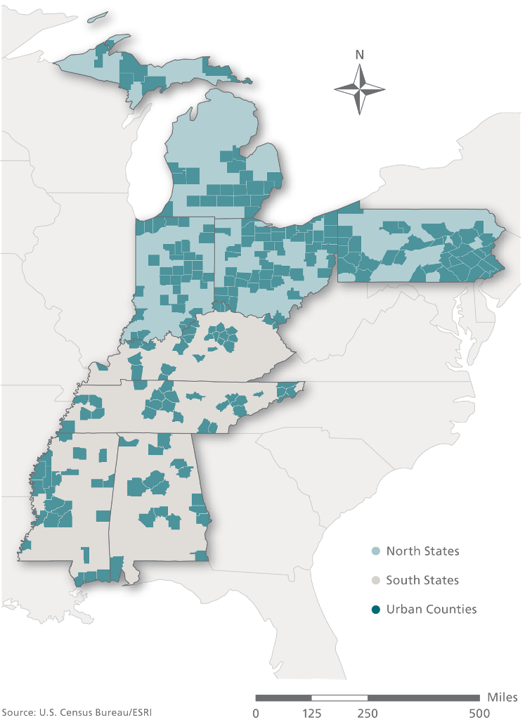
Source: U.S. Census Bureau.
On the other hand, income and manufacturing pollution in both regions follow similar trends. Per capita income increased in the North and South at similar rates (and comparable to the nation's), and manufacturing air pollution estimates declined at similar rates in both regions. This pattern does not imply that pollution inevitably decreases with income growth, as suggested by the Environmental Kuznets Curve hypothesis (see box 1). Rather, the decline in manufacturing pollution experienced in both regions during the past decade may be due to changes that have taken place over time, such as a decrease in heavily polluting manufacturing activities like the production of metal.3Other changes include less-polluting technologies and more environmentally favorable regulations.4 Since 2003, the decrease in manufacturing pollution for every dollar increase in income - in per capita terms - has slowed for both regions. Within the North region, urban counties in Pennsylvania and Ohio start at similar income and pollution levels in 1998, but as of 2008, Pennsylvania's income level and income-to-pollution ratio both stand clearly higher than Ohio's.
Urban County Trends
Urban counties with above-average manufacturing employment rates in our study group states (Alabama, Indiana, Kentucky, Michigan, Mississippi, Ohio, Pennsylvania, and Tennessee) form a collection of older and newer manufacturing centers. Unfortunately, many rural counties lack manufacturing employment and pollution data; therefore, we report data on such variables only for urban counties in these states.7,8 Our analysis covers the 11-year period from 1998 through 2008 (see figure 1). We use data on manufacturing Gross Domestic Product (GDP) by state, chained to 2005 dollars, as a measure of manufacturing output (see top panels of figure 2).9
Figure 2
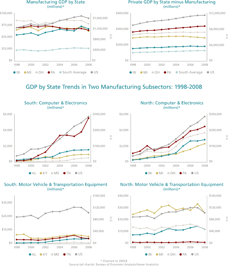
Source: Bureau of Economic Analysis; Haver Analytics.
While manufacturing output in the North region states is still about three times higher on average than in the South, 10 between 1998 and 2008 total GDP for the North states declined by 1 percent (from $275 billion to $271 billion). At the same time the South region saw its manufacturing GDP by state grow by more than 15 percent (from $93 billion to $107 billion). Indiana and Kentucky stand as two regional outliers. During this period, all northern states saw slight decreases in manufacturing GDP by state except Indiana, where manufacturing GDP grew by more than 20 percent (from $55 billion to $67 billion).11 Conversely, all southern states had an increase in manufacturing GDP except Kentucky, which lost almost 10 percent (from $29 billion to $26 billion).12
Figure 3
Source: Bureau of Economic Analysis; Haver Analytics.
The South also leads the North in GDP growth for non-manufacturing industries (total GDP by state minus manufacturing GDP by state), though both regions showed double-digit growth in the study period. The North grew 12 percent (from $1.13 trillion to $1.26 trillion) and the South 21 percent ($424 billion to $511 billion).13 In the North, Pennsylvania's non-manufacturing output measure grew faster than that of other northern states.
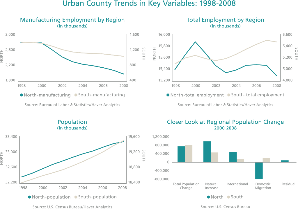
Employment in manufacturing shrank in both regions by more than 25 percent as productivity continued to increase. Figure 3 shows manufacturing employment dropped at a higher rate in the North than in the South beginning in 2000.
Sharpening our focus to specific industries, figure 4 shows that machinery and fabricated metals use a greater share of labor in the North versus the South, while food and wood production account for a greater share of labor in the South than in the North. Figure 4 also illustrates that the largest employment drop in northern states is in motor vehicle and transportation equipment, unlike the southern states that grew slightly in that sector. However, figure 2 shows that output in both regions has remained virtually unchanged. Figure 2 also illustrates output in the computer and electronics sector, which has seen rapid growth nationwide. Tennessee in the South shows the greatest gains in this sector. In the North, output in computer and electronics is still quite small in comparison to that of motor vehicle and transportation equipment. Total employment rates across all industries (manufacturing and non) for the two regions are on diverging paths, with the South showing a net gain over the 11-year period and the North showing a net loss (see figure 3). Both North and South regions have experienced similar population growth rates over most of the study period. In a more detailed look at the population change, estimates from the U.S. Census Bureau for 2000-2008 - slightly different years than those of the study period - show the major difference between the regions lies in the pattern of domestic migration. Almost 800,000 moved away from the North while the South gained nearly 200,000 in the 9-year period (see figure 3).
Figure 4
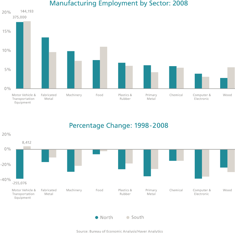
Source: Bureau of Economic analysis; Haver Analytics.
Along with a decline in manufacturing employment, both the North and South regions have experienced a consistent decline in manufacturing pollution, according to our estimates (see box 2 for an explanation of how these estimates were derived). The vast majority of manufacturing pollution, 73 percent, is released into the air (see figure 5).14 The states of the North region exhibit both higher income and higher manufacturing pollution levels per capita than the states of the South region throughout the study period (see figure 6).
Figure 5 and 6
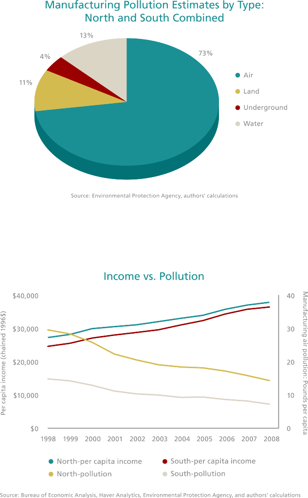
Source: Environmental Protection Agency, authors' calculations.
Box 2
How did we calculate the pollution estimates?
Data Used
The pollution estimates we use in this report are products of two datasets: the Toxic Release Inventory (TRI), compiled by the Environmental Protection Agency (EPA ), and County Business Patterns (CBP) from the U.S. Census Bureau. The TRI provides data on reported manufacturing pollution by facility, while the CBP provides data on the number of manufacturing facilities by county.15
Several requirements determine which facilities are required by the EPA to submit a TRI report. They must fall under the applicable NAICS code and be large enough to employ 10 or more full-time equivalent employees.16, They must also manufacture or process more than 25,000 pounds or use more than 10,000 pounds of any of the EPA -listed chemicals during the calendar year.17 The number of listed chemicals has expanded, too, from roughly 300 at TRI's inception in 1987 to more than 650. For the purpose of this report, the 1995 chemical list will be used to maintain consistency.18 The list contains pesticides, carcinogens, reproductive toxicants, and developmental toxicants that are characterized as high or moderately high in toxicity.19
The CBP dataset is compiled from several sources including the IRS, the Social Security Administration, the Bureau of Labor Statistics, and the Census Bureau.20
The process
While other studies have used pollution data from monitoring stations, we use TRI data because it allows us to match pollution with the manufacturing subsector that produces it.21First, TRI data in the lower 48 states are aggregated by the NAICS code sub-sectors (first four digits of the NAICS code) and divided by the total number of TRI reporting facilities in each sub-sector. This average pollution-per-sub-sector estimate is multiplied by the total number of manufacturing establishments for that sub-sector in each county according to the CBP data. The results are aggregated by county and represent the total estimated manufacturing pollution produced in tons. Using population estimates at the county level, we compute pollution estimates per capita.
A Simpler Depiction: The Equation

Note, however, that the average manufacturing pollution estimates computed for TRI reporting facilities, excluding the smaller firms, is then applied to all CBP-reported facilities, even though these facilities likely pollute at different levels. This may lead to biased pollution estimates.
Manufacturing Pollution and Income
While manufacturing activity has increased in the South and remained steady in the North, pollution due to manufacturing has been declining, along with manufacturing labor in both regions. At the same time, both regions have seen per capita income increase at rates similar to those of the nation. Figures 7 and 8 illustrate the movement of income and manufacturing pollution levels for both regions and for the individual states of the North region, respectively. These graphs, however, should not be held as evidence for the Environmental Kuznets Curve. A brief discussion of this hypothesis follows since it informs our interpretation of the data.
Figures 7
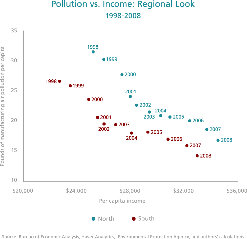
Source: Bureau of Economic analysis; Haver analytics; Environmental Protection Agency; authors' calculations.
Figure 8
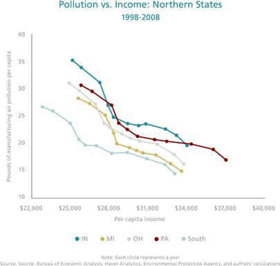
Source: Bureau of Economic analysis; Haver analytics; Environmental Protection Agency; authors' calculations.
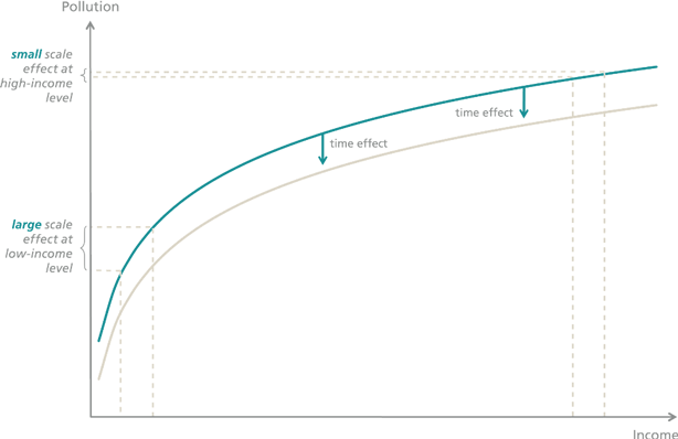
In studying the relationship between economic growth and pollution in the context of the developing world, or income and pollution in the U.S., some researchers have argued that at low income levels, an increase in per capita income results in increased pollution, while at higher income levels, pollution peaks and starts to decline, moving in the opposite direction from income as consumers can afford and demand more environment-friendly options. 22 More recently, other researchers have pointed to a lack of empirical evidence to support this hypothesis. Roger Perman and David Stern, for instance, provide an alternative explanation. They claim that the U-shaped relationship between pollution and income seen at higher income levels has to do with two opposing effects on pollution that take place simultaneously:23
- A positive scale effect, where, with all other factors equal, higher income levels lead inevitably to higher pollution levels.
- A negative time effect, where, over time, technology and environmental awareness tend to reduce pollution for all levels of income.
These two effects can produce an inverted U-shaped relationship of pollution to income if the scale effect is stronger than the time effect for developing countries experiencing rapid growth, but weaker for developed countries growing at a slower rate (see figure 9).
Figure 9
Source: Bureau of Economic Analysis; Haver Analytics; Environ,emtal Protection Agency; authors' calculations.
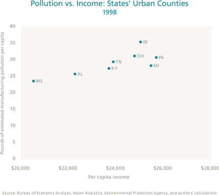
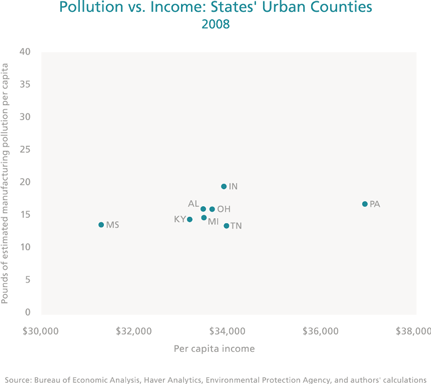
In figures 7 and 8, each point represents yearly average levels (over all urban counties in a region or state, respectively) of per capita income against estimated pollution due to manufacturing. Thus, a scale effect on pollution cannot be derived from this data since time is not being held constant. In order to isolate the scale effect, one can either plot income and pollution for any given year or average them over the full time period. Figure 10 does so for two fixed points in time, 1998 and 2008, showing no support for the hypothesis that, all else fixed, higher income levels are related to lower pollution levels.
Figure 10
Source: Bureau of Economic Analysis; Haver Analytics; Environ,emtal Protection Agency; authors' calculations.
Figure 11
Source: Bureau of Economic Analysis; Haver Analytics; Environ,emtal Protection Agency; authors' calculations.
What can be learned from figures 7 and 8 is that the major gains in pollution reduction during the study period took place between 1998 and 2002. Since 2003, the rate of decline in manufacturing pollution for every dollar increase in income (in per capita terms) has slowed for both regions. Michigan urban counties have come closer to the Southern region in terms of their income and manufacturing pollution mix. Indiana's pollution levels were consistently the highest in the region throughout the entire period. And while urban counties in Pennsylvania and Ohio started off at similar income and pollution levels in 1998, Pennsylvania's income and its income-to-pollution ratio were significantly higher than Ohio's by 2008. In other words, while both states have reduced their pollution to similar levels, Pennsylvania was able to achieve this reduction while increasing its per capita income at a faster rate. It is likely that these gains are related in part to Pennsylvania's increased growth in the non-manufacturing industries after 2003 relative to all other Northern states. Pennsylvania also leads the North region states in the production of computers and electronics, although by a small margin.
Final thoughts
Manufacturing output and employment in the U.S. have been moving in opposite directions since the beginning of the 1980s, as productivity increases have led to more output with less labor. Northern states, once home to the core of the nation's manufacturing industry, have lost some share of manufacturing activity. They have nonetheless been able to maintain manufacturing output relatively constant. Employment in manufacturing, on the other hand, has experienced a significant drop. Like employment, pollution due to manufacturing has been decreasing over time as manufacturing activity has shifted to less polluting sub-sectors and technologies, and states have issued or strengthened environmentally related regulations. These changes are largely captured under what researchers call the "time effect" on pollution, and apply more or less homogeneously across all states. All states in our analysis experienced decreases in pollution and increases in real income simultaneously. However, Pennsylvania, the state with the most gains in non-manufacturing output during the period, is able to achieve higher income levels at pollution levels comparable to those in Ohio, Michigan, and Indiana.
Efforts to modernize and support growth in their manufacturing sectors continue in all states. In Ohio, the Third Frontier program, launched in 2002, aims to create an "innovation ecosystem" and stimulate an environment that can house a more diverse and high-tech-oriented manufacturing sector.27 It is still too early to assess its long-term impact on the Ohio economy, but the program is off to a promising start. SRI International reported recently that the Third Frontier program has significantly increased the availability of early-stage capital, supported the development of research capacity and partnerships between universities and the industry, and contributed to employment growth in the technology sector.28
Rightfully so, old industrial centers ought to value the environmental gains brought about by changes in their manufacturing sector. However, reduced pollution due to manufacturing is not a differentiating factor among these Northern states, and on its own may play only a small role in boosting the attractiveness of the region. More likely, innovation in manufacturing - with a stronger focus on its high-tech sectors - and investment in upgrading labor-force skills may provide employment and income gains that, coupled with a cleaner environment, will enhance the living conditions and economic appeal of the region.29
Footnotes
- Markusen, Ann. 1987. "Regions: The Economics and Politics of Territory." Totowa, NJ: Rowman and Allenheld.
- Wheat, Leonard F. 1986. "The Determinants of 1963-77 Regional Manufacturing Growth: Why the South and West Grow." Journal of Regional Science. 26 (4): 635-659.
- According to the Bureau of Economic Analysis/Haver Analytics, metalrelated employment in the North and South dropped by 24% and 16% respectively. Changes in metal-related GDP in the North and South were -17% and 1% respectively. Metal-related industries combine primary metal and fabricated metal manufacturing.
- For example, the EPA increased the standards regulating particulate matter on September 21, 2006 (http://www.epa.gov/air/particlepollution/pdfs/20060921_factsheet.pdf).
- Stern, David. (2003). "The Environmental Kuznets Curve." Online Encyclopedia of Ecological Economics. http://www.ecoeco.org/education_encyclopedia.php
- Grossman, Gene & Krueger, Alan. 1991. "Environmental Impacts of a North American Free Trade Agreement." NBER working paper. National Bureau of Economic Research.
- According to the U.S. Census Bureau, "urban" refers to "all territory, population, and housing units located within an urbanized area (UA ) or an urban cluster (UC ). It delineates UA and UC boundaries to encompass densely settled territory, which consists of: (a) core census block groups or blocks that have a population density of at least 1,000 people per square mile and (b) surrounding census blocks that have an overall density of at least 500 people per square mile" (http://www.census.gov/geo/www/ua/ua_2k.html). While rural counties accounted for a majority of the land in the eight states (65%), they accounted for only 23% of the population.
- The source of the manufacturing employment data, the Bureau of Labor Statistics (BLS ), gives two instances when data is deemed non-disclosable. One is if there are fewer than three establishments in a given industry for a geographic area, and another is if one firm accounts for more than 80 percent of area employment in a given industry. These conditions often made manufacturing employment data for rural counties sparse and increased the censoring problem.
- According to the Bureau of Economic Analysis, "GDP by state is the value added in production by the labor and capital located in a state. GDP for a state is derived as the sum of the GDP originating in all industries in the state" (http://www.bea.gov/regional/definitions/nextpage.cfm?key=Gross%20domestic%20product%20(GDP)%20by%20state)
- Bureau of Economic Analysis/Haver Analytics. Data is by state since it is not available at the county level ( http://www.bea.gov/.
- Bureau of Economic Analysis/Haver Analytics.
- Ibid.
- Ibid.
- The amount of estimated manufacturing air pollution is the same for both North and South regions.
- http://www.epa.gov/tri/index.htm
- http://www.naics.com/search.htm
- http://ohioepa.custhelp.com/app/answers/detail/a_id/110/~/who-is-required-to-file-a-toxic-release-inventory-(tri)-report
- http://www.epa.gov/tri/trichemicals/list%20changes/TRIChemicalListChanges120110.pdf
- http://tri.supportportal.com/link/portal/23002/23021/Article/17337/How-has-TRI-changed-over-time
- http://www.census.gov/econ/cbp/faq.htm
- Agarwal, Nikhil, Banternghansa, Chanot, and Bui, Linda. 2009. "Toxic Exposure in America: Estimating Fetal and Infant Health Outcomes." Federal Reserve Bank of St. Louis. Working Paper Series.
- Grossman, Gene and Krueger, Alan. 1995. "Economic Growth and the Environment." The Quarterly Journal of Economics. 110 (2): 353-377, and Carson, Richard, Jeon, Yongil, and McCubbin, Donald. 1997. "The Relationship Between Air Pollution Emissions and Income: U.S. Data." Environment and Development Economics 2 (4): 433-450.
- Perman, Roger and Stern, David I. 2003. "Evidence from Panel Root Unit Root and Cointegration Tests that the Environmental Kuznets Curve Does Not Exist." The Australian Journal of Agriculture and Resource Economics. 47 (3): 325-347, and Stern, David. 2004. "Environmental Kuznets Curve." Encyclopedia of Energy. Vol. 2: 517-525.
- The Penn State Center (http://pittsburgh.center.psu.edu/projects/topics/strategic-initiatives/vacant-lot-reclamation).
- http://gtechstrategies.org/7/strategy
- Refers to the use of plants to clean up toxic chemicals in the soil. (http://www.clu-in.org/download/citizens/citphyto.pdf).
- http://thirdfrontier.com/History.htm.
- http://www.development.ohio.gov/ohiothirdfrontier/Documents/RecentPublications/OH_Impact_Rep_SRI_FINAL.pdf.
- http://blog.ohiomeansbusiness.com/manufacturing/ohios-reinventedmanufacturing-industry/.
- Brookings defines green economy as "the sector of the economy that produces goods and services with an environmental benefit"
(http://www.brookings.edu/~/media/Files/Programs/Metro/clean_economy/0713_clean_economy.pdf).