

- Share
Which Estimates of Metropolitan-Area Jobs Growth Should We Trust?
The earliest available source of metro-area employment numbers is the initial estimates of State and Metro-Area Employment, Hours, and Earnings (SAE) from the Current Employment Statistics program, but these figures are subject to large revisions. We show how large those revisions are for six metro areas and the four states in the Fourth Federal Reserve District. We also compare the precision of the initial estimates to the Quarterly Census of Employment and Wages (QCEW), which is less timely but more accurate. Our analysis confirms that the best approach for those wanting accurate metro-area employment figures is to use the final, benchmarked SAE or the QCEW.
The views authors express in Economic Commentary are theirs and not necessarily those of the Federal Reserve Bank of Cleveland or the Board of Governors of the Federal Reserve System. The series editor is Tasia Hane. This paper and its data are subject to revision; please visit clevelandfed.org for updates.
People want to know how their region’s economy is faring, and one of the measures they focus on is the number of jobs. In their search for timely data, they often look to the State and Metro-Area Employment, Hours, and Earnings (SAE) estimates, which are released about five weeks after the end of every month. However, many people are unaware of substantial errors that undermine the value of these data.
The SAE estimates come from the Current Employment Statistics program run by the Bureau of Labor Statistics. In this program, the number of jobs in each of the 50 states and the nation as a whole is estimated from a representative sample of approximately 6 percent of worksites in the United States. However, the survey design and size produce too small a sample to generate accurate estimates for metro areas. To create its initial set of employment estimates for metro areas, the Bureau of Labor Statistics uses a combination of the available survey data and imputation models.1 This approach results in data that may be slow to reflect current conditions, and because of that, the initial data may be revised substantially when better data are available.
There are alternatives to the initial SAE estimates. They are not as timely, but they are far more accurate. First, there is the Quarterly Census of Employment and Wages (QCEW), also produced by the Bureau of Labor Statistics. The QCEW is based on data from the unemployment insurance system and covers 98 percent of all employment. The QCEW is more accurate than the initial SAE because it is an actual count of employment. It is released about seven months after the end of a quarter.
Second, there is the annual revision of the SAE data. These annual revisions are the most accurate employment statistics available for metro areas. For metro areas, they are a combination of the QCEW figures plus an estimate of the employment the QCEW does not include, excepting self-employment. They cover only up to September of the prior year.2
The public, policymakers, and businesses are all interested in knowing how many jobs their regions have gained or lost recently. But wrong data can be worse than no data. We show how large the revisions of the initial SAE estimates have been for six metro areas and the four states in the Fourth District. We also compare the precision of the initial estimates to the QCEW. These comparisons show that by looking to the initial SAE estimates for metro-level employment statistics, people may get the most recent data, but they also get unreliable data. A far more accurate picture of local employment conditions can be had from the annual SAE revision or the QCEW.
Margin of Error
The first thing we did to gauge the accuracy of the initial SAE estimates was to ask the Bureau of Labor Statistics (BLS) for its estimates of the error. The BLS cautions visitors about using the initial SAE estimates for analysis, noting that any analysis based on them would be “affected by subsequent revisions.” It points out that the initial estimates are subject to two sources of error, sampling and nonsampling. Sampling errors are errors in the estimates that are due strictly to random sampling. Smaller samples produce larger sampling errors.
The BLS provided us with its standard errors of the initial SAE metro-level estimates of 12-month job changes. These standard errors provide an estimate of the degree of sampling error only. They do not account for nonsampling errors such as survey nonresponse, reporting errors, or the model error for data series that are model-based. Forty-four percent of the data series in the SAE metro-level estimates contain model-based imputations.
To make the BLS’s standard errors easier to visualize, we convert each to a margin of error. The margin of error is the number of jobs that we are 90 percent sure represents the maximum difference between the true job change and the estimated job change. The margin of error shows us how much we should expect a metro-level estimate of year-over-year job change to differ from the true job change.
To get a sense of the relative magnitude of these errors, we divide the margin of error by the absolute value of each metro area’s March 2013 year-over-year job change. This gives the margin of error as a multiple of the year-over-year change in jobs. Figure 1 plots the median relative margin of error for metro areas of differing population sizes.
Figure 1 shows that for every size of metro area, the median margin of error around the estimated job change is larger than the reported year-over-year change in jobs. The figure also shows that the relative margin of error is larger in less populous areas. This is particularly apparent in metro areas with populations below 250,000, where the margin of error is five times the size of the change in jobs. This makes sense because smaller metro areas will have fewer sampled establishments, thus increasing the potential for sampling error.
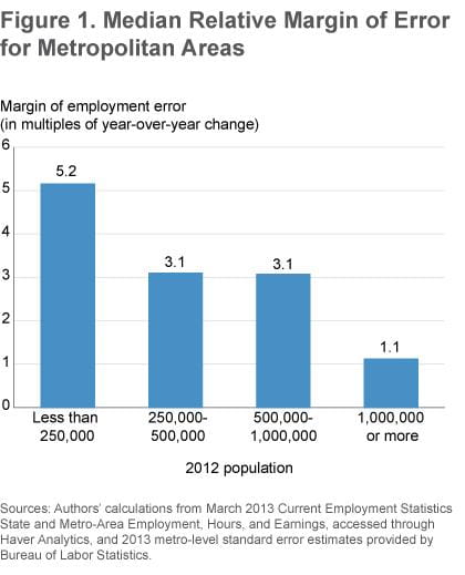
To put this margin in practical terms, imagine that a reported loss of 10,000 jobs could actually be a true loss of 60,000 or a gain of 40,000 jobs in an area of that size. For metro areas with populations of one million or more, the margin of error is about the same size as the year-over-year change in jobs. For metro areas with populations between 250,000 to 1,000,000, the margin of error is about three times the size of the year-over-year job change.
The margins of error for year-over-year jobs-change estimates from the initial SAE are often larger than the estimated change itself. If the estimates were based solely on the survey data, this would imply that one could not make conclusions about the magnitude of job changes—or even the direction of changes—from the initial SAE estimates, especially for smaller metro areas. This is why the BLS augments the survey data with imputation models to generate the metro-area estimates. The other option is to dramatically increase the size of the sample for the survey, but that would be quite costly.
The Size of Revisions
As we’ll show in this section, the margins of error dramatically overestimate the size of the typical error in the initial SAE. This indicates that the models the BLS uses are doing their job and helping to compensate for the small samples. That said, the revisions to the initial SAE can be quite large. From 2006 to 2012, four of the six metro areas we studied had at least one month with revisions that added or subtracted more than 2 percent of employment, which is enough to wipe out the typical average year-over-year change in jobs for these metro areas.
The initial SAE employment estimates are revised at least twice. The first revision happens the month after the estimates are released and involves minor changes primarily due to late survey responses. The second set of revisions comes when the SAE is benchmarked to the QCEW. This annual benchmarking revises the initial employment estimates to match the QCEW plus an estimate of the employment that the QCEW does not cover. Additional revisions can occur late if large corrections are made to the QCEW, but the most significant revisions come with the benchmarked SAE (hereafter final SAE).
We calculated the size of the revisions we report by subtracting the initial SAE from the final SAE. We focus exclusively on the four states in the Fourth Federal Reserve District (Kentucky, Ohio, Pennsylvania, and West Virginia) and six of its metropolitan statistical areas: Akron, Cincinnati, Cleveland, Columbus, Lexington, and Pittsburgh. Unless noted otherwise, the summary statistics cover the period from January 2006 to March 2012.3
We compare the size of the revision to the typical year-over-year change in employment.4 Year-over-year changes are the number of jobs in a month minus the number of jobs in that month in the prior year. The prior-year estimates used to calculate the year-over-year change for the initial estimates are the same as the revised prior-year estimates reported in the BLS’s press releases.
Figure 2 shows the year-over-year percent change in jobs from the final SAE, the initial SAE, and the QCEW for the six metro areas. You can think of the final SAE as correct and the others as two early estimates of the change. The QCEW is almost always closer to the final SAE than is the initial SAE. The figure also shows that the initial SAE has been less accurate in the Akron and Columbus metro areas than in the other metro areas. The initial SAE has been underestimating the Cleveland metro area’s employment growth since 2011.
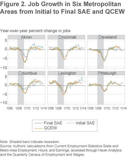
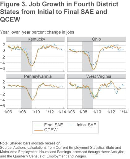
Figure 3 has comparable graphs for Fourth District states. The initial SAE is more accurate for states than for metro areas (generally due to the larger sample sizes) and is especially accurate for Pennsylvania.
Summary statistics allow us to quantify the differences across metro areas and states (table 1). Looking at metro areas, we see that the average absolute value of revisions ranges from 0. 4 percent of employment in the Pittsburgh metro area to 1.2 percent of employment in Akron. For states, this average is 0.2 percent in Pennsylvania and 0.5 percent in Kentucky, Ohio, and West Virginia. It is somewhat surprising that Ohio’s revisions are as large in percentage terms as the smaller states because Ohio’s larger sample size should yield more precise estimates.
Table 1. Summary Statistics about Size of Revisions and Year-over-Year Change
|
|
Revisions | Year-over-year change | Median ratio of revisions and year-over-year change | Percent of months where revision is larger than year-over year-change | ||
|---|---|---|---|---|---|---|
| Metropolitan Statistical Areas | Average magnitude | Percent of employment | Average magnitude | Percent of employment | ||
| Akron, OH | 3,852 | 1.2 | 5,775 | 1.7 | 0.86 | 41.3 |
| Cincinnati, OH-KY-IN | 6,992 | 0.7 | 15,848 | 1.5 | 0.52 | 26.7 |
| Cleveland-Elyria, OH | 6,288 | 0.6 | 17,184 | 1.6 | 0.56 | 33.3 |
| Columbus, OH | 10,191 | 1.1 | 16,092 | 1.7 | 0.55 | 22.7 |
| Lexington-Fayette, KY | 2,043 | 0.8 | 4,929 | 2.0 | 0.38 | 9.3 |
| Pittsburgh, PA | 4,757 | 0.4 | 13,521 | 1.2 | 0.35 | 21.3 |
| States | ||||||
| Kentucky | 8,899 | 0.5 | 31,087 | 1.7 | 0.22 | 14.7 |
| Ohio | 26,252 | 0.5 | 85,329 | 1.6 | 0.37 | 24.0 |
| Pennsylvania | 12,932 | 0.2 | 72,283 | 1.3 | 0.15 | 2.7 |
| West Virginia | 3,801 | 0.5 | 8,641 | 1.1 | 0.52 | 18.7 |
Source: Authors’ calculations from Current Employment Statistics State and Metro-Area Employment, Hours, and Earnings, accessed through Haver Analytics, and Quarterly Census of Employment and Wages (QCEW).
The typical absolute value of the actual year-over-year change in jobs for the metro areas and states in the Fourth District is larger than the typical revision. The average absolute value of the year-over-year change in jobs ranges from 1.1 percent in West Virginia to 2.0 percent in Lexington. In contrast to the margin of error results, in all six metro areas and all four states, the median ratio of the absolute values of revisions and year-over-year changes is below 1. These results indicate that the BLS’s modeling process yields more accurate estimates than the survey would give on its own.
To get an idea of how these ratios translate into the magnitude of revisions, consider the Akron metro area, which has the highest median ratio (0.86), and the state of Pennsylvania, which has the lowest (0.15). These median ratios mean that an initial reported loss of 10,000 jobs in Akron could turn out to be a loss of somewhere between 1,400 and 18,600 jobs when the final estimates are released. In Pennsylvania, a reported loss of 10,000 jobs could turn out to be a loss of between 8,500 and 11,500 jobs.
These examples reflect typical revisions, but very large revisions do occur. The initial SAE for Akron in June 2009 was 329,800 jobs, which gave a year-over-year loss of 10,000 jobs. The final SAE was 317,100 jobs and gave a year-over-year job loss of 22,700—more than double the initial estimate. Revisions go both ways. The revision process changed the estimate of the number of jobs in Cleveland in March 2012 from 980,800 jobs to 1,003,100 jobs, and the year-over-year change in jobs went from a loss of 800 jobs to a gain of 21,500 jobs. Cases like these are the reason we urge caution when using the initial SAE.
Accuracy of the QCEW
Because the SAE data are benchmarked annually and the QCEW data are released quarterly, there are times when the only available sources of metro-level employment statistics are the initial SAE and the QCEW. During those times, data users are faced with choosing between the two. This section shows that the QCEW is the better choice, by quantifying how much closer the QCEW estimates are to the final SAE estimates than the initial SAE estimates are.
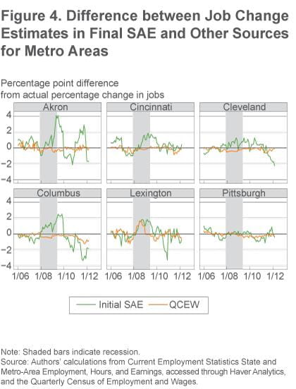
The differences in the year-over-year percent change in employment between the earlier source (initial SAE or QCEW) and the final SAE are shown in figures 4 and 5. The closer the lines are to zero, the more similar the source is to the final SAE. When the line is above zero, the earlier source overestimated the amount of jobs growth; below zero, it underestimated. Figures 4 and 5 show that the percent changes between the QCEW and the final SAE are almost always smaller than the percent changes between the initial SAE and the final SAE. The figures also show that the accuracy of the QCEW is similar across metro areas, while the accuracy of the initial SAE varies substantially.
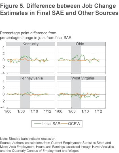
Summary statistics confirm these patterns. First we examine how often the two sources disagree with the final SAE on whether employment rose or declined year over year (first two columns of table 2). Metro areas varied a lot on how often the initial SAE disagreed with the final SAE on the direction of change, ranging from 21 percent of months for Cleveland to 2.7 percent of months for Pittsburgh. The QCEW and the final SAE disagreed on the direction of jobs change between 2.7 percent of months and 9.3 percent. The disagreement rate for the QCEW was lower than that for the initial SAE for every metro area except Pittsburgh, where the two were equal. The QCEW was also more accurate than the initial SAE for every state except Pennsylvania, where the two disagreement rates are equal.
Table 2. Summary Statistics Comparing Accuracy of Initial Estimates and QCEW
| Percent of months year-over-year change was in wrong direction | Correlation with final SAE | |||
|---|---|---|---|---|
| Metropolitan Statistical Areas | Initial SAE | QCEW | Initial SAE | QCEW |
| Akron, OH | 14.7 | 2.7 | 0.84 | 0.99 |
| Cincinnati, OH-KY-IN | 12.0 | 9.3 | 0.95 | 0.99 |
| Cleveland-Elyria, OH | 21.3 | 4.0 | 0.95 | 1.00 |
| Columbus, OH | 18.7 | 2.7 | 0.79 | 0.99 |
| Lexington-Fayette, KY | 9.3 | 6.7 | 0.91 | 0.96 |
| Pittsburgh, PA | 2.7 | 2.7 | 0.94 | 0.99 |
| States | ||||
| Kentucky | 8.0 | 4.0 | 0.97 | 0.99 |
| Ohio | 12.0 | 4.0 | 0.97 | 1.00 |
| Pennsylvania | 4.0 | 2.7 | 0.99 | 1.00 |
| West Virginia | 2.7 | 2.7 | 0.95 | 0.99 |
Source: Authors’ calculations from Current Employment Statistics State and Metro-Area Employment, Hours, and Earnings, accessed through Haver Analytics, and Quarterly Census of Employment and Wages (QCEW).
The next measure we use to judge how well the trends from the initial SAE and the QCEW match the trends from the final SAE is the correlation coefficient (last two columns of table 2). The higher the correlation, the more similar the trends are. The year-over-year change from the final SAE is strongly correlated with the initial SAE, with correlations ranging from 0.79 to 0.95 for metro areas and 0.95 to 0.99 for states. This indicates the value of the initial SAE: while not perfect, it can be a useful early indicator of employment trends, especially at the state level. However, for all metro areas and states, the year-over-year growth from the final SAE is more highly correlated with the growth from the QCEW, with only Lexington having a correlation below 0.99.
Conclusion
At first blush, it appears that people who want to know how many jobs their metropolitan area is gaining (or losing) have two sources to choose from: the SAE or the QCEW. However, since the SAE is subject to large revisions, it is better to think of these as three sources: the initial SAE (which comes out two months after the close of the measured month), the QCEW (which comes out four to nine months after the initial SAE), and the final SAE (which comes out four to fifteen months after the initial SAE). We—and the Bureau of Labor Statistics—recommend using the initial SAE with caution because it is hard to tell when the patterns in that data will stand up to revisions.
Both the rates of disagreement on the direction of changes and the correlation coefficients show that the trends in job growth from the QCEW match the trends from the final SAE more closely than do those from the initial SAE. The final benchmarked SAE is released as many as nine months later than the release of the relevant quarter’s QCEW. During that time, people interested in measuring metro areas’ year-over-year change in jobs would be better off using the QCEW instead of the initial SAE.
Footnotes
- For more details on the methodology for the CES and SAE, please see chapter 2 of the Bureau of Labor Statistics’ Handbook of Methods. Return to 1
- For example, the benchmarked data released on March 21, 2014, revised the data for October 2012 through December 2013. This revision benchmarked the data from October 2012 to September 2013 to the QCEW. The data for October 2013 to December 2013 will be subject to further revision in the next round of benchmarking in March 2015. Return to 2
- This period was chosen because changes to MSA definitions make SAE data before 2005 incomparable, and the most recent data with final benchmarked SAE in the archived Haver database is March 2012. Return to 3
- Due to the limited availability of machine-readable initial SAE estimates, for all months except December we use the estimates released with the following month’s data. These estimates contain revisions due to corrections to the survey process, which are typically minor. The December estimates are the actual initial estimates because the first revision of the December estimates happens at the same time as the benchmarking revisions, making them incomparable to the other first revisions. Return to 4
Suggested Citation
Elvery, Joel A., and Christopher Vecchio. 2014. “Which Estimates of Metropolitan-Area Jobs Growth Should We Trust?” Federal Reserve Bank of Cleveland, Economic Commentary 2014-05. https://doi.org/10.26509/frbc-ec-201405
This work by Federal Reserve Bank of Cleveland is licensed under Creative Commons Attribution-NonCommercial 4.0 International

