

- Share
Concentrated Poverty
Although the U.S. poverty rate was the same in 2000 as it was in 1970, the geographic distribution of the poor has become more concentrated. A higher concentration of poor in poor neighborhoods is a concern because it may mean the poor are exposed to fewer opportunities that affect their outcomes in life, like employment and income. We show where and how poverty has become more concentrated in the United States, and who is most likely to be affected.
The views authors express in Economic Commentary are theirs and not necessarily those of the Federal Reserve Bank of Cleveland or the Board of Governors of the Federal Reserve System. The series editor is Tasia Hane. This paper and its data are subject to revision; please visit clevelandfed.org for updates.
Although the U.S. poverty rate was the same in 2000 as it was in 1970, the geographic distribution of the poor has become more concentrated. A higher concentration of poor in poor neighborhoods is a concern because it may mean the poor are exposed to fewer opportunities that affect their outcomes in life, like employment and income. We show where and how poverty has become more concentrated in the United States, and who is most likely to be affected.
Poverty in the United States has become more concentrated. Although the overall poverty rate was about 12 percent in both 1970 and 2000, we have seen an increase in the share of poor individuals who live in neighborhoods with others who are also poor.
While overall poverty rates might not have gotten worse, the growing concentration of people living in poverty is troubling. People’s outcomes in terms of employment and income are determined not only by individual factors like educational attainment and employment experiences, but also by the resources and advantages of the groups they are a part of, like families, neighborhoods, and nations. Children born in the United States typically have greater access to resources and opportunities than those born in impoverished countries. As a result, they enjoy higher incomes and a higher standard of living. Likewise, poor children who live and attend school in neighborhoods with wealthier families will tend to have better chances in life than those who live in neighborhoods where they exclusively interact with other poor kids.
In this Commentary, we show where and how poverty has become more concentrated in the United States, and who is most likely to be affected.
Individual and Neighborhood Poverty Rates
Official poverty statistics in the United States measure the percent of individuals with income below an absolute threshold. The Census Bureau defines a set of these income thresholds that depend on family size and composition, and family members are considered to be in poverty if their family’s total income is less than the appropriate threshold. It is important to note that this definition measures income before taxes and transfers, and as a result there is considerable debate about whether it might be better for future measures to define poverty in terms of consumption (Meyer and Sullivan, 2010).
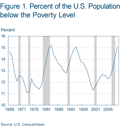
Poverty rates have varied between 11 percent and 15 percent of the population over the last 40 years with a clear procyclical pattern (figure 1). The latest available data are from 2010 and show a sharp rise in the poverty rate during the last recession. While the increase was spread across racial groups, the long-run trends in poverty vary when broken out by race.
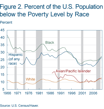
Poverty rates for whites have been relatively unchanged over the last 40 years (figure 2). The poverty rates of Asians declined in the late 1990s and have been similar to those of whites over the past decade. In 2010, for example, the poverty rate for Asians was 12 percent. Blacks and Hispanic populations have had a different experience. While poverty rates for these groups also decreased substantially throughout the 1990s, they are at a markedly higher level than other groups—27 percent for each in 2010.
As informative as individual-level poverty statistics are for understanding the income available to individual members of a family, they don’t provide information about the resources available to individuals through their larger community This is important because one can imagine many reasons that the poverty in one’s neighborhood could be just as important, if not more so, than the poverty of one’s family. A poor family living in a wealthy neighborhood might have access to better schools, better information about the local labor market, or greater access to public goods like safety than a poor family living in a poor neighborhood.
Since it is difficult to measure these neighborhood characteristics, as well as others like the types of peers and role models present, researchers have studied the distribution of poverty across geographic areas. Although an imperfect measure, neighborhood poverty is thought to give us some information about the neighborhood resources that help shape individuals’ opportunities.
Trends in Neighborhood Poverty
To examine the distribution of neighborhood poverty rates, we analyzed decennial census data. We drew these data from the National Historical Geographic Information System (NHGIS) and looked at variation in poverty rates across census tracts and how it changed in recent decades. We define neighborhoods as census tracts, which typically have around 4,000 residents and are delineated to contain a relatively homogeneous population.
We begin our investigation in 1970 because the poverty rate was not defined before the 1970 census, and we end with the year 2000 because data has been collected differently in subsequent years, and also because recent trends have been so heavily influenced by the recent recession (See “Recent Trends in Neighborhood Poverty” for more on this point).
To maintain consistency across years, we focus on census tracts in the 615 counties that already had census tracts in 1970. (Although the variables used to construct the poverty rate are different in these years, we do not believe these differences are large enough to change the main results presented here. An online appendix has a technical discussion about the sample and the variables used in the construction of poverty rates in 1970 and 2000. See the Recommended Readings for the link.)
The researcher Paul Jargowsky documented some of the major trends for this period. He showed that the share of the population living in high-poverty neighborhoods increased dramatically between 1970 and 1990, and then it decreased between 1990 and 2000.
To illustrate these trends, table 1 shows the total number of residents in our sample living in tracts with a given poverty rate in the census years between 1970 and 2000 (for more detail, see the online appendix). The 10 percent threshold is a cutoff that has been used to define high- and low-poverty neighborhoods in some social programs, and examining changes around this cutoff helps to illustrate the overall trends. In 1970, 56 million Americans lived in census tracts with poverty rates above 10 percent. By 1990 that number had grown to 74 million, and by 2000 it had become 85 million.
| Poverty rate (percent) | Millions of people | |||
|---|---|---|---|---|
| 1970 | 1980 | 1990 | 2000 | |
| 2.5 or less | 11.8 | 13.3 | 21.7 | 21.7 |
| 10 or greater | 55.9 | 61.6 | 74.3 | 85.4 |
| 20 or greater | 21.7 | 25.6 | 33.7 | 37.8 |
| 40 or greater | 3.8 | 5.3 | 8.2 | 6.5 |
| Sample size | 148.4 | 164.8 | 182.9 | 204.7 |
Turning our attention to the extremes, we see a large increase between 1970 and 2000 in the number of Americans living in high-poverty neighborhoods. The number of people living in neighborhoods with poverty rates of at least 20 percent grew dramatically from 22 million in 1970 to 38 million in 2000. Smaller in scale, but still worrying, is that the number of people living in neighborhoods with poverty rates of 40 percent or greater more than doubled in our sample before declining in the 1990s. In 1990, 8.2 million Americans in our sample lived in such extremely high-poverty neighborhoods.
Note that coupled with these trends in high-poverty neighborhoods was a trend of increasing numbers living in extremely low-poverty neighborhoods. In 1970, 12 million people lived in neighborhoods with poverty rates of less than 2.5 percent, and this grew to 22 million by 1990.
Since the country’s population grew from 203 million to 281 million between 1970 and 2000, the raw number of people living in high-poverty neighborhoods might not be the best measure of changes in concentrated poverty. Another approach is to measure the share of the overall population in our sample living in neighborhoods with particular poverty rates. These data are shown in table 2.
| Poverty rate (percent) | Share of population (percent) | |||
|---|---|---|---|---|
| 1970 | 1980 | 1990 | 2000 | |
| 2.5 or less | 8.0 | 8.4 | 11.9 | 10.6 |
| 10 or greater | 37.7 | 38.8 | 40.8 | 41.8 |
| 20 or greater | 14.6 | 16.1 | 18.7 | 18.5 |
| 40 or greater | 2.6 | 3.3 | 4.7 | 3.2 |
Although the majority of Americans live in neighborhoods with low poverty rates, these data show worrying trends. One trend is that if you were to select one American at random in 1970 and another one in 2000, the person selected in 2000 would be more likely to have a poor neighbor than the person in 1970. Another trend shown in table 2 is that the percentage of Americans in our sample living in extremely high-poverty neighborhoods (greater than 40 percent poor residents) nearly doubled between 1970 and 1990, but then fell back to its 1980 level by 2000. Finally, the share of Americans in neighborhoods with concentrations of at least 10 percent or 20 percent poor also increased between 1970 and 1990. However, the trends of these poor, but not extremely poor, neighborhoods are less encouraging than are those for the extremely poor neighborhoods. The percentage of the population in neighborhoods with poverty rates of at least 20 percent stayed constant in the 1990s, and the percentage in neighborhoods with poverty rates greater than 10 percent actually continued to increase during those years.
Concentrated Poverty Demographics
The distributions of neighborhood poverty rates just examined show that the poor are unevenly distributed across neighborhoods. This is the case because people sort themselves into neighborhoods, and in the process they create neighborhoods with different distributions of various characteristics.
As a result, people at the same poverty level might have different experiences of poverty, depending on the neighborhood in which they live. We can get an idea of this effect by comparing the neighborhood poverty rates experienced by people at various poverty levels. Not surprisingly, the poor and nonpoor experienced quite different rates of neighborhood poverty in 1970 and 2000.
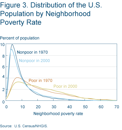
Many more of the poor lived in high-poverty neighborhoods than the nonpoor. To give a concrete example, only 33.6 percent of the nonpoor lived in a neighborhood of 10 percent poverty or more in 1970, compared with 70.0 percent of the poor (figure 3). These percentages grew to 36.8 and 75.5, respectively, by 2000. While both the nonpoor and the poor were more likely to live in a neighborhood of 10 percent poverty or more in 2000 than in 1970, this increase was greater for the nonpoor than the poor.
Note that as the share of residents living in very high poverty neighborhoods increased between 1970 and 2000, the share in very low-poverty neighborhoods also increased (table 2). Since the overall poverty rate did not change dramatically between 1970 and 2000, these data are consistent with other measures indicating residential segregation by income increased during recent decades (Watson, 2009).
Given both the higher poverty rates of blacks and the history of racial segregation in the United States, one would expect that African Americans tend to live in poorer neighborhoods than whites. This expectation is borne out in the data, as shown in Wilson (1987). Between 1970 and 2000, blacks tended to live in neighborhoods with higher poverty rates than did whites or other minorities. For example, the median white person in our sample lived in a neighborhood with a poverty rate of 6.5 percent in 2000, compared with 18.2 percent for the median black person.
It is possible these differences are not directly related to racial segregation. Such differences could arise simply from self-sorting by income combined with the fact that African Americans have a higher poverty rate than whites. However, figure 4 shows that racial segregation is likely to play an important part in explaining the differences in distributions by race. (We use data from 1980 in this figure because poverty rate by race is not readily available from the 1970 Census at the census tract level.)
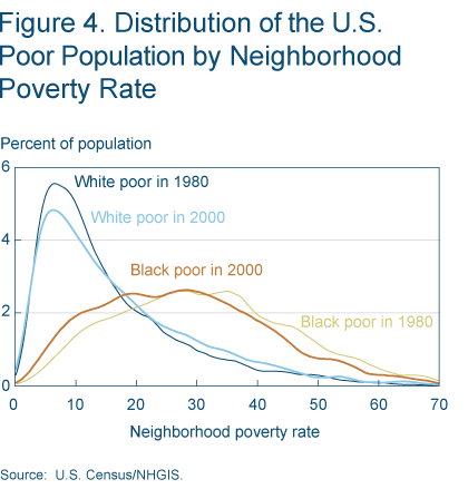
This figure shows that even conditional on being poor, blacks live in much poorer neighborhoods than whites. Most of the white poor live in neighborhoods with much lower poverty rates than the black poor. In 1980 only a small share of the white poor lived in neighborhoods with poverty rates greater than 20 percent, while a majority of the black poor lived in such neighborhoods. Looking at even poorer neighborhoods, relative to the white poor, much larger shares of the black poor lived in neighborhoods with poverty rates of 30 percent, 40 percent, or even 50 percent. Although the distributions became less disparate by 2000, very large differences remained. These differences in neighborhood poverty rates are a leading explanation for the persistence of differences by race in several outcomes, like educational attainment and income.
Implications
We have seen that there is considerable variation in neighborhood poverty rates in the United States. The data we have examined indicate that the share of Americans living in high-poverty neighborhoods increased between 1970 and 2000. And we have found that an individual’s poverty status or race is highly predictive of the neighborhood poverty rate they will experience.
Because it is likely that neighborhoods are one of the factors that shape individuals’ opportunities, we might be concerned with how neighborhood poverty impacts outcomes. For example, we might ask: If the next Bill Gates or Warren Buffett were to grow up in a neighborhood of concentrated poverty, would their talents be utilized?
This question might concern us out of fairness at the individual level. At the same time, this question might cause us to wonder if the current distribution of poverty across neighborhoods serves to limit the collective wealth of our society. These questions warrant further study so that we can better understand the implications of residential sorting for our society, especially in light of the increase in concentrated poverty we have documented here.
Recommended Reading
- “Recent Trends in Neighborhood Poverty,” by Dionissi Aliprantis, and Nelson Oliver, 2011. Federal Reserve Bank of Cleveland, Economic Trends.
- “Heterogeneity, Stratifi cation, and Growth: Macroeconomic Implications of Community Structure and School Finance,” Roland Benabou, 1996. The American Economic Review, 86(3).
- “The Enduring Challenge of Concentrated Poverty in America: Case Studies from Communities Across the U.S.,” edited by David Erickson, Carolina Reid, Lisa Nelson, Anne O’Shaughnessy, and Alan Berube, 2008. Federal Reserve System and the Brookings Institution.
- Poverty and Place: Ghettos, Barrios, and the American City, by Paul A. Jargowsky, 1997. New York: Russell Sage Foundation.
- “Stunning Progress, Hidden Problems: The Dramatic Decline of Concentrated Poverty in the 1990s,” by Paul A. Jargowsky, 2003. The Brookings Institution.
- “The Re-Emergence of Concentrated Poverty: Metropolitan Trends in the 2000s,” by Elizabeth Kneebone, Carey Nadeau, and Alan Berube, 2003. The Brookings Institution.
- “Consumption and Income Inequality in the U.S. since the 1960s,” by Bruce D. Meyer and James. X. Sullivan, 2010. Unpublished manuscript, University of Chicago.
- “Inequality and the Measurement of Residential Segregation by Income in American Neighborhoods,” by Tara Watson, 2009. The Review of Income and Wealth, vol. 55, no. 3.
- The Truly Disadvantaged: The Inner City, the Underclass, and Public Policy, by William J. Wilson, 1987. University of Chicago.
- Concentrated Poverty: Online Appendix. The appendix has a technical discussion about the sample and the variables used in the construction of poverty rates in 1970 and 2000.
Suggested Citation
Aliprantis, Dionissi, and Mary Zenker. 2011. “Concentrated Poverty.” Federal Reserve Bank of Cleveland, Economic Commentary 2011-26. https://doi.org/10.26509/frbc-ec-201126
This work by Federal Reserve Bank of Cleveland is licensed under Creative Commons Attribution-NonCommercial 4.0 International

