

- Share
Raising the College Degree Share: How Nongraduates Figure Into It
In their search for strategies to spur economic development, one statistic civic leaders and researchers invariably use to identify the cities to emulate is the share of college graduates. That is because the college degree share of a region is highly correlated with its economic performance. But too narrow a focus on the graduates can lead to misguided policies. A more thorough analysis suggests that the reason some areas pull ahead and some fall behind in their college degree shares may be due to trends in nongraduate population growth that regional leaders either cannot or would not directly address with public policies.

The views authors express in Economic Commentary are theirs and not necessarily those of the Federal Reserve Bank of Cleveland or the Board of Governors of the Federal Reserve System. The series editor is Tasia Hane. This paper and its data are subject to revision; please visit clevelandfed.org for updates.
In their search for strategies to spur economic development, one statistic civic leaders and researchers invariably use to identify the cities to emulate is the share of college graduates. That is because the college degree share of a region is highly correlated with its economic performance. But too narrow a focus on the graduates can lead to misguided policies. A more thorough analysis suggests that the reason some areas pull ahead and some fall behind in their college degree shares may be due to trends in nongraduate population growth that regional leaders either cannot or would not directly address with public policies.
As economists have documented over and over again, the share of adults who hold college degrees in a region is strongly associated with the economic performance of that region. That connection has led government and civic leaders to pursue raising their region’s share of college graduates as a goal in itself, anticipating that economic benefits will follow.
Unfortunately, a focus on the college degree share can lead to misguided policies. It is a summary statistic that can change for many reasons. One metro area could have a fast-rising share because it has a lot of universities graduating local students or attracting high-skilled immigrants. Another area might achieve a rising share by losing unskilled workers when its low-skill industry declines. To understand the factors that have shaped the degree share, we need to dig behind the summary statistic and examine what is happening to both the graduate and nongraduate populations.
The share of adults with college degrees has risen nationwide over the past 30 years, and some regions have fared better than others. One apparent trend in the data is that “smart places are getting smarter.” Regions that had higher degree shares several decades ago have raised their degree share more than regions that started with a lower degree share.
I analyze growth in the degreed and nondegreed populations to investigate this trend. I find that places that have a high degree share today have gained fewer nongraduates since 1980. Most places that end up at the bottom of the degree share ranking have experienced large growth in their nongraduate populations relative to their size in 1980.
My results offer a caution to civic leaders who hope to improve their education levels by copying the policies of the so-called smart cities. If we do not understand the full context of the population changes, it is possible to overstate the success of education and development policies in giving some regions an advantage over others. A more thorough analysis suggests a large portion of the gaps may be due to trends in nongraduate population growth that regional leaders either cannot or would not directly address with public policies.
Degree Share and Economic Outcomes
When policymakers discuss regional economic development, the share of adults with a college degree is almost always part of the conversation. The statistic is the center of attention because researchers have shown it is positively associated with practically all other important measures of regional economic success.
Educated people can produce higher value goods and services, and this is reflected in their wages. Having a higher share of college graduates is associated with more additional economic activity than would be explained by just replacing high-school graduate incomes with college graduate incomes. It appears that college graduates are more productive when they are near other college graduates. The per capita level of economic activity is higher in larger labor markets, and growth in economic activity is higher too. The degree share is positively associated with income growth, business formation, and patent activity.
There are several theories regarding why the benefits of gathering workers together, so-called agglomeration economies, might exist. Some economists argue that clusters of similar industries are able to efficiently share workers, suppliers, customers, and knowledge. Others have argued that the interaction of diverse people and businesses is the critical factor because it speeds the creation of new ideas and thus growth.
Comparing Degreed and Nondegreed Populations to a Historical Baseline
In 1980, 20.1 percent of America’s working-age metropolitan population held a college degree. By 2008, that share had risen to 32.3 percent. Overall, the degree share has risen faster in MSAs (metropolitan statistical areas) that had high degree shares in 1980. This observation is driven substantially by 15 large metro areas at the high end and 15 large metros at the bottom end (figure 1). For the other 209 metro areas, the relationship between initial degree share and the growth in their degree share is slightly negative. The top and bottom performers are key to the divergence of education levels that we observe, so I analyze them specifically.
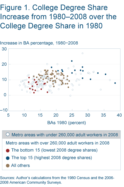
To uncover the growth trends driving the different rises in degree shares, I make a simple change in measurement. Instead of presenting the college graduates in an MSA as a percent of the current population, I present the number of college graduates in 2008 as a percent of their metro area’s population in 1980.1 The nongraduate adults are presented in the same way. Using a historical population figure adjusts the numbers so that figures for places with very different populations, such as New York and Omaha, can be compared.
Scaling the current subpopulations to the baseline total population enables one to see the size of the skilled and unskilled workforces on the same scale within each metro area, namely the percent of the 1980 total (This is preferable to comparing a percent of the 1980 graduate population to a percent of the 1980 nongraduate population). For example, if someone said that Nashville’s college graduate population has grown by 232 percent since 1980 and its nongraduate population has grown by 62 percent, it seems like Nashville is headed for the top of the charts. The smaller base of college graduates in 1980 makes the graduate growth appear very large. Dividing the 2008 populations by the 1980 total reveals that the current graduate population is 62 percent of the 1980 total and the nongraduate population is 132 percent of the 1980 total. This reflects the growth in the populations but keeps in perspective that there are still more nongraduates than graduates.
This measure using the historical baseline does not mask fast or slow growth in one category behind fast or slow growth in another category. Such masking can happen with the commonly reported degree share because it is a purely relative measure. For example, the degree share for Bakersfield, CA, has only risen 1.5 percent since 1980, which might mislead people into thinking there are no more college graduates there. Bakersfield’s college graduate population has risen 133 percent, but this is obscured by the 111 percent increase in its nondegreed population. Bakersfield’s 2008 college graduate population equals 31 percent of the 1980 total working-age population, while its nongraduates equal 178 percent of the 1980 total.
In highly educated places, such as Ann Arbor, MI, the graduate and nongraduate measures are similar. In Ann Arbor, the graduates in 2008 are 107 percent of the 1980 population and the nongraduates are 125 percent of the 1980 population. In most places, where college degree holders are one-sixth to one-third of the population, the nondegree measure is much larger than the degree-holder measure (as in Bakersfield and Nashville). If both figures are high (like Boise, at 108 and 242), it means the metro area’s population has grown by a large percentage since 1980; if both figures are low (like Buffalo, at 30 and 70), the metro area has been a slow-growing place.
In 1980, the adults in each metro area were looking forward to the changing economy and making numerous decisions that would determine the future degree share in their area. They had to decide how much to invest in education for themselves and their children. They had to select business investments and public policies that could make their region more or less attractive to college graduates or nongraduates. They made decisions about residential construction and infrastructure that had a large impact on the local cost of living. All of these choices led to the workforce that the MSA has today.
The U.S. population of adults grew substantially between 1980 and 2008, so the national measures of college graduates and nongraduates together add to 181 percent of the 1980 population. In 2008, the number of college degree-holding adults equaled 58 percent of the 1980 adult population. The number of nondegreed adults in 2008 equaled 123 percent of the 1980 population. These figures are the national averages against which we can compare individual metros (they are population weighted).
Examining the Top and Bottom Cities
The 15 large metro areas with the highest degree share in 2008 are the winners of the horse race, as frequently reported in the media. We would expect them to have vastly outperformed the nation in adding college graduates relative to their initial population. The Austin, Raleigh, and Ann Arbor metro areas clearly have. Nine of the metro areas have outpaced the nation by more moderate amounts. Two of the MSAs, New York and Baltimore, made it into this elite selection despite having college graduate populations (50 and 49) that were lower than the national average relative to their 1980 populations (figure 2). How is the possible?
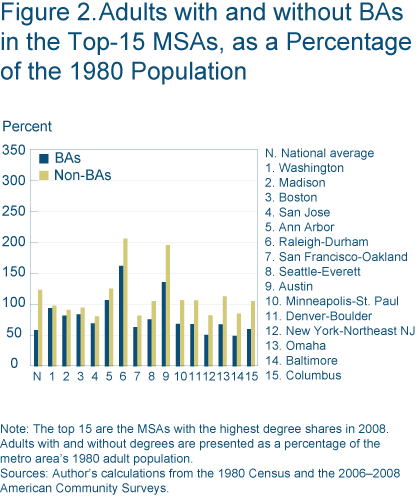
If we shift our focus from the college graduates to the rest of the population, we find a common theme in these highly educated regions. Most of them have experienced low to average growth in their nondegree holding adult populations. Fully 12 of the 15 top large metros have grown their nondegreed population by less than the national average. This may surprise people who know that the economies of cities with high degree shares are generally quite strong. We might expect these places to be attracting a lot of migrants, both high skilled and low skilled.
Chris Berry and Ed Glaeser documented that in the 1970s and 1980s, both skilled and unskilled workers had higher wages if they were in an area with a higher degree share. However, by 2000, the advantage that low-skilled workers enjoyed from working in a high-skilled region had fallen, while the college graduates’ wage advantage had risen. If the cost of living is higher in these high-skilled areas, it would not be surprising if unskilled people decided they could improve their quality of life by earning a similar wage in a less expensive area. Unskilled people from outside these regions would see the same mismatch, and they would opt to stay away. Berry and Glaeser attempted, without success, to find evidence that housing prices impacted degree-share growth in the 1990s. This question certainly needs further study with data reflecting the last decade’s house price appreciation.
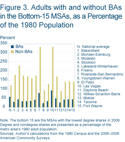
On the other end of the scale, what has been happening in the 15 large metros with the lowest level of bachelor’s degree attainment among their working age adults (figure 3)? Compared to the national average, 13 of the MSAs have added few college graduates since 1980. The other common theme in this selection of metro areas is very rapid growth of their nondegree holding adult populations. Twelve of the MSAs exceed the national average by 17 to 211 percentage points. Adding the graduate and nongraduate figures together would show that most of these metros have grown their populations extensively overall, in contrast to the moderately-growing, highly-educated MSAs in the top 15.
Analyzing All Metros
We might wonder if these top and bottom large metro areas are somehow unusual, or if they fit a larger pattern. To investigate this, I analyzed all 239 metro areas on which we have data for both 1980 and 2008. I grouped them into five categories by their 2008 degree shares and averaged their graduate and nongraduate measures (figure 4).2 The difference in the college degree percent from the top tier (67) to the fourth tier (43) is 24 points. The difference in the nongraduate percent between the first (103) and fourth (144) tiers is much larger at 41 points. The bottom tier contains metro areas that experienced exceptionally rapid growth in their nondegree holding population, 87 points beyond the first tier.
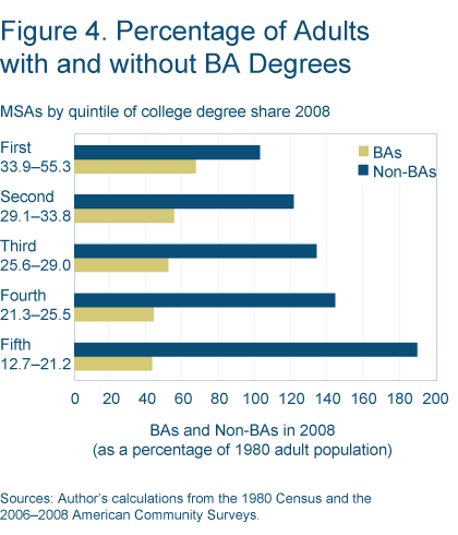
If the differences between metro areas were driven by education alone, we would see similar total population growth in each category, and educational attainment would shift people from the nongraduate percentage to the graduate percentage. However, this is not what we observe. Each step to a lower degree-share category is associated with higher total population growth. In each step down, more nongraduates are “gained” than graduates are “lost.”
Consider an illustration of the influence of the differences in the two populations’ growth. The current gap in average college degree share between the top and bottom tiers is 21 points. If the graduate figures in both the top and bottom tiers were set to the national average, the gap would close to 12.6 points. If the nongraduate figures of the top and bottom tier were equal to the national average, the gap would shrink to 9.4 points.
The high-degree-share metro areas have benefitted from the fact that the modest growth they have had is weighted heavily toward college graduates. If we take the total population growth in each metro, and decompose it into the growth of college graduates and nongraduates, we find that over 72 percent of the population growth in top three categories of MSAs is accounted for by the growth of graduates. The sources of growth in the fourth tier favored nongraduates at 75 percent over graduates at 25 percent. In the bottom tier, the growth of nongraduates equals 92 percent of the total growth.
Implications for Policy
What can policymakers learn from taking into consideration trends in populations of both college graduates and nongraduates? Investing in education is, of course, important because post-secondary education adds a graduate and subtracts a nongraduate. Education thus improves the degree share in two ways. What about population growth? Should regional leaders actively pursue it?If the total number of college graduates is what creates the benefits (agglomeration economies) associated with gathering highly educated people, then population growth should be welcomed because it increases the total college graduate population in the MSA. Browsing through the list of metro areas, one can find 11 large MSAs that added more graduates than the top quintile average (67 percent), but didn’t make the top quintile because they also added more nongraduates. These include Phoenix, Orlando, Boise, Dallas, and Charlotte.
In a recent paper, Ed Gleaser and Kristina Tobio look at the trends in the Sunbelt, where most fast-growing cities are found. They find that productivity gains in the Sunbelt have not greatly outpaced the nation’s since 1980, and demand for the amenity of warm weather has also been unchanged. They explain the continued rapid population growth in the South as a response to large increases in the supply of housing. Policies that encourage low-cost construction may be the ones some regional leaders want to pursue, if they want an expansion of both their graduate and nongraduate populations.
If it is the ratio of college graduates to nongraduates that really matters, then policies that promote total population growth are unnecessary. Resources can be directed elsewhere. Thirteen large MSAs in the top category added fewer graduates than the national average, but still made the top degree share category because their nongraduates figures were even further below the national average. These educated, slow-growing places include Philadelphia, Chicago, and Hartford. These places have succeeded in raising their education levels despite attracting and retaining very few nonskilled workers relative to their initial populations. Keep in mind that this is not that same thing as saying that slow growth will cause a region’s degree share to rise. As Tim Dunne explained in his 2007 commentary, northern, cold weather cities with lower degree shares in 1970 actually shrank in most cases. This did not enable all of them to significantly raise their educational attainment at the city level. At a metro level, their regions remained in the middle or bottom of the rankings.
Relying too heavily on the college degree share and focusing only on college graduates can be misleading. Some metro areas that appear to be highly successful at raising their college degree share are really just keeping pace with the national growth in college graduates while not offering an attractive standard of living to adults without college degrees. It may not be politically desirable, or even possible, for other metro areas to copy their “success.” Likewise, there are metro areas that are gathering massive workforces of college graduates, but they receive less attention from regional development experts because strong in-migration of nongraduates keeps the college degree share at a modest level.
The point to take away from this analysis is that the growth in the nondegree population has to be taken into consideration when the divergence of education levels is discussed. Educating students, retaining graduates, and attracting migrant graduates all matter, but retaining or attracting nongraduates also matters. The populations of adults without college degrees are not static or immobile. Looking at growth relative to a historical baseline refocuses our attention on the majority of the workforce that does not hold an undergraduate degree. Understanding how they impact “smart places getting smarter” is an important step toward deriving useful policy recommendations from this phenomenon.
College Degree Shares in the Fourth District
Population increases from 1980 to 2008 in the metro areas of the Fourth District are all well below the national average of 81 percent. The populations of the Lexington, Columbus, and Cincinnati metro areas have increased by 44 percent to 65 percent, with a favorable mix of graduates to nongraduates. Pittsburgh, Akron, and Cleveland each have college graduate populations that are 35 percent to 37 percent of their 1980 population. However, Cleveland’s nongraduate population is higher than Pittsburgh’s relative to their 1980 totals by 19 percentage points. This contributes to Pittsburgh’s college degree share being 4 points higher than Cleveland’s.
| Metro area | College degree share 2008 | BAs as a percent of 1980 adult population | Non-BAs as a percent of 1980 adult population | Working-age adult population growth 1980–2008 |
|---|---|---|---|---|
| National average | 32.0 | 58 | 123 | 81 |
| Lexington-Fayette | 41.4 | 66 | 94 | 60 |
| Columbus | 36.3 | 60 | 105 | 65 |
| Pittsburgh | 32.5 | 35 | 72 | 7 |
| Cincinnati-Hamilton | 31.8 | 46 | 98 | 44 |
| Akron | 30.8 | 37 | 82 | 19 |
| Cleveland | 28.5 | 36 | 91 | 27 |
| Erie | 27.4 | 31 | 82 | 12 |
| Dayton-Springfield | 26.2 | 26 | 74 | 1 |
| Toledo | 22.2 | 15 | 53 | −32 |
| Canton | 21.6 | 26 | 95 | 21 |
| Youngstown-Warren | 19.8 | 23 | 94 | 17 |
Note: Lexington, Columbus, and Youngstown each added one county to their MSA between 1980 and 2008. Pittsburgh and Cleveland both added two counties, and Cincinnati added five counties. Toledo lost Monroe County to the Detroit MSA. Dayton lost Preble County and gained Clark County.
Footnotes
- The data I use for this analysis are from the 1980 Census and the 2006, 2007, and 2008 American Community Surveys. The three recent surveys are combined to make more accurate estimates, but I refer to them by the most recent year, 2008. I limit the analysis to working-age adults. I exclude people younger than 25 because many of them are still finishing their undergraduate degrees. I also do not include people who are 65 or over and neither working nor looking for work. I assume these people are retired and unlikely to reenter the labor force. The definitions of the MSAs have changed in many cases as the Census Bureau added exurban counties that were developed. These counties were not included in 1980 because their populations were small and few of their workers were commuting into the MSA. The addition of these counties’ populations into the MSAs is a source of growth, along with migration and natural increase. Return
- I weighted the average calculations using the 2008 population, so the numerous small metros are not overrepresented. Return
Recommended Reading
- “Altered States: A Perspective on 75 Years of State Income Growth,” 2005. Federal Reserve Bank of Cleveland, Annual Report.
- “The Complementarity between Cities and Skills,” by Edward Glaeser and Matthew Resseger. 2010. Journal of Regional Science, 50:1.
- The Economy of Cities. Jane Jacobs. 1969. New York: Vintage.
- “Educational Attainment and Metropolitan Growth,” by Paul Gottlieb and Michael Fogarty. 2003. Economic Development Quarterly, 17:4.
- “The Growth of Cities in the Fourth District,” by Timothy Dunne. 2007. Federal Reserve Bank of Cleveland, Economic Commentary (August).
- “The Rise of the Sunbelt.” by Edward L. Glaeser and Kristina Tobio. 2008. Southern Economic Journal, 74:3.
Suggested Citation
Whitaker, Stephan D. 2011. “Raising the College Degree Share: How Nongraduates Figure Into It.” Federal Reserve Bank of Cleveland, Economic Commentary 2011-09. https://doi.org/10.26509/frbc-ec-201109
This work by Federal Reserve Bank of Cleveland is licensed under Creative Commons Attribution-NonCommercial 4.0 International

