

- Share
Changes in the Occupational Structure of the United States: 1860 to 2015
This Commentary describes how the mix of occupations in which people have been employed in the United States has evolved over time. After 100 years of dramatic change, the mix of occupations has been more stable since 1970. This trend adds occupational structure to the growing list of ways our nation’s economy has become less dynamic in recent decades.
The views authors express in Economic Commentary are theirs and not necessarily those of the Federal Reserve Bank of Cleveland or the Board of Governors of the Federal Reserve System. The series editor is Tasia Hane. This paper and its data are subject to revision; please visit clevelandfed.org for updates.
Look at any business magazine and you are likely to find a story about the rapid pace of change in the economy. However, a growing body of evidence has shown that the US economy has become less dynamic in recent decades. For example, there have been declines in internal migration rates (Molloy, Smith, and Wozniak, 2011), job creation and destruction rates (Davis et al., 2012), job flows (Bjelland et al., 2011, Davis et al., 2012), new business formation (Decker et al., 2014), and productivity growth (e.g., Gordon, 2016). Research suggests that this loss of dynamism has slowed the economy’s ability to adapt to changes and reduced growth in productivity and wages (e.g., Decker et al., 2014 and Molloy et al., 2016).
The rate of change in the types of work people do, or occupational mix, is an element of economic dynamism that has not been studied. This type of change often reflects business innovations. When a business adopts new technology, produces new products, or makes other changes to its processes, doing so usually causes changes in occupational mix. Consider what happens when a factory automates. The number of production workers usually declines, while the number of engineers rises and the front office stays stable. This shifts the employment share of production workers down and the shares of engineering, management, and office workers up. Similar changes happen when office technology changes. For example, Autor, Levy, and Murnane (2002) found that when a bank adopted computerized check processing, the number of clerical workers required for check processing fell by about one-fifth, which caused increases in the employment shares of all other occupational groups at the bank.
This Commentary examines changes in occupational mix in the United States from 1860 to 2015. This long horizon helps put today’s economic change in the context of past periods of rapid technological change such as the agricultural and industrial revolutions of the late 19th and early 20th centuries. As with other work that finds that economic dynamism has fallen, I find that US occupational mix has become increasingly stable since 1970, and the rate of change in occupational structure is now low relative to that of most past decades. In fact, the degree of change in the occupational mix in recent years is less than half that seen in the decades with the most change, the 1900s and the 1940s. While a stable occupational mix implies that career disruptions are less common than they have been in the past, the reduced rate of change is an additional way the nation’s economy has become less dynamic in recent decades.
Measuring Occupational Mix over Time
I use individual-level data from the decennial censuses from 1860 through 2000 (excepting 1890) and the American Community Surveys of 2005, 2010, and 2015. The data are a 1 percent random sample of households in all years. These data come from Integrated Public Use Microdata Series, or IPUMS (Ruggles et al., 2015) and include an occupation code that is time-consistent, meaning that the same codes were applied to all years of data.1 This occupation code enables me to have a long time series with consistent occupation definitions. I restrict the data to people who are in the labor force, but I put no age restrictions on the data because the age at which people enter the labor force has changed over the 155 years covered in the study. Alaska and Hawaii are excluded from the study because they were not consistently included in the decennial censuses prior to becoming states in 1959.
The set of time-consistent occupation codes contains some occupations that are not included in all years, either because they are recent additions or archaic (such as “gentleman/lady at leisure”). In order to make meaningful comparisons across time, I translate these codes into a stable set of occupations by making a crosswalk from the time-consistent occupation codes to the major occupational groups of the current Standard Occupational Classification System (SOCS). The main advantage of aggregating occupations to major occupational groups, which I will call simply occupational groups from now on, is that it helps to code occupations equivalently in all periods. Using occupational groups also focuses on large changes in occupational mix while ignoring small ones. For example, machinists and tool and die makers are similar occupations that are measured separately, but since they all are in the same occupational group my measures will not reflect any shifts within these two occupations. That is desirable in this case because these occupations are similar. However, focusing on occupational groups will also obscure some significant occupational changes. For example, blacksmiths and machinists are both in the production occupational group, so using occupational groups will cause me to understate the degree of the change in metalworking during the 19th century.
Of the 268 occupations listed in my sample, five did not have a clear one-to-one relationship to a major occupational group in SOCS. For these occupations, I looked at the distribution of more detailed occupation codes within these occupations to see which major occupational group predominated. One of the five, “laborers (not elsewhere classified)”—essentially, laborers outside of agriculture and mining—is a large occupation that cuts across several occupational groups, so I treat it as its own major occupational group. The other four were assigned to the occupational group that fits the largest proportion of employment in that occupation.2 Table 1 shows the resulting occupational groups and their shares of employment in 1860 and 2015.
| Employment share | Change in share | |||
|---|---|---|---|---|
| Occupational group | 1860 | 2015 | ||
| Administration, business, financial, and legal | 1.0 | 16.3 | 15.4 | |
| Office administration | 0.5 | 12.4 | 11.9 | |
| Business and financial | 0.1 | 3.2 | 3.1 | |
| Legal | 0.4 | 0.7 | 0.3 | |
| Management | 4.8 | 13.2 | 8.4 | |
| Other service occupations | 1.1 | 13.1 | 12.0 | |
| Food related | 0.4 | 5.1 | 4.7 | |
| Personal service | 0.2 | 3.0 | 2.8 | |
| Arts, media, and sports | 0.3 | 3.2 | 2.9 | |
| Protective service | 0.2 | 1.9 | 1.7 | |
| Healthcare | 1.0 | 9.5 | 8.5 | |
| Healthcare professionals | 1.0 | 6.3 | 5.3 | |
| Healthcare support | 0.0 | 3.2 | 3.2 | |
| Sales | 2.5 | 8.7 | 6.2 | |
| Construction, extraction, transportation, and moving | 10.2 | 7.6 | −2.6 | |
| Construction and extraction | 7.6 | 4.0 | −3.6 | |
| Transportation and moving | 2.6 | 3.5 | 0.9 | |
| Science, math, architecture, and engineering | 0.1 | 7.4 | 7.3 | |
| Mathematical | 0.0 | 4.1 | 4.1 | |
| Architecture and engineering | 0.1 | 2.5 | 2.4 | |
| Scientists | 0.0 | 0.8 | 0.8 | |
| Cleaning, maintenance, and repair | 10.5 | 6.8 | −3.7 | |
| Cleaning and maintenance | 8.2 | 3.9 | −4.3 | |
| Maintenance and repair | 2.4 | 2.9 | 0.5 | |
| Production | 14.2 | 6.5 | −7.6 | |
| Education, library, and social service | 1.8 | 6.1 | 4.2 | |
| Education and library | 1.4 | 4.9 | 3.5 | |
| Social service | 0.5 | 1.2 | 0.7 | |
| Laborers | 9.6 | 3.6 | −6.1 | |
| Farm, fishing, and forestry | 43.2 | 1.2 | −42.1 | |
Source: Author’s calculations from IPUMS USA data (Ruggles et al. 2015).
Notes: In figure 1 the nonbolded groups were combined into the bolded category above them. The full occupational group detail was used to calculate the occupational change indexes.
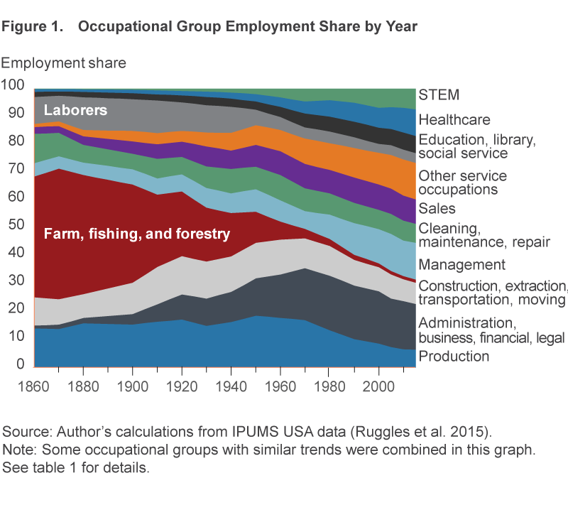
National Occupational Change
Figure 1 shows how the occupational mix in the United States has changed over time. To make the graph more readable, some occupational groups with similar trends were combined, resulting in 12 larger occupational groups (shown in bold in table 1). The graph shows five major shifts in occupational mix: the decline of agricultural employment (1870 to 1970), the rise of office work (1870 to 1970), the decline of manual labor (1940 to 1970), the decline of production work (1950 to 2010), and the rise of management (1880 to 1950 and more rapidly from 1970 to 2005). Another thing that jumps out from this graph is that the occupational mix has been relatively stable since 1990.
To summarize the changes in the occupational groups’ employment shares into a single number that can be compared across time, I use the index of dissimilarity from Duncan and Duncan (1955). The occupational change index is defined as
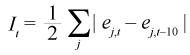
where ej,t is occupational group j’s share of employment in year t.3 This index has an intuitive meaning: It is the percent of employed people who would need to change to a different major occupational group for the occupational structure to be the same as it was 10 years prior.4
The resulting index is plotted in figure 2. The average occupational change index across these 14 decades is 6.8 percent. The index peaked at 10.7 percent in 1950, with its second-highest level in 1910. Overall, the index trended upward from 1900 to 1970, rising from 4.4 percent in 1900 to 8.0 percent in 1970. The degree of change in occupational mix has been steadily declining since 1970, falling to 4.3 percent in 2015. This means that the percentage change in occupational mix between 2005 and 2015 was just over half the change between 1960 and 1970.
One potential reason that the index was relatively high between 1910 and 1970 is that there were dramatic changes in agricultural technology, and the share of employment accounted for by the farming, fishery, and forestry occupational group over this time fell from 35 percent in 1900 to 3 percent in 1970. To see the degree to which this one occupational group affected the results, I calculated an alternate index that excludes the farming, fishery, and forestry group. Like the overall index, this nonfarming index peaked in 1950, though at 8.7 percent, it is 2 percentage points lower than the overall index in 1950. The most dramatic difference between the two series occurred in 1910: The overall index is almost double the nonfarming index (9.9 percent and 4.9 percent, respectively). The two 1910 indexes differ so much because the greatest change in occupational structure between 1900 and 1910 was a large drop in the farming, fishery, and forestry occupational group’s share of employment, which declined more between 1900 and 1910 than in any other decade. While the nonfarming index shows less occupational change than the overall index in most periods, the core pattern remains: Occupational change has been slowing since 1970, and the index reached its lowest value in 2015. This means that agriculture plays little role in the recent stabilization of occupational structure.
Changes in the Nation’s Occupational Structure between 2005 and 2015
While the occupational change index was at its lowest in 2015, the index indicates that some notable changes in the US occupational structure occurred between 2005 and 2015. In the discussion that follows, I focus on the occupational groups that had the largest changes in share, even though some other groups had larger percent changes, because the change in share better reflects the size of the impact on the economy as a whole.
The occupational groups with the largest declines in share were the office administration, construction and extraction, and production groups, with declines of 1.2 percentage points, 1.1 percentage points, and 0.9 percentage points, respectively. The office administration group’s share of employment peaked in 1980, but it declined more between 2005 and 2015 than in any other 10-year period. The decline in the share of the construction and extraction group reflects both long-term trends and the fact that 2005 occurred during the housing boom. The decline in the production group’s share of employment continues a trend that began in the 1950s.
The occupational groups that had the largest increase in employment share between 2005 and 2015 were the healthcare professional, healthcare support, and food preparation and serving-related occupational groups, with increases of 1.0 percentage points, 0.7 percentage points, and 0.7 percentage points, respectively.5 The two healthcare occupational groups have grown rapidly in most decades since 1940. The food-related occupational group has had a growing share of employment in most decades since 1920, rising from 1.1 percent in 1920 to 5.1 percent in 2015.
State-Level Occupational Change
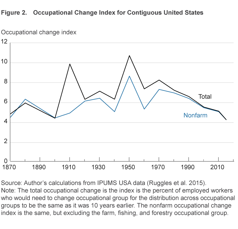
The index of occupational change can also be calculated for individual states and the District of Columbia, which makes it possible to explore the degree of change in occupational mix at the state level. When interpreting these indexes, we must keep in mind some geographical and statistical issues that aren’t relevant at the national level, but the indexes can still give us useful insights into occupational changes within and across the states.
Geographical issues to be aware of include the fact that the data measure place of residence, not place of work. So when a worker moves from one state to another, it can change the occupational distributions of both the state she leaves and the state she moves to. For this reason, the index for the nation is lower than that of most states in all years—when people migrate across state lines it can change state indexes, but not the national index. A similar logic applies with respect to the geographic size of states: In small states, a shorter move is required to move into or out of the state, a situation which leads small states to have relatively high indexes. Hence, the two states with the largest indexes in 2015 are the District of Columbia (8.5 percent) and Delaware (7.9 percent), and the state with the lowest occupational change index is Texas (3.5 percent). Also, as state occupational indexes are based on where people live, not where they work, smaller states are more likely to host workers who live and work in different states. Therefore, it is difficult to compare the indexes of states of notably different sizes.
The statistical issue that has to be considered when looking at the state indexes is that the indexes are based on a random sample and therefore have sampling error. The sampling error falls with population size, so populous states have smaller margins of error than less populous states. I use bootstrapped standard errors to estimate the 95 percent confidence intervals for the state indexes. In 2015, the margin of error (which is half the size of the confidence interval) ranged from 0.1 percentage points in California to 3.1 percentage points in Vermont. These dramatic differences in precision are the other reason we have to be cautious when comparing indexes across states.
With these considerations in mind, we can turn to how occupational mix has evolved at the state level. The state indexes of occupational change from 2005 to 2015 are listed in table 2 and mapped in figure 3. On the map, each color represents a quintile in the distribution of the index across states—the darker the color, the higher the occupational change index. While the District of Columbia and Delaware have the highest indexes (perhaps because of their proximity to other states), the map shows that there are four clear clusters of states with notable changes in occupational structure over these 10 years.
| State | 2015 occupational change index | Rank | 95% confidence interval | |
|---|---|---|---|---|
| Lower bound | Upper bound | |||
| Washington DC | 8.5 | 1 | 5.8 | 11.3 |
| Delaware | 7.9 | 2 | 5.3 | 10.5 |
| Rhode Island | 6.9 | 3 | 5.4 | 8.5 |
| Vermont | 6.9 | 4 | 3.8 | 10.0 |
| Idaho | 6.8 | 5 | 5.1 | 8.6 |
| Nevada | 6.7 | 6 | 5.8 | 7.7 |
| Montana | 6.7 | 7 | 4.3 | 9.1 |
| Oregon | 6.5 | 8 | 5.8 | 7.1 |
| West Virginia | 6.4 | 9 | 5.0 | 7.8 |
| Massachusetts | 6.3 | 10 | 5.9 | 6.7 |
| Nebraska | 6.3 | 11 | 4.9 | 7.7 |
| South Dakota | 6.1 | 12 | 3.6 | 8.7 |
| North Dakota | 6.1 | 13 | 3.1 | 9.0 |
| Kansas | 6.0 | 14 | 5.2 | 6.9 |
| New Hampshire | 6.0 | 15 | 4.5 | 7.5 |
| Utah | 5.9 | 16 | 4.8 | 6.9 |
| Alabama | 5.6 | 17 | 5.0 | 6.2 |
| California | 5.6 | 18 | 5.5 | 5.6 |
| Arizona | 5.5 | 19 | 5.0 | 5.9 |
| New Mexico | 5.4 | 20 | 4.0 | 6.7 |
| Tennessee | 5.4 | 21 | 4.9 | 5.8 |
| South Carolina | 5.3 | 22 | 4.7 | 5.9 |
| Louisiana | 5.3 | 23 | 4.7 | 6.0 |
| Illinois | 5.3 | 24 | 5.1 | 5.6 |
| New Jersey | 5.3 | 25 | 5.0 | 5.6 |
| Wyoming | 5.3 | 26 | 2.4 | 8.2 |
| Oklahoma | 5.3 | 27 | 4.4 | 6.2 |
| Maryland | 5.2 | 28 | 4.8 | 5.6 |
| Virginia | 5.2 | 29 | 4.8 | 5.5 |
| Iowa | 5.1 | 30 | 4.2 | 6.1 |
| New York | 5.1 | 31 | 4.9 | 5.2 |
| Arkansas | 5.1 | 32 | 4.3 | 5.9 |
| Mississippi | 5.0 | 33 | 4.1 | 5.8 |
| Indiana | 4.9 | 34 | 4.5 | 5.3 |
| Georgia | 4.9 | 35 | 4.5 | 5.2 |
| Minnesota | 4.8 | 36 | 4.2 | 5.3 |
| Michigan | 4.7 | 37 | 4.5 | 5.0 |
| Wisconsin | 4.7 | 38 | 4.3 | 5.2 |
| North Carolina | 4.7 | 39 | 4.3 | 5.0 |
| Florida | 4.6 | 40 | 4.5 | 4.8 |
| Connecticut | 4.6 | 41 | 3.9 | 5.3 |
| Kentucky | 4.6 | 42 | 4.1 | 5.1 |
| Maine | 4.5 | 43 | 2.9 | 6.0 |
| Colorado | 4.4 | 44 | 4.0 | 4.8 |
| Pennsylvania | 4.4 | 45 | 4.1 | 4.6 |
| Washington | 4.3 | 46 | 3.9 | 4.7 |
| Ohio | 4.2 | 47 | 4.0 | 4.4 |
| Missouri | 4.0 | 48 | 3.6 | 4.4 |
| Texas | 3.6 | 49 | 3.5 | 3.7 |
Source: Author’s calculations from IPUMS USA data (Ruggles et al., 2015).
The first cluster is Idaho, Montana, Oregon, and Nevada, all of which are in the highest quintile of the distribution and have indexes ranging from 6.5 percent (Oregon) to 6.8 percent (Idaho). This Northwest cluster experienced especially large changes in occupational structure because of a decline in the employment shares of construction and extraction occupations with the end of the housing bubble and strong growth in healthcare and food-related occupations.
The second cluster consists of Massachusetts, New Hampshire, Vermont, and Rhode Island, with indexes ranging from 6.0 percent (New Hampshire) to 6.9 percent (Rhode Island). This New England cluster saw relatively large changes in occupational structure because of growth in the employment shares of healthcare, mathematical, and management occupations.
The third cluster is Kansas, Nebraska, North Dakota, and South Dakota, with indexes ranging from 6.0 percent (Kansas) to 6.3 percent (Nebraska). This Plains cluster saw very different patterns than the nation, with the employment share of the laborer occupational group rising 0.9 percentage points and the employment share of construction and extraction occupations remaining unchanged even though the nation saw a 1.1 percentage point decline in this group’s employment share. These changes are consistent with the rapid growth in the energy sector in this cluster of states between 2005 and 2015.
The final cluster of states is Illinois, Indiana, Iowa, Kentucky, Michigan, Minnesota, Missouri, Ohio, Pennsylvania, and Wisconsin, which all have low occupational change indexes. Of these states, all but Illinois had indexes that fell in the two lowest quintiles of the distribution of the index. These states had indexes ranging from 4.0 percent (Missouri) to 5.3 percent (Illinois). The direction of change in the occupational group shares in these states was similar to that of the nation, but generally of a smaller magnitude.
Occupational Change in Fourth District States
Now we turn our attention to the states in the Federal Reserve’s Fourth District: Kentucky, Ohio, Pennsylvania, and West Virginia. In 2015, West Virginia had an index of 6.4 percent, the 9th highest in the nation (figure 4). The other Fourth District states had relatively low indexes in 2015: 4.6 percent in Kentucky, 4.4 percent in Pennsylvania, and 4.2 percent in Ohio (ranked 42nd, 45th, and 47th in the nation, respectively).
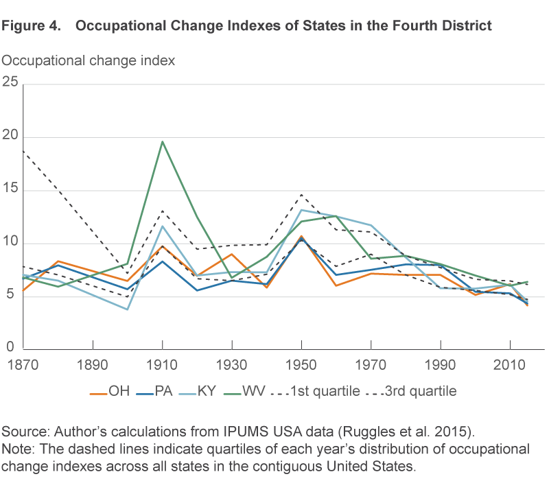
Compared to other states in the Fourth District, Kentucky had relatively high levels of occupational change from 1940 through 1970. This is primarily because Kentucky had a high share of farm, fishing, and forestry occupations. In 1940, 30 percent of Kentucky’s employment was in this occupational group, the 10th-highest share of any state at the time and more than double the share in any other Fourth District state. By 1970, farm, fishing, and forestry occupations declined to 6 percent of Kentucky’s employment. Since 1990, Kentucky’s occupational change indexes have been more influenced by changes in the share of employment in production occupations—this group’s employment share fell from 13 percent in 1990 to 9 percent in 2010.
In most periods since 1870, Ohio had occupational change indexes that were low compared most other states in the nation. Of the 15 periods covered here, Ohio’s index was in the lowest quartile in 6 periods and in the second-lowest quartile in 5 periods. Ohio has never had an occupational change index in the top quartile over this time span. The state had its highest-ranking occupational change indexes in 1990 and 2010 (7.4 percent and 6.2 percent, ranked 19th and 22nd, respectively). Ohio’s 1990 index was high because of a large decline in the employment share of the production group (down 4.3 percentage points) and an increase in the employment share of the management group (up 2.5 percentage points). Ohio’s 2010 index was high because of declines in the employment shares of the production and office administration groups (down 2.7 percentage points and 1.2 percentage points, respectively) and increases in the healthcare support and healthcare professionals groups (up 1.3 percentage points and 1.2 percentage points, respectively).
Like Ohio, in most decades Pennsylvania had a low degree of occupational change relative to other states in the country—its index has never been in the top quartile of occupational change. Of the 15 periods covered here, Pennsylvania’s index was in the lowest quartile in 8 periods and in the second-lowest quartile in 6 periods. Pennsylvania had its highest-ranking occupational change indexes in 1980 and 1990 (8.1 percent in both decades, ranked 28th and 13th, respectively). These peaks were driven by large declines in the share of employment of production occupations, which fell almost in half between 1970 and 1990, and increases in the share of employment in management occupations, which doubled between 1970 and 1990.
West Virginia had two periods with especially high levels of occupational change. The first was 1900 to 1930, during which the share of employment in farm, fishing, and forestry occupations fell from 48 percent to 19 percent and the share of employment in construction and extraction occupations rose from 11 percent to 25 percent as coal mining rapidly expanded. The other period of dramatic change in West Virginia’s occupational structure was 1940 to 1970, when the employment share of farm, fishing, and forestry occupations fell from 12 percent to 2 percent and the employment share of construction and extraction occupations fell from 24 percent to 13 percent as coal mining became less labor intensive.
Caveat
There is one significant caveat to using occupational mix to measure economic change: It fails to capture changes in the tasks performed by specific occupational groups. There have been substantial within-occupation changes in the tasks workers perform. A machinist from 1900 would not be able to operate the computer-controlled machines that machinists routinely use today. A cashier from 1900 would be amazed by today’s bar code scanners (and perhaps threatened by self-checkout lines). The occupational change index presented above does not reflect these task changes, unless they caused changes in occupational mix.
This caveat means that the occupational change index understates the level of task change. However, the trend is affected only if the rate of within-occupational-group changes in tasks have varied over time. If the tasks that workers in an occupational group are performing have changed less in recent decades than in the past, then the occupational change index may actually understate the decline in task change. There is good reason to think that this within-occupational-group task change has also declined recently. For example, Gordon (2015) notes that the digital revolution dramatically changed office work between 1970 and 2000, but in 2015 “the equipment used in office work and the productivity of office employees closely resembles that of a decade ago.”
Conclusion
Measuring changes in occupational structure captures an element of economic change that is especially relevant to the workforce: Changes in the kinds of work people do. The occupational change indexes presented above show that the degree of change in the nation’s occupational structure peaked in 1950 and has been falling since 1970. In 1950, 10.7 percent of workers would have to change occupational groups to make the occupational distribution the same as it was 10 years earlier—the comparable figure for 2015 is4.3 percent. The relatively low levels of occupational change in recent decades join a host of other measures—including lower productivity growth, reduced migration, reduced job flows, and less business formation—that show that the United States’ economy has become less dynamic in recent decades.
Not all states have followed the nation’s trend. For example, while occupational change has been slowing in the nation since 1970, occupational change accelerated in Pennsylvania between 1970 and 1990. In a more recent example, the western half of the United States saw larger changes in occupational structure between 2005 and 2015 than did the eastern half of the nation.
Like many changes, the slowdown in occupational change has both good and bad ramifications. On the positive side, this means that sharp structural changes that can disrupt lives (such as the large decline in production work that forced many to change careers in the 1980s) are less common than they have been in past decades. On the negative side, the lack of occupational change may be restraining income growth. Past changes in occupational mix have contributed to income growth, such as the rise of high-wage occupations such as manager and the decline of low-wage occupations such as laborer and farmworker. The slowdown in occupational change may be part of the reason income growth has been slower in recent decades than it was between 1940 and 1970.
Footnotes
- I use the IPUMS occupation code OCC1950. Return to 1
- This proportion was 60 percent or greater for each of these occupations. Return to 2
- Person-level sample weights from the IPUMS data were used in calculating shares. Return to 3
- Because there is no occupational data for 1890, in 1900 the index is half the index value of the change between 1880 and 1900 and can be thought of as the average value of the index over those two decades. Return to 4
- The food preparation and serving-related occupational group includes occupations most commonly found at restaurants, such as cooks, dishwashers, and wait staff. It covers the full range of restaurants, from fast food to fine dining. Return to 5
References
- Autor, David, Frank Levy, and Richard J. Murnane. 2002. “Upstairs Downstairs: Computers and Skills on Two Floors of a Large Bank.” Industrial and Labor Relations Review, 55(3), April, 432–447.
- Bessen, James. 2015. Learning By Doing: The Real Connection Between Innovation, Wages, and Wealth. New Haven, CT: Yale University Press.
- Bjelland, Melissa, Bruce Fallick, John Haltiwanger, and Erika McEntarfer. 2011. “Employer-to-Employer Flows in the United States: Estimates Using Linked Employer-Employee Data.” Journal of Business and Economic Statistics, 29(4), 493–505.
- Davis, Steven J., R. Jason Faberman, and John Haltiwanger. 2012. “Labor Market Flows in the Cross Section and over Time.” Journal of Monetary Economics, 59(1), 1–18.
- Decker, Ryan, John Haltiwanger, Ron Jarmin, and Javier Miranda. 2014. “The Role of Entrepreneurship in US Job Creation and Economic Dynamism.” Journal of Economic Perspectives, 28(3), 3–24.
- Duncan, Otis Dudley, and Beverly Duncan. 1955. “A Methodological Analysis of Segregation Indexes.” American Sociological Review, 20(2), 210–217.
- Gordon, Robert J. 2015. “Secular Stagnation: A Supply-Side View.” American Economic Review: Papers and Proceedings, 105(5), 54–59.
- Gordon, Robert J. 2016. The Rise and Fall of American Growth: The US Standard of Living since the Civil War. Princeton, NJ: Princeton University Press.
- Molloy, Raven, Christopher L. Smith, and Abigail Wozniak. 2011. “Internal Migration in the United States.” Journal of Economic Perspectives, 25(3), 173–196.
- Ruggles, Steven, Katie Genadek, Ronald Goeken, Josiah Grover, and Matthew Sobek. 2015. Integrated Public Use Microdata Series: Version 6.0 [dataset]. Minneapolis: University of Minnesota.
Suggested Citation
Elvery, Joel A. 2019. “Changes in the Occupational Structure of the United States: 1860 to 2015.” Federal Reserve Bank of Cleveland, Economic Commentary 2019-09. https://doi.org/10.26509/frbc-ec-201909
This work by Federal Reserve Bank of Cleveland is licensed under Creative Commons Attribution-NonCommercial 4.0 International

