- Share
Urban Decline in Rust-belt Cities
Many Rust-Belt cities have seen almost half their populations move from inside the city borders to the surrounding suburbs and elsewhere since the 1970s. As populations shifted, neighborhoods changed—in their average income, educational profile, and housing prices. But the shift did not happen in every neighborhood at the same rate. Recent research has uncovered some of the patterns characterizing the process.
The views authors express in Economic Commentary are theirs and not necessarily those of the Federal Reserve Bank of Cleveland or the Board of Governors of the Federal Reserve System. The series editor is Tasia Hane. This paper and its data are subject to revision; please visit clevelandfed.org for updates.
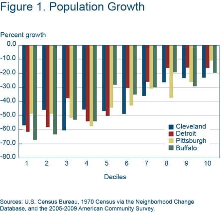
Most major Rust-Belt cities have seen their populations shrink since their heydays, and with that decline, the average income of the remaining residents has fallen as well. Cities such as Buffalo, Cleveland, Detroit, and Pittsburgh have each lost more than 40 percent of their populations over the last four decades. However, the losses have not been uniform across neighborhoods. Some neighborhoods have declined more rapidly than others.
The uneven population decline across neighborhoods implies that the distributions of income, house prices, and human capital have also shifted within cities and larger metropolitan areas over time. While the challenges posed by the decline in overall population are well recognized, the movement of the population across neighborhoods within these Rust-Belt cities creates additional challenges. Policymakers and city planners need to understand how such neighborhood dynamics evolve and, ultimately, how the underlying dynamics interact with the provision of public services and infrastructure.
Recent research on population and income dynamics in four Rust-Belt cities shows that neighborhoods with the lowest housing prices are the ones that experience the steepest declines in population, but that income falls more sharply in neighborhoods with middle-tier house prices. These patterns are the reverse of a gentrification process. Both processes involve the borders of poor and rich neighborhoods. But where gentrification typically leads to an outward expansion of high-income neighborhoods into low-income neighborhoods, reverse gentrification involves an inward contraction of high-income neighborhoods, as the border areas become low-income.
This Commentary describes the reverse gentrification process and its consequences in four cities—Buffalo, Cleveland, Detroit, and Pittsburgh—from 1970 to 2006. While reverse gentrification occurred to some degree in all four cities, there are distinct differences across them. In addition, to show how neighborhood dynamics in the central city influence the surrounding suburbs, the Cleveland-Akron metropolitan area is explored more closely, focusing on changes in the inner-ring and outer-ring suburbs.
Patterns of Urban Decline in Rust-Belt Cities
Cleveland, Detroit, Buffalo, and Pittsburgh are alike in many ways. All lie within close proximity to one another, and all were centers of manufacturing activity and still relatively large in 1970. Remarkably, from 1970 to 2006 all four of these cities lost about 45 percent of their population (see table 1). Median household incomes fell in all of them (in real terms), though less in Buffalo and Pittsburgh. Incomes in Cleveland and Detroit fell by about 30 percent, Buffalo by 20 percent, and Pittsburgh by 10 percent.1 Median home prices have not changed much in any of these cities. In fact, in Cleveland the median price of a home changed almost exactly 0 percent from 1970 to 2006.
Table 1. Comparison of Population, Income, House Prices, and Education in Cleveland, Detroit, Buffalo, and Pittsburgh in 1970 and 2006
| Buffalo | Pittsburgh | |||||
|---|---|---|---|---|---|---|
| 1970 | 2006 | Change (%) | 1970 | 2006 | Change (%) | |
| Population | 462,783 | 257,758 | −44 | 520,167 | 297,061 | −43 |
| Median household income (2009 dollars) | 38,395 | 29,637 | −23 | 37,477 | 33,818 | −10 |
| Median home value (2009 dollars) | 71,477 | 64,702 | −9 | 69,570 | 78,749 | 13 |
| Fraction with college or higher degree | 6.7 | 20.4 | 13.7 | 9.0 | 31.3 | 22.3 |
| Cleveland | Detroit | |||||
|---|---|---|---|---|---|---|
| 1970 | 2006 | Change(%) | 1970 | 2006 | Change(%) | |
| Population | 751,046 | 406,427 | −46 | 1,511,336 | 834,116 | −45 |
| Median household income (2009 dollars) | 41,674 | 28,238 | −32 | 46,438 | 30,184 | −35 |
| Median home value (2009 dollars) | 92,826 | 92,477 | 0 | 86,108 | 93,966 | 9 |
| Fraction with college or higher degree | 4.4 | 12.0 | 7.6 | 6.2 | 11.3 | 5.1 |
Sources: U.S. Census Bureau, 1970 Census and 2006 American Community Survey.
One area in which the cities have differed more is educational attainment—a measure of what economists call “human capital.” Cleveland and Detroit had the lowest proportion of residents over the age of 25 with a college degree or higher in 1970 (4 percent and 6 percent, respectively), and both experienced relatively small gains in this share by 2006, leaving both at about 12 percent. In contrast, Buffalo and Pittsburgh were slightly more highly educated in 1970 (7 percent and 9 percent, respectively) but are now much more highly educated (20 percent and 31 percent, respectively).
To examine how the population has shifted across neighborhoods over time, and how these changes have affected other neighborhood characteristics like income, housing prices, and educational attainment, I looked at groups of neighborhoods based on their home prices in 1970. I used home prices because they provide a summary measure of the amenities and characteristics of the neighborhoods. To create the groups, I ranked the census tracts in each city by their median home price and then divided each city’s set of tracts into 10 similarly sized groups. (I label these deciles 1 through 10, ordered from the lowest to the highest median home price in 1970).
In terms of population changes within the city, Cleveland displays a pattern similar to that of Detroit, Pittsburgh, and Buffalo (figure 1). While population dropped in tracts all across the city, it dropped the most in the initially low-price tracts and the least in the highest-price tracts.
With respect to income growth, Cleveland and Detroit are again similar; both saw the steepest drops in income in the middle deciles (figure 2). The highest deciles do not drop in income by that much, but the next-highest deciles experience a big drop in income as lower-income residents move in. These trends can be described as a shrinking of the high-income neighborhoods inward toward their core.
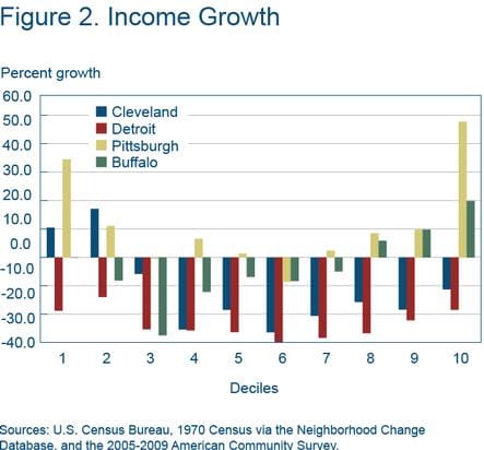
In Buffalo and Pittsburgh the overall pattern is the same, but growth rates in most neighborhoods are higher than in Cleveland and Detroit. It is worth noting that in Pittsburgh and Buffalo, incomes surge ahead in the highest-home-price neighborhoods between 1970 and 2006—by almost 50 percent in Pittsburgh and 20 percent in Buffalo—a phenomenon that is not present in Cleveland or Detroit. This reflects the fact that these neighborhoods are situated near centers of higher education, which have attracted highly skilled residents. By contrast, some of the neighborhoods closest to Cleveland’s major higher education institutions are outside the city limits.
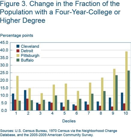
The top decile neighborhoods of Pittsburgh and Buffalo have also experienced sizable gains in educational attainment (figure 3). By contrast, gains in educational attainment in Cleveland and Detroit are much more modest and somewhat flat across the neighborhood price deciles. Even the lowest-decile neighborhoods in Pittsburgh saw a dramatic increase in educational attainment. This change is consistent with the high-income growth that occurred in these areas and suggests that there is some degree of gentrification occurring in Pittsburgh.
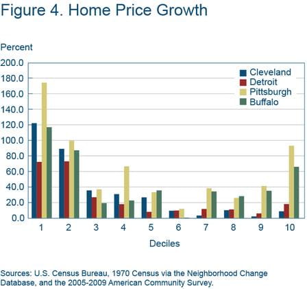
Home-price growth in Cleveland and Detroit is very small in all deciles except for the two lowest-price deciles (figure 4). Some of the price increases in the lowest-price deciles may be attributable to what statisticians call “mean reversion.” Mean reversion—the return to a long-run trend—might occur due to measurement error or transient local shocks. Either way, the more interesting part of the figure is seen in the difference in growth rates between Cleveland and Detroit and Pittsburgh and Buffalo. While Cleveland and Detroit show less than 20 percent growth in all of the upper five deciles, Pittsburgh and Buffalo show much stronger growth rates in the top deciles (especially in the top decile). The relatively stronger home-price growth rates in Pittsburgh and Buffalo’s top deciles may be driven by increases in educational attainment in neighborhoods close to these cities’ major higher education institutions.
Overall, Cleveland experienced similar, although less severe, patterns to those found in Detroit. Population declines were steepest in the lowest-price tracts, while incomes fell most sharply in tracts in the middle deciles. At the same time, none of the neighborhood deciles in either city saw large increases in educational attainment.
These patterns are consistent with the patterns of urban decline (or reverse gentrification) described in recent research by Veronica Guerrieri, Daniel Hartley, and Erik Hurst. These researchers show that this type of urban decline occurs when low (citywide) housing demand leads to population loss in the lowest-price neighborhoods, and falling prices allow lower-income households to move into formerly middle income neighborhoods. As this happens, housing prices in those middle neighborhoods fall (or rise less than in the other neighborhoods).
In contrast, despite similar declines in population across the distribution of neighborhoods in Pittsburgh and Buffalo, these cities experienced income growth in the top three housing-price deciles. Underlying that achievement are large gains in educational attainment in these neighborhoods. As a result, these neighborhoods also experienced increases in home prices. These price increases may be due to the increasing desirability of these neighborhoods as the neighborhood residents become more highly educated (possibly influencing school quality and other local public goods).
A Closer Look at the Cleveland Metropolitan Area
For the remaining part of my analysis, I broaden the geographical scope to look at the entire metropolitan statistical area (MSA), the region around a city (or cities) that, practically speaking, is seen as part of the same economic and social community. I limit my focus to Cleveland, so that I can present maps of the area which reveal more of the spatial details regarding how neighborhoods have changed in this larger region from 1970 to the present. While the City of Cleveland has been losing population since 1950, the combined population of the seven counties of the MSA—Cuyahoga, Geauga, Lake, Medina, Portage, and Summit—has been relatively stable. It dropped from about 3 million residents in 1970 to 2.75 million in 1990 and went back up to 2.84 million in 2000. (I omit Ashtabula County, which is part of the present-day Cleveland-Akron-Elyria combined statistical area, because tract-level data are not available for Ashtabula in 1970.)
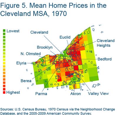
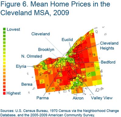
Figures 5–8 show how different variables are distributed across the census tracts of the Cleveland-Akron-Elyria MSA. Each variable is broken into 20 bins ranging from lowest to highest, dividing the set of census tracts into 20 ranking groups based on the value of the variable.
In 1970 home prices in the City of Cleveland were uniformly lowest in the neighborhoods closest to the center of the city and then a bit higher in the neighborhoods that were farthest away from downtown (figure 5). Prices generally rose as one crossed the border into the inner-ring suburbs. In 1970 there were three groupings of high-home-price census tracts: one in the western suburbs, one in the southern suburbs, and one in the eastern suburbs.
By the time data was collected for the 2005–2009 American Community Surveys, the high-housing-price areas had pushed outward a bit farther from downtown Cleveland (figure 6). At the same time, the home-price rankings of census tracts in a number of the inner-ring suburbs had fallen dramatically. These changes are most striking in a group of southeastern suburbs: Highland Hills, North Randall, Warrensville Heights, Bedford Heights, Bedford, and Maple Heights. Less striking, but similar patterns can be seen to the southwest in Parma, Parma Heights, Brooklyn, Brook Park, Middleburg Heights, North Olmsted, Berea, Fairview Park, and to the northeast in Euclid, South Euclid, East Cleveland, the northern half of Cleveland Heights, Richmond Heights, Willowick, and Wickliffe.
The same sets of suburbs that experienced a drop in home-price ranking over this period also tended to experience large drops in their household-income ranking (figure 7). In general, it appears that the boundaries of the high-income areas that were present in 1970 have pulled outward, away from downtown Cleveland.
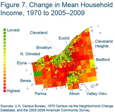
A few notable exceptions to this pattern can be found in the southern part of Cleveland Heights and in parts of Shaker Heights, possibly bolstered by their proximity to cultural attractions in University Circle and the Case Western Reserve University campus. A few other pockets where housing prices and income rankings have not fallen by as much as other places with similar proximity to downtown Cleveland include Bratenahl and the northern part of Lakewood (which have the amenity of being situated on the Lake Erie coastline), and Independence and Valley View (situated along the Cuyahoga Valley National Park).
The Importance of Amenities
Why do housing prices rise in neighborhoods where the average income of the residents rises, and fall where income declines? One possibility is that the housing stock in these areas changes. When higher-income residents move in, for example, they might make improvements to the housing stock, or when lower-income residents move in, they may be more likely to defer home maintenance when finances are tight.
However, the change in housing prices might have more to do with other kinds of neighborhood characteristics that change when the income of the residents goes up or down. In the same way that natural amenities like ocean views or pleasant weather conditions make an area more desirable, living near high-income neighbors offers amenities that affect the demand for housing in the neighborhood as well—good schools, lower crime, greater entertainment options, and so on.
One way to explore how much those amenities are influencing housing prices is to construct a measure that can tease out changes in home prices which are not due to changes in the housing stock (and thus reflect changes in land values). Figure 8 shows such a measure. It controls for changes in the structural characteristics of the homes in each census tract, such as the fraction that are single-family detached houses, the number of bedrooms, and the average age of homes. Comparing the map of changes in income to the map of changes in this land-value measure reveals similarities in many places. In fact, at the tract-level, the change in household income and the change in the land-value measure have a correlation of 65 percent.
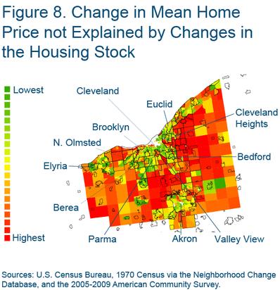
This correlation suggests that it is likely that changes in land values are driven by changes in the features of neighborhoods that are associated with the income of the residents, such as school quality, crime rates, restaurants, and entertainment options. It is also noteworthy that the maps of changes in income and land values also show the retreat of the high-income areas deeper into the suburbs, but they also indicate a little bit of gentrification in the Tremont, Ohio City, and Edgewater neighborhoods, close to downtown Cleveland.
On the whole, the Cleveland MSA shows spatial patterns of urban decline that are similar to other cities that have been affected by large drops in labor demand, such as the retreating boundaries of the high income areas. However, there do seem to be signs of gentrification in a few neighborhoods, and resiliency to urban decline in another set of neighborhoods. It also appears that high-income households have moved further out into the countryside during this period.
Some of this movement may be due to households sorting into jurisdictions that provide the mix of public goods and tax levels that they prefer. Since the City of Cleveland has a relatively small geographic footprint and there are many small cities and towns nearby, different bundles of taxes and public good provision are readily available.
Footnote
- All dollar amounts and growth rates are in real terms, expressed in 2009 dollars. Return to 1
References
- “Endogenous Gentrification and Housing-Price Dynamics,” Veronica Guerrieri, Daniel Hartley, and Erik Hurst, 2013. Journal of Public Economics.
- “Within-City Variation in Urban Decline: The Case of Detroit,” Veronica Guerrieri, Daniel Hartley, and Erik Hurst, 2012. American Economic Review, 102:3.
Suggested Citation
Hartley, Daniel A. 2013. “Urban Decline in Rust-belt Cities.” Federal Reserve Bank of Cleveland, Economic Commentary 2013-06. https://doi.org/10.26509/frbc-ec-201306
This work by Federal Reserve Bank of Cleveland is licensed under Creative Commons Attribution-NonCommercial 4.0 International


