

- Share
The Demographics of Urban Migrants Since the Pandemic
The postpandemic movement of people out of urban neighborhoods is speeding up changes in the age, credit risk, income, home ownership, and ethnic mix of these neighborhoods. Migration has been consistent with patterns in place before the pandemic, but at higher levels.

The views authors express in District Data Briefs are theirs and not necessarily those of the Federal Reserve Bank of Cleveland or the Board of Governors of the Federal Reserve System. The series editor is Harrison Markel.
Introduction
Has the pandemic and the shift to hybrid work altered the demographics of urban neighborhoods? To answer this question, I break out people moving into and out of urban neighborhoods by five demographic measures—age, credit score, income, homeownership, and ethnicity—and find that net migration out of those neighborhoods has increased for almost all types of people since the pandemic began in early 2020. However, in 2022 and in the first three quarters of 2023, migration patterns for demographic groups have moved back toward—but have not reached—their prepandemic levels nationally. At the metro level, the changes in migration into and out of urban neighborhoods were widespread across demographic groups rather than being concentrated, for example, among certain ages or income levels. This has left the demographic composition of metro areas’ typical urban migrants only modestly changed since the
pandemic began.
The migration flows reported here are estimated using the Federal Reserve Bank of New York/Equifax Consumer Credit Panel (CCP). This is an anonymous, random 5 percent sample drawn from the credit his- tories maintained by Equifax. The CCP is updated quarterly, and data are available through the third quarter of 2023. To approximate an annual estimate for 2023, the migrant counts from Q1 through Q3 of 2023 are scaled up (multiplied by 4/3). This Data Brief is part of a series that explores migration trends for urban neighborhoods across the US (Whitaker, 2023). Urban neighborhoods are census tracts in populous metro areas that are either high-density, with over 7,000 people per square mile, or were developed before WWII, when development focused on pedestrians. Further details about measuring migration and designating urban neighborhoods can be found in the Appendix.
How Has Net Migration by Age Changed for Urban Neighborhoods?
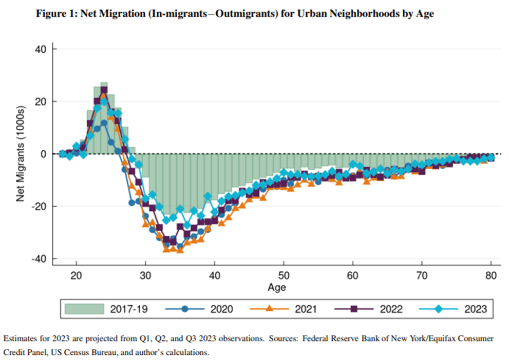
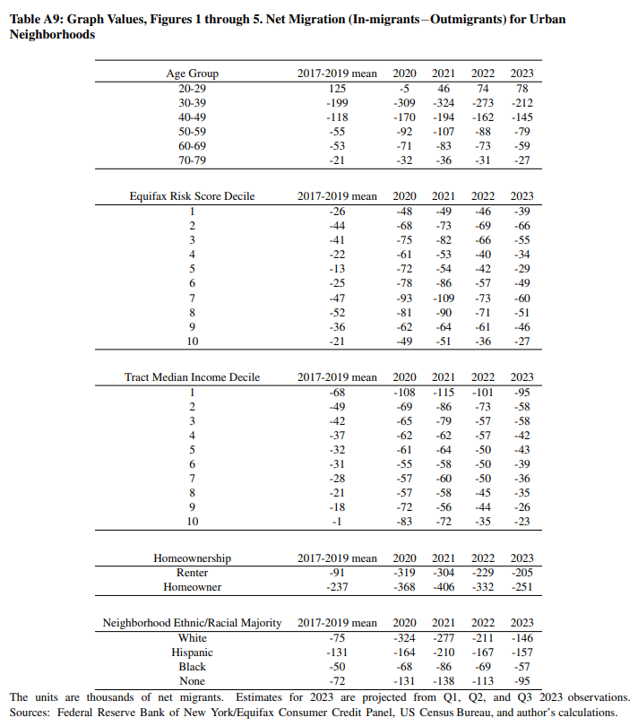
Since the pandemic began, net flows of people in every age group, from students to retirees, have been less favorable to urban neighborhoods, contributing either to declining populations or slower growth. Figure 1 presents net migration to and from urban neighborhoods by age. The prepandemic (2017-2019) average is represented by the green bars. In 2020, the inflow of people aged 18 to 27 into urban neighborhoods declined 75 percent from the prepandemic average. It partially recovered in 2021, but in 2022, it remained down by 29 percent. For people between the ages of 28 and 39, outflows in 2021 were 74 percent higher than the prepandemic average, and remained 43 percent higher in 2022. Flows for people in their late 20s and 30s have been quite close to the prepandemic pace in the first three quarters of 2023, but that could change when the fourth quarter is observed. Among people in their 40s, net outflows from urban neighborhoods were 64 percent above prepandemic levels in 2021 and 37 percent above in 2022. Older cohorts, including people in their 50s, 60s, and 70s, all display an outflow pattern similar to that of people in their 40s.
While the age distribution plays a role in net urban migration, we should not mistakenly believe that an urban exodus was inevitable due to the aging of millennials. As an illustration, consider that in the three years before the pandemic, net urban outmigration was averaging 83,000 people per quarter. If we take the net migration rates of each age cohort in the prepandemic period and multiply them by the age cohort sizes in the postpandemic period, the estimate implies that net migration out of urban neighborhoods would increase to 87,000 per quarter. This reflects the fact that there are now more millennials in their 30s, which is the peak age group for leaving urban neighborhoods. The actual observed net migration out of urban neighborhoods has averaged 163,000 per quarter since the pandemic began. The aging of millennials and the smaller cohorts of people in their early 20s can explain only a small fraction of the change observed since the pandemic.
Are People with Better Credit Leaving Urban Neighborhoods?
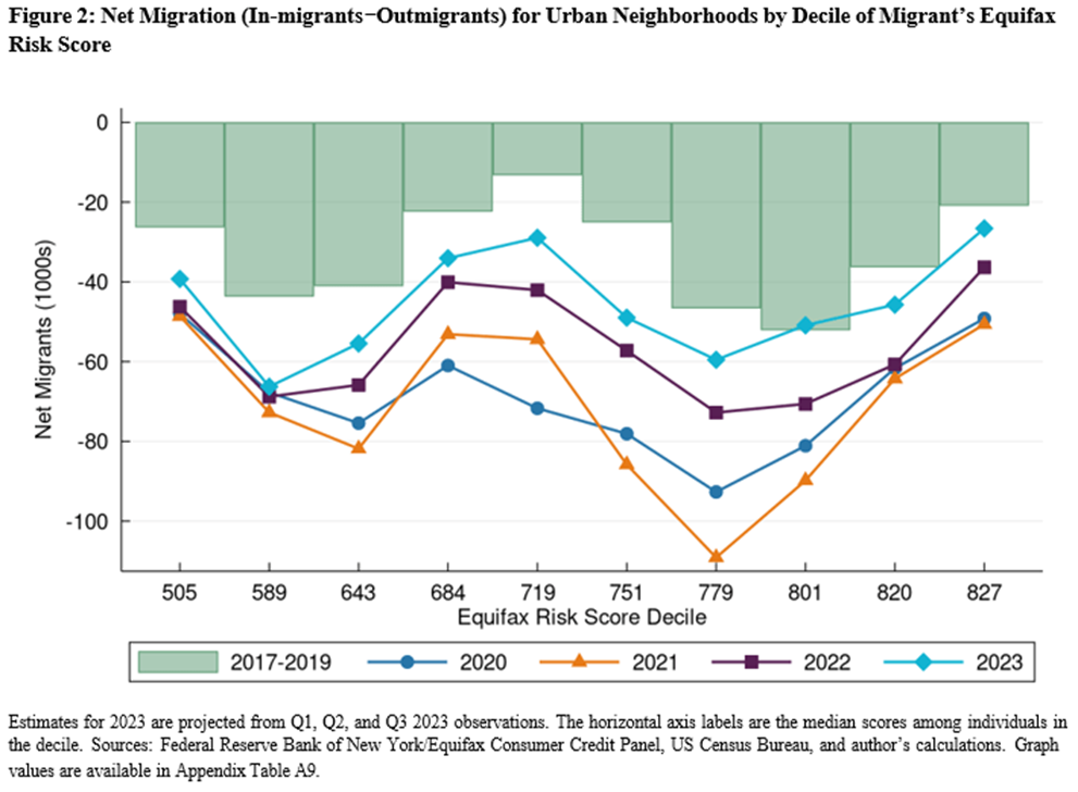
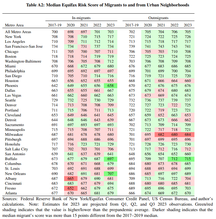
As with people of all ages being less likely to choose urban neighborhoods in the pandemic and postpandemic years, net outmigration from urban neighborhoods was higher regardless of people’s credit scores: low, middle, or upper. The CCP reports the Equifax Risk Score for each borrower each quarter, and this score can serve as a measure of financial health and access to credit. The score uses credit history data to predict borrowers’ probability of becoming delinquent on their debts. Higher scores suggest a lower risk of default. As can be seen in Figure 2, in 2020, the outflows at every decile increased. In 2021, strong additional net outflows occurred for people with scores in the upper 700s (deciles 6, 7, and 8). In 2022 and through the first three quarters of 2023, the distribution shifted back toward the prepandemic pattern, but with higher levels of outmigration in nine out of ten deciles of the Equifax Risk Score.
Are High-Income People Leaving Urban Neighborhoods?
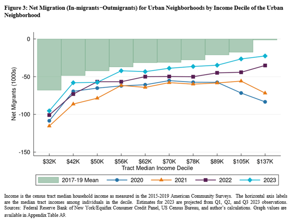
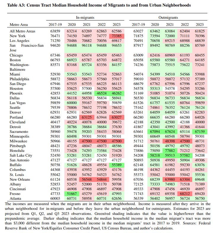
In Figure 3, we can see that in 2020 and 2021, net migration was unusually negative for high- income urban neighborhoods. However, the relationship between net migration and income is returning to its prepandemic pattern. The income values are assigned to movers based on the median household income of the urban census tract they are arriving in or leaving from. The CCP does not have an individual or household income measure.
Are Homeowners Leaving Urban Neighborhoods?
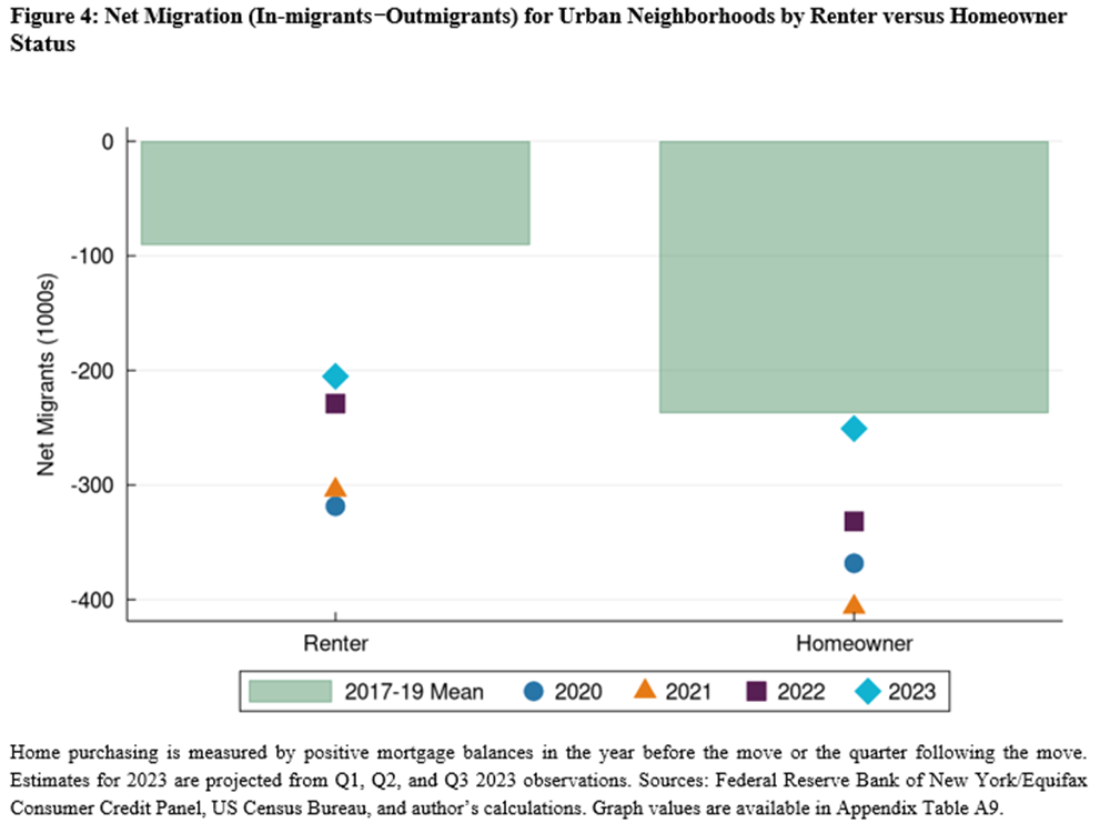
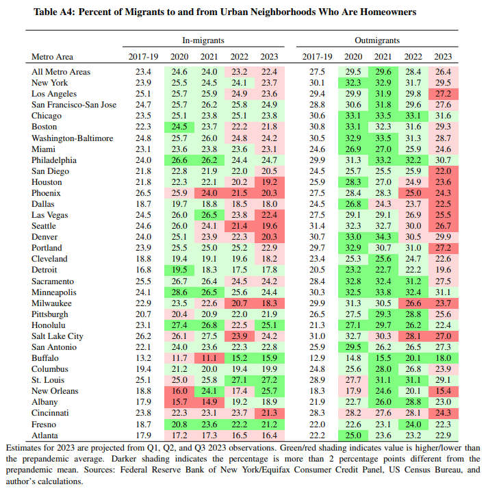
In the national aggregates presented in Figure 4, the net migration of homeowners was elevated by 169,000 migrants in 2021, which corresponds to a nationwide surge in home sales that year.1 However, the additional net outflow of renters from urban neighborhoods in 2021 was even larger, at 213,000. The estimates for 2022 reflect a slowdown in net outmigration for both renters and homeowners. The preliminary estimate for 2023 (the first three quarters’ count scaled up to approximate an annual total) suggests that the elevated net outmigration from urban neighborhoods, relative to the prepandemic average, is now concentrated among renters.
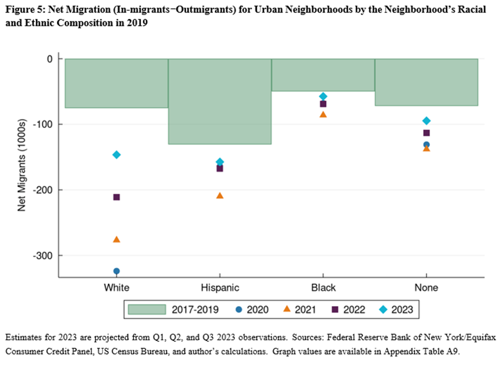
Could the Pandemic Alter the Racial or Ethnic Composition of Urban Neighborhoods?
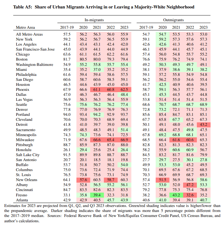
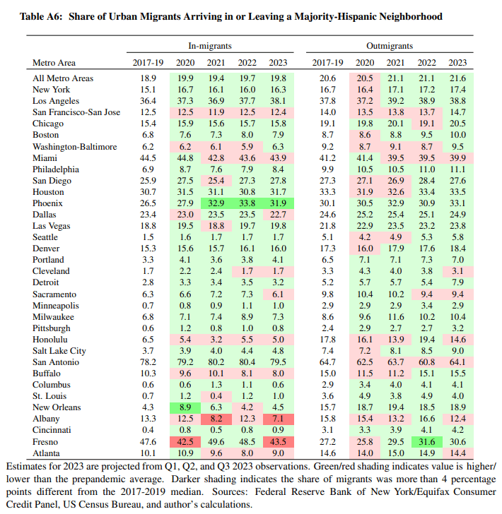
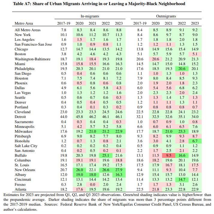
In each year since the pandemic, the net outmigration from majority-white urban neighbor- hoods has been the highest among four types of neighborhoods grouped by race and ethnicity compared with prepandemic norms (Figure 5).2 Other things being equal, this will probably decrease the share of America’s urban population that is white. As with the other demographic measures presented above, the 2022 and 2023 estimates for neighborhood migration patterns display a brisk return to normal.
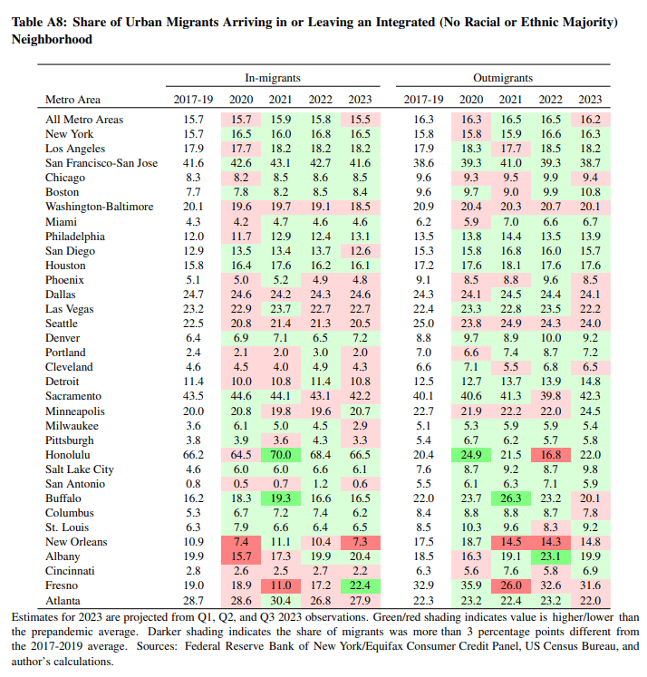
Are There Important Demographic Changes for Individual Metro Areas?
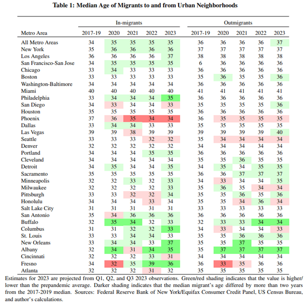
Very few metros have displayed substantial changes in the demographics of the people moving into or out of their urban neighborhoods. In a set of tables below (Table 1 and Tables A2 through A8), we can see changes from the prepandemic norms to the postpandemic levels for the 33 metro areas that have over 250,000 residents in their urban neighborhoods. The statistics are the mean or median of the measures discussed above. The values are shaded green if there are increases and red if there are decreases. Changes above a moderate threshold, which are more likely to have important consequences, are highlighted with darker shades.3
We might predict that in some urban areas with high concentrations of remote-capable workers in central business districts, there could be a shift to younger, lower-income households filling housing units in the urban neighborhoods vacated by hybrid workers opting for suburban housing. However, in most major metros, the median ages of urban movers have either remained the same or changed by just one year. Among the metros that saw larger changes, the in-migrants to urban neighborhoods have become older in most cases. An exception is Phoenix, where the median age of people entering urban neighborhoods dropped from an unusually high 37 down to 34.
What is remarkable about Table 1 and Tables A2 through A8 is that they suggest that the demographics of people arriving in and leaving the urban neighborhoods of each metro area have been very steady. In Table A4, we can see increases in outmigrants who are homebuyers, but this is so widespread, it is a national rather than a local phenomenon. In the other measures, only a handful of metros display large changes, and most of the larger changes are temporary rather than persistent. The stability of the means and medians of age, credit score, income, and the ethnic majority measures suggests that the postpandemic increases in net outmigration from urban neighborhoods were broad-based rather than heavily concentrated among specific demographic groups.
Conclusion
In 2022 and the first three quarters of 2023, net migration remained less favorable to urban neighborhoods than before the pandemic. The postpandemic net outmigration has slowed from a surge, but remains above its prepandemic trend and appears to be making urban populations smaller than they would otherwise be.
This less favorable migration is widely spread across demographics such that the typical person moving into or out of an urban neighborhood is similar to the typical person making that same type of move before the pandemic. This is true for both individual metros and the US as a whole. The net outmigration is accelerating changes in the age, credit risk, income, home ownership, and ethnic mix of urban neighborhoods in line with patterns established before the pandemic.
Footnotes
- In the CCP, having a mortgage balance serves as the indicator that a person is a homeowner rather than a renter. This is easily observed in the quarters before someone moves, but if people take a few months to purchase a home in their new location, they might be misclassified. For consistency, the percentage of movers presented in Figure 4 includes movers who have any mortgage balance in the year before or the quarter after they move. It might be best to think of these as people who were able to get a mortgage and had a desire to own a home, even though some may be transitioning back to renting when they move. Return to 1
- Credit histories do not record individual borrowers’ race or ethnicity. Return to 2
- In each case, I tested whether the changes in levels were statistically significant. The differences were significant in most cases. However, when working with big data such as the CCP, it is often the case that fairly large sample sizes cause the standard errors to be very small, and small changes in the measure of interest meet the criteria to be statistically significant (Whitaker, 2018). However, I do not highlight all statistically significant differences because the vast majority are not “economically" significant. That is, the changes or differences are too small to matter. Table A1 displays the distributions of the measure for the 37 metro areas with populations above 2 million. The thresholds were selected by looking at the standard deviations and interquartile ranges of the measures and considering what type of change would be needed to move a metro up or down in the ranks by more than a few notches. The thresholds are subjective, but readers can substitute their own. Return to 3
References
- DeWaard, Jack, Janna Johnson, and Stephan Whitaker (2019). “Internal migration in the United States: A comprehensive comparative assessment of the Consumer Credit Panel.” Demographic Research, 41, pp. 953–1006. doi:10.4054/DemRes.2019.41.33.
- Lee, Donghoon and Wilbert Van der Klaauw (2010). “An introduction to the FRBNY Consumer Credit Panel.” Staff Report 479, Federal Reserve Bank of New York. URL https://fedinprint.org/item/fednsr/ 12522.
- Whitaker, Stephan D. (2018). “Big data versus a survey.” The Quarterly Review of Economics and Finance, 67, pp. 285–296.
- Whitaker, Stephan D. (2019a). “12 facts about temporary urbanists.” Federal Reserve Bank of Cleveland Economic Commentary (2019-07).
- Whitaker, Stephan D. (2019b). “Population, migration, and generations in urban neighborhoods.” Federal Reserve Bank of Cleveland Economic Commentary (2019-08). doi:10.26509/frbc-ec-201908.
- Whitaker, Stephan D. (2023). “Urban and regional migration estimates: Will your city recover from the pandemic?” Cleveland Fed District Data Brief (20230803).
Appendix
Measuring Migration Using Credit Histories
The flows reported in this Data Brief are estimated using the Federal Reserve Bank of New York/Equifax Consumer Credit Panel (CCP). This is an anonymous, random 5 percent sample drawn from the credit histories maintained by Equifax. Each month, Equifax receives reports from all types of lenders, including credit card companies and servicers of mortgages, student loans and auto loans. The reports contain information on payments and outstanding balances, as well as mailing addresses. Equifax employs an algorithm that considers all of the addresses reported for a person and identifies the most likely current residence. Equifax anonymizes all the data, removing names, Social Security numbers, and street addresses, before adding the data to the CCP, but the census block of the street address is reported in the CCP. Using a unique random identifier for each borrower, researchers can observe if someone moves to a different census block during a quarter. For more details about the CCP and its use in measuring migration, see Lee and Van der Klaauw (2010) and DeWaard, Johnson, and Whitaker (2019).
Definitions
This Data Brief follows several previous publications in defining urban neighborhoods as census tracts with population densities above 7,000 people per square mile or those with over half of their housing stock built before World War II (Whitaker, 2019a,b). To be classified as urban, the pre-war neighborhoods must have a density of at least 2,000 people per square mile so that they can continue to function as an urban neighborhood even if their population has fallen far below a mid-20th century peak. The neighborhoods must also be in metro areas of at least 500,000 because we generally associate the concept of "urban" with major population centers rather than the historic main streets found in small cities and towns.
The metropolitan areas in this report are combined statistical areas. This is the most aggregate definition of metro areas, and it combines, for example, Washington DC with Baltimore, San Jose with San Francisco, Akron with Cleveland, etc. Metro areas are combinations of counties that are tightly linked by worker commutes and other economic activity.
Economic Significance Thresholds

Changes in Demographic Measures for Migrants to and from Urban Neighborhoods of Major Metros
Suggested Citation
Whitaker, Stephan D. 2024. “The Demographics of Urban Migrants Since the Pandemic.” Federal Reserve Bank of Cleveland, Cleveland Fed District Data Brief. https://doi.org/10.26509/frbc-ddb-20240118
This work by Federal Reserve Bank of Cleveland is licensed under Creative Commons Attribution-NonCommercial 4.0 International

