

- Share
A Speeding Rate Starts to Slow: COVID-19 Mortality Rates by State
In most US states, mortality rates grew more slowly between April 5, 2020 and April 12, 2020 than they did in prior weeks. However, “slower” does not mean “slow”—during that week, mortality rates doubled or more in 37 states.
The views authors express in District Data Briefs are theirs and not necessarily those of the Federal Reserve Bank of Cleveland or the Board of Governors of the Federal Reserve System. The series editor is Harrison Markel.
The cumulative COVID-19 mortality rate of the United States has doubled or more each week between February 29, 2020 and April 12, 2020. Thankfully, doubling has stopped in several states as of April 12, 2020. One of these states, Louisiana, had the third-highest COVID-19 mortality rate in the country. In the Cleveland Fed’s District,1 the growth in mortality rates has continued to slow in Kentucky, Ohio, and West Virginia, but not in Pennsylvania. However, in most states mortality rates are still rising rapidly—mortality rates doubled or more between April 5, 2020 and April 12, 2020 in 37 states, including all four District states.
This report builds from my work on national coronavirus epidemics in Getting to Accuracy: Measuring COVID-19 by Mortality Rates and Percentage Changes. Though there have been reports that COVID-19 deaths are underreported,2 I focus on mortality rates instead of confirmed cases because deaths tend to be measured more consistently than confirmed COVID-19 cases. Counts of cases are sensitive to the extent of testing, which varies between states.
The measure of mortality rates that this report uses is the cumulative number of COVID-19 deaths in a state divided by the state’s population in the fourth quarter of 2019; the rate’s unit is deaths per million people.3 The national rates provided here are based on the sums of the state data. The mortality rate measures how deadly an epidemic has been. Note that this is not a fatality rate, such as deaths per person with a COVID-19 infection. Analysis of state fatality rates is impossible until there are good estimates of the number of people who have been infected.4
This report uses the 7-day moving average of the 1-day percentage change in the mortality rate, which I will refer to as the daily percentage change, as a proxy measure for an epidemic’s growth rate. The higher the daily percentage change, the faster the epidemic’s growth has been in the prior 7 days. The graphs include reference lines that show how many days it would take for a mortality rate to double at a given daily percentage change.
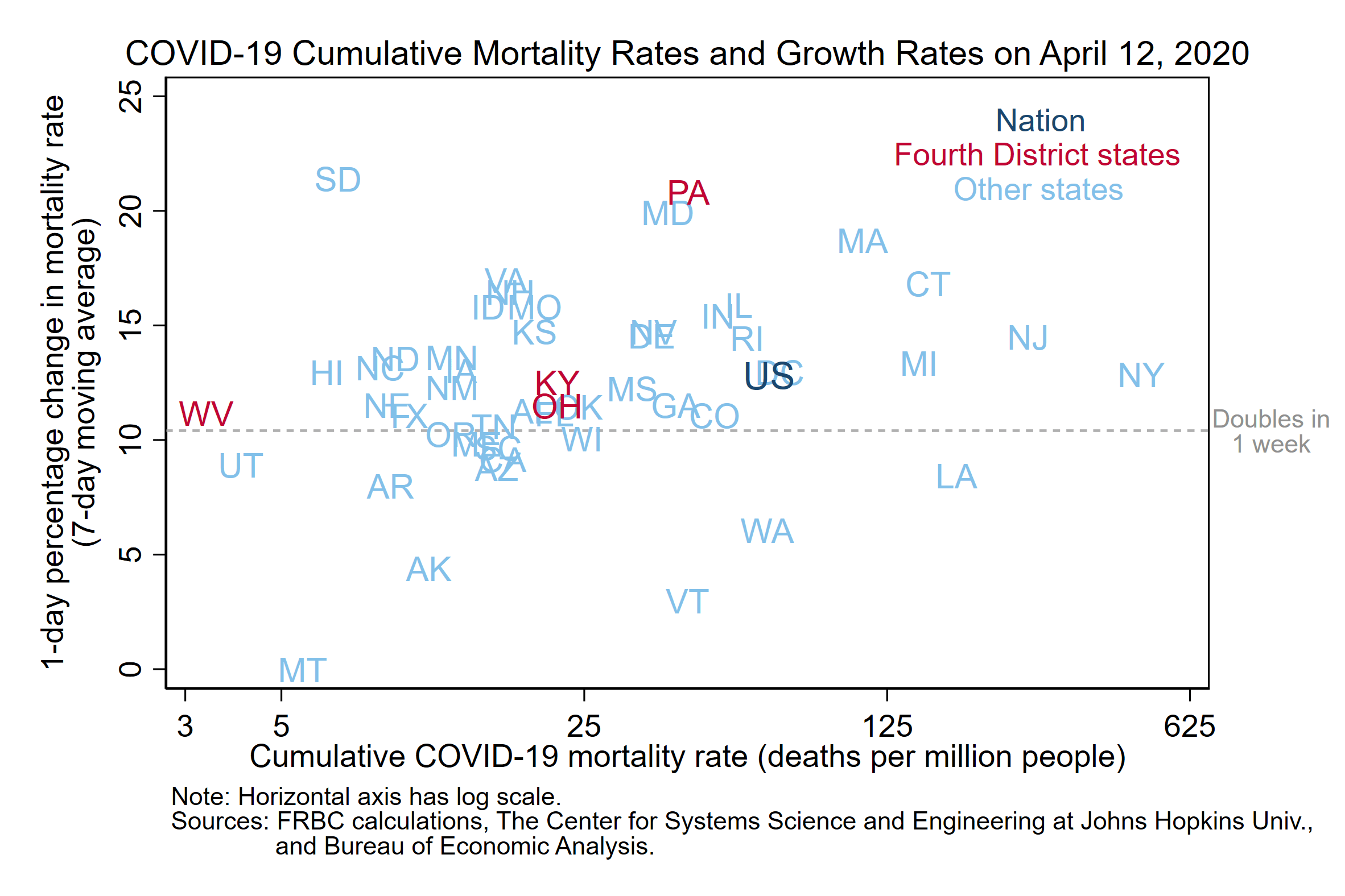
Figure 1 shows the mortality rate and daily percentage change for states and the nation as a whole on April 12, 2020.5 The mortality rate is on the horizontal axis—this axis has a log scale, so values rise rapidly from left to right. New York had the highest mortality rate in the country (483 per million), followed by New Jersey (265 per million). The nation’s mortality rate (67 per million) is higher than those of most states because several of the most populous states have relatively high mortality rates (Illinois, Michigan, New York, New Jersey, and Pennsylvania).
The vertical axis of figure 1 shows the daily percentage change. In most states, mortality rates grew more slowly between April 5, 2020 and April 12, 2020 than they did in prior weeks.6 However, “slower” does not mean “slow”—during that week, mortality rates doubled or more in 37 states. The states whose points are above the dashed reference line have seen mortality rates at least double in the week through April 12, while those below the line have had slower growth. South Dakota has the highest daily percentage change (21.4 percent), followed by Pennsylvania (20.9 percent).
The differences in mortality rates across states and the speeds at which their epidemics are growing can also be seen on the map in figure 2. The color of each state shows both the mortality rate and how fast the state’s mortality rate grew in the 7 days prior to April 12, 2020. Louisiana’s color indicates that, relative to other states, its mortality rate is high and slow growing. In contrast, Massachusetts and Pennsylvania have both relatively high and relatively fast-growing mortality rates. The light gray states, such as Arkansas, have both relatively low and relatively slow-growing mortality rates.
The region of the country with the clearest concentration of states with high mortality rates runs along the east coast, from Massachusetts to Maryland. There is also a cluster in the Great Lakes region, consisting of Illinois, Indiana, and Michigan.7 The Southwest region has both relatively low and relatively slow-growing mortality rates.
Map of Cumulative COVID-19 Mortality Rates and Growth Rates in the Past Week
(on April 12, 2020)
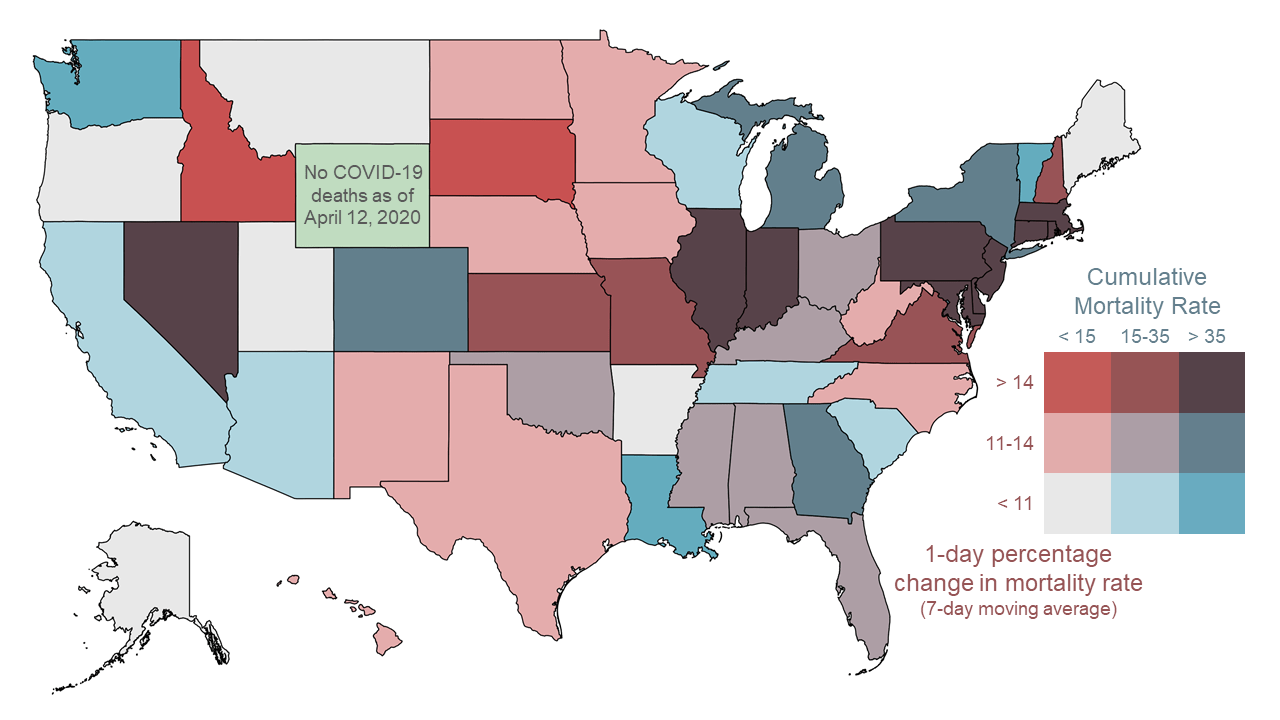
Note: The District of Columbia is in the same high mortality rate, medium growth category as Georgia.
Sources: FRBC calculations, The Center for Systems Science and Engineering at Johns Hopkins Univ., and Bureau of Economic Analysis.
The Cleveland Fed’s District includes Ohio, western Pennsylvania, eastern Kentucky, and the northern panhandle of West Virginia. Figure 3 shows the trajectory of the COVID-19 epidemic in each of these states. Like figure 1, this figure has mortality rate on the horizontal axis and daily percentage change on the vertical axis. However, the ranges of the axes are different. Since the mortality rate is cumulative, time moves from left to right along a state’s line—the last data point for each state is April 12, 2020. The dots on the lines indicate data from Sundays, which means that there is a week of data between each pair of dots. To reduce volatility, data is excluded until the first day that the state had at least 5 cumulative deaths for 7 days. West Virginia is an exception because the state had fewer than 5 cumulative deaths until April 9, 2020.
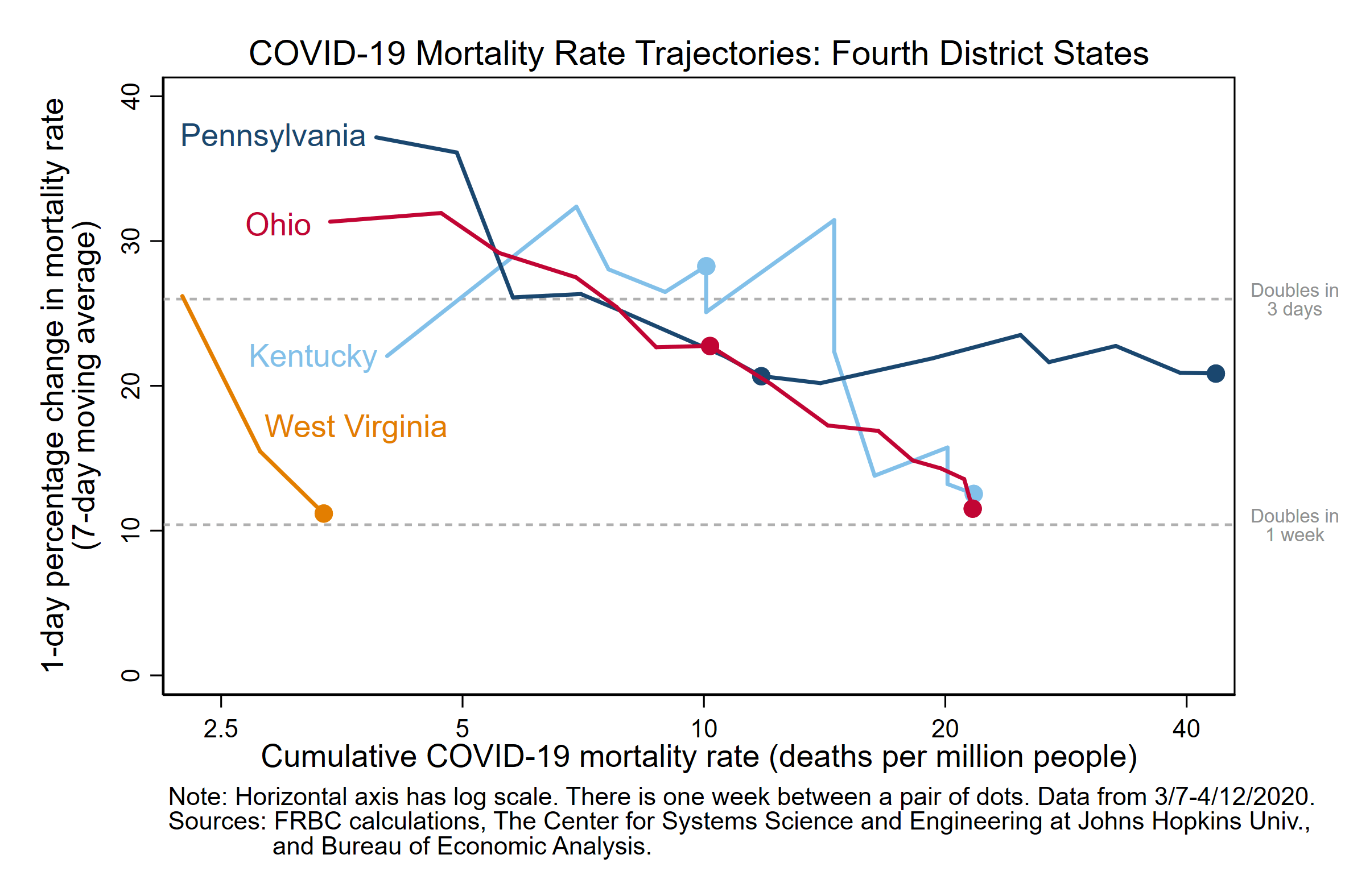
The epidemics in Pennsylvania and Ohio were on similar trajectories until the most recent week of data (April 5, 2020 through April 12, 2020). During that week, Ohio’s daily percentage change fell 11.3 percentage points to 11.5 percent, while Pennsylvania’s percentage change ticked up 0.2 percentage points to 20.9 percent. Partly as a consequence, the latest mortality rates for these two states have also diverged. As of April 12, 2020, Ohio’s mortality rate was just more than half of Pennsylvania’s—22 per million and 43 per million, respectively. Based on an online map of case counts, Pennsylvania’s epidemic is worst in the eastern portion of the state, particularly around Philadelphia.
At 22 deaths per million and 12.5 percent, Kentucky’s latest mortality rate and percentage change are similar to those of Ohio. This is a notable improvement over the rate of growth Kentucky had in the first week of April, when the state’s mortality rate was doubling approximately every three days. West Virginia’s COVID-19 mortality rate is both low and slow growing, which is a good sign. However, it is too early to draw any definitive conclusions about the trajectory of this state’s epidemic.
How do Fourth District states compare to other states in the nation as of April 12, 2020? Pennsylvania’s epidemic has been on a poor trajectory recently—the state has the second-highest daily percentage change of any state, and its mortality rate is higher than those in three-fourths of other states. Kentucky and Ohio are near the middle of the distribution across states in both the level and growth of mortality rates. This is why both states are in the middle category in figure 2. At 3 per million, West Virginia has the second-lowest mortality rate of any state—the lowest rate is in Wyoming, which has not had any COVID-19 deaths. West Virginia’s latest daily percentage change (11.2 percent) is just below the nation’s (12.8 percent).
In all but a few states, COVID-19 mortality rates grew less quickly between April 5, 2020 and April 12, 2020 than they had in the two prior weeks. While this is good news, we should not confuse it with an end to these epidemics—mortality rates are still increasing rapidly. It is important to recognize that the deceleration in many states’ epidemics is precisely what stay-at-home orders and other public health measures were designed to achieve. Public health experts tell us that the trajectories of these epidemics would have been deadlier without social distancing measures.8
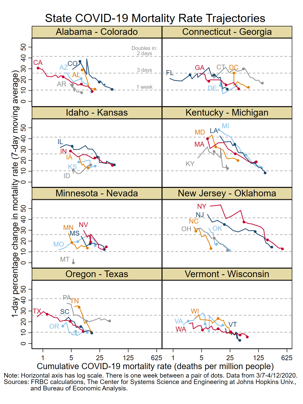
Note: Figure 4 shows the cumulative COVID-19 mortality rate trajectories for the District of Columbia and 38 states that have had at least 5 cumulative COVID-19 deaths for 14 days as of April 12, 2020. The panels are arranged in alphabetical order and include up to 5 states per panel. To reduce volatility, data is excluded until the first day that the state had at least 5 cumulative deaths for 7 days.9
Footnotes
- The Fourth Federal Reserve District includes Ohio, western Pennsylvania, eastern Kentucky, and the northern panhandle of West Virginia. Return to 1
- See www.nytimes.com/2020/04/05/us/coronavirus-deaths-undercount.html and www.nytimes.com/2020/04/14/nyregion/new-york-coronavirus-deaths.html. Data used in this report reflects the April 14, 2020 revisions. Return to 2
- The COVID-19 data comes from The Center for Systems Science and Engineering at Johns Hopkins University, https://github.com/CSSEGISandData/COVID-19/tree/master/csse_covid_19_data/csse_covid_19_time_series (accessed on 4/15/2020). The population data comes from the U.S. Bureau of Economic Analysis, www.bea.gov/data/income-saving/personal-income-by-state (accessed on 4/6/2020). Return to 3
- For more information, see this article on the challenges in estimating COVID-19 fatality rates: www.thelancet.com/journals/laninf/article/PIIS1473-3099(20)30244-9/fulltext. Return to 4
- Wyoming is not on the graph because it is the only state that has no reported COVID-19 deaths as of April 12, 2020. Return to 5
- This is evident in figure 4 at the end of this report, which shows the mortality rate trajectories for the District of Columbia and 38 states. Return to 6
- I am referring to Bureau of Economic Analysis Regions, www.bea.gov/news/blog/2016-07-07/real-personal-income-states-2014. Return to 7
- For example, https://radio.wosu.org/post/coronavirus-ohio-acton-says-social-distancing-working-urges-not-ease. Return to 8
- The 12 excluded states are: Alaska, Hawaii, Maine, Nebraska, New Hampshire, New Mexico, North Dakota, Rhode Island, South Dakota, Utah, West Virginia, and Wyoming. Return to 9
Suggested Citation
Elvery, Joel A. 2020. “A Speeding Rate Starts to Slow: COVID-19 Mortality Rates by State .” Federal Reserve Bank of Cleveland, Cleveland Fed District Data Brief. https://doi.org/10.26509/frbc-ddb-20200416
This work by Federal Reserve Bank of Cleveland is licensed under Creative Commons Attribution-NonCommercial 4.0 International

