

- Share
Labor’s Declining Share of Income and Rising Inequality
Labor income has been declining as a share of total income earned in the United States for the past three decades. We look at the past effect of the labor share decline on income inequality, and we study the likely future path of the labor share and its implications for inequality.
The views authors express in Economic Commentary are theirs and not necessarily those of the Federal Reserve Bank of Cleveland or the Board of Governors of the Federal Reserve System. The series editor is Tasia Hane. This paper and its data are subject to revision; please visit clevelandfed.org for updates.
Labor income has declined as a share of total income earned in the United States. This decline was caused by several factors, including a change in the technology used to produce goods and services, increased globalization and trade openness, and developments in labor market institutions and policies.
One consequence of the labor share decline has raised concerns. Since labor income is more evenly distributed across U.S. households than capital income, the decline made total income less evenly distributed and more concentrated at the top of the distribution, and this contributed to increased income inequality. In this Commentary, we look at how the labor share decline has affected income inequality in the past, and we study the likely future path of the labor share and its implications for inequality.
The Decline in Labor’s Share of Income
Household income comes in two types: labor income, which includes wages, salaries, and other work-related compensation (such as pension and insurance benefits and incentive-based compensation), and capital income, which includes interest, dividends, and other realized investment returns (such as capital gains). During the last three decades, labor’s share of total income has declined in favor of capital income (see “Behind the Decline in Labor’s Share of Income” for more detail).
There are a number of ways to measure the share of income that accrues to labor. We look at three different data sources, and each provides broad evidence of the decline. According to data from the Bureau of Economic Analysis, labor’s share of gross national income fluctuated around 67 percent during the 1980s, 1990s, and early 2000s, but it has declined since then and now stands at 63.8 percent.1 (See figure 1.) According to the Bureau of Labor Statistics, the ratio of compensation to output for the nonfarm business sector fluctuated around 65 percent until the early 1980s and has declined steadily since, from 63 percent during the 1980s and 1990s to 58.2 percent most recently. Finally, a 2011 study of income tax returns and demographic data by the CBO (CBO 2011) finds that labor’s share of income decreased from 75 percent in 1979 to 67 percent in 2007.
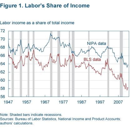
These three data sources measure slightly different labor share concepts, which is why their estimated levels are different. But they agree in indicating a significant drop of 3 to 8 percentage points in labor’s share of income since the early 1980s, with the trend accelerating during the 2000s.
Such a decline had implications for the distribution of incomes. Labor income is more evenly distributed across U.S. households than capital income, while a disproportionately large share of capital income accrues to the top income households. As the share that is more evenly distributed declined and the share that is more concentrated at the top rose, total income became less evenly distributed and more concentrated at the top. As a result, total income inequality rose.
Income Inequality
Income inequality is the dispersion of annual incomes across households, relative to the average household income. Inequality affects a variety of other important economic variables, such as the composition of consumption and investment, tax revenue and government spending, government policies, economic mobility, human capital accumulation, and growth. Some economists—most prominently Raghuram Rajan in his book Fault Lines—have suggested that rising income inequality contributed to the debt accumulation and financial imbalances that led to the recent financial crisis. And of course income inequality is the focus of much attention as an indicator, albeit imperfect, of the inequality of lifetime income and welfare across households.
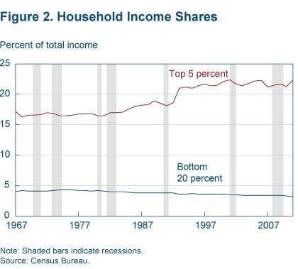
Several indicators suggest that inequality was declining up to the late 1970s, but it has since reversed course. It rose sharply during the 1980s and early 1990s and currently is at near record-high levels. Between 1967 and 1980, the average real income of the bottom 20 percent of households grew by 1.34 percent, faster than the 1.09 percent growth rate of the top 20 percent and the 0.67 percent of the top 5 percent. After 1980, however, the opposite occurred: Average real income grew by 0.05 percent only for the bottom 20 percent of households, while it grew by 1.24 percent for the top 20 percent and by 1.67 percent for the top 5 percent (DeNavas-Walt et al. 2011). The share of income earned by the top-income households rose significantly after 1980, while the share earned by the bottom-income households declined (figure 2).
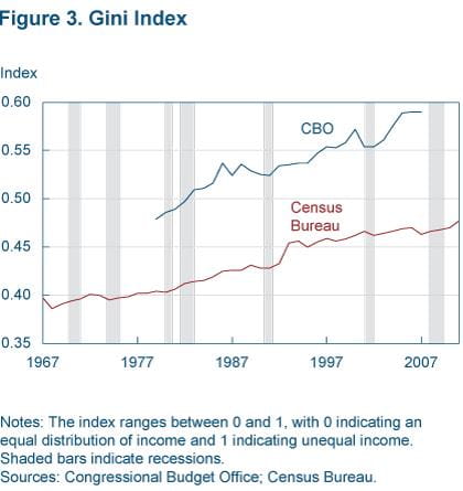
The most closely watched indicator of income inequality is the Gini index, an index that increases from 0 to 1 as income distribution becomes relatively more dispersed.
The Gini index is equal to half the relative mean income difference, that is, the average difference in income between households in the economy, expressed as a percentage of the average household income. For example, if the Gini index is 0.40 and the average household income is $50,000, the relative mean difference is 0.40 × 2 = 0.80, or 80 percent, which means that on average the difference in income between two randomly selected households in the population is 0.80 × $50,000 = $40,000.
The Gini index points to increasing inequality during the entire 1967–2010 period, and especially during the 1980s and early 1990s (figure 3). When computed using Census Bureau data, the Gini index increased from 0.40 in 1967 to 0.48 in 2011. This means that in 1967 the difference in income between households was on average 80 percent of the average household income, while in 2010 it was 96 percent. When computed by the CBO, which uses income tax data and a broader definition of income that includes capital gains, the Gini index increased from 0.48 in 1979 to 0.59 in 2007, which means that the relative mean difference in income between households increased from 96 percent to 118 percent.
There are limits to what income inequality measures. For starters, it indicates inequality of outcomes, not of opportunities. It focuses on income, not on welfare, which depends on other variables such as consumption, leisure, health, and public goods. On one hand, income inequality does not respond to changes in the level of income, remaining constant when all households earn proportionally more (or less). On the other hand, it changes all the same regardless of whether the richest households earn more or the poorest households earn less. And, since it provides a snapshot of the relative dispersion of income across households in a given year, part of it is simply explained by the fact that households earn a variable income during the different stages of their lives. That part does not reflect lifetime income inequality. Because inequality responds similarly to very different factors, it is as important to learn why it has risen.
Most of the rise in income inequality since 1980 has been attributed to an increase in the returns to education and in the wage differential between high-skilled and low-skilled labor. Over time, the marginal productivity of high-skilled workers has increased relative to low-skilled workers, which has driven the demand for their labor higher and raised their relative compensation. As a result of this change, labor income became less evenly distributed and more concentrated at the top.
However, part of the increase in income inequality was due to the decline in labor’s share of income, and the associated shift from the more evenly distributed type of income to the more concentrated one. As shown in box 1, the Gini index increases by approximately 0.15 to 0.33 percentage points for every percentage point decline in the labor share. Given these numbers, the decline that the labor share has experienced since the early 1980s (3 to 8 percentage points depending on the measure) translates into an increase of the Gini index of up to 2.5 percentage points. This is close to the CBO’s estimate, which suggested that the decline in the labor share from 1979 to 2007 raised the Gini index by 2.3 percentage points.
This is a sizeable effect. More importantly, most of the effect occurred during the last decade, when the decline in the labor share was accelerating. Is this trend going to continue, and how will it affect income inequality going forward?
Future Paths
We use the model described in box 2 to learn about the future path of the labor share. The model decomposes the labor share into its long-run trend and its transitory components, and then it forecasts the future path of the overall labor share. We do all the calculations twice, once with the BEA data and once with the BLS data.
According to our model, the labor share trend has declined since 1980, with an accelerated drop in the 2000s, in both sets of data (figure 4). In the BEA data, the trend declined from levels as high as 69 percent before 1980 to 66.9 percent in 2000, to 64.9 percent today. In the BLS data, the trend declined from levels of approximately 64.5 percent before 1980 to 62.8 percent in 2000, to 59.8 percent today. According to these measures, the trend in the labor share declined 1.5 to 2 percentage points between 1980 and 2000, and then dropped an additional 2 to 3 percentage points, for a total of 4 to 4.5 percentage points.
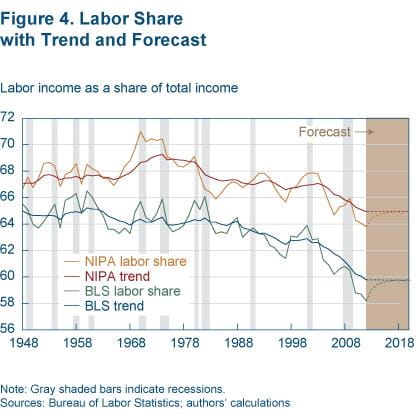
Our model indicates that the labor share is currently 1 to 1.5 percentage points below its long-run trend level. Part of the decline in the labor share in the past five years was temporary, and it will be reversed as the recovery continues. Going forward, the labor share will pick up and converge to its long-run trend value. This will tend to decrease income inequality, lowering the Gini index by up to 0.5 (0.33 × 1.5) percentage points, as the decomposition in box 1 indicates.
Income inequality will not necessarily decrease though. As shown in box 1, inequality is affected not only by the relative shares of labor and capital income, but also by the concentrations of each. Concentration refers to the way each type of income is distributed across the households that earn it. In particular, concentration indexes measure how concentrated capital or labor income is at the top of the income distribution.
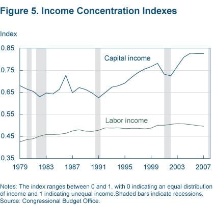
The future path of labor concentration is hard to predict, as it depends on the evolution of the returns to education and of the wage-skill premium. The concentration of capital income, however, is strongly procyclical, rising during recoveries (figure 5), and this suggests that capital income will become more concentrated at the top in the coming years of the recovery, helping to raise income inequality even further. This effect has dominated the dynamics of income inequality during the past two business cycles, so the future path of income inequality will likely be determined by the strength of the recovery and the associated pickup of the concentration of capital income.
Footnotes
- In the BEA’s NIPA accounts, gross national income equals the sum of the following categories: Compensation of employees; proprietors’ income; rental income; corporate profits; net interest income; indirect taxes less subsidies; depreciation. To compute the labor share, we need to identify what part of each category is labor income, and what part is capital income. To do that, we follow an established methodology. We classify the compensation of employees as unambiguous labor income (UL), and we classify corporate profits, rental income, net interest income, and depreciation as unambiguous capital income (UK). The remaining categories, proprietors’ income and indirect taxes less subsidies, are partly labor income and partly capital income, in proportion to UL and UK, respectively. As a result, labor’s share is computed as the ratio of unambiguous labor income to the sum of unambiguous labor and capital income, i.e., UL/(UL+UK). (See Gomme and Rupert 2004 for a discussion of this methodology. Notice, however, that they also exclude the government and housing sectors, so their measure of labor's share differs from ours.) [The reference to Gomme and Rupert 2004 was modified on 10/23/2012.] Return to 1
Sources Cited
- “Income, Poverty, and Health Insurance Coverage in the United States: 2010,” Carmen DeNavas-Walt, Bernadette D. Proctor, and Jessica C. Smith, 2011. U.S. Census Bureau, Current Population Reports, P60–239, U.S. Government Printing Office, Washington, DC.
- “Measuring Labor’s Share of Income,” Paul Gomme and Peter C. Rupert, 2004. Federal Reserve Bank of Cleveland, Policy Discussion Paper, no. 7.
- “Trends in the Distribution of Household Income between 1979 and 2007,” Edward Harris and Frank Sammartino, 2011. Congressional Budget Office.
- “Behind the Decline in Labor’s Share of Income,” Margaret Jacobson and Filippo Occhino, 2012. Federal Reserve Bank of Cleveland, Economic Trends.
Suggested Citation
Jacobson, Margaret, and Filippo Occhino. 2012. “Labor’s Declining Share of Income and Rising Inequality.” Federal Reserve Bank of Cleveland, Economic Commentary 2012-13. https://doi.org/10.26509/frbc-ec-201213
This work by Federal Reserve Bank of Cleveland is licensed under Creative Commons Attribution-NonCommercial 4.0 International

