

- Share
Measuring Deaths from COVID-19
Medical data are new to the analyses and deliberations of Federal Reserve monetary policymakers, but such data are now of primary importance to policymakers who need to understand the virus’s trajectory to assess economic conditions and address the virus’s impacts on the economy. The number of deaths caused by COVID-19 is one key metric that is often referred to, but as with other COVID metrics, it is a challenge to measure accurately. We discuss the issues involved in measuring COVID-19 deaths and argue that the change in the number of directly observed COVID-19 deaths is the most reliable and timely approach when using deaths to judge the trajectory of the pandemic in the United States, which is critical given the current inconsistencies in testing and limitations of hospitalization data.
The views authors express in Economic Commentary are theirs and not necessarily those of the Federal Reserve Bank of Cleveland or the Board of Governors of the Federal Reserve System. The series editor is Tasia Hane. This paper and its data are subject to revision; please visit clevelandfed.org for updates.
In a recent interview on 60 Minutes,1 Federal Reserve Chair Jerome Powell stated that “at the moment, the thing that matters more than anything else is the medical metrics, frankly. It’s the spread of the virus. It’s all the things associated with that. Of course, we’re also looking at the employment data. … But in a sense, those are a byproduct. So what we’re really looking at is getting the medical data, which is not what we usually look at, taken care of so that the economic data can start to recover.” As Chair Powell notes in his interview, data on COVID-19 are what matter now to policymakers who are trying to devise policies to support economic activity in the face of the ongoing pandemic. One key question policymakers have had to answer is which medical metrics are the most informative and useful for tracking the spread of the virus and assessing its likely course? Hospitalization rates, the number of patients in intensive care units, positive cases, and deaths are all helpful for understanding the state of the pandemic in the United States.2
In this Economic Commentary we describe the issues involved in measuring deaths from the COVID-19 pandemic. While measuring COVID-19 deaths is potentially more straightforward than measuring COVID-19 cases, measuring deaths is still fraught with difficulties and nuance. We argue for what we consider to be the most reliable and timely approach available at the current time when using deaths to judge the trajectory of the pandemic in the United States.
Measuring Deaths
It is useful to distinguish between two types of death associated with COVID-19. We will refer to a death directly caused by an individual’s COVID-19 illness as a disease death and a death indirectly caused by COVID as an epidemic death.3 Epidemic deaths are deaths of individuals who are not infected with COVID, but who die as a result of the changes in our society brought about by the virus. For example, patients with chronic health conditions might die because healthcare resources were diverted from them and toward COVID-19 patients or because they were fearful of going to an emergency room during a pandemic. Additional deaths could also occur from economic dislocation. Conversely, epidemic deaths also include deaths averted by the changes brought about by COVID. For example, with lockdowns, fewer people are dying in car accidents. Such instances of “averted deaths” would be subtracted from the count of total epidemic deaths.
For health and economic policy, we want to know if disease deaths and epidemic deaths are growing, shrinking, or staying the same over time. There are two main approaches to measuring disease deaths. The first is direct observation, and the second is to measure excess mortality, which is the sum of observed disease deaths, unobserved disease deaths, and epidemic deaths. Excess mortality has been proposed as a way of improving our measurement of disease deaths relative to directly measured disease deaths. We think that excess mortality is an unreliable measure and therefore our best indicator of whether disease deaths are increasing or decreasing is the change in observed disease deaths. Unfortunately, even the change in observed disease deaths is itself nontrivial to measure.
Directly observing disease deaths attributable to COVID-19 requires knowing, through official medical determination, that COVID-19 is the cause of death or probable cause of death. Most countries began by directly observing disease deaths as deaths in a hospital accompanied by a positive COVID-19 test. It eventually became clear, however, that counting in this way was undercounting disease deaths significantly because of the disease deaths occurring outside of hospitals, the inadequate number of COVID-19 tests being performed, and unreliable COVID-19 test results (such as false negatives).
Recently, criteria for determining directly observed disease deaths have changed both in the United States and abroad, resulting in altered trajectories for the disease’s impact. For example, The Economist (2020a) notes that “France’s official death toll accelerated rapidly in April, after its central health authority began including people who died in nursing and care homes. By April 15th, nearly 40% of the 17,000 recorded national fatalities came from such institutions.” The United States changed its measurement approach on April 14, 2020, so that case counts and disease death counts now include both confirmed and probable cases and deaths. A “probable case or death” is defined by the CDC as a death that is associated with no confirmatory laboratory testing but that meets various other criteria such as showing symptoms of COVID-19, having been exposed to others with the disease, having COVID-19 listed as the cause of death on the death certificate, and so on.4
However, even with these changes to measuring directly observed disease deaths, there is still concern that this variable does not capture the full impact of the pandemic. For this reason, some have recommended using excess mortality to measure disease deaths. Excess mortality is frequently used to monitor the severity of flu and pneumonia seasons, as well as other epidemics. Excess mortality is calculated as the additional number of deaths in a given time of the year relative to historical data regarding deaths over the same time frame. Unusually high spikes in the number of deaths, an otherwise fairly consistent statistic with respect to the time of the year, are assumed to be related to the excessive spread of diseases, like COVID-19.
Deaths calculated with the excess-mortality statistic are higher than directly observed COVID-19 disease deaths for countries where the comparison has been made (The Economist, 2020a and 2020b). We expect that for the United States, directly observed disease deaths will make up somewhere between 50 and 90 percent of excess mortality. This is the range found in other developed countries where the process of generating the direct measurement is most similar to that of the United States (specifically, developed countries with healthcare workers trained to observe disease deaths; see The Economist, 2020a).
The additional deaths captured by the excess-mortality measure could reflect disease deaths that were missed because of inadequate testing or the difficulty of observing such deaths outside of hospitals. However, the additional deaths could also reflect epidemic deaths, those that are either caused or hastened by the epidemic but not by the disease itself. Counting these deaths clouds the accurate measurement of deaths caused by the disease itself.
There are two main sources of mortality data currently being used for the United States. The first source is state health departments, which report directly observed disease deaths.5 The second source is the National Center for Health Statistics (NCHS) National Vital Statistics System (NVSS), which reports the number of deaths from all causes, including directly measured COVID-19 deaths.
In our view, the best metric using deaths for the real-time measurement of the state of the COVID-19 epidemic in the United States is directly observed disease deaths. In the analysis below, we explain how we reached this conclusion.
Measuring Excess Mortality (Disease+Epidemic Deaths) in the United States
Estimating excess deaths in the United States requires all-causes mortality data from the NCHS.6 However, the NCHS data could be inadequate for making policy decisions related to COVID-19 because they are not fully accurate in time to be helpful. The provisional data released in real-time by the NCHS are incomplete; the real-time data are continuously revised as new data arrive on deaths that occurred during a given calendar week.7 Though the data are typically defined as final, and therefore deemed complete, after a lag of one or two years, the true completeness of the data is unknown at any given point in time, and this creates uncertainty about conclusions drawn from the data that is difficult to quantify.
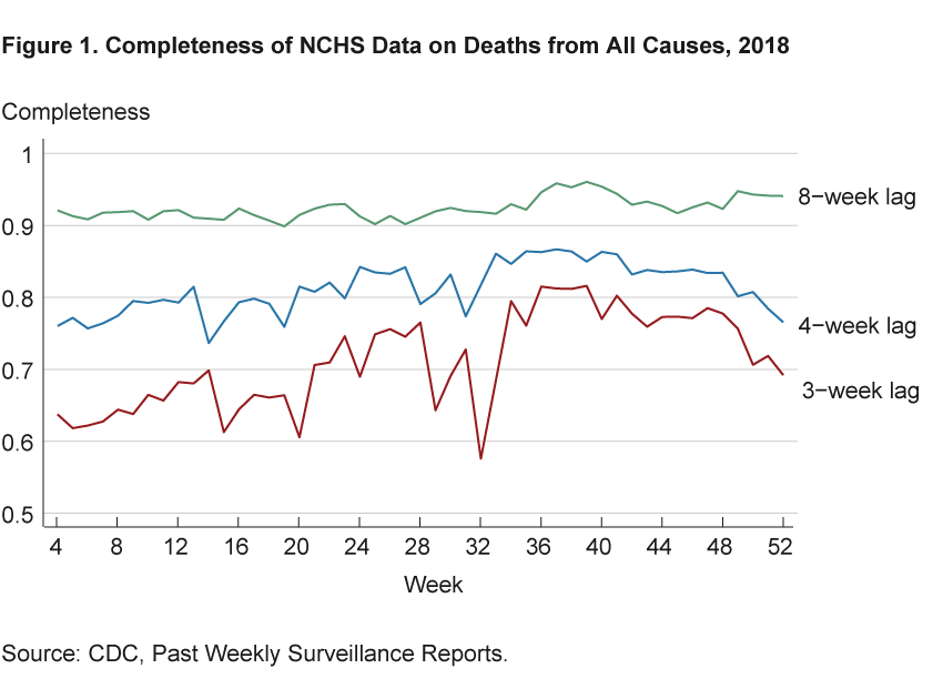
To explore the possible extent of the data’s incompleteness, figure 1 shows estimates of the completeness of NCHS data on deaths from all causes for 2018. Completeness is calculated as the ratio of deaths in a calendar week as measured 3, 4, and 8 weeks later to the deaths in that same calendar week as measured in the complete data (for 2018, that is from week 1 of 2020). The figure shows that when measured with a 3-week lag, between 20 percent and 40 percent of deaths are missing in any given week relative to those identified in the complete data; with a 4-week lag, between 15 percent and 25 percent of deaths are missing; and with an 8-week lag, less than10 percent of deaths are missing.8
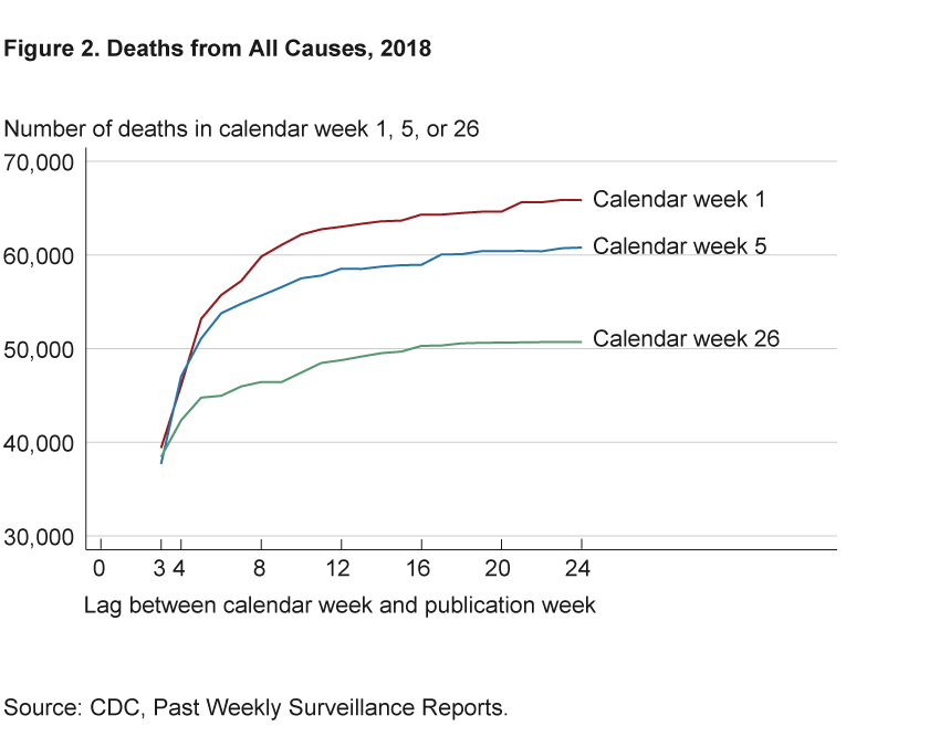
More revisions occur for times of the year that typically experience higher death rates. Figure 2 shows the number of deaths in weeks 1, 5, and 26 of 2018 as reported in each vintage of data throughout 2018. The data change dramatically over an 8-week lag and flatten out after 16 to 20 weeks, or 4 to 5 months after the date about which we are trying to learn. Weeks 1 and 5 gain upward of 20,000 deaths over the horizon displayed, while week 26 gains around 10,000 deaths over the same time horizon.
According to the CDC website, the delay in deaths’ appearing in the NCHS data is due to the steps that must be completed in order to report death certificate data. The NCHS obtains its data from states’ vital records offices after they have received completed death certificates from official certifiers such as doctors, medical examiners, and coroners. Certifiers indicate the cause of death and must sometimes wait for confirmatory tests before they can complete and submit the death certificates.
Furthermore, some deaths can take longer to appear in the NCHS data. Deaths due to conditions such as influenza, pneumonia, and COVID-19 must be manually hand coded. Manually coded deaths account for about 20 percent of the total, and while hand-coding is usually complete within 7 days of the death certificate’s being received, the delay can be longer when the number of deaths increases significantly, as it has with COVID-19. The CDC notes that as a result of differences in processing different conditions, “underestimation of the number of deaths may be greater for certain causes of death than others.”
The lag in reporting matters because we could draw incorrect conclusions from incomplete data. And the ways that our conclusions could be biased are difficult to predict. Furthermore, most analyses assume that inferences taken from the NCHS data will only improve with greater completeness or a longer time lag. But even that assumption may not be warranted because the uncertainty in inference created by incompleteness in the NCHS data is difficult to quantify.9
Figure 3, inspired by Morgan (2020), gives an example in which real-time NCHS deaths data could lead to mistaken conclusions about the number of COVID-related deaths and whether they are trending up or trending down. The figure shows pneumonia deaths, but COVID-19 is likely to have similar lag times because deaths from both maladies are hand-coded by the CDC. The blue line in the figure shows pneumonia deaths in 2018 as measured in week 1 of 2019 in the NCHS data. Looking at that line alone, one would conclude that in 2018:Q4 deaths were largely flat and even steeply declining at the very end of the year. However, a comparison with the seasonal pattern over 2012–2017, shown by the averages in the black line, makes clear that this conclusion would probably be incorrect—a rise in deaths typically occurs in those months, as is seen in the line for week 52.
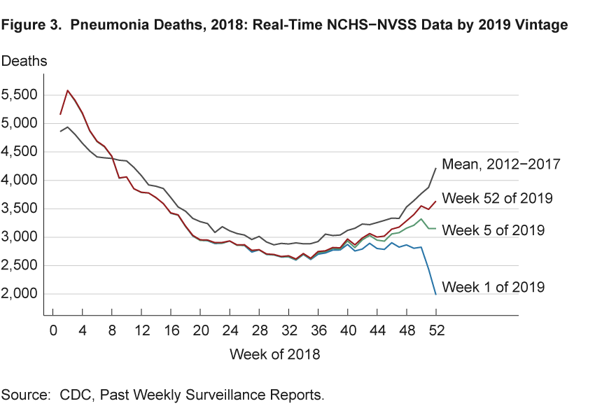
The green line in the figure shows that by week 5 of 2019 one would have made accurate conclusions about the increase and acceleration in pneumonia deaths during weeks 40–44 in 2018. Thus, we would have obtained reliable estimates, and drawn better conclusions, from the NCHS data with a time lag of three months from the end of the period in question.
The panels of figure 4 characterize how conclusions about monthly changes in deaths that are based on real-time data might compare with conclusions about monthly changes that are based on the complete data. These figures show the four-week change in deaths from all causes by vintage of NCHS data. The lines show the change in each calendar week from four weeks prior for vintages with 4- and 8-week lags and from the complete data. The left panel shows data about deaths occurring in 2016, and the right shows the analogous figure for 2018. Complete data are taken as data from week 1 of 2018 and week 1 of 2020, respectively. When a line is below zero, it means the number of deaths decreased over the previous four weeks. When a line is positive, it means deaths have increased.
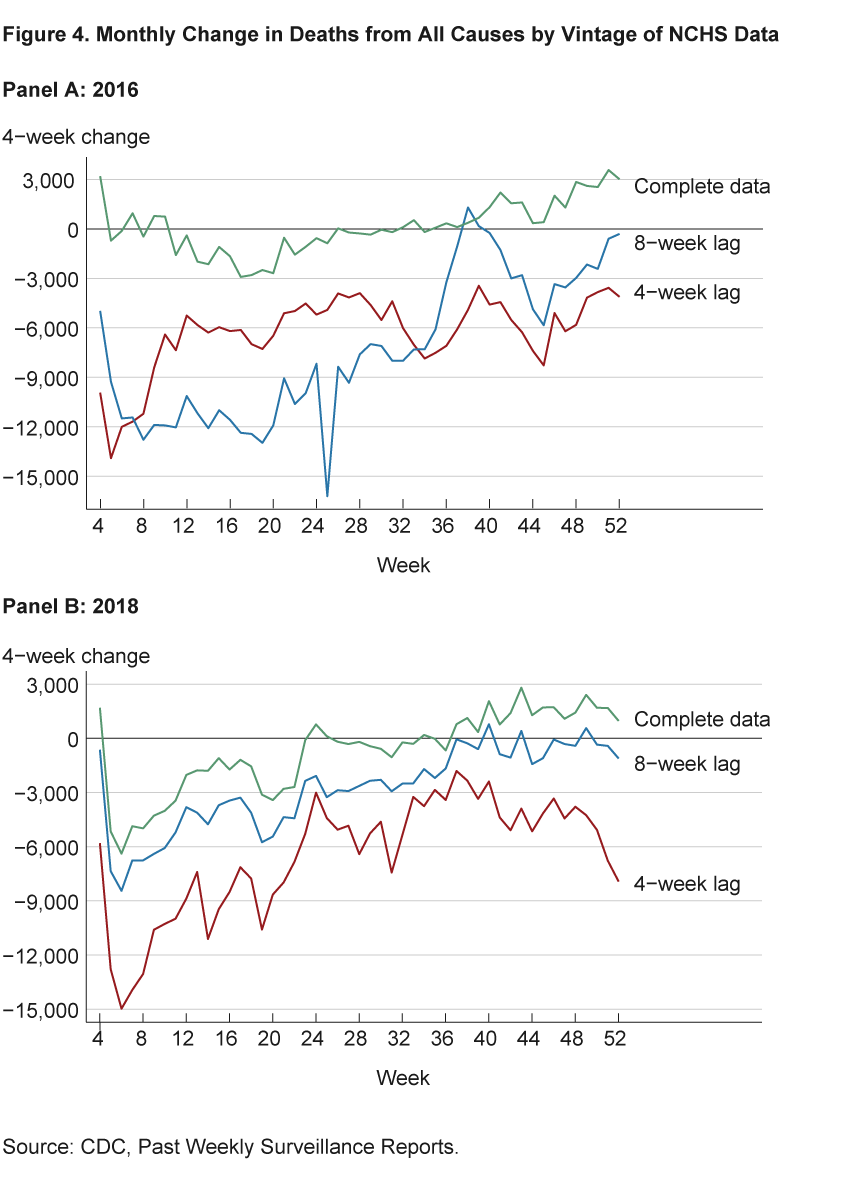
The figures demonstrate three important points. First, the data with a 4-week lag can be very different from the complete data, as one would expect given the above analysis. Second, the data with an 8-week lag are not always better than data with a 4-week lag for interpretation in real time. Finally, there are not only differences in magnitude between the lagged and complete data, but also differences in sign. In both years, the later weeks have negative changes for lagged data, indicating decreases in the number of deaths, and positive changes for the complete data, indicating increases in the number of deaths. These differences in sign imply that not only are total death counts unreliable before the data are complete, but our measures of changes in the death rate over time can be as well, leading to incorrect conclusions about trends in excess mortality.
As demonstrated above, the inferences taken from the NCHS data will not necessarily improve with a greater time lag, and the uncertainty in inference created by incompleteness in the NCHS data would be difficult to quantify. Furthermore, while the NCHS data do come with estimates of completeness, these estimates are based on the average number of deaths in previous years. Calculating completeness this way could be misleading as the number of deaths occurring during the pandemic far exceeds the average, leading to completeness scores greater than 100—implying we have all the data—even though new revisions keep being made. COVID-19 data are likely to be more incomplete for longer than with other causes of death in the past because of the large number of COVID-19 deaths and the need to manually code them in the NCHS data. As discussed on the CDC’s website, the delay in assembling complete data is an especially important issue when we are trying to measure deaths at the state level.
Directly Measured Disease Deaths in the United States
The ultimate source of COVID-19 death data for the United States in all major aggregators appears to be directly measured virus deaths reported by state health departments.10 While these data could also suffer from issues related to completeness, the issue of accuracy is more likely to be a problem because these data are reported more quickly and without all of the verifications done to ensure quality in the NCHS data. However, the timeliness with which the COVID-19 death data are available from the states and the data’s earlier completeness relative to the excess-mortality data allow us to draw more valid conclusions about the current state of the pandemic than we could with excess-mortality data.
We concentrate on data aggregated from state health departments by the COVID Tracking Project. The COVID Tracking Project provides daily updated state-level and national data. It also provides links to the source data on each state’s health department website along with grades for data quality.
The data on daily COVID-19 deaths are shown in figure 5 as blue dots and triangles, with triangles representing deaths reported between 4 pm on Mondays and 4 pm on Tuesdays and dots representing those reported within the same time frame on the other days of the week. We can make three observations about these data.
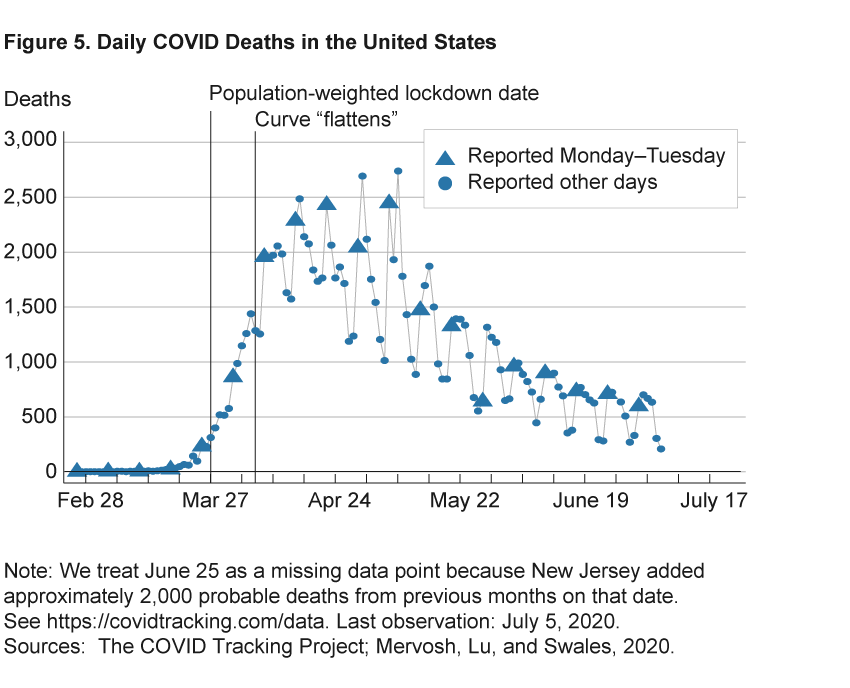
First, social-distancing policies and behaviors have worked in flattening the curve. The left vertical line indicates that March 27 is the average date at which governors issued stay-at-home orders when weighted by each state’s population.11 Just before March 27, COVID deaths were increasing rapidly. The right vertical line indicates that COVID-19 deaths stopped increasing 10 days later, on April 6.12
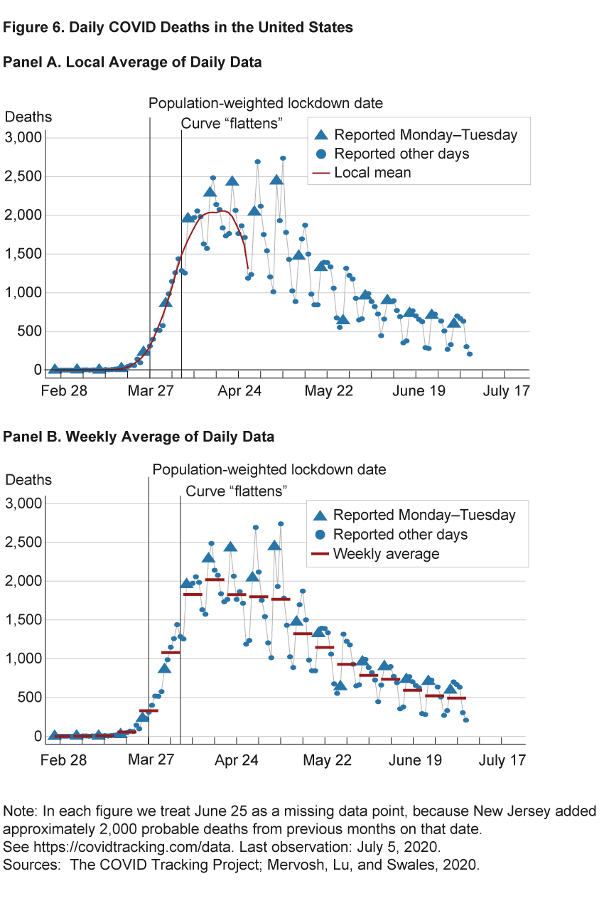
Second, daily changes in the data are noisy, so that a full week’s worth of data is required to detect changes in trends. The triangles highlight that death counts reported over Mondays and Tuesdays tend to be much higher than death counts on other days. If we were to use a local average over recent days to detect trends, we could easily draw mistaken conclusions because of day-of-the-week effects rather than true trends. This is illustrated by the red line in figure 6. Local means estimated on data up to April 26 would indicate that deaths were declining rapidly; similar conclusions would have been reached at multiple points over recent weeks. However, we know from hindsight that this was just the result of a decline in deaths over the course of the day of week: the average over those weeks (the red bars in the panel on the right of figure 6) was not declining over that stretch, and in subsequent weeks deaths remained at a similar level.
And third, by looking at weekly averages of COVID-19 deaths in the United States we see that daily disease deaths were fairly steady between 1,700 and 2,000 for the five weeks from April 6 through May 10. Then, beginning the week of May 11, deaths began a slow decline.
Conclusion
Many basic questions face policymakers and all of us going forward: Should policy, and our individual efforts, be targeted to social distancing for seniors, other susceptible populations, and those already infected (Acemoglu et al., 2020; Chari, Kirpalani, and Phelan, 2020)? Or is the more important distinction between social interactions in work and nonwork settings (Baqaee et al., 2020)? Determining the policies that will achieve the best outcomes for health and economic activity depends on understanding the state of the pandemic—whether death rates from COVID-19 are rising or falling, and for which demographics and geographies. Accurate measurement of mortality will allow us to better understand the state of the pandemic. Using mortality data such as directly observed disease deaths, which are both more timely and more complete than excess mortality, will improve policy decisions and will be vital in monitoring outbreaks.
COVID-19 Mortality Data: Charts and Analysis
The Cleveland Fed provides regularly updated charts and analysis of mortality data across the United States.
The charts and data interpretation on the website is an update of work documented in Elvery, 2020.
Footnotes
- https://www.cbsnews.com/news/full-transcript-fed-chair-jerome-powell-60-minutes-interview-economic-recovery-from-coronavirus-pandemic/. Return to 1
- The data available for measuring the COVID-19 epidemic in the United States are far from perfect. Case counts are becoming more useful but have been difficult to interpret because testing varies vastly across jurisdictions and is inconsistently measured. Assessing the issue in early April, when the number of daily tests was less than 20 percent of the daily tests in early July, journalist Nate Silver concluded that “Coronavirus case counts are meaningless.” (Silver, 2020). To give a sense of the types of problems posed by testing data, we point out that as of May 11, 2020, the CDC reported 600,000 tests had cumulatively been conducted. Another source of COVID-19 data for the United States, the COVID Tracking Project, reported 1.9 million tests by the same date. Silver (2020) and Madrigal and Meyer (2020) provide useful discussions of what we can learn from testing data. Return to 2
- The World Health Organization (WHO) defines an epidemic as “the occurrence in a community or region of cases of an illness, specific health-related behaviour, or other health-related events clearly in excess of normal expectancy.” Return to 3
- https://www.cdc.gov/coronavirus/2019-ncov/covid-data/faq-surveillance.html. Return to 4
- Not all states measure this variable in the same way. Return to 5
- Most states do not typically release timely state-level data on deaths from all causes; their reporting of COVID deaths is an exceptional data release due to the pandemic. While some geographically small and densely populated areas such as New York City have reported timely all-causes mortality data recently, again this is due to the exceptional nature of the pandemic. For timely all-causes death data the best source is likely to be the NCHS. Return to 6
- In order to index the real-time data, we assume that data reports labeled week n are released in week n+1. We then define the lag between two specific weeks in terms of the days between the midpoint of the calendar week and the midpoint of the publication week. For example, week 1 mortality data are not available until the week 3 report, which is not published until week 4. Thus, there is a 3-week lag between the calendar week and publication. The shortest lag between a calendar week and a publication week for mortality data is 3 weeks in the 2015–2016, 2016–2017, and 2017–2018 flu season reports. A flu season starts in week 40 of a given year and goes to week 39 of the following year. In the 2018–2019 flu season, the lag was shortened to 2 weeks. In response to the current COVID crisis, the lag since the 2020 week 15 report has been 1 week. Return to 7
- Our findings represent an improvement over the degree of completeness that Spencer and Ahmad (2016) reported. They do a similar analysis with data from 2015–2016 and their completeness levels are lower than ours for all lags. The improvement in the completeness numbers suggests that the issue is being addressed by the NCHS. Return to 8
- Official statistics often have this type of uncertainty (Manski, 2015). Return to 9
- The CDC updates its count of total COVID-19 deaths daily in a separate data set from the NCHS data (with both data sets being released by the CDC; here are links to the NCHS-NVSS and state health department data sets on the CDC’s website.). The second distinct data set appears to ultimately be aggregated from state health departments, as the CDC defers to data reported by states in the case of discrepancies. (See the section “About the Data’’ on CDC’s “Cases in the U.S.” page.) The widely used website created by Johns Hopkins University’s Center for Systems Science and Engineering (CSSE) cites the CDC as the source of its US deaths data. Data from state health departments also appear to be the ultimate source for data posted to the websites of the Institute for Health Metrics and Evaluation (IHME) and WorldoMeters.info. (For information on the data sets, see IHME and WorldoMeters.) The New York Times also has a data set that includes deaths tracked down by reporters. This reporting work may matter significantly for variables other than deaths, but The New York Times COVID virus death variable tracks the CDC variable almost identically over the period we analyzed. Return to 10
- For example, if half of the population received stay-at-home orders on March 26, and the other half of the population received stay-at-home orders on March 28, then the population-weighted stay-at-home order date would be March 27. Return to 11
- The date of April 6 is chosen by a formal statistical analysis; the precise date would not change dramatically if instead we simply eye-balled the data and made a judgment call. Return to 12
References
- Acemoglu, Daron, Victor Chernozhukov, Iván Werning, and Michael Whinston. 2020. “Optimal Targeted Lockdowns in a Multi-Group SIR Model.” National Bureau of Economic Research, Working Paper No. 27102. https://doi.org/10.3386/w27102.
- Baqaee, David, Emmanuel Farhi, Michael Mina, and James Stock. 2020. “Reopening Scenarios.” National Bureau of Economic Research, Working Paper No. 27244. https://doi.org/10.3386/w27244.
- Chari, Varadarajan, Rishabh Kirpalani, and Christopher Phelan. 2020. “The Hammer and the Scalpel: On the Economics of Indiscriminate versus Targeted Isolation Policies during Pandemics.” National Bureau of Economic Research, Working Paper No. 27232. https://www.nber.org/papers/w27232.
- Economist, The. 2020a.“COVID-19 Data: Tracking COVID-19 Excess Deaths across Countries.” Graphic Detail. Updated April 28, 2020.
- Economist, The. 2020b. “Fatal Flaws: COVID-19’s Death Toll Appears Higher than Official Figures Suggest.” Graphic Detail (April 4).
- Elvery, Joel. 2020. “COVID-19 Mortality Rate Trends in Countries and US States.” Federal Reserve Bank of Cleveland, District Data Briefs (June 24).
- Madrigal, Alexis C., and Robinson Meyer. 2020. “How Could the CDC Make That Mistake?” 2020. The Atlantic (May 21).
- Manski, Charles F. 2015. “Communicating Uncertainty in Official Economic Statistics: An Appraisal Fifty Years after Morgenstern.” Journal of Economic Literature, 53(3): 631–653. https://www.aeaweb.org/articles?id=10.1257/jel.53.3.631.
- Mervosh, Sarah, Denise Lu, and Vanessa Swales. 2020. “See Which States and Cities Have Told Residents to Stay at Home.” The New York Times (March 31).
- Morgan, Tyler. 2020. GitHub Data Repository: Tylermorganme/Pni-Data. Jupyter Notebook. https://github.com/tylermorganme/pni-data. Last accessed April 9.
- Silver, Nate. 2020. “Coronavirus Case Counts Are Meaningless.” FiveThirtyEight (April 4).
- Spencer, Merianne R., and Farida Ahmad. 2016. “Timeliness of Death Certificate Data for Mortality Surveillance and Provisional Estimates.” National Center for Health Statistics, National Vital Statistics System Special Report No. 001.
Suggested Citation
Aliprantis, Dionissi, and Kristen Tauber. 2020. “Measuring Deaths from COVID-19.” Federal Reserve Bank of Cleveland, Economic Commentary 2020-18. https://doi.org/10.26509/frbc-ec-202018
This work by Federal Reserve Bank of Cleveland is licensed under Creative Commons Attribution-NonCommercial 4.0 International

