

- Share
The Evolution of Household Leverage during the Recovery
Recent research has shown that geographic areas that experienced greater household deleveraging during the recession also experienced relatively severe economic contractions and slower recoveries. This analysis explores geographic variations in household debt over the past recession and recovery. It finds that regions that had very high household leverage at the start of the recession have shifted back toward national norms, while the variation of leverage within metro areas has maintained steady relationships with neighborhood characteristics such as location, demographics, and the age of the housing stock.

The views authors express in Economic Commentary are theirs and not necessarily those of the Federal Reserve Bank of Cleveland or the Board of Governors of the Federal Reserve System. The series editor is Tasia Hane. This paper and its data are subject to revision; please visit clevelandfed.org for updates.
The run-up to the most recent recession was characterized by a large increase in household debt, especially mortgage debt. Household debt began falling during the recession, and this deleveraging continued for four years after the economy resumed growing. Recent research has shown that the degree of deleveraging that occurred in different geographic areas is associated with the severity of the recession and the pace of recovery in those areas (Mian and Sufi 2010, Mian, Rao, and Sufi 2013). Places where the most household deleveraging occurred were also those that experienced relatively severe economic contractions and slower recoveries.
The better policymakers understand what normally determines household leverage, the more adept they can be at anticipating or preventing disruptive deleveraging events. Explaining why household debt varied geographically over the past recession and recovery provides an opportunity to increase that understanding. To that end, this analysis looks at how and why the distribution of household leverage both across the United States and within metropolitan areas has evolved since the beginning of the recession. It finds that much of the variation can be explained by location, demographics, and qualities of the housing stock, and it reveals that regions that had very high household leverage at the start of the recession have shifted back toward national norms, while the variation of leverage within metro areas has maintained steady relationships with neighborhood characteristics.
General Patterns in Household Leverage
For this analysis, information about household debt is derived from the Federal Reserve Bank of New York Consumer Credit Panel, which is a sample of Equifax credit records. The sample includes the debt balances of approximately 12 million people, which is 5 percent of all US residents who have credit histories. These records are first aggregated into census tracts and then linked to income and demographic data from the American Community Surveys (ACS).1 Next, debt-to-income ratios (DTI), a standard measure of household leverage, are calculated. The DTI ratios reported here are the mean debt per credit record within a census tract, divided by the tract’s per capita income.
Figure 1 displays the average values across all census tracts for various types of debt relative to income. It shows that total DTI declined from 1.8 in 2007 to 1.5 in 2013 and that Americans have generally lowered their DTIs for credit cards (−0.06), auto loans (−0.01), and home equity loans (−0.02). The only category in which average DTI has increased is student loans (+0.04). Any discussion of the variance of household leverage will have to focus on home loans because mortgages are by far the largest component of household debt. Average tract mortgage debt is down from 1.28 times per capita income to 1.05 times per capita income.
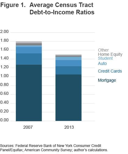
Sources: Federal Reserve Bank of New York Consumer Credit Panel/Equifax; American Community Survey; author's calculations
The variance in DTIs across neighborhoods has declined even more dramatically than the levels of leverage. By comparing the distributions in 2007 and 2013, we can see that fewer tracts have DTIs above 2.0, and more tracts now have levels below 1.5 (figure 2). In 2007, the tracts at the 90th percentile had a DTI of 2.96. By 2013, the 90th percentile was found at 2.30.
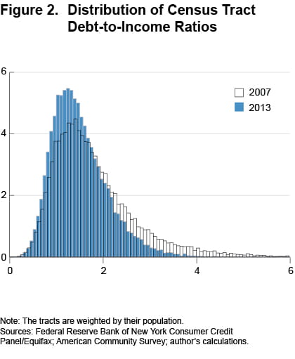
Note: The tracts are weighted by their population.
Sources: Federal Reserve Bank of New York Consumer Credit Panel/Equifax; American Community Survey; author's calculations.
Variation in Household Leverage across the US and within Metro Areas
Places with the highest DTI ratios are likely to be those with the highest prevailing home prices. Along with being the largest expense in most household budgets, the cost of housing is also one of the most widely varying costs between regions. House prices are driven by such things as local labor markets, amenities, and the availability of land and permits for new construction. Also, because property taxes are capitalized into home prices, jurisdictions with lower property taxes will have higher home prices (other things being equal).
With its combination of natural amenities, industry clusters, building constraints, and property tax caps, California stands out for having extraordinarily high home prices and DTI ratios. In 2007, 34 percent of all top decile tracts were found in California. California, which holds 12 percent of the US population, had more than its share of heavily indebted households. Despite substantial deleveraging, California’s metropolitan areas, from San Francisco to Bakersfield to San Diego, still dominate the rankings of metro areas by DTI in 2013. Other metro areas that have maintained high DTI averages include Honolulu, Hawaii, and Provo, Utah. The housing-boom leaders Phoenix and Las Vegas placed high in 2007, but have fallen out of the top quarter of the rankings.
The bottom 10 percent DTI tracts are concentrated in the northern industrial metro areas that have excess housing stock. These include Syracuse, Rochester, Buffalo, Scranton, Pittsburgh, Cleveland, Toledo, Dayton, and Detroit. Low DTI tracts are also very common throughout the rural areas of the Midwest and South.
We can see these differences in DTI between metro areas if we compare maps of census tracts in high, middle, and low DTI regions. These maps also demonstrate that there is variation within every metro area.
Las Vegas had very high DTI levels in 2007 (figure 3). However, even at the peak of the housing boom, some neighborhoods in that area still had low DTI. The Las Vegas map circa 2013 shows that substantial deleveraging has occurred. Seven out of ten tracts have moved down by one quintile or more, and fully 95 percent off the tracts had some decline in DTI. The average DTI for the metro area has declined from a very high 2.64 to a level near the national average, 1.53.
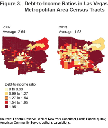
Sources: Federal Reserve Bank of New York Consumer Credit Panel/Equifax; American Community Survey; author's calculations.
The Columbus, Ohio, metro area is typical of regions in the middle of the national distribution (figure 4). It has areas of high and low DTI. High DTI tracts are in some cases bordering low-DTI tracts in the city center, but most high DTIs are found in outer-ring tracts. Eighty-four percent of residents in this metro area experienced declining DTIs in their tract, with 53 percent of the tracts moving down to a lower quintile. The declines were modest, and this is reflected in the decrease of the region’s average DTI from 1.55 to 1.34.
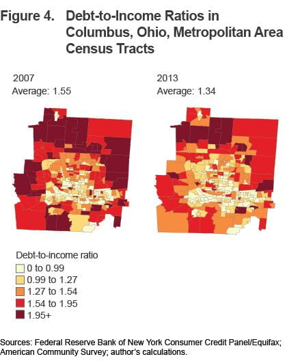
Sources: Federal Reserve Bank of New York Consumer Credit Panel/Equifax; American Community Survey; author's calculations.
The Pittsburgh region is a good representation of a low-housing-cost area (figure 5). At the peak of the housing boom, 76 percent of its tracts were already in the bottom two quintiles. DTIs declined further in 63 percent of tracts and increased in 37 percent of tracts. The average leverage in the Pittsburgh metro area has barely changed from 2007 to 2013.
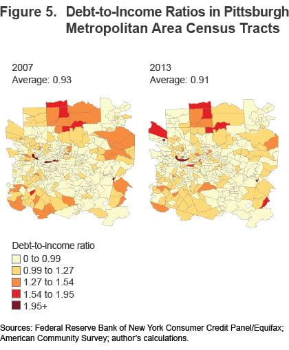
Sources: Federal Reserve Bank of New York Consumer Credit Panel/Equifax; American Community Survey; author's calculations
Factors Explaining Variation within Metro Areas
If tracts in the same metro areas share a labor market and access to many of the same amenities, wfhy do such wide differences persist between the highest and lowest tracts? We can investigate this by linking the DTI measures to demographic and housing stock measures, and looking for patterns. The demographic measures that are merged in from the ACS include family type (married, married with children, single parents, etc.), age, educational attainment, recent movers, the share of foreign-born individuals, and employment status (unemployed, not in the labor force). The housing measures include the home-ownership rate, the age of the homes, and location of the homes relative to jobs (measured by commute times).
Tracts with DTIs at the 90th percentile have shares of married couples with children that are at least 20 percent higher than the average tract. The share of college graduates is 5 to 6 percentage points above average in these neighborhoods. The homes in high-DTI neighborhoods are newer, with approximately 29 percent being built after 1990. In other tracts, about 23 percent of homes are of these recent vintages. The tracts with the lowest DTIs are mirror images. They have fewer than average married couples with children, fewer college graduates, and more prewar homes than new homes. The patterns in these characteristics are largely unchanged between 2007 and 2013.
These patterns make intuitive sense. Married couples often purchase their first home close to the time they start having children. Their mortgages will be more recent, with more of the balance outstanding. Likewise, tracts of new homes will have newer mortgages, while tracts of older homes will probably have a substantial fraction of households with their mortgages paid down. College graduates have fewer and shorter spells of unemployment, so they have access to more credit and feel secure enough to carry more debt relative to their incomes.
If we want to explain the variance of DTI among tracts more formally, we can enter each tract’s metro area, demographics, and housing characteristics into a statistical model. In figure 6, each section of the bars represents the portion of the variance that can be explained using the model and the demographic, housing, or metro area variables. The bar sections sum to the total variance of DTI. In 2007, this model could explain 68 percent of the total variance. The demographic and housing stock measures for the neighborhoods could explain 29 percent of the variance in that year. Despite all the changes on households’ balance sheets, the demographic and housing stock characteristics still explain about the same portion of the variance, 30 percent, in 2013. The driver behind the higher variance in 2007, and the greater predictive power of the model in that year, was the extremely high DTIs that prevailed in some regions during the housing boom.
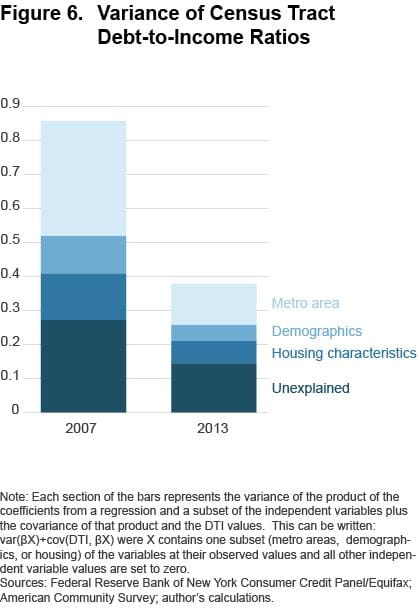
Note: Each section of the bars represents the variance of the product of the coefficients from a regression and a subset of the independent variables plus the covariance of that product and the DTI values. This can be written:var(βX)+cov(DTI, βX) were X contains one subset (metro areas, demographics, or housing) of the variables at their observed values and all other independent variable values are set to zero.
Sources: Federal Reserve Bank of New York Consumer Credit Panel/Equifax; American Community Survey; author's calculations.
Seven years ago, 38 of the country’s 385 metro areas had per borrower debt that averaged between 2.36 and 3.92 times per capita income.2 These metro areas were mostly in Western states including California (25 metros), Utah (3), Arizona (1), Colorado (1), and Oregon (1). Three Florida metro areas were also in the group. DTIs in these areas placed them very far from the bulk of the other metro areas, where average DTIs were between 1.23 and 1.70. The variance of DTI was 0.44 when these top 38 regions were excluded but jumped to 0.86 if they were included.
By 2013, all 38 had massively deleveraged, and now even the highest-metro-DTI averages are below 2.46. The 2013 DfTI variance among all 385 metro areas, including the former outliers, is 0.38. The additional variance created by the outlier metro areas in 2007 meant that just knowing a tract’s metro area was enough to explain a great portion, 39 percent, of the variation in the tract’s DTI. After the deleveraging, the differences between metro areas can still explain a major portion, 32 percent, of the overall variance, although not quite as much as before the recession.
Implications
In the medium term, expansion of household credit can be associated with many positive trends for a neighborhood or city. In the best cases, expanding mortgage debt reflects income growth and house-price appreciation. Increased student loans should be associated with investments in human capital. Credit card and auto borrowing can increase local economic activity and sales tax revenue.
However, all these trends can be slowed or reversed when households are deleveraging. Rapidly falling mortgage balances in a neighborhood can be part of a cycle of falling home prices and foreclosures eliminating underwater mortgages. When households change their expectations about their future earnings, due to slowdowns and layoffs, they cut back on current spending, stop taking on new debt, and pay off outstanding balances if possible. Highly leveraged households can experience hardship due to reduced work hours and small losses of income.
The last recession displayed how households’ difficulties affect their communities. Local retailers and service providers struggled due to falling consumer demand. Many jurisdictions experienced sharp declines in sales tax revenue when their residents switched from running up credit card tabs to paying them down.f
To prevent disruptive periods of deleveraging, we need to understand what drives households to accumulate debt. Fortunately, we can explain a majority of the variation in neighborhood DTI levels, even as this variation has evolved since the recession. Much of the geographic variation that existed in 2007 was driven by regions that had had extraordinary, unsustainable home-price appreciation. These areas have experienced substantial deleveraging, and this has cut the total variance of neighborhood DTI ratios in half.
There remains substantial variation of household leverage within metro areas, and this variation relates in predictable ways to family structure, education levels, the age of homes, and other neighborhood characteristics. These patterns appear to have held steady through the recession and recovery.
Footnotes
- The ACS-based estimates of the census tract measures are created by combining five years of observations (2005-2009 or 2008-2012). This ensures that enough people were surveyed in each tract to produce adequate sample sizes. Return
- The metro area definitions used here are the Office of Management and Budget’s Core-Based Statistical Areas. Return
References
- Mian, Atif, and Amir Sufi. 2010. “Household Leverage and the Recession of 2007-09.” International Monetary Fund, Economic Review, 58(1): 74-117.
- Mian, Atif, Kamalesh Rao, and Amir Sufi. 2013. “Household Balance Sheets, Consumption, and the Economic Slump.” Quarterly Journal of Economics, 128(4): 1687.
Suggested Citation
Whitaker, Stephan D. 2014. “The Evolution of Household Leverage during the Recovery.” Federal Reserve Bank of Cleveland, Economic Commentary 2014-17. https://doi.org/10.26509/frbc-ec-201417
This work by Federal Reserve Bank of Cleveland is licensed under Creative Commons Attribution-NonCommercial 4.0 International

