

Mortgage Lending Patterns in Fourth District Communities as of May 2011
Housing markets are still struggling. The latest edition of Mortgage Lending Patterns takes a regional look at housing conditions in the Fourth District. Our analysis, based on data from May 2011, shows that home prices within Ohio MSAs—among them Cleveland, Akron, Cincinnati, Columbus, and Toledo—have fallen further from their peaks than MSAs in the surrounding Fourth District states, such as Pittsburgh. Find out more, including a look at trends in delinquency and foreclosure rates in Ohio, Pennsylvania, Kentucky, West Virginia, and the nation as a whole.
Map One
The change in home prices varies markedly across the region. When compared with other 4th District MSAs, home prices in most of Ohio’s MSAs have fallen the greatest since the 1st quarter of 2006.
Figure 1: MSA: Percentage Change in Home Prices 1Q: 2006 - 1Q:2011
Note: FHFA uses the 2008 MSA boundaries. Prepared by the Federal Reserve Bank of Cleveland's Community Development team
Source: Haver Analytics / FHFA All-Transactions HPI
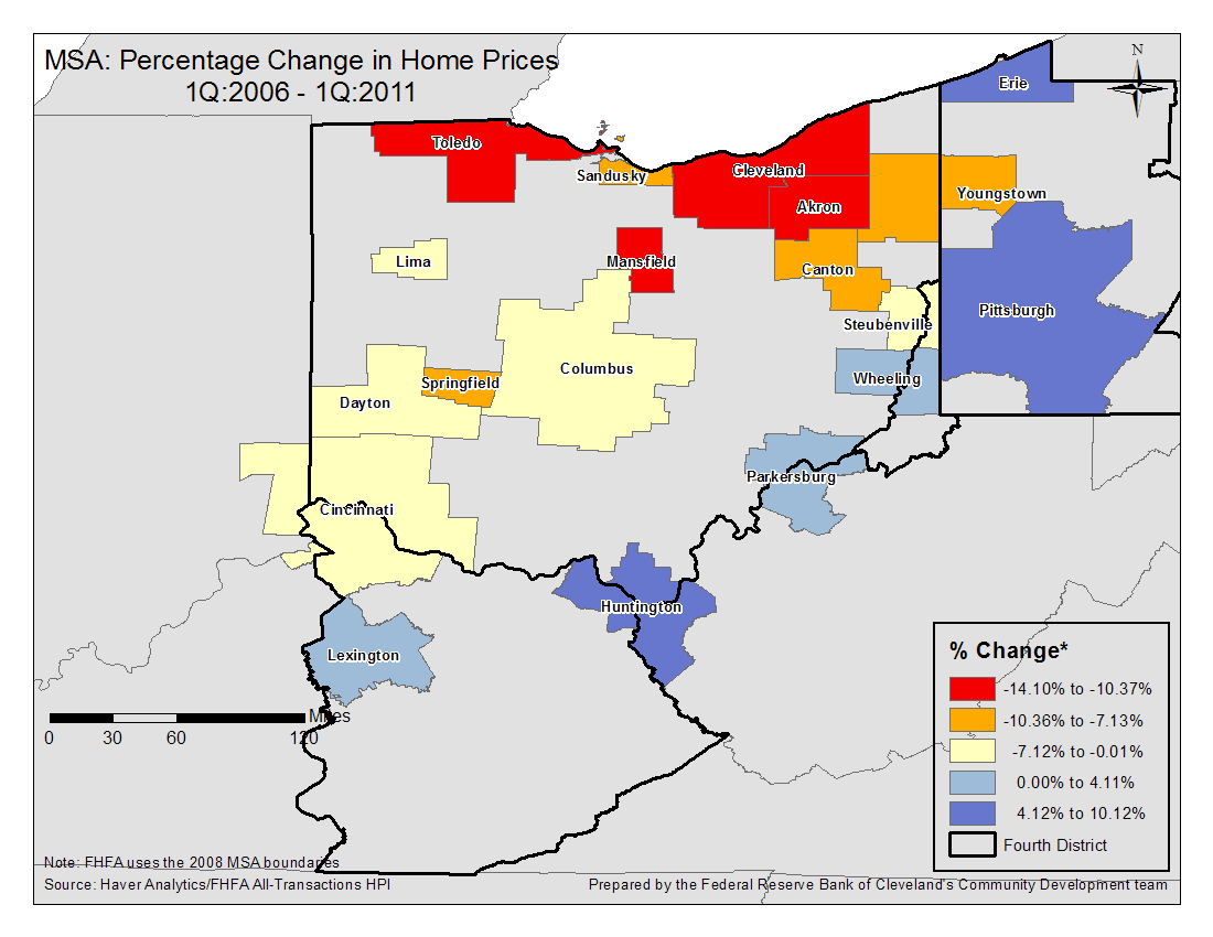
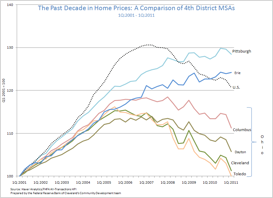
Figure Two
Here are three main points that can be taken from this chart:
- Pennsylvania MSAs have seen continued increases in home prices, albeit at a slowing rate. Ohio MSAs, on the other hand, have exhibited a clear peak between 2005 and 2006, followed by a sustained drop.
- Ohio MSA home prices peaked earlier than home prices in the U.S., an indicator that problems were occurring in that state prior to the nationwide housing crash.
- Most Ohio MSAs continue to see drops in home prices, with several in danger of losing all gains from the past 10 years.
Figure 2: The Past Decade in Home Prices: A Comparison of 4th District MSAs
Note: 1Q:2001 - 1Q:2011
Note: Prepared by the Federal Reserve Bank of Cleveland's Community Development team
Source: Haver Analytics / FHFA All-Transactions HPI
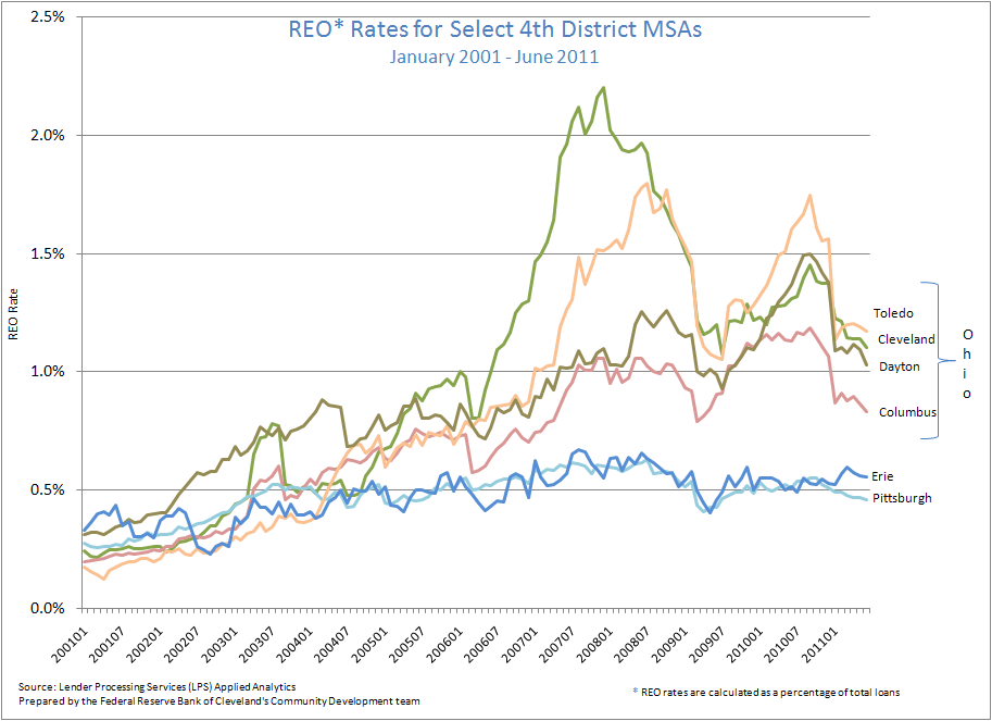
Figures Three and Four
Contributing to sluggish home prices are high rates of both foreclosures and Real Estate Owned (REO), or bank-owned, properties. The danger is that many times a home exits foreclosure only to enter REO. In large numbers, this trend will continue to depress home prices in that region. Consistent with that argument, rates in Ohio MSAs for both are almost twice that of Pennsylvania MSAs on average.
Figure 3: Foreclosure Rates in Select 4th District MSAs
January 2001 - June 2011
Note: Prepared by the Federal Reserve Bank of Cleveland's Community Development team
Source: Lender Processing Services (LPS) Applied Analytics
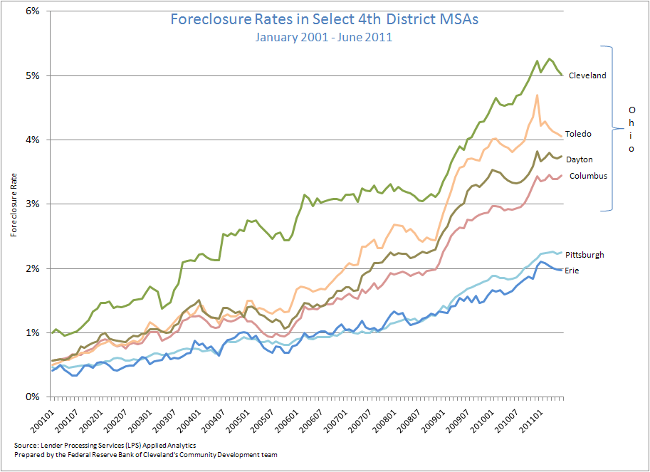
Figure 4: REO* Rates for Select 4th District MSAs
January 2001 - June 2011
*REO Rates are calculated as a percentage of total loans
Note: Prepared by the Federal Reserve Bank of Cleveland's Community Development team
Source: Lender Processing Services (LPS) Applied Analytics
Additional map and charts
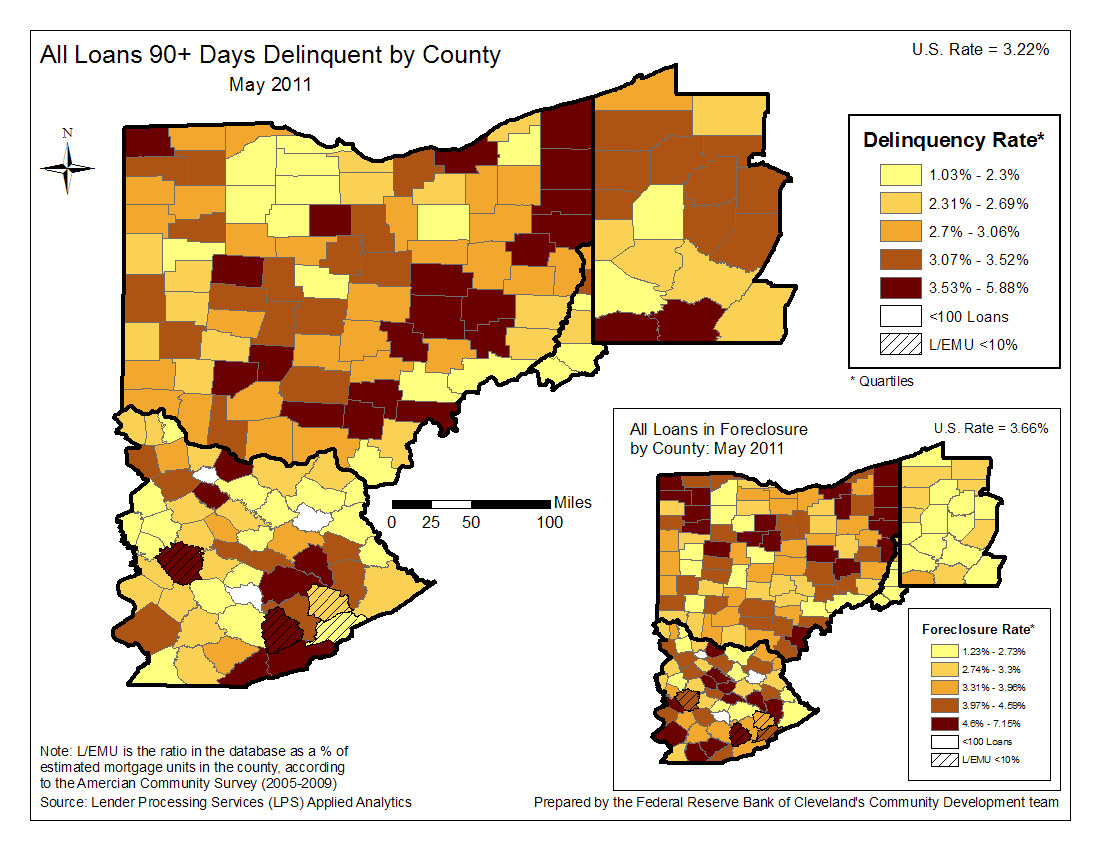
- Map: Rate of all loans 90+ days delinquent and in foreclosure by county (May 2011)
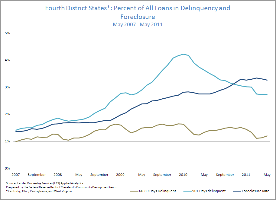
- Chart: Percent of all loans in delinquency and foreclosure for the 4th District (May 2007-May 2011)
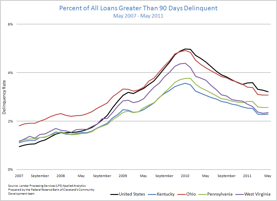
- Chart: Percent of all loans 90+ days delinquent by state (May 2007-May 2011)
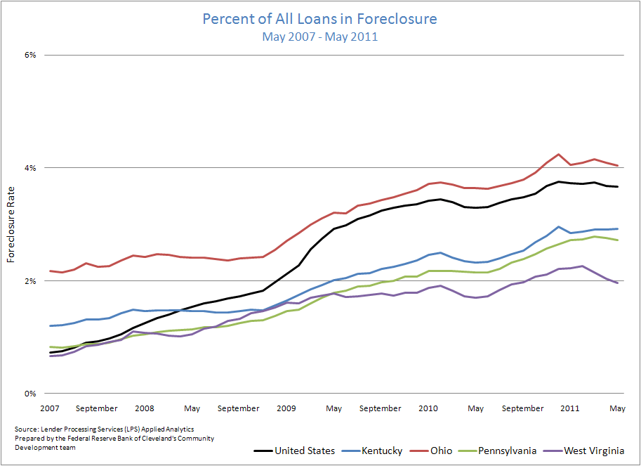
- Chart: Foreclosure rate for all loans by state (May 2007-May 2011)
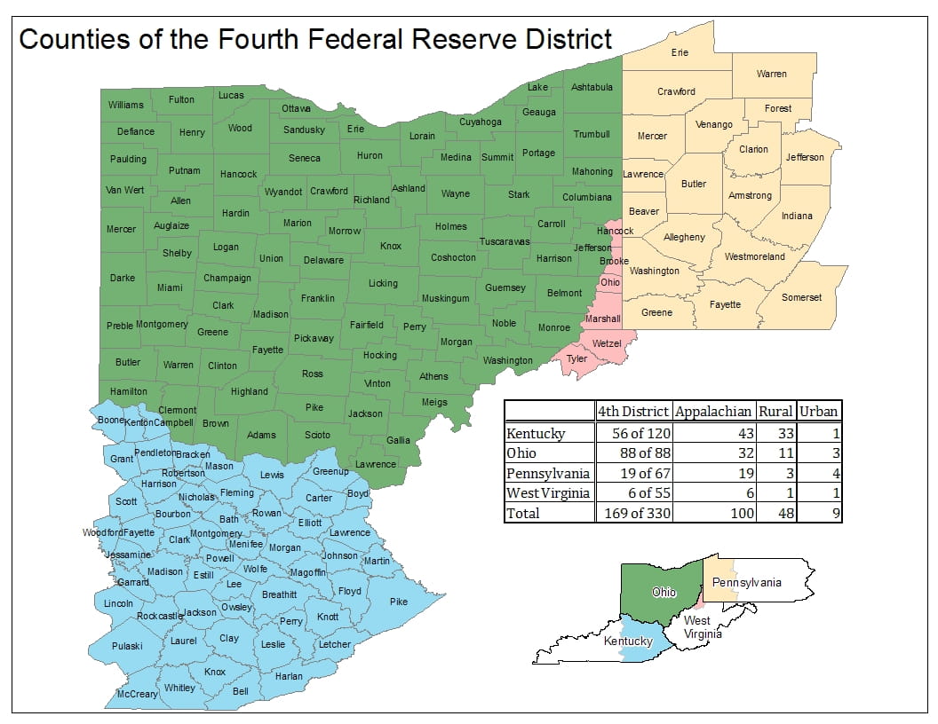
These data briefs provide periodic snapshots of mortgage lending activity and foreclosure patterns in our District using the most recent data (check out this detailed, county-specific map of the 4th District). Delinquency and foreclosure data are from Lender Processing Services (LPS) Applied Analytics. The data include loan level servicing data for both securitized loans and loans held in portfolio from the top 10 residential mortgage servicers in the nation and others. Smaller servicers have less representation.
The views expressed in this report are those of the author(s) and are not necessarily those of the Federal Reserve Bank of Cleveland or the Board of Governors of the Federal Reserve System.
- Share