

Migrants from High-Cost, Large Metro Areas during the COVID-19 Pandemic, Their Destinations, and How Many Could Follow
When the COVID-19 pandemic forced tens of millions of people to work remotely, some chose to relocate out of high-cost, large metro areas. Did people move to cheaper metros or give up in city living altogether? How many will follow in their footsteps, and what could their relocating mean for the places they choose?
When the COVID-19 pandemic forced tens of millions of people to work remotely, there was much speculation about whether this would allow people to leave the most expensive, large metro areas and move to other regions.1 If remote work became a permanent option, would people choose to live in regions with big-city amenities but more affordable housing (lower-cost, large and midsized metro areas)? Or would they give up on city living altogether and seek a small-town lifestyle and the natural amenities that rural areas afford?
This data brief presents estimates of the number of people who have already migrated from the high-cost, large population centers to lower-cost and less-populated regions during the pandemic. It also presents the potential impacts on lower-cost regions that might receive more remote workers.2 Migration away from high-cost, large metro areas did spike during the pandemic. Even if the percentage of remote workers following these recent migration patterns is small, the number of these workers may be large enough to provide other regions the opportunity to substantially grow their workforces.
For the analysis in this brief, I use the following list of high-housing-cost, high-population metro areas that may have experienced increased out-migration during the pandemic: New York, Los Angeles, Chicago, Washington DC, Miami, Boston, San Francisco, Riverside, Seattle, San Diego, Denver, Portland, Sacramento, and San Jose. The list was selected as follows. I started with all metro areas with the top-quartile median list prices per square foot, according to data from the National Association of Realtors.3 I then removed all metro areas with populations smaller than 2 million except for San Jose, because its population was close to 2 million (1,990,660) and its housing costs are the second highest in the country. Finally, I added New York and Chicago to the list because the price of housing that is within normal commute times (25–30 minutes) of their employment centers would easily place in the top quartile. My migration estimates are based on location data included in the Federal Reserve Bank of New York/Equifax Consumer Credit Panel (CCP). For details about how migration can be measured using the CCP, please see the appendix.
Table 1 presents the estimated gross migration flows between the high-cost, large areas and other types of regions during the pandemic (April to December 2020). The table also gives a percentage representing how much higher or lower the flow was during the pandemic relative to the average flow during the same months (April to December) of 2017, 2018, and 2019. The percentage changes support the hypothesis that during the pandemic, people increased their migration toward regions with lower housing costs. Gross migration flows from the high-cost, large metro areas increased by 5.6 percent toward lower-cost, large metro areas. The flows from high-cost, large metro areas to midsized metro areas increased by 10 percent, and the flows to small metro areas and rural regions increased by approximately 9 percent.
The other flows toward midsized metro areas and small metro areas, towns, and rural areas were slightly larger than in previous years. In sharp contrast, the flows toward the high-cost, large metro areas declined by 8 percent to 9 percent during the pandemic relative to the three years prior.
| To high-cost, large metro areas (>2M) | To lower-cost, large metro areas (>2M) | To midsized metro areas (500K–2M) | To small metro areas (<500K), towns, and rural areas | |||||
|---|---|---|---|---|---|---|---|---|
| Migrants | Percent Change |
Migrants | Percent Change |
Migrants | Percent Change |
Migrants | Percent Change |
|
| From high-cost, large metro areas (>2M) | 644,600 | -2.3 | 440,980 | 5.6 | 425,200 | 10.3 | 549,120 | 9.3 |
| From lower-cost, large metro areas (>2M) | 316,460 | -8.8 | 344,460 | -5.6 | 335,240 | 0.9 | 551,440 | 0.3 |
| From midsized metro areas (500K–2M) | 302,480 | -8.1 | 332,700 | -5.9 | 389,340 | -1.5 | 602,240 | 1.4 |
| From small metro areas, towns, and rural areas | 379,260 | -9.4 | 533,060 | -5.8 | 588,900 | -4.5 | 1,399,740 | -2.7 |
Notes: Populations indicated in parentheses. The pandemic period is the second, third, and fourth quarters of 2020. The percentage change is relative to the migration flows to the same areas in the same quarters of the year averaged over 2017, 2018, and 2019.
Sources: Federal Reserve Bank of New York/Equifax Consumer Credit Panel, American Community Survey, National Association of Realtors, and author’s calculations.
How unusual is the shift of migration away from high-cost, large metro areas that has occurred during the pandemic? Figure 1 presents a time series of net migration between the high-cost, large metro areas and other regions of the country. The increased net migration out of high-cost, large metro areas during the pandemic was not a repeat of something that happened during the Great Recession but rather a rapid acceleration of a trend emerging during the previous expansion.
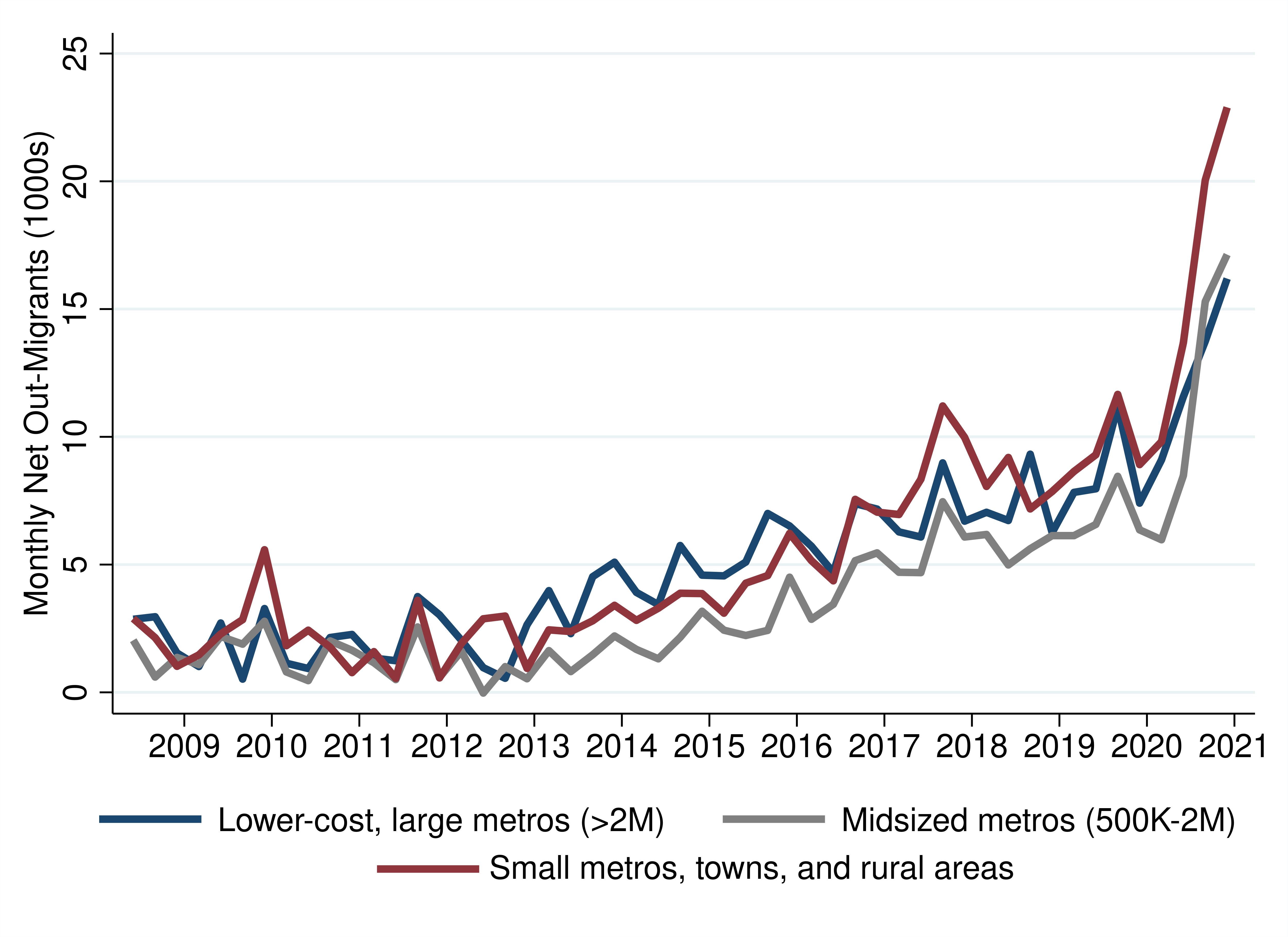
Sources: Federal Reserve Bank of New York/Equifax Consumer Credit Panel, American Community Survey, National Association of Realtors, and author’s calculations.
Table 2 presents the changes in migration out of the high-cost, large metro areas and reveals that migration flows increased from almost all of them toward lower-cost or less-populated regions. Migration out of the New York metro area and several metro areas in California has increased dramatically. Interestingly, the New York and San Francisco metro areas are exceptional in that more people have been leaving them to go to other high-cost, large metro areas.
| To other high-cost, large metro areas (>2M) | To lower-cost, large metro areas (>2M) | To midsized metro areas (500K–2M) | To small metro areas (<500K), towns, and rural areas | |||||
|---|---|---|---|---|---|---|---|---|
| Migrants | Percent Change |
Migrants | Percent Change |
Migrants | Percent Change |
Migrants | Percent Change |
|
| New York | 93,440 | 3.9 | 103,120 | 12.5 | 103,660 | 18.1 | 87,760 | 18.8 |
| Los Angeles | 131,200 | -1.3 | 55,700 | 9.4 | 48,500 | 15.0 | 46,380 | 10.8 |
| Washington | 36,320 | -9.6 | 56,040 | 1.1 | 40,920 | 3.2 | 52,580 | 8.6 |
| Chicago | 31,520 | -13.5 | 47,100 | -1.4 | 32,060 | 0.6 | 55,520 | 6.7 |
| San Francisco | 74,840 | 11.3 | 19,040 | 12.0 | 24,240 | 19.9 | 38,800 | 19.2 |
| Miami | 34,780 | -7.4 | 43,860 | -1.0 | 34,420 | 9.7 | 42,280 | 6.5 |
| Boston | 29,100 | -0.6 | 15,960 | 0.7 | 45,900 | 11.6 | 33,080 | 15.7 |
| Riverside | 62,500 | -2.7 | 19,660 | 11.5 | 13,660 | 0.4 | 23,700 | 6.3 |
| Seattle | 23,220 | -12.5 | 18,000 | -0.3 | 17,680 | 2.4 | 45,480 | 4.3 |
| San Diego | 42,560 | -5.2 | 19,580 | 8.5 | 17,900 | 8.2 | 23,840 | 6.9 |
| Denver | 13,140 | -9.4 | 18,920 | 3.4 | 17,640 | -2.0 | 36,780 | 5.6 |
| San Jose | 40,840 | 0.6 | 8,040 | 9.9 | 10,240 | 13.5 | 13,680 | 6.3 |
| Sacramento | 19,000 | -6.8 | 7,240 | 9.1 | 10,380 | 11.1 | 22,380 | 4.7 |
| Portland | 12,140 | -19.5 | 8,720 | 0.8 | 8,000 | 3.6 | 26,860 | -4.5 |
Notes: Populations indicated in parentheses. The pandemic period is the second, third, and fourth quarters of 2020. The percentage change is relative to the migration flows to the same areas in the same quarters of the year averaged over 2017, 2018, and 2019. The city name indicates the core based statistical area (www.census.gov/geographies/reference-maps/2020/geo/cbsa.html).
Sources: Federal Reserve Bank of New York/Equifax Consumer Credit Panel, American Community Survey, National Association of Realtors, and author’s calculations.
The migration estimates presented here include only people who have left their metro area and not those who moved to a suburb or exurb. However, there does seem to be a phenomenon of migrants being more likely during the pandemic than they were in previous years to leave the metro area but remain close enough to possibly drive back to a place of employment a few times each month or quarter. Table 3 shows that during the pandemic, six metro areas—Miami, New York, Boston, San Francisco, Chicago, and Los Angeles—experienced sharp increases in the number of people moving out to regions that were closer (less than 150 miles away) relative to previous years. In each of those cases, these increases are larger than the increases in migration to regions beyond 150 miles relative to the prior three years.
| To other regions within 150 miles | To other regions beyond 150 miles | |||
|---|---|---|---|---|
| Migrants | Percent Change | Migrants | Percent Change | |
| New York | 99,900 | 21.9 | 288,900 | 10.2 |
| Los Angeles | 99,900 | 8.3 | 183,160 | 3.6 |
| Washington | 57,080 | 4.5 | 128,940 | -0.3 |
| Chicago | 31,800 | 8.7 | 134,560 | -3.2 |
| Miami | 22,900 | 22.6 | 134,580 | -1.2 |
| San Francisco | 60,340 | 15.5 | 96,680 | 13.9 |
| Boston | 55,440 | 18.0 | 68,780 | 1.1 |
| Riverside | 52,880 | -3.4 | 66,880 | 5.8 |
| Seattle | 25,540 | -1.1 | 79,060 | -0.9 |
| San Diego | 25,980 | 0.6 | 78,040 | 2.5 |
| Denver | 21,020 | 7.5 | 65,920 | -0.7 |
| San Jose | 38,020 | 4.8 | 34,860 | 3.9 |
| Sacramento | 23,480 | 0.5 | 35,520 | 3.2 |
| Portland | 15,900 | -10.2 | 39,940 | -4.7 |
Notes: The pandemic period is the second, third, and fourth quarters of 2020. The percentage change is relative to the migration flows to the same areas in the same quarters of the year averaged over 2017, 2018, and 2019. The city name indicates the core based statistical area (www.census.gov/geographies/reference-maps/2020/geo/cbsa.html).
Sources: Federal Reserve Bank of New York/Equifax Consumer Credit Panel, American Community Survey, National Association of Realtors, and author’s calculations.
It is not surprising then that the big “winners” from the changes in net migration during the pandemic are smaller metro areas near the high-cost, large metro areas. Table 4 lists the 25 metro areas where the change in net migration into the metro area from high-cost, large metro areas has been highest relative to the size of the local labor force.4 Recalling that not all migrants are remote workers or necessarily in the workforce, this is an upper bound on the gain of employees. The regions on the list mostly fall into three groups: those that are adjacent to, or within a three-hour commute of, high-cost, large metro areas (such as Oxnard and Fort Myers); those with growing tech clusters (such as Austin and Raleigh); and those that, before the pandemic, sent more migrants to high-cost, large metro areas than they received back but saw that trend reverse during the pandemic (such as Buffalo, Rochester, Pittsburgh, St. Louis, and Cleveland).
| Net migration from high-cost, large metro areas | Change in net migration from high-cost, large metro areas | Change in net migration from high-cost, large metro areas as a percent of the metro-area workforce | |
|---|---|---|---|
| Cape Coral–Fort Myers, FL | 5,880 | 2,827 | 1.05 |
| Oxnard, CA | 3,540 | 2,987 | 0.94 |
| Stockton, CA | 5,480 | 2,213 | 0.88 |
| Boise City, ID | 6,440 | 2,160 | 0.64 |
| North Port–Sarasota, FL | 5,060 | 1,947 | 0.64 |
| Austin, TX | 11,640 | 5,753 | 0.54 |
| Palm Bay–Melbourne, FL | 2,960 | 1,200 | 0.54 |
| Spokane, WA | 2,620 | 1,213 | 0.50 |
| Bakersfield, CA | 2,880 | 1,473 | 0.47 |
| Virginia Beach, VA | 2,640 | 2,200 | 0.29 |
| Buffalo, NY | 1,280 | 1,580 | 0.29 |
| Baltimore, MD | 5,160 | 3,947 | 0.29 |
| Allentown–Bethlehem, PA | 3,600 | 1,013 | 0.28 |
| Albuquerque, NM | 920 | 1,053 | 0.27 |
| Raleigh, NC | 4,640 | 1,540 | 0.24 |
| Milwaukee, WI | 2,520 | 2,020 | 0.24 |
| Las Vegas, NV | 13,800 | 2,307 | 0.23 |
| Rochester, NY | 840 | 1,167 | 0.23 |
| Atlanta, GA | 11,380 | 5,933 | 0.22 |
| Pittsburgh, PA | 900 | 2,260 | 0.20 |
| Salt Lake City, UT | 2,260 | 1,413 | 0.19 |
| Houston, TX | 8,000 | 5,380 | 0.18 |
| Oklahoma City, OK | 880 | 1,093 | 0.17 |
| St. Louis, MO | 1,040 | 2,387 | 0.17 |
| Cleveland, OH | 1,100 | 1,800 | 0.17 |
Notes: The pandemic period is the second, third, and fourth quarters of 2020. The change is the increase over the migration flows to the same areas in the same quarters of the year averaged over 2017, 2018, and 2019. The city name indicates the core based statistical area (www.census.gov/geographies/reference-maps/2020/geo/cbsa.html).
Sources: Federal Reserve Bank of New York/Equifax Consumer Credit Panel, Occupational Employment Statistics, American Community Survey, National Association of Realtors, and author’s calculations.
Can lower-cost metro or rural areas revitalize themselves by luring remote workers away from the most expensive cities? While it is difficult to answer this question definitively, a few calculations can provide a sense of the possible scale. Using the occupation classifications from Dingel and Neiman (2020) and the Occupational Employment Statistics data, we can estimate that there are approximately 17 million telework-capable workers in the high-cost, large metro areas.5 No one knows yet how many of these people will be permitted by their employers to permanently telework (thereby making relocation outside of the metro area feasible), and of those permitted, how many will want to do so. Without an estimate available, I will describe scenarios based on assumed rates of departures. Table 5 presents key metrics under three scenarios.
| Scenario | |||
|---|---|---|---|
| 1% of remote workers leave | 3% of remote workers leave | 5% of remote workers leave | |
| Thousands of remote workers who would move | 172 | 517 | 862 |
| Direct decline of employees in the high-cost, large metro areas | 0.4% | 1.2% | 2.1% |
| Direct increase of employees everywhere else in the country if the remote workers distribute themselves proportionally with respect to current employees | 0.2% | 0.5% | 0.8% |
| Direct increase of employees in lower-cost, large metro areas (>2M) if all of the remote workers move there | 0.5% | 1.5% | 2.5% |
| Direct increase of employees in midsized metro areas (500K–2M) if all of the remote workers move there | 0.6% | 1.7% | 2.8% |
| Direct increase of employees in small metro areas (<500K), towns, and rural areas if all the remote workers move there | 0.4% | 1.3% | 2.2% |
Sources: Occupational Employment Statistics, Dingel and Neiman (2020), National Association of Realtors, and author’s calculations.
The metrics in Table 5 suggest that if 5 percent of the telework-capable employees decided to leave their high-cost, large metro area, there would be a migration of approximately 862,000 workers. If these workers dispersed themselves in proportion to the current employees in every region outside of the high-cost, large metro areas, they would add 0.8 percent to the employment levels everywhere outside of the high-cost, large metro areas. If the remote workers needed access to a major airport or wanted continued access to urban amenities, they might concentrate in the lower-cost, large metro areas—that is, those with populations of more than 2 million. If they dispersed themselves in proportion to the distribution of current employment in these lower-cost, large metro areas, they would increase employment in each of those regions by 2.5 percent. Alternately, if these remote workers desired to get away from large cities entirely and seek small towns and rural settings, they could increase employment in those areas by 2.2 percent.
If 10 percent of remote workers left, then the values in the 5 percent scenario would scale up by a factor of 2. Higher-percentage scenarios should be viewed with caution because as the share of out-migrants rises, housing costs will fall, and that will weaken what is probably the most important factor pushing people out of the high-cost, large regions.
It is reasonable to expect an employment multiplier effect for any remote workers who arrive in a new region. These workers are bringing their spending into the region while selling their labor outside of it. Their demand for in-person services such as healthcare, home maintenance, and childcare will create additional local employment and possibly draw in more migrants (Moretti, 2010; van Dijk, 2016; Bartik and Sotherland, 2019).
To put this potential growth into context, Table 6 presents the average annual employment growth for lower-cost, large metro areas. I then translate a 2.5 percent increase in local employment from the highest scenario into years and months of growth, setting aside any associated multiplier effects. For example, under this scenario, when Cleveland receives its share of migrating remote workers, the metro area will be set ahead by approximately 2 years and 4 months of employment growth. I have assumed that the remote workers will distribute themselves proportionately to simplify the comparisons, but of course, it’s unlikely the migration flows would follow that pattern. Remote workers might head to the metro areas where they grew up, a situation that would favor the regions that sent the most workers to the high-cost, large metro areas during the previous decade. Others may move toward urban or natural amenities or to regions that actively recruit them.
| 2.5 percent of metro area’s current employment | Average annual employment growth, 2014–2019 | Years | Months | |
|---|---|---|---|---|
| Pittsburgh | 28,715 | 0.2% | 16 | 6 |
| Cleveland | 26,070 | 1.1% | 2 | 4 |
| Baltimore | 34,252 | 1.1% | 2 | 4 |
| Philadelphia | 71,597 | 1.2% | 2 | 0 |
| St. Louis | 34,111 | 1.2% | 2 | 0 |
| Detroit | 49,303 | 1.5% | 1 | 7 |
| Minneapolis | 49,070 | 1.6% | 1 | 6 |
| Kansas City | 26,815 | 1.7% | 1 | 6 |
| Cincinnati | 26,974 | 1.9% | 1 | 4 |
| Houston | 75,973 | 2.2% | 1 | 2 |
| Indianapolis | 26,330 | 2.4% | 1 | 0 |
| Tampa | 33,255 | 2.4% | 1 | 0 |
| Columbus | 26,375 | 2.5% | 1 | 0 |
| Atlanta | 68,291 | 2.7% | 0 | 11 |
| Phoenix | 52,797 | 3.1% | 0 | 10 |
| Dallas | 91,024 | 3.3% | 0 | 10 |
| Las Vegas | 25,386 | 3.3% | 0 | 8 |
| San Antonio | 25,814 | 3.4% | 0 | 8 |
| Orlando | 32,150 | 3.7% | 0 | 8 |
| Austin | 26,717 | 4.1% | 0 | 7 |
| Charlotte | 31,006 | 5.3% | 0 | 6 |
Notes: Large refers to metro areas with populations of more than 2 million. The city name indicates the core based statistical area (www.census.gov/geographies/reference-maps/2020/geo/cbsa.html).
Sources: Occupational Employment Statistics, Dingel and Neiman (2020), National Association of Realtors, State and Metro Area Employment, and author’s calculations.
If we consider the change in net flows reported in Table 4 and the magnitude of the flows considered in Tables 5 and 6, a reasonable conclusion is that out-migration from high-cost, large metro areas would have to increase substantially to reach levels that could have an impact on lower-cost and less-populated regions. We see that most of the regions that have gained additional migrants during the pandemic (Table 4) have gained only a fraction of 1 percent of their labor force (also, not all migrants will be in the labor force). However, if the recent experience with telework opens the possibility of moving for hundreds of thousands of professionals, the potential gains are substantial. Attracting even a fraction of these remote workers to a region could bring more economic activity than attracting several large employers.
Appendix
Measuring Migration with the CCP
The CCP is a nationally representative, random sample of Equifax’s credit report data. It tracks 5 percent of US consumers with a credit file (it also covers people with credit files residing in the same household, but that data was not used in this analysis). As a credit rating agency, Equifax receives reports of borrowers’ addresses each month from lenders. Equifax uses an algorithm that considers all of the addresses reported for an individual and determines what is most likely to be the individual’s current address.
To protect privacy, Equifax does not include names or addresses in the CCP data provided to the Federal Reserve Bank of New York. Equifax creates an anonymous, unique identification code that enables researchers to add each person’s new data to that individual’s existing panel on a quarterly basis. The census block that contains a borrower’s address is reported in the CCP, and the block can be used to place individuals in any larger geography, such as a census tract, county, or metro area. We can observe all people who are reported living in a region that is different from the region they were living in one quarter ago. The counts of these people are the basis for the estimates of migration between regions that are reported in this brief.
The views expressed in this report are those of the author(s) and are not necessarily those of the Federal Reserve Bank of Cleveland or the Board of Governors of the Federal Reserve System.
Footnotes
- See Reyes, 2020; Tavernise and Mervosh, 2020; and Deagon, 2020. Return to 1
- Remote workers are only part of any migration flow because job changers, retirees, students, and others also move. However, recent changes in migration are highly correlated with labor markets’ shares of telework-capable occupations. See Whitaker, 2021. Return to 2
- National Association of Realtors. Realtor.com Residential Listings Database. (accessed February 26, 2021) https://www.realtor.com/research/data/. The median listing price per square foot is reported monthly, and I averaged the values over the period used in the comparisons: March 2017 to December 2020. The quartiles were calculated with population weights. Return to 3
- I also limited this list to places with a change in net migration of at least 1,000. Regions with smaller populations can have large estimated percentage changes due to their small sample size. Return to 4
- See Bureau of Labor Statistics, 2019. Return to 5
References
- Bartik, Timothy J., and Nathan Sotherland. 2019. “Local Job Multipliers in the United States: Variation with Local Characteristics and with High-Tech Shocks.” Working Paper 19–301. W.E. Upjohn Institute. doi.org/10.17848/wp19-301.
- Deagon, Brian. 2020. “Tech Industry's Work-From-Home Plans Could Reach Beyond Silicon Valley.” Investor’s Business Daily. (May 29). www.investors.com/news/technology/work-from-home-tech-industry-plans-could-reach-beyond-silicon-valley/.
- Dingel, Jonathan I., and Brent Neiman. 2020. “How Many Jobs Can Be Done at Home?” Working Paper 26948. National Bureau of Economic Research. doi.org/10.3386/w26948.
- Frey, William H. 2017. “U.S. Immigration Levels Continue to Fuel Most Community Demographic Gains.” Brookings: The Avenue (blog). August 3, 2017. www.brookings.edu/blog/the-avenue/2017/08/03/u-s-immigration-levels-continue-to-fuel-most-community-demographic-gains/.
- Moretti, Enrico. 2010. “Local Multipliers.” American Economic Review 100 (2): 373–77. doi.org/10.1257/aer.100.2.373.
- Reyes, Max. 2020. “Covid-19 May Fuel Migration from High-Cost Cities, Analyst Says.” Bloomberg. (May 11). www.bloomberg.com/news/articles/2020-05-11/covid-19-adds-fuel-to-great-migration-from-high-cost-cities.
- Tavernise, Sabrina, and Sarah Mervosh. 2020. “America’s Biggest Cities Were Already Losing Their Allure. What Happens Next?” New York Times. (April 19). www.nytimes.com/2020/04/19/us/coronavirus-moving-city-future.html.
- US Bureau of Labor Statistics. 2019. “Occupational Employment Statistics, Table 2.” (May). www.bls.gov/oes/tables.htm.
- Van Dijk, Jasper Jacob. 2016. “Local Employment Multipliers in U.S. Cities.” Journal of Economic Geography, April, lbw010. doi.org/10.1093/jeg/lbw010.
- Whitaker, Stephan. 2021. “Did the COVID-19 Pandemic Cause an Urban Exodus?” Federal Reserve Bank of Cleveland, District Data Brief. (February 5). doi.org/10.26509/frbc-ddb-20210205.
Suggested Citation
Whitaker, Stephan D. 2021. “Migrants from High-Cost, Large Metro Areas during the COVID-19 Pandemic, Their Destinations, and How Many Could Follow.” Federal Reserve Bank of Cleveland, Cleveland Fed District Data Brief. https://doi.org/10.26509/frbc-ddb-20210325
This work by Federal Reserve Bank of Cleveland is licensed under Creative Commons Attribution-NonCommercial 4.0 International


- Share